RawPedia Book
Getting Started
Scope
RawTherapee is a powerful cross-platform raw image processing program, released under the GNU General Public License Version 3. Started in 2005 by Gábor Horváth, it was released as open-source software in 2010 and has been under development by an international team ever since. RawTherapee has an extensive set of tools specifically aimed at processing photographs. It works very well in conjunction with raster graphics editors, such as Photoshop or GIMP, and a digital asset manager, such as digiKam.
Get RawTherapee
Head over to the Download page to get stable builds for production use or unstable development builds for testing.
Start RawTherapee

When you start RawTherapee you will land in the File Browser tab, and it might be empty. You need to point RawTherapee to where your raw photos are stored. Use the folder tree browser on the left of the File Browser tab to navigate to your raw photo repository and double-click on the folder to open it. Then double-click on a raw photo to start editing it.
Edit your first image
First, a little background. A raw photo contains a dump of sensor data, which makes up the bulk of the raw file. This sensor data does not look like a pretty image, in fact it does not look like anything - it is "raw" data, ergo the name. It must be "cooked" to look like the image you saw through the viewfinder. Your camera cooks the raw data into a pretty image, which it stores as a JPEG file inside the raw file (yes, even when you're shooting in only "RAW" mode as opposed to "RAW+JPEG" mode). Due to this fundamental fact of the data being "raw", there is no one correct way for a raw photo to look - the way your camera makes it look is not "the right way", nor is it the only way. However, many photographers would like to use the "camera look" as a starting point for further adjustments, and RawTherapee makes this possible.
When displaying a raw photo in the File Browser which has never been edited in RawTherapee before, the photo's thumbnail is based on the JPEG image embedded inside that raw file -- the exact same image you see when viewing that photo on your camera or in most other software. Once you open that photo in the Editor, RawTherapee creates a new thumbnail based on the actual raw data. Since creating an image from raw data requires "cooking" it, and since you have not manually edited that image yet, RawTherapee uses parameters from the default processing profile for raw photos to process it. From that moment on, the photo's thumbnail is no longer based on the embedded JPEG but on the actual raw data. When you make adjustments to the image in the Editor, the thumbnail is updated to reflect your changes.
Editing is done in the Editor. This is where you work with RawTherapee to create stunning works of art - or perhaps just apply first aid to your snapshots. When you open a raw photo in the Editor for the first time, the default processing profile for raw photos is applied, which as of RawTherapee 5.4 is set to "Auto-Matched Curve - ISO Low" (unless you changed it in Preferences), and it automatically adjusts your raw photo to look like the out-of-camera JPEG. It does so by analyzing the JPEG image which was created by your camera and is stored within the raw file, and adjusting the tone curve so as to match it. In most cases this match is very close to the "camera look". In rare cases it may fail. See the Auto-Matched Curve article for more information.

Take a moment to look around this Editor tab.
Notice that there are tabs within this tab - on the right of screen towards the top. These tabs and the controls under them are the Toolbox. You probably have the first tab open and, if you hover your mouse over it, you'll find that it's called the Exposure tab. Below the choice of tabs are the tools the chosen tab contains – Exposure, Shadows/Highlights, Tone Mapping etc. If you click on one of them it will expand so that you can see its contents. Click again and it will collapse. Right-click on one and that one will expand while all others will collapse - a time-saving shortcut. To the left of each tool's label is a power button (![]() on /
on / ![]() off) which lets you turn it on or off, or in some cases instead of a power button there is a triangular expander
off) which lets you turn it on or off, or in some cases instead of a power button there is a triangular expander ![]() . Read the Tools section of the General Comments About Some Toolbox Widgets article for a detailed explanation.
Browse through the tabs and panels until you feel totally overwhelmed by all that's available.
. Read the Tools section of the General Comments About Some Toolbox Widgets article for a detailed explanation.
Browse through the tabs and panels until you feel totally overwhelmed by all that's available.
Before you start working on an image, here is some important advice – Don't Panic! You are in no danger of destroying any of your prized images if you make a mistake. RawTherapee has some features which help you protect your images:
- RawTherapee does non-destructive editing of your raw files. This means that RawTherapee will never, ever change the raw file itself. All changes are stored in sidecar files. You can find out more about them in the Sidecar Files - Processing Profiles article.
- When using the Editor, you'll see the History panel on the left. This panel shows a history stack of every change you have made to your image. To go back to any step (including when the image was first loaded), just click on the relevant line in the History panel.
- Under the History panel you'll see a Snapshots panel. You can skip it for now, but you'll find it handy when you gain experience with RawTherapee. This panel stores the state of all the tools as a "snapshot". This allows you to easily, for example, tweak your photo to a nice and colorful look and take a snapshot, then tweak it again to a lovely black-and-white look and take a snapshot, and then compare the two just by clicking on either snapshot. (Note: RawTherapee does not save snapshots to the PP3 file yet, it will do so in the future. If you have three snapshots which you want to retain, you will need to click through them and save a PP3 file each time under a unique name).
- As you might expect, Control-z will undo the previous change.
Basics
- Open the raw photo. RawTherapee automatically makes it look like your camera's output. If you're happy with the result, you're done. Else read on.
- Click on the
 Color tab and expanding the White Balance tool by right-clicking on it (or use the w keyboard shortcut). RawTherapee will start with the white balance used by your camera. Most white balance adjustments involve moving the Temperature and Tint sliders, or using the
  Spot White-Balance Picker on a colorless (neutral gray) patch. Adjust to taste.
 - Next, fix the exposure by going to the
 Exposure tab, expanding the Exposure tool and adjusting it to taste. For now, just use the Exposure Compensation and Saturation sliders.
 - If your image is noisy, switch to the
 Detail tab, zoom to 100% either using the
  button or using the z keyboard shortcut, because the effects of the tools in this tab are only visible in the zoomed-to-100% preview (and of course in the saved image), and enable the Noise Reduction tool by clicking on the power button
  leaving the settings at their default values for now. RawTherapee has automatically removed color (chrominance) noise. Luminance noise is removed manually, though leave it for now as luminance noise generally lends a pleasing, grainy, film-like look. As a general rule, when using noise reduction don't use sharpening. Zoom back out to see the whole image either using the
  button or using the f keyboard shortcut key.
 - Now you decided you want to fix the geometry and composition of your photo.
- First make the horizon level, or correct the things which should be vertical such as street lamps or building edges. To easily do this, press the "s" key on your keyboard (the same as clicking the
 button), and click-and-drag a line along the horizon or along the edge of a building over the preview. Your image will rotate accordingly and you will automatically be taken into the
  Transform tab.
 - To crop the photo, press the c shortcut key on your keyboard (or use the
 button) and click-and-drag a crop over the preview; you will notice that the Crop tool becomes automatically enabled. There is no need to "apply" a crop - it takes effect the moment you draw it. You can zoom to fit the crop area by using the f keyboard shortcut, or ⎇ Alt+f if you want to fit the whole image. You may want to set the Crop "Guide type" to "none" if it's a problem.
 - Finally, you want to downscale the photo, because who wants to upload a 10MB JPEG to your social network. Enable the Resize tool and the Post-Resize Sharpening sub-tool, and leave them at the default settings. The resizing effect is only applied to the saved image, not to the preview, so you won't see any change in the preview as you enable these tools.
- First make the horizon level, or correct the things which should be vertical such as street lamps or building edges. To easily do this, press the "s" key on your keyboard (the same as clicking the
- You're all set, let's save it straight away. Click the
 Save Current Image button (located below the lower left corner of the preview area), or use the ^ Ctrl+s keyboard shortcut. Save it as a JPG file using default settings (quality at "92", subsampling at "balanced"). These are good all-round settings. Choose a folder where you want it saved to, and after a few seconds your file will be ready in the folder you selected. If you close RawTherapee, the settings you used will be stored in a PP3 sidecar file next to the raw file, so that you can re-open the raw photo in the future and retain the tool settings you used.
Now that you went through basic photo adjustment and are familiar with the steps, let's recap the steps but with more advanced details.
Advanced
Always read each tool's article here on RawPedia before using it, to get a firm understanding of what it does. The articles explain how the tools work in RawTherapee, while the general concepts unspecific to RawTherapee are left to the user to find on Wikipedia or elsewhere.
Be sure to see the Keyboard Shortcuts.
The order of the tools inside RawTherapee's engine pipeline is hard-coded, so from that point of view it does not matter when you enable or disable a tool. However some tools can make a large impact on other tools, e.g. changing exposure may require you to re-adjust color toning, and some tools may require plenty of CPU power to calculate the preview making updates of the preview from then on slow, so it is for this reason we suggest you stick to this general order of operations:
- Start off by making sure that RawTherapee's environment is set up correctly, meaning:
- Make sure that RawTherapee is using your monitor's color profile if you use a color-managed workflow. Check Preferences > Color Management. You may also need to load the appropriate calibration curves into your graphics card if you built your monitor color profile on top of them, though how you do that is outside the scope of RawTherapee.
- Make sure that the Color Management tool is configured correctly. Usually the defaults are best. Read the Color Management and Color Management addon articles. If instead of using the color matrix or DCP or ICC profiles shipped with RawTherapee you decide to use an external one, for example a self-made DCP or one from Adobe, load it as the first thing you do, otherwise you may need to re-adjust some of the color tools. Always use an output profile - in most cases the default one, RT_sRGB. If you think you're being smart by selecting "No ICM: sRGB Output", you're mistaken.
- If you want to use a Flat-Field and/or Dark-Frame image, do so now, to avoid re-adjustment.
- Now set the correct White Balance. You may fix the exposure first if the image is too dark (or too bright) to see white balance changes.
- Next, adjust the Exposure, using the Exposure Compensation and Black sliders to get the image into the right ballpark. Once in the right ballpark, continue with using both tone curves. Be sure to read the Tone Curve section in the Exposure article to learn why there are two of them and how best to use them - they are a very powerful tool!
- In the Basics section above we suggested that you use the Saturation slider (in the Exposure tool). Now that you've learned the basics and are exploring more advanced techniques, we suggest you not use the Saturation slider anymore, and instead use the more powerful CC curve in the Lab Adjustments tool, as it gives you finer control.
- The order of the rest gets fuzzy. Some tools will unavoidably influence others. Carry on with the Lab Adjustments tool and then the rest of the tools in the Exposure tab.
- Then use the tools in the Color tab.
- Then zoom to 100% and use the tools in the Detail tab. Generally, don't sharpen if you're using noise reduction.
- Finally, zoom out again and use the tools in the Transform tab. The reason you left these for last is that they may make the preview image appear a bit blurry, because in order for the preview to be responsive, RawTherapee uses that very preview image you see at the very resolution you see - small - to show what the tools do, and when you rotate or otherwise change the geometry of a small image, there is a clear softening. This is not a problem when saving as by that point RawTherapee does its processing on the full-sized image, which is slow but of high quality.
- You can edit metadata in the
 Meta tab at any time before saving.
 - Save, either directly when you want to save a single photo, or via the
 Batch Queue when you want to process many photos. See the Saving Images article.
Features
- Open-source, cross-platform.
- Easy camera-like starting point. By default, RawTherapee matches your raw photo to look like the out-of-camera JPEG photo. You can export as-is, or make further tweaks.
- RawTherapee uses SSE optimizations for better performance on modern CPUs, and performs calculations in floating point precision.
- Color management using the LittleCMS color management system.
- Supports DCP and ICC color profiles.
- Supports most raw formats, as well as floating-point HDR images in the DNG format. Also supports JPEG, TIFF and PNG.
- Support for film negatives and monochrome cameras.
- Queue your photos for later exporting, freeing up your CPU for working with the preview in a responsive way.
- Rate photos using a 0-5 star system (ratings are read from embedded Exif and XMP), tag them by color, filter by filename and metadata.
- Scroll the tool panels using your mouse scroll wheel without worrying about accidentally misadjusting any tools, or hold the Shift key while using the mouse scroll wheel to manipulate the adjuster the cursor is hovering over.
- Efficient use of vertical screen space by right-clicking on a tool to expand it while automatically collapsing all other tools.
- A Before|After view to compare your latest change to any previous one.
- Lossless editing - all adjustments are stored in PP3 sidecar files.
- Dedicated command line support to automate RawTherapee using scripts or call it from other programs.
- Preserve, edit or strip metadata from exported images.
- Localized in over 15 languages.
- Adaptation of the CIECAM02 color appearance model ratified by the International Commission on Illumination (CIE) to maintain accurate colors and to, given a set of initial viewing condition parameters, convert the image so that it will look the same under the target viewing conditions.
- Profiled lens correction (vignetting, distortion, chromatic aberration) using Lensfun or Adobe Lens Correction Profiles (LCP).
- Dark frame subtraction and flat field correction to eliminate some forms of noise and sensor dust and correct vignetting and lens color casts.
The Floating Point Engine
RawTherapee performs all calculations in 32-bit floating point precision (in contrast to 16-bit integer as used in many other converters such as dcraw and also in RawTherapee up to version 3.0).
Classical converters work with 16-bit integer numbers. A pixel channel has values ranging from 0-65535 in 16-bit precision (to increase precision, converters usually multiply the 12- or 14-bit camera values to fill the 16-bit range). The numbers have no fractions, so for example there is no value between 102 and 103. In contrast, floating point numbers store a value at a far wider range with a precision of 6-7 significant digits. This helps especially in the highlights, where higher ranges can be recovered. It allows intermediate results in the processing chain to over- or undershoot temporarily without losing information. The fraction values possible also help to smooth color transitions to prevent color banding.
The downside is the amount of RAM that floating point numbers require, which is exactly twice that of 16-bit integer. Together with the ever-increasing megapixel count of digital cameras, a 32-bit operating system can quite easily run out of memory and cause RawTherapee to crash. Therefore a 64-bit operating system is highly recommended for stability.
We officially ended support for 32-bit versions of RawTherapee with release 5.0-r1 in February 2017. Do not file bug reports regarding issues on 32-bit systems.
If you nevertheless need to use RawTherapee on a 32-bit system, the following will help make the most of it:
- Use 4-Gigabyte Tuning in Windows. See "4-Gigabyte Tuning: BCDEdit and Boot.ini" for an explanation of what it is, and find out how to do it by reading the guide "How to set the /3GB Startup Switch in Windows XP and Vista".
- Close other programs while working in RawTherapee.
- Use a single Editor tab.
- Turn off "auto-start" in the Queue. Add photos to the Queue as usual. When ready to start processing them, restart RawTherapee to free up RAM (no image open in the Editor), and start the queue.
- Ensure that RawTherapee does not load dark-frame or flat-field images if you do not use them.
- Avoid having more than a few hundred photos per folder, as each photo requires a little RAM (thumbnail, embedded ICC profile, etc.).
Memory Requirements
To open an image in the Editor, RawTherapee 5.6 needs very roughly this much RAM, in bytes:
- Non-raw
- 8-bit:
(width * height * 3) + (width * height * 4) + (previewWidth * previewHeight * 28) - 16-bit:
(width * height * 3 * 2) + (width * height * 4) + (previewWidth * previewHeight * 28) - 32-bit:
(width * height * 3 * 4) + (width * height * 4) + (previewWidth * previewHeight * 28)
- 8-bit:
- Raw
(width * height * 4) + (width * height * 4) + (width * height * 12) + (previewWidth * previewHeight * 28)
Some overhead memory is additionally required, for example for generating thumbnails of other images which reside in the opened image's folder.
The memory requirement for processing and saving an image depends on what tools you use and can vary significantly from the above - the above pertains only to opening an image.
8-bit and 16-bit
Introduction
You will hear terms such as "8-bit", "16-bit", "24-bit", "32-bit", "64-bit" and "96-bit" with reference to digital images. This article will clarify what those things mean.
Digital images consist of millions of pixels, and each pixel describes one or more color channels. Grayscale images need only one channel (a value of 0 could represent pure black, 255 could represent pure white, and the values in-between would then represent shades between black and white), while RGB color images need three channels - one describes red, one green and one blue. Each channel describes only an intensity, so there is nothing inherently green about a number which describes a pixel from the green channel; colors derive from the interaction between all three channels in the RGB color model.
A single pixel could represent more than three channels, for example it could contain information about an alpha channel (which describes transparency) or an infra-red channel (which some scanners support).
The higher the bit depth, the more precisely a color can be described, at a cost of requiring longer computation, more RAM and more storage space.
Bits Per What?
Bit depth is expressed as a value which describes either the number of bits per pixel (BPP), or bits per channel (BPC). The very popular JPEG format typically saves images with a precision of 8 bits per channel, using three channels, for a total of 24 bits per pixel. The TIFF format supports various bit depths, for example 32 bits per channel for a total of 96 bits per pixel.
When describing bit depth, state what you're describing to leave no room for ambiguity. For example, if someone says they have a "32-bit" image, does that mean the image has 32 bits per channel, or does it have 4 channels at 8 bits per channel?
Precision
What difference does bit depth make? The more bits are available to describe a color, the more precisely you can describe that color.
- A precision of 1 bit per channel means that there is only 1 bit to describe the value. A bit can only be 0 or 1, so you can only represent two values, which typically would mean black or white.
- A precision of 2 bits per channel means there are two bits available to describe a color. Since each bit can be 0 or 1, and there are two of them, they can represent 4 possible values:
[00] = 0
[01] = 1
[10] = 2
[11] = 3
If we use 0 to represent black and 3 to represent white, there are two additional shades of gray which can be described.
- A precision of 8 bits per channel means there are 8 bits which can represent 256 values:
[0000 0000] = 0
[0000 0001] = 1
(...)
[1111 1110] = 254
[1111 1111] = 255
If we use 0 to represent black and 255 to represent white, 254 shades of gray can also be described. This is what JPEG files use - 8 bits per channel, with 3 channels. It is sufficient to be used for most ready-to-view photographs in the sRGB color space without visible posterization, so you can use it when saving photographs ready to be viewed over the internet. It is not suitable as an intermediate format nor as a final format if there is a chance you might need to tweak the photograph later on, as you run the risk of introducing posterization artifacts, depending on the strength of adjustments. 8-bit precision is not enough to represent a high dynamic range scene in a linear way without posterization, i.e. you theoretically could use 8 bits of precision to describe a high dynamic range scene linearly, but the numbers would be so far apart that heavy posterization would occur. For instance, if a photograph captures a sunny day in the park, and if we assume that black should be 0 and white should be 1 000 000, we could map 0 to 0 and 255 to 1 000 000, but then there would only be 254 values left for describing all the remaining 999 999 shades of the original scene.
- A precision of 16 bits per channel (16-bit integer) means there are 16 bits which can represent 65536 values:
[0000 0000 0000 0000] = 0
[0000 0000 0000 0001] = 1
(...)
[1111 1111 1111 1110] = 65534
[1111 1111 1111 1111] = 65535
Digital cameras typically capture light in 12-bit or 14-bit precision (and due to noise and imprecise electronics the lowest bits are of dubious quality). 16 bits per channel are enough for most photography needs, including for use in intermediate files (if you want to pass an image from one program to another without data loss).
- The values of a 16-bit floating point image, also known as half-precision floating point, are spread in a way more suitable to sampling light than in 16-bit integer. This is so for various reasons: human vision is more sensitive to small changes in dark tones than to small changes in bright ones; our eyes respond to light in a logarithmic way (light must be 10 times more intense in order for us to see it as twice as bright); and specular highlights which can be the the brightest elements in a scene (the sun reflecting off a door knob) need not be described as accurately as all the other tones. In 16-bit floating-point notation, values are distributed more closely in the (lower) darker tones than in the (higher) lighter ones, thus allowing for a more accurate description of the tones more significant to us.
- A 32-bit floating point image can represent 4.3 billion values per channel, and requires roughly twice the disk space as a 16-bit image. Few programs support 32-bit images.
One of the reasons bit depth affects mostly shadows is due to the way colors are stored. Each color is defined by a mixture of red, green and blue. Using an 8-bit image and the color orange as an example, many values are possible when describing bright orange, but the number of samples available to describe dark orange drops to very few, i.e. only the lowest 3-4 bits from each channel can be used to describe dark orange, which means only 16 possibilities exist. The higher the bit-depth, the more colors can be described, and posterization avoided.
Gamma Encoding
Gamma encoding can be used when saving image files, meaning that values are modified in such a way that more can be allocated in the shadow range than in the highlight range, which better matches the human eye's sensitivity. This means that an 8 bit JPEG can display as much as log2((1/2^8)^2.2) = 17.6 stops of dynamic range, which indeed exceeds the 14 stops of the current best cameras, which explains why you sometimes can see a camera's shadow noise even in an 8-bit JPEG. However, due to the non-linear distribution, we lose precision compared to the raw file recorded in a linear way by the digital camera. Practically this is not a problem when the output file is the definitive one and will not be processed anymore, however a photo can be vastly improved when saved as raw data and processed using a state of the art raw processing program, such as yours truly - RawTherapee.
After RawTherapee
Once you have adjusted a photo in RawTherapee and are ready to save, you are faced with a choice of output format, per-channel bit depth, color space and gamma encoding. If you plan to post-process your photos after RawTherapee in a 16-bit-capable image editing program, it is better to save them in a lossless 16-bit format. RawTherapee can save images in 16-bit integer precision (denoted as "TIFF (16-bit)" in the Save dialog) as well as 16-bit floating-point precision (denoted as "TIFF (16-bit float)"). Uncompressed TIFF at 16-bit integer precision is suggested as an intermediate format as it is the fastest to save and is widely compatible with other software. 32-bit files are roughly twice the size and not well supported by other programs.
RGB and Lab


RGB and CIE L*a*b* (or just "Lab") are two different color spaces, or ways of describing colors.
Many people wonder what the differences are between adjusting lightness, contrast and saturation in the RGB color space, or lightness, contrast and chromaticity in the Lab color space. RGB operates on three channels: red, green and blue. Lab is a conversion of the same information to a lightness component L*, and two color components - a* and b*. Lightness is kept separate from color, so that you can adjust one without affecting the other. "Lightness" is designed to approximate human vision, which is very sensitive to green but less to blue. If you brighten in Lab space, the result will often look more correct to the eye, color-wise. In general we can say that when using positive values for the saturation slider in Lab space, the colors come out more 'fresh', while using the same amount of saturation in RGB makes colors look 'warmer'.
- Comparison of RGB and Lab adjustments

Neutral

RGB Lightness +30

Lab Lightness +30

RGB Contrast +45

Lab Contrast +45

RGB Saturation +25

Lab Chromaticity +25

Vibrance +25


The difference between the Lightness slider in the Exposure section (in RGB space) and the Lightness slider in the Lab section is subtle. A RGB Lightness setting of +30 produces an image that is overall a bit brighter than when using a Lab Lightness setting of +30. The colors in Lab Lightness are somewhat more saturated. The contrary is true for the Contrast sliders; when using a RGB Contrast of +45 the colors will be clearly warmer than when using a Lab Contrast of +45. The contrast itself is about the same with the two settings. Do not hesitate to use both sliders to adjust saturation and/or contrast. As for the Saturation/Chromaticity sliders, setting the RGB Saturation slider to -100 renders a black and white image which appears to have a red filter applied, while the Lab Chromaticity slider renders a more neutral black and white image. Positive RGB Saturation values will lead to hue shifts (the larger the value, the more visible the shift), while positive Lab Chromaticity values will boost colors while keeping their hues correct, rendering a crisp and clean result. Lab chromaticity (via the "Chromaticity" slider or "CC" curve) is the recommended method for boosting colors.
Making a Portable Installation
RawTherapee and the cache folder can be stored "self-contained" on a USB flash drive or any other mass-storage device.
For Windows
Get the latest build of RawTherapee. Since we want it portable, we don't want the installer, just the bare, zipped program. If the latest version on our website is in simple zipped form without an installer, you can skip this step. However, if it is an installer, you need to first extract the RawTherapee files.
- If it is an Inno Setup installer (.exe extension, all recent Windows installers are Inno Setup ones at the time of writing, summer 2014), get innounp or innoextract to unpack it.
- If it is an MSI installer (no recent Windows builds use this at the time of writing), fire up a command prompt and type:
msiexec /a RawTherapee.msi TARGETDIR="C:\TargetDir" /qb
- Replace the name of the MSI installer and the target directory as appropriate. Spaces in the TargetDir path are allowed, as the path is enclosed in quotes.
Let's assume that you've unzipped your archive into E:\RawTherapee, where E:\ is the drive letter of your USB flash drive. Open the E:\RawTherapee\options file, and set the MultiUser option to false. Now when you run RawTherapee, it will store the cache and your settings in subfolders relative to the executable, named mycache and mysettings, respectively, so in E:\RawTherapee\mycache and E:\RawTherapee\mysettings.
See also the File paths page on how to set a different location for these two folders.
When updating RawTherapee, it is recommended to unzip the new version to a new folder and simply move mycache and mysettings into it.
For Linux
Getting RawTherapee to run off a portable medium such as a USB flash drive on various Linux systems is not straightforward due to the nature of Linux systems. While the Windows version of RawTherapee comes bundled with all required libraries to run on any Windows version, Linux distributions differ significantly from each other and as a result a version of RawTherapee built for one distribution is unlikely to run under a different distribution. One way around this is by using an AppImage.
A RawTherapee AppImage is a single file which contains a RawTherapee executable along with all the required files needed for it to run on any Linux distribution. Download it, make it executable, and run it. We are currently in the testing phase regarding AppImages. They are not yet available from our Downloads page, but you can find them on our "development builds" page in the forum.
Regardless whether you use the AppImage or a "proper" RawTherapee build from the distribution's package manager, you will want to be able to hang on to your RawTherapee configuration and processing profiles.
In order to backup your configuration you will want to copy RawTherapee's config folder onto your USB stick. Specifically, you want the "options" file, your custom "camconst.json" if you made one, and any custom PP3, ICC, DCP and LCP profiles. The File Paths article describes where to find these.
The File Browser Tab
- The left panel
- The "Places" panel on the top links to your home folder, USB card readers, the system's default "photos" folder, or custom folders.
- Below this is a standard tree-type file browser that you can use to navigate to folders containing your photos. RawTherapee does not complicate things by requiring you to import photos into databases as some other software do.
- The right panel
- The "Filter" tab lets you show only photos which match the parameters you specify.
- The "Inspect" tab shows a preview at a fixed scale of 100% of the image your mouse cursor is hovering over, which is either the largest JPEG image embedded in the raw file, or the image itself when hovering over non-raw images.
- The "Batch Edit" tab allows you to apply tool settings to the selected image or images. This allows you to quickly enable some tool in many photos at once.
- The "Fast Export" tab lets you quickly process the selected images by bypassing certain tools even if they are enabled in the processing profiles of those images, so that you can get a quick preview of the raw files for example to delete the shots which are blurry or out of focus.
- The central panel shows thumbnails of the folder currently selected.
You can hide the individual panels using the "Show/Hide the left panel ![]() " and "Show/Hide the right panel
" and "Show/Hide the right panel ![]() " buttons - see the Keyboard Shortcuts page.
" buttons - see the Keyboard Shortcuts page.
When you open a folder, RawTherapee will generate thumbnails of the photos in that folder in the central panel. The first time you open a folder full of raw photo files, RawTherapee will read each file and create a thumbnail based on the embedded JPEG image (every raw photo has an embedded JPEG image, sometimes even a few of various sizes). This can take some time on folders with hundreds of photos, but it only happens the first time you open that folder. All subsequent times you go to a previously opened folder, RawTherapee will read the thumbnails from its cache if they exist, and this will be much faster than the first time you opened that folder.
The JPEG image embedded in each raw photo is identical to the out-of-camera JPEG image you would get if you shot in JPEG mode (or in "RAW+JPEG" mode). This JPEG is not representative of the actual raw data in that photo, because your camera applies all kinds of tweaks to the JPEG image, such as increasing the exposure a bit, increasing saturation, contrast, sharpening, etc.
After you start editing a photo, its thumbnail in the File Browser tab is replaced with what you see in the preview in the Editor tab, and every tweak you make is reflected in the thumbnail. The thumbnails are stored in the cache for quick future access. If you want to revert to the embedded JPEG image as the thumbnail, then right-click on the thumbnail (or selection of thumbnails) and select "Processing Profile Operations > Clear".
Use the zoom icons in the File Browser's top toolbar to make the thumbnails smaller or larger. Each thumbnail uses some memory (RAM), so it is advisable not to set the thumbnail size too high ("Preferences > File Browser > Maximal Thumbnail Height").
You can filter the visible photos by using the buttons in the File Browser's or Filmstrip's top toolbar, as well as by using the "Find" box or the "Filter" tab. Possible uses:
- Show only unedited photos,
- Show only photos bracketed +2EV,
- Show only photos ranked as 5 star,
- Show only photos with a specific ISO range,
- Show only photos with a NEF extension.
If your screen's resolution is too low to fit the whole toolbar, some of the toolbar's contents (buttons, drop-downs, etc.) may become hidden. To see them, simply hover the cursor over the toolbar and use the mouse scroll-wheel to scroll the contents left and right.
Rating
RawTherapee allows you to rank images between 0 and 5 stars. RawTherapee 5.7 introduced support for reading the rating information stored within the image's metadata, e.g. as set by your camera or by other software, and showing it through its star rank system.
Metadata tags used for conveying the rating have evolved over the years, and RawTherapee prioritizes them in the following ascending order:
- Exif
rating - XMP
rating - PP3
rank
That is, if an image has an Exif rating tag with value 1 and an embedded XMP rating tag with value 2, then RawTherapee will show 2 stars. If you then rank it 3 stars in RawTherapee, the 3-star rating is shown in RawTherapee's File Browser and Filmstrip.
Note that RawTherapee's star ranking does not get exported to saved images. That is, if you saved the image from the above example, the saved file would contain Exif:rating=1 and XMP:rating=2 if you set "metadata copy mode" to "copy unchanged" - it would not reflect the 3-star rank anywhere. Furthermore, if you set "metadata copy mode" to "apply modifications", the saved file would only contain Exif:rating=1, as editing XMP is unsupported so it gets stripped.
Batch Adjustments - Sync
RawTherapee lets you batch-adjust, or sync, the processing settings in many photos at the same time in generally two ways. It lets you copy and paste a processing profile (a collection of tool settings), in parts or in full, to any number of images. It also lets you select any number of images and adjust any tool in all of them at once (sync), and it lets you do this in two ways. Let's take a closer look.
Both ways involve making a selection of photos you want the processing profile or adjustments applied to. Selections are made using standard key combinations: Shift+click to select a range, Ctrl+click to select individual images, or Ctrl+A to select everything. Both ways are performed from the File Browser tab. The "copy & paste" method can also be done via the Filmstrip.
Copy & Paste
Copying and pasting a processing profile to a selection of images is a very common task. Assume you took a series of photos - for example studio shots, wedding portraits or focus-bracketed macro photos. All images in each series are going to be very similar; they will probably use the same lens, the same ISO, the same white balance, and end up being used for the same purpose. This means that they will all probably require the same processing settings - the same noise reduction, the same sharpening and lens distortion correction, and so forth.
To process the lot, what you would usually do is open any one image from the whole series in the Editor tab and tweak it to your liking. Once you have finished tweaking it, you will apply this image's processing profile to all other images in the same series. To do that, go to the File Browser tab, right-click on this photo and select "Processing Profile Operations > Copy", then select the images you want to apply this profile to, right-click on any one of them (it doesn't matter which) and select "Processing Profile Operations > Paste". In one quick operation you have replicated the same tool settings in the whole series of images.
Additionally, RawTherapee lets you apply only a part of the copied processing profile, for example only the "Resizing" tool. To do this, use the "Processing Profile Operations > Paste Partial" option instead of the "Paste" option.
Sync
RawTherapee lets you instantly apply tool adjustments to a selection of images. Similar functionality in other software is called "sync". This method is useful for when you don't need to see an accurate preview of your changes, for example when you only want to enable the "Resizing" tool in a selection of photos, because when working in the File Browser tab your only preview are the small and inaccurate thumbnails. This method can only be performed from the File Browser tab because you need access to that tab's batch tools (the panel on the right).
When you're in the File Browser tab, select the images you want to batch-adjust (sync), then use the tool panel on the right to make adjustments. Your tweaks can either replace the existing ones ("Set" mode), or be added to them ("Add" mode). For example if you select two photos, one of which has previously been tweaked with +1EV Exposure Compensation and one which has not, and you set Exposure Compensation to +0.6EV, then the previously-tweaked photo would end up having +1.6EV Exposure Compensation in "Add" mode and just +0.6EV in "Set" mode. The photo which was not previously tweaked would have +0.6EV in both modes. You can decide which tools should work in which mode from the Batch Processing tab in Preferences.
Deleting Files
As RawTherapee is a cross-platform program, it has its own trash bin, independent from your system one if you have a system one.
Using the Trash Bin
To move files to the trash bin, either use the "Move to trash" button ![]() in the top-right corner of each thumbnail, or right-click on a selection of files and choose "File operations > Move to trash". These files are then marked as being in the trash bin, but they are not deleted from your hard drive.
in the top-right corner of each thumbnail, or right-click on a selection of files and choose "File operations > Move to trash". These files are then marked as being in the trash bin, but they are not deleted from your hard drive.
- To hide all files which are marked as being in the trash bin, click the "Show only non-deleted images" button
 in the top toolbar.
 - To see the contents of the trash bin, click the "Show contents of trash" button
 .
. - While you are viewing the contents of the trash bin a new "Permanently delete the files from trash" button
 appears to the left of the thumbnails - use it to delete all trashed files from your hard drive.
 - Click on the "Clear all filters" button
 to return to the default view.
Deleting From the Hard Drive
To delete files from your hard drive without using the trash bin, just right-click on a file or on a selection of files and choose "File operations > Delete" or "Delete with output from queue". Both options delete the selected photo and its sidecar file from your hard drive, but "Delete with output from queue" also deletes the saved image whose filename matches the template which you currently have set in the Queue tab, in the "Use template:" field.
The Image Editor Tab

Introduction
The Image Editor tab is where you tweak your photos. By default RawTherapee is in "Single Editor Tab Mode, Vertical Tabs" (SETM/VT) which is more memory-efficient and lets you use the Filmstrip (described below). You can switch to "Multiple Editor Tabs Mode" (METM) by going to "Preferences > General > Layout", however each Editor tab will require a specific amount of RAM relative to the image size and the tools you use, and also the Filmstrip is hidden in this mode, so we recommend you first give SETM a try.
The Preview Panel
The central panel shows a preview of the image being edited. This preview is generated from raw data if such is available. It reflects the adjustments made by the tools in the Toolbox. Note that the effects of some tools are only accurately visible when you are zoomed in to 1:1 (100%) or more; these tools are marked in the interface with a "1:1" icon ![]() alongside the tool's name.
alongside the tool's name.
When opening an image, RawTherapee loads the tool settings from the sidecar file if one exists, else it applies a default sidecar file as specified in "Preferences > Image Processing > Default Processing Profile". When you close the image (which happens automatically if you open a different image or if you close RawTherapee) the current tool settings are automatically saved to a sidecar file as specified in "Preferences > Image Processing > Processing Profile Handling".
Eek! My Raw Photo Looks Different than the Camera JPEG
When opening a raw photo you may notice that it looks different from your camera's JPEG, or from what other software show when viewing the same raw photo. In some cases this difference is minute, but in other cases it could be significant - the image could be darker, lack contrast, be less sharp and more noisy. What gives?
There are three things you must know first to understand what is happening here:
- Your camera does not show you the real raw data when you shoot raw photos. It processes the raw image in many ways before presenting you with the histogram and the preview on your camera's display. Even if you set all the processing features which your camera's firmware allows you to tweak to their neutral, "0" positions, what you see is still not an unprocessed image. Exactly what gets applied depends on the choices made by your camera's engineers and company management, but usually this includes a custom tone curve, saturation boost, sharpening and noise reduction. Some cameras, particularly low-end ones and Micro Four-Thirds system, may also apply lens distortion correction to not only fix barrel and pincushion distortion but also to hide dark corners caused by severe vignetting or by the lens hood. Most cameras also underexpose every photo you take by anywhere from -0.3EV to -1.3EV or more, in order to gain headroom in the highlights. When your camera (or other raw editing software) processes the raw file it compensates for this by increasing exposure compensation by the same amount.
- When shooting a raw photo, most cameras embed within the raw file a full-resolution JPEG image with tone curves and other adjustments applied. Some raw files contain as many as three JPEG images differing only in resolution. Most cameras offer storing photos in one of three modes: "RAW", "JPEG", or "RAW+JPEG". The embedded JPEG image discussed here is stored within the raw file even in just "RAW" mode! When you open raw files in other software, what you are usually seeing is not the raw data, but the embedded, processed JPEG image! Examples of software which are either incapable of or which in their default settings do not show you the real raw data: IrfanView, XnView, Gwenview, Geeqie, Eye of GNOME, F-Spot, Shotwell, gThumb, etc. It is worth mentioning at this point that if you shoot in "RAW+JPEG" mode then you could in fact be wasting space on your memory card and gaining nothing for it, as your raw files most likely already contain an embedded JPEG identical to the external one saved in "RAW+JPEG" mode.
- Most raw development programs (programs which do read the real raw data instead of just reading the embedded JPEG) apply some processing to it, such as a base tone curve, even at their most neutral settings, thereby making it impossible for users to see the real, untouched contents of their raw photos. Adobe Lightroom is an example. Comparing RawTherapee's real neutral image to a pseudo-neutral one from these other programs will expose the differences.
RawTherapee, on the other hand, is capable of showing you the real raw image in the main preview, leaving the way you want this data processed up to you. When you use the "Neutral" processing profile you will see the demosaiced image with camera white balance in your working color space with no other modifications. You can even see the non-demosaiced image by setting the demosaicing method to "None".
To provide you with a more aesthetically pleasing starting point, RawTherapee by default uses the Auto-Matched Curve processing profile, which automatically generates a tone curve to make the tones of the raw image match those of the embedded JPEG, if one exists. If one does not exist, you can use the Standard Film Curve processing profile, which applies a curve which looks good in most cases. Choose the sub-type (ISO Low/Medium/High) depending on how noisy your image is.
Scrollable Toolbars
The toolbars above and below the main preview hold a certain number of buttons and other widgets which might not fit on lower resolution screens. If your screen's resolution is too low to fit the whole toolbar, some of the toolbar's contents (buttons, drop-downs, etc.) may become hidden. To see them, simply hover the cursor over the toolbar and use the mouse scroll-wheel to scroll the contents left and right.
Preview Background Color

The background color of the preview panel may be changed to allow you to better judge how the image tones will appear when the saved image is viewed on a website (or image viewer, or print) of a similar background color.
This choice also applies to the cropped-off area, if the image is cropped. See "Preferences > General > Appearance > Crop mask color".
Available options:
- theme-based (see Preferences > General > Appearance),
- black,
- L* middle grey,
- white.
Preview Channel

The preview can be toggled to show one of the following channels:
- red,
- green,
- blue,
- luminosity, which is calculated as 0.299*R + 0.587*G + 0.114*B.
Preview of individual channels may be helpful when editing RGB curves, planning black/white conversion using the channel mixer, evaluating image noise, etc. Luminosity preview is helpful to instantly view the image in black and white without altering development parameters, to see which channel might be clipping or for aesthetic reasons.
Preview Mask

Available options:
- Focus mask, which shows which areas are in focus (based on how sharp they appear),
- Sharpening contrast mask, which visualizes the mask which decides which areas are affected by sharpening. See Sharpening > Contrast Mask.
- Clipped shadow indication.
- Clipped highlight indication.
The clipped shadow ![]() and
and ![]() highlight indicators in the Editor allow you to easily see which areas of the image are too dark or too bright. Highlighted areas are shaded according to the much they transgress the thresholds.
highlight indicators in the Editor allow you to easily see which areas of the image are too dark or too bright. Highlighted areas are shaded according to the much they transgress the thresholds.
The thresholds for these indicators are defined in Preferences > General.
The clipped shadow indicator will highlight areas where all three channels fall at or below the specified shadow threshold.
The clipped highlight indicator will highlight areas where at least one channel lies at or above the specified highlight threshold. If you want to see only where all channels are clipped, then enable the luminosity preview mode in addition to the clipped highlight indicator.
Clipping is calculated using data which depends on the state of the gamut button ![]() which you can toggle above the main preview in the Editor tab. When the gamut button is enabled the working profile is used, otherwise the gamma-corrected output profile is used.
which you can toggle above the main preview in the Editor tab. When the gamut button is enabled the working profile is used, otherwise the gamma-corrected output profile is used.

The focus mask is designed to highlight areas of the image which are in focus. Naturally, focused areas are sharper, so the sharp areas are highlighted. The focus mask is more accurate on images with a shallow depth of field, low noise and at higher zoom levels. To improve detection accuracy for noisy images, evaluate at smaller zoom, around the 10-30% range. The current implementation analyzes the preview image, which is rescaled from the original captured size down to what you see on screen. When zoomed less than 100%, the preview image is downscaled, a side-effect of which is the apparent reduction of noise. You can take advantage of this to help identify truly sharp details, rather than noise itself which may introduce a false micro texture. At the same time, downscaling compresses larger scale details into a smaller size, and it may introduce aliasing artifacts, both of which could lead to false positives. You can increase your confidence by viewing the mask at various zoom levels. It is not always fault proof, but can be helpful in many cases. Due to these caveats, be sure to double-check your images if you decide to delete them based on the focus mask.
Detail Window
The "New detail window" button ![]() , situated below the main preview next to the zoom buttons, opens a new viewport over the main preview of an adjustable size and of adjustable zoom. This lets you work on the photo zoomed-to-fit while examining several areas of interest at a 100% zoom (or even more). The benefit of using this feature is particularly important to users with slower machines, though not only them, as the zoomed-out main preview takes a shorter amount of time to update than if you were to zoom it to 100% because working at a zoom level less than 100% excludes certain slow tools, such as Noise Reduction, while the little detail windows zoomed to 100% do include all tools and are fast to update because of their small size. This allows you can use the main preview for your general exposure tweaks where it is necessary to see the whole image, and one or more detail windows to get sharpening and/or noise reduction just right.
, situated below the main preview next to the zoom buttons, opens a new viewport over the main preview of an adjustable size and of adjustable zoom. This lets you work on the photo zoomed-to-fit while examining several areas of interest at a 100% zoom (or even more). The benefit of using this feature is particularly important to users with slower machines, though not only them, as the zoomed-out main preview takes a shorter amount of time to update than if you were to zoom it to 100% because working at a zoom level less than 100% excludes certain slow tools, such as Noise Reduction, while the little detail windows zoomed to 100% do include all tools and are fast to update because of their small size. This allows you can use the main preview for your general exposure tweaks where it is necessary to see the whole image, and one or more detail windows to get sharpening and/or noise reduction just right.
Preview Refresh Delay
Changing any tool's parameters sends a signal for the preview image to be updated accordingly. Imagine what would happen if there was no "delay period", and you dragged, for example, the exposure compensation slider from 0.00 to +0.60. A signal would be sent to update the preview for every single change of that value - for +0.01, +0.02, ... +0.59, +0.60. Updating the preview 60 times would be completely unnecessary and actually take longer than it takes you to move the slider. This is especially true for more complicated tools, such as noise reduction, where a preview update can take even a second (depending on your CPU and preview size). The solution is for RawTherapee to wait for a very short period from the moment you stop moving a slider (you don't have to let go of it, pausing movement is enough) until the moment it sends a signal for the preview to be refreshed.
We have introduced two parameters which control the length of this waiting period:
- AdjusterMinDelay
- Default value = 100ms.
- This is used for tools with a very fast response time, for example the exposure compensation slider.
- AdjusterMaxDelay
- Default value = 200ms.
- This is used for tools with a slow response time, for example the CIECAM02 sliders.
You can adjust both of these values in the options file in the config folder.
The Left Panel
To the left is a panel which optionally shows the main histogram ("Preferences > General > Layout > Histogram in left panel"), and always shows the Navigator, History and Snapshots.
You can hide this panel using the ![]() hide icon, or its keyboard shortcut.
hide icon, or its keyboard shortcut.
Main Histogram


A histogram in photography is a graphical representation of the number of pixels of a given value. Typically the horizontal axis represents the range of possible values while the vertical axis represents the count of pixels with that value. The axes need not be linear - RawTherapee can also scale the histogram logarithmically.
Regardless of the photo's bit depth, the histogram itself has a precision of 256 sampling bins. To understand this, let us look at the example of a 16-bit image using integer precision. Its range of possible values spans from 0 to 65535 (2^16 = 65536 possible values, and since 0 is a possible minimum value then the maximum value is 65535). Drawing a histogram using 16-bit precision would mean that it would need to be 65535 pixels wide to faithfully represent the data, and no screen today is anywhere near that wide. Instead, all pixels with values from 0 to 255 (65535/256*1) are grouped into the first "bin". The second bin consists of a count of all pixels with values from 256 to 511 (65535/256*2). The third bin represents values 512 to 767 (65535/256*3). And so on until bin 256. This happens regardless of the input image's bit depth - and RawTherapee's engine uses 32-bit floating-point precision anyway.
The main histogram can simultaneously show one or more of the following:
 the red channel,
 the green channel,
 the blue channel,
 CIELab luminance,
 chromaticity.
 red, green and blue channels of the source raw image before demosaicing.
The histogram shows the channels listed above using the gamma-corrected output profile when the gamut button ![]() is disabled (default), or using the working profile when the button is enabled. The status of this button also affects the values shown in the Navigator panel, as well as the clipped shadow
is disabled (default), or using the working profile when the button is enabled. The status of this button also affects the values shown in the Navigator panel, as well as the clipped shadow ![]() and
and ![]() highlight indicators. It does not affect the raw histogram.
highlight indicators. It does not affect the raw histogram.
Like water in a pipeline, image data flows through RawTherapee from the input file through various stages, most of which the user can control, to the output. The output could be the image saved in a file, or the image displayed on your screen. Each stage affects the color data. The histogram allows you to visualize this data at several stages. By default, the histogram shows color data as it will appear if you save the output image, including processing done at all intermediate stages. By enabling the gamut button ![]() you can peak at the data at the early stage where it gets converted into the working space. You can even look at the raw data before any transformations or demosaicing are applied.
you can peak at the data at the early stage where it gets converted into the working space. You can even look at the raw data before any transformations or demosaicing are applied.
Let's examine the large histogram example above. Though it actually shows four histograms (red, green, blue and luminance), focus on one histogram at a time. The horizontal axis represents the possible values of the histogram, where "A" are the darkest values possible, "C" the mid-tones, and "E" the brightest possible values. The position of the histogram line on the vertical axis represents how many pixels have that value. We can see that there are zero pixels in the red channel with values around "A" (from zero to very dark), because the histogram line lies right along the bottom. There is a significant number of pixels where the red channel is dark (between A and B), and a significant number where it is light (around D). Then, importantly, there is a spike at the right end of the histogram, at E - it tells us that a large number of pixels have maximal red values - they are clipped.
Generally speaking, you should care when clipping occurs on skin, and not care when it's due to specular highlights. If a histogram shows clipping, and if you care about the clipped regions, you should start by establishing where the clipping occurs. Check the raw histogram - are any channels clipped? If yes, then maybe highlight reconstruction can help. If the raw histograms are not clipped, then all the required information is intact, and it is some stage downstream in the pipeline which causes clipping. Ensure your working profile's gamut is large enough by enabling the gamut button ![]() to see histograms at the working profile stage of the pipeline. You might want to temporarily apply the Neutral profile to disable all the tools while checking, then revert. If your working space is not causing clipping (the default working space is ProPhoto and it's huge), then it's likely your adjustments which are causing clipping. Reduce exposure, go easy on the curves, use dynamic range compression if necessary.
to see histograms at the working profile stage of the pipeline. You might want to temporarily apply the Neutral profile to disable all the tools while checking, then revert. If your working space is not causing clipping (the default working space is ProPhoto and it's huge), then it's likely your adjustments which are causing clipping. Reduce exposure, go easy on the curves, use dynamic range compression if necessary.
Knowing how to read a histogram is a basic and very useful skill, as it can point out issues with your image regardless of how dim or miscalibrated your monitor may be.
To help you visualize the data, the histogram (as of RawTherapee 5.5) has three modes which scale the data in the x and y axes differently:
 Linear-linear mode. You find gridlines at halves, quarters, eighths and sixteenths, depending on the size of the histogram.
 Linear-log mode. The x-axis is linear, the y-axis and the horizontal gridlines are scaled logarithmically. The position of the gridlines still corresponds to the halves, quarters, etc.
 Log-log mode. Both the x- and y-axes are scaled logarithmically. The gridlines are not scaled logarithmically, but correspond to stops - with every gridline the value doubles, so there are lines for the values 1, 3, 7, 15, 31, 63, and 127 (
pow(2.0,i) - 1)).
When there is a disproportionately bright area relative to the rest of the image, it will show up as a spike in the histogram. If you want to show this on a histogram with a linear y axis, the spike may push the lesser values down the y-axis, making them difficult to see. Switch to one of the log modes to scale the data and help you get a better overview of all values.
The histogram can be moved to the left/right panel from "Preferences > General > Layout > Histogram in left panel".
Raw Histograms
Raw files contain a dump of data captured by the sensor and quantified by the analog-to-digital converter. The raw file as a container has a bit depth of its own, typically 16-bit, while the data it contains could have a lower bit depth - typically it is 12-bit (0-4096) or 14-bit (0-16384). To display the data from a raw file as an image, one of the several key bits of information required to process the data correctly are the black and white levels. The black level is not necessarily 0, as the sensor and camera electronics produce digital noise, so the noise floor may lie for instance at 512. The white level is also not necessarily 16384; it depends on various things, and may lie for instance at 16300. For more information, see the articles Demosaicing and Adding Support for New Raw Formats (especially the header of the camconst.json file). The black and white level values used by RawTherapee are hierarchically set by looking in several places: in dcraw.c, inside the raw file's metadata, and in camconst.json (latter takes precedence). Furthermore, the user can tweak the raw black and white levels from within RawTherapee.
The raw histograms show data after black level subtraction. The right end of the histogram is anchored on the white level. The raw histograms are affected by the detected black and white levels as well as by the black and white level adjustments made by the user in RawTherapee.
When examining the raw histogram, you may also want to set the demosaicing method to "none". This will reveal the sensor pattern in the preview, and also cause the Navigator panel to show the raw RGB values of the pixel currently being hovered over. These values are affected by the detected black and white levels as well as by the black level adjustments made by the user in RawTherapee, but they are not affected by the white level adjustments ("white-point correction") made by the user in RawTherapee.
Waveform
In RawTherapee, the waveform is a special representation of the RGB channels which shows the position of the image pixels horizontally and the value of each pixel vertically. The number of pixels having the same position and value is indicated by the intensity.
In greater detail:
- each column represents a group of columns in the image. For example, if the waveform has 256 columns and the image is 5376 pixels wide, each column of the waveform represents 21 columns of the image. From left to right, the columns show the analysis of the corresponding groups of 21 columns in the image
- the analysis of the pixel values is performed on the final image, that is, taking into account the output profile
- for each column, the R, G, and B values of the pixels are placed vertically. The greater the channel value of the pixel, the higher it is placed in the column. Each channel of a pixel is placed according to its value (the three values do not have to be together)
- when several channels coincide at the same point on the waveform, their colors blend. For example, yellow points come from additive blending of the red and green channels
- the more pixels of a group that have the same channel value (therefore they all represent the same point in the waveform), the brighter or more intense the color of that channel will be. Suppose, in the previous example in a group of 21 columns of the image, there is a set of 300 pixels with a red channel value of 180 and another set of 40 pixels with a value of 57. When showing them in the waveform, the first set will have a red point brighter than the second. They will be located in the same column, but the first point will be higher and brighter than the other one. Additionally, you have a small slider to the left of the waveform to change the brightness of the points (if you do not see it, you should toggle the button to show the display options …). Increasing the brightness of the points, you will be able to better see when there are overexposed or underexposed pixels (at the top or bottom of the waveform)

If you look carefully at the waveform you will see some dashed horizontal lines. They represent the position of the values 1, 3, 7, 15, 31, 63, and 127 (same as the vertical dashed lines in the histogram) and also the values 0 (although this line is obscured by the line for 1) and 255 (the uppermost dashed line). The waves never reach the lower or upper limits of the graph. This way the clipped values can be seen better.
Just like the histogram, you can independently activate or disable the three RGB channels and the luminosity, and also the bar that indicates the channel values of the image pixel currently under the mouse pointer.
In the example photo, you can see there are two distinct areas. To the left, a padlock with contrasty areas and different shades of color. To the right, we have gray wood that darkens towards the image border. Most of the waves are located in the lower part of the graph because the image has low luminosity (the average luminosity tends to a middle gray or a little darker).
In the case of the gray wood, you can see in the waveform that on the right side (corresponding with the location of the door) there is one thick descending white line. It is white because the wood has a neutral gray tone and the three channels of the pixels have similar values which create white when mixed. It is thick because there are different shades of gray (different values) in the wood texture. The line has a clear tendency to go down to the right where the wood is darker.
The peak that is on the left side comes from the padlock, with green and red channels more or less equal (generating a yellow area) and the blue channel is lower, coinciding with the brass tone of the padlock. The small cyan streak above the peak and at the top of the waveform comes from the overexposed reflection of the padlock shackle. Finally, the abrupt change in the white line at the left part of the waveform represents the large contrast between the edge of the door frame and the deep shade between the frame and door.
RGB Parade

This is the same as the waveform, but with the color channels separated in to three adjacent graphs.
In this form, you can better see what happens with each channel, without the blending of colors or some channels blocking others. The disadvantage is that it is somewhat more difficult to identify a column of a channel in the corresponding area of the image because the graphs are narrower.
In the example, you can see the overexposed areas of the padlock correspond to the green and blue channels.
Vectorscopes
The vectorscopes are graphical representations of the image pixel colors. Every pixel is represented as a white point located at the position of the graph corresponding with the hue and saturation.
In the same way as with the waveform, the vectorscopes are calculated with the colors in the exported image, that is, based on the [output profile].
In RawTherapee, there are two types of vectorscopes:
- the H-S Vectorscope: shows pixel colors based on the [HSL color model]. The more saturated colors are located closer to the edges of the graph, which represent the limits of the output color space and is useful to estimate the number of pixels that are outside the color gamut, or about to go outside.
- the H-C Vectorscope: shows the colors based on the [Lch color space]. It is useful to estimate the saturation of colors as we perceive it with our eyes, that is, how “intense” or “washed-out” we perceive the colors. The closer to the edges the white points are, the more saturated the colors are.
The saturation can be understood as the amount of color there is in a hue, relative to the maximum for that hue (the “purest” hue), that is, the percentage of the pure color that the observed color has. The “average” person usually understands the “colors” as the hue with 100% saturation. In the color spaces used in the vectorscopes, these “colors” are found along the edges of their color ranges (similar to the CIExy diagram). The difference between HSL and Lch is that the latter represents the colors in a way that is closer to how we see them.
In the H-S Vectorscope the saturated colors at 100% (or almost) are located near the edges of the circle as white spots, indicating colors that are completely saturated or are already clipped. The concentric circles in the graph indicate a saturation of 25%, 50%, 75%, or 100% (in the outermost circle). This vectorscope is a good way to see how many pixels are outside (or almost outside) the color space of the output profile.

In this vectorscope you will see that there are three axes that point to the colors red, yellow, green, cyan, blue, and magenta.
In the image analysis, the saturated pixels are shown near the larger circle, between the colors yellow and red (top right).
The rest of the pixels are distributed and with different “amounts of color” (saturation), represented as white areas of a more or less intense color, depending on the number of pixels in that area.

By activating the “show out-of-gamut colors” button you will see a cyan mask that highlights the out-of-gamut pixels.
In the H-C Vectorscope the concentric circles represent the chroma values 32, 64, 96, and 128. The further towards the edges a color is located, the more saturated it is.
The chroma values are calculated with the values a* and b* from the L*a*b* coordinates that you can see in the Navigator panel using the formula: ![]()
In this example you see the more saturated colors reaching approximately the value 85. Specifically, they are the red and yellow tones.

However, keep in mind that the three-dimensional color space is not regular (they are not spheres or cubes) and therefore to correctly estimate the clipped colors you should combine more than one analysis method.
Additionally, you can see a diagonal line at the top right. This line indicates the average Caucasian skin hue. In a portrait, hovering the mouse pointer over a medium skin tone, the graph should mark the pixel around this line. Otherwise, there is a color cast on the skin that you would be interested in removing.
The Navigator panel shows a thumbnail of the currently opened image, and RGB, HSV and Lab values of the pixel your cursor is currently hovering over.
The values shown in the main histogram and Navigator panel are either those of the working profile or of the gamma-corrected output profile, depending on the state of the gamut button ![]() located in the toolbar above the main preview. When the gamut button is enabled the working profile is used, otherwise the gamma-corrected output profile is used.
located in the toolbar above the main preview. When the gamut button is enabled the working profile is used, otherwise the gamma-corrected output profile is used.
By clicking on the values in the Navigator you can cycle between these three formats:
- [0-255]
- [0-1]
- [%]
RawTherapee 5.1 onward can show the real raw photosite values. To see them, set the Navigator to use the [0-255] range, apply the Neutral processing profile, then set the Demosaicing method to "None". The Navigator will show the real raw photosite values after black level subtraction within the range of the original raw data.
History
The History panel contains a stack of entries which reflect each of your image editing actions. By clicking on the entries you can step back and forth through the different stages of your work.
An entry is added each time you adjust a different widget - multiple edits to the same widget are stored as one entry. For example, adjusting the exposure compensation slider from "0" to "0.3" and then to "0.6" will result in one entry being stored with a final value of "0.6". Likewise, when adjusting a curve, all individual control point adjustments are grouped into one history entry. Should you wish to store the adjustments as two (or more) history entries, you will have to split them by adjusting some other widget. For example, assuming a curve is in "Film-like" mode and you want to keep to that way: adjust several control points on the curve, then toggle the curve mode from "Film-like" to "Standard" and then back to "Film-like" to create a new history entry, and then continue adjusting the curve.
The history stack is not saved - it is lost as soon as you close the Editor tab. None of your adjustments are lost though, as the final state of all tools is saved in the sidecar file, ready to be used the next time you open that image.
Snapshots
Under the History panel is a panel called Snapshots. Its use is in that you can save a snapshot of the photo with all the adjustments up to that point in time, and then proceed to further modify your photo to give it a different appearance, saving new snapshots at every moment you feel you might have reached a version of your photo worth saving. Once you have two or more snapshots, you can just click on them to flip through the different versions and stick with whichever one you like best. In the future, the snapshots will be saved to the PP3 sidecar file. For now, the history and snapshots are lost when you load a new photo in the Image Editor or close RawTherapee.
The Right Panel
To the right is a panel which optionally shows the main histogram and Processing Profiles selector ("Preferences > General > Layout > Histogram in left panel"), and always shows the Toolbox.
You can hide this panel using the ![]() hide icon, or its keyboard shortcut.
hide icon, or its keyboard shortcut.
Processing Profile Selector
The Processing Profiles panel allows you to apply, save, load, copy and paste processing profiles, partially or in full.

Read the Sidecar Files / Processing Profiles page for more information.
Toolbox
The Toolbox, in the right panel, contains all the tools you use to tweak your photos. Each tool has its own RawPedia article.
Editor Tab Modes
RawTherapee allows you to work on photos in two modes:
- Single Editor Tab Mode (SETM), where you work only on one photo at a time, and each photo is opened in the same Editor tab. There is a horizontal panel called the Filmstrip at the top of the Editor tab showing the rest of the photos in that folder for easy access. There are Previous Image and Next Image

 buttons in the bottom toolbar (and keyboard shortcuts for them) to switch to the previous/next image.
 - Multiple Editor Tabs Mode (METM), where each photo is opened in its own Editor tab. The Filmstrip is hidden in this mode and there are no previous/next buttons. Having multiple photos opened at the same time requires more RAM.
Try both modes and see which one suits you best. To do that, click on the Preferences icon ![]() in the bottom-left or top-right corner of the RT window, choose "General > Layout" and set Editor Layout to your preferred choice.
in the bottom-left or top-right corner of the RT window, choose "General > Layout" and set Editor Layout to your preferred choice.
Use this Preferences window to select a different language for the user interface, to choose a different color theme, change the font size, etc.
It is also possible to start RawTherapee in no-File-Browser-mode (without the File Browser tab) by specifying RawTherapee to open an image from your operating system's file browser (in other words, right-click on a photo and select "Open With > RawTherapee"), or by using the image filename as an argument when starting RawTherapee from the command line (rawtherapee /path/to/some/photo.raw). This mode was introduced for people with little RAM as not having a File Browser tab means RawTherapee uses a little less memory, however in practice the amount of memory saved is little and the usability cost outweighs the little benefit, so it is likely to be removed in the future (see issue 2254).
The Filmstrip


If you use Single Editor Tab Mode ("Preferences > General > Layout") you can display a horizontal panel above the preview, this is called the Filmstrip. It contains thumbnails of all images in the currently opened album, and is synchronized with the currently opened image so that you can use keyboard shortcuts or the previous ![]() and next
and next ![]() image buttons to open the previous/next image without needing to go back to the File Browser tab.
image buttons to open the previous/next image without needing to go back to the File Browser tab.
As of RawTherapee version 4.2.10, you can hide the Filmstrip's toolbar to save screen space. There are two ways of doing this: one way just toggles the toolbar on/off without resizing the filmstrip to the new height, and the other way does the same but also automatically resizes the filmstrip's height. Both are invoked via keyboard shortcuts only. As resizing the filmstrip's height will trigger a refresh of the image preview and this might take a while if using CPU-hungry tools like noise reduction while zoomed in at 100%, the mode that doesn't resize has been implemented for users with slow machines. Users with fast machines will find the auto-resizing mode more helpful.
Monitor Profile and Soft-Proofing
The widgets under the main preview in RawTherapee 5 allow you to apply a monitor color profile to the preview image. This enables users who have calibrated and profiled their monitors to get an instant and accurate preview of their work, whether you're staying in sRGB or working in a wide gamut. Note: OS X users are limited to sRGB and will not get an accurate preview otherwise (see discussion), while users of Linux and Windows will get a correct wide-gamut preview.
Go to Preferences > Color Management and point the "Directory containing color profiles" to the folder into which you saved your monitor and printer ICC profile. Restart RawTherapee for the changes to take effect. Now you will be able to select your monitor's color profile in the combo-box under the preview. Use the "Relative Colorimetric" rendering intent unless you have a good reason otherwise.
One can also enable soft-proofing of the preview. This will show you what your image will look like once it gets transformed by the printer profile set in Preferences > Color Management. If you want to adjust an image for printing and you have an ICC profile for your printer-paper combination you could set that as your output profile, enable "Black point compensation" in Preferences so that the blackest black in your image will match the blackest black your printer-paper combination is capable of reproducing, then enable soft-proofing. You will see what your image will look like if you print it. This allows you to make adjustments and get an instant preview of the result, saving you time and ink on test prints.
The icon with exclamation mark next to the soft-proofing button will gray out areas that cannot be reproduced by your printer, i.e. areas where you will loose details.
You should have a calibrated and profiled monitor in order for the soft-proofing preview to be accurate.
The items you see in the monitor profile combo-box (under the main preview) and in the printer profile combobox (in Preferences > Color Management) are ICC files located in a folder which you can point RawTherapee to by going to "Preferences > Color Management > Directory containing color profiles".
Batch Adjustments - Sync
RawTherapee lets you batch-adjust, or sync, the processing settings in many photos at the same time in generally two ways. It lets you copy and paste a processing profile (a collection of tool settings), in parts or in full, to any number of images. It also lets you select any number of images and adjust any tool in all of them at once (sync), and it lets you do this in two ways. Let's take a closer look.
Both ways involve making a selection of photos you want the processing profile or adjustments applied to. Selections are made using standard key combinations: Shift+click to select a range, Ctrl+click to select individual images, or Ctrl+A to select everything. Both ways are performed from the File Browser tab. The "copy & paste" method can also be done via the Filmstrip.
Copy & Paste
Copying and pasting a processing profile to a selection of images is a very common task. Assume you took a series of photos - for example studio shots, wedding portraits or focus-bracketed macro photos. All images in each series are going to be very similar; they will probably use the same lens, the same ISO, the same white balance, and end up being used for the same purpose. This means that they will all probably require the same processing settings - the same noise reduction, the same sharpening and lens distortion correction, and so forth.
To process the lot, what you would usually do is open any one image from the whole series in the Editor tab and tweak it to your liking. Once you have finished tweaking it, you will apply this image's processing profile to all other images in the same series. To do that, go to the File Browser tab, right-click on this photo and select "Processing Profile Operations > Copy", then select the images you want to apply this profile to, right-click on any one of them (it doesn't matter which) and select "Processing Profile Operations > Paste". In one quick operation you have replicated the same tool settings in the whole series of images.
Additionally, RawTherapee lets you apply only a part of the copied processing profile, for example only the "Resizing" tool. To do this, use the "Processing Profile Operations > Paste Partial" option instead of the "Paste" option.
Sync
RawTherapee lets you instantly apply tool adjustments to a selection of images. Similar functionality in other software is called "sync". This method is useful for when you don't need to see an accurate preview of your changes, for example when you only want to enable the "Resizing" tool in a selection of photos, because when working in the File Browser tab your only preview are the small and inaccurate thumbnails. This method can only be performed from the File Browser tab because you need access to that tab's batch tools (the panel on the right).
When you're in the File Browser tab, select the images you want to batch-adjust (sync), then use the tool panel on the right to make adjustments. Your tweaks can either replace the existing ones ("Set" mode), or be added to them ("Add" mode). For example if you select two photos, one of which has previously been tweaked with +1EV Exposure Compensation and one which has not, and you set Exposure Compensation to +0.6EV, then the previously-tweaked photo would end up having +1.6EV Exposure Compensation in "Add" mode and just +0.6EV in "Set" mode. The photo which was not previously tweaked would have +0.6EV in both modes. You can decide which tools should work in which mode from the Batch Processing tab in Preferences.
Saving
Your original raw file will never be altered by RawTherapee.
There are several ways of saving an image from the Image Editor tab:
- Save immediately from the Editor tab,
- Save via the Queue,
 Edit Current Image in External Editor (described in its own article).
Save Immediately
In the Editor tab, if you click on the little hard disk icon ![]() at the bottom-left of the preview image, or hit the ^ Ctrl + s shortcut, you can "Save immediately". This works as a standard "Save As" dialog. You can select the name and location for the output file (RawTherapee will automatically add the extension based on the chosen format), choose the output file format and bit depth, set the compression level, choose whether you want the processing profile saved alongside the output image, etc. The last option lets you choose whether you want to "Save immediately" or "Put to the head/tail of the processing queue". If you choose to "Save immediately", RawTherapee will be busy saving your photo as soon as you click "OK", so it will be less responsive to any adjustments you might try doing while it's busy saving, and it will also take longer to open other images as long as it's busy saving this one. For this reason it is recommended that you use the queue if you want to tweak other photos right away.
at the bottom-left of the preview image, or hit the ^ Ctrl + s shortcut, you can "Save immediately". This works as a standard "Save As" dialog. You can select the name and location for the output file (RawTherapee will automatically add the extension based on the chosen format), choose the output file format and bit depth, set the compression level, choose whether you want the processing profile saved alongside the output image, etc. The last option lets you choose whether you want to "Save immediately" or "Put to the head/tail of the processing queue". If you choose to "Save immediately", RawTherapee will be busy saving your photo as soon as you click "OK", so it will be less responsive to any adjustments you might try doing while it's busy saving, and it will also take longer to open other images as long as it's busy saving this one. For this reason it is recommended that you use the queue if you want to tweak other photos right away.
The Save window will by default open the location you saved to the last time you used this window. For your convenience, a shortcut to the folder containing the source image is automatically added to the bookmarks panel on the left side of the Save window. If you want to save the image to the source folder, clicking on this bookmark will save you having to manually click through to navigate to that location.
A shortcut for the OK button is ^ Ctrl + ⌅ Enter.
Put to the Head / Tail of the Processing Queue
If you click on the gears icon ![]() or in the "Save" window choose "Put to head or tail of the processing queue", your image will be kept in a queue of files to be processed, so RawTherapee can make the most of your CPU and be responsive while you tweak your photos. Once you're done tweaking and adding them to the queue, you can have RawTherapee start processing the queue while you go and enjoy some tea. The benefit of putting it to the queue using the "Save" window is that you can individually change the file format, name and destination of each image, whereas putting images to the queue without using the "Save" window will use the settings from the "Queue" tab.
or in the "Save" window choose "Put to head or tail of the processing queue", your image will be kept in a queue of files to be processed, so RawTherapee can make the most of your CPU and be responsive while you tweak your photos. Once you're done tweaking and adding them to the queue, you can have RawTherapee start processing the queue while you go and enjoy some tea. The benefit of putting it to the queue using the "Save" window is that you can individually change the file format, name and destination of each image, whereas putting images to the queue without using the "Save" window will use the settings from the "Queue" tab.
Naming
If your original raw file was called photo_1000.raw, the default processed file name will be photo_1000.jpg (or .tif or .png). There is an option in the "Save current image" window: "Automatically add a suffix if the file already exists". When checked, you can make different versions of one raw, which will be saved as photo_1000.jpg, photo_1000-1.jpg, photo_1000-2.jpg, etc. The same applies when you send different versions of the same image to the Queue.
The Batch Queue
Introduction
Saving images from RawTherapee can be done in several ways, the two most common of which are either saving the image immediately ![]() from the Editor tab, or adding it to the batch processing queue
from the Editor tab, or adding it to the batch processing queue ![]() which resides in the Queue tab.
which resides in the Queue tab.
Using the "Save immediately" feature will put your CPU immediately to work, and as a result, opening and tweaking other images in the Editor will be somewhat slow while the image is being saved. The queue mechanism allows you to put edited images which are ready to be saved to a virtual queue which you can start processing at a later time. Adding them to the queue is instant, so you can continue editing other images and making the most of your CPU for editing. Once you are done editing and putting images to the queue, you can flip the large "On" switch and go off to brew yourself a coffee while RawTherapee grinds away at all the images in the queue.
The queue is persistent - you can exit RawTherapee and restart it later; the queued images will still be there. The queue can even survive a crash.
Adding Images to the Queue
There are several ways of adding an image to the queue:
- When you are done tweaking an image in the Editor, click the "Put current image to processing queue" button .
- Also in the Editor tab, click the "Save current image" button and select "Put to the head/tail of the processing queue".
- Right-click on a thumbnail in the File Browser or the Filmstrip and select "Put to queue".
Regardless which method you use, when you go to the Queue tab you will see your photos lined up, ready for processing (if you had the queue set to "Auto-start", it may have finished processing before you viewed it).
Queue Settings

The Queue has several settings, such as the output file format and destination. These settings take effect in all cases except when you use the "Save current image" button ![]() , select "Put to the head/tail of the processing queue" and enable the "Force saving options" checkbox. In this case, the settings seen in the "Save" window will be used, and the ones from the Queue tab ignored. In all other cases, the settings from the Queue tab will be used.
, select "Put to the head/tail of the processing queue" and enable the "Force saving options" checkbox. In this case, the settings seen in the "Save" window will be used, and the ones from the Queue tab ignored. In all other cases, the settings from the Queue tab will be used.
The settings speak for themselves. Two things worth pointing out:
- "Save processing parameters with image" will save a sidecar file alongside the output file, with the same filename as the output image but with a ".pp3" extension. This is useful when you want to save multiple copies of the same photo, each one tweaked a bit differently.
- The destination folder can be set by selecting "Save to folder", but if you need to dynamically customize the destination folder and filename then select "Use template" instead. Hover your mouse over the Use template input box and a tooltip with an explanation will pop up:
Specify the output location based on the source photo's location, rank, trash status or position in the queue.

Using the following pathname as an example:
/home/tom/photos/2010-10-31/photo1.raw
the meaning of the formatting strings follows:
%d4 = home
%d3 = tom
%d2 = photos
%d1 = 2010-10-31
%f = photo1
%p1 = /home/tom/photos/2010-10-31/
%p2 = /home/tom/photos/
%p3 = /home/tom/
%p4 = /home/

%r will be replaced by the photo's rank. If the photo is unranked, '0' is used. If the photo is in the trash, 'x' is used.

%s1, ..., %s9 will be replaced by the photo's initial position in the queue at the time the queue is started. The number specifies the padding, e.g. %s3 results in '001'.

If you want to save the output image alongside the source image, write:
%p1/%f

If you want to save the output image in a folder named 'converted' located in the source photo's folder, write:
%p1/converted/%f

If you want to save the output image in
'/home/tom/photos/converted/2010-10-31', write:
%p2/converted/%d1/%f
Running the Queue
In the top-left corner of the Queue tab you will find an "On/Off" switch, and an "Auto-start" checkbox.
- If "Auto-start" is enabled, processing will start as soon as an image is sent to the queue. Usually you will not want this, as this will use your CPU for processing the photos in the queue leaving very little CPU time for allowing RawTherapee to be responsive while you tweak other photos.
- If "Auto-start" is not checked, you will have to activate the queue manually by hitting the "On/Off" switch.
You can pause the queue by hitting the "On/Off" switch - RawTherapee will first finish processing the current photo.
Clearing the Queue
You can remove a specific image from the queue by clicking the small "Cancel job" ![]() button in the corner of each thumbnail.
button in the corner of each thumbnail.
You can clear the whole queue right-clicking on a thumbnail and clicking "Select all" and "Cancel job", or by using the ^ Ctrl + a keyboard shortcut to select all thumbnails and then hitting the ⌦ Delete key on the keyboard.
Edit Current Image in External Editor The "Edit current image in external editor" feature allows you to have RawTherapee fully process the current image and immediately open it in any external application. You can use this feature to easily send the image to an image editor such as GIMP or Photoshop for further processing, or to preview the processed image in an image viewer.
The button to send the image to an external application ![]() is located at the bottom-left of the preview panel. When the button is clicked, the image will be processed and sent to the currently selected external application. The button's icon and tooltip reflect the current external application. To select a different application, click on the drop-down arrow and select an item from the list (this list can be configured via Preferences > External Editor). Note that the last entry in the list is "Other". If this option is selected, clicking the button will open a list of installed applications. RawTherapee will then send the processed image to the chosen application.
is located at the bottom-left of the preview panel. When the button is clicked, the image will be processed and sent to the currently selected external application. The button's icon and tooltip reflect the current external application. To select a different application, click on the drop-down arrow and select an item from the list (this list can be configured via Preferences > External Editor). Note that the last entry in the list is "Other". If this option is selected, clicking the button will open a list of installed applications. RawTherapee will then send the processed image to the chosen application.
When using this feature, RawTherapee processes your image and saves it as a gamma-encoded 16-bit integer TIFF to the temporary folder as specified in Preferences > External Editor > Output Directory.
Command-Line Options
Explanation
<Chevrons>indicate parameters you can change.[Square brackets]mean the parameter is not mandatory.- The pipe symbol
|indicates a choice of one or the other. - The dash symbol
-denotes a range of possible values from one to the other.
Since RawTherapee 5.1, two executables are provided.
RawTherapee GUI
Use this application to start the version with graphical user interface.
Usage:
rawtherapee <selected dir>- Start File Browser inside folder.
rawtherapee <file>- Start Image Editor with file.
-w- Do not open the Windows console. This option is available in Windows only. If you pass parameters to the RawTherapee executable it spawns a console window so that you can see the verbose output of your processing. Normally Windows closes this console directly after RawTherapee is terminated. To let you see the output we added a prompt which waits for you to hit a key before closing the console. By specifying
-wno console will be opened and therefore no key press is needed. Useful if you want to invokerawtherapee.exein batch, e.g. from a PowerShell script. Please note that-wwill have no effect for "Debug" builds where a console window will be opened unless you're starting RawTherapee from a console window already.
- Do not open the Windows console. This option is available in Windows only. If you pass parameters to the RawTherapee executable it spawns a console window so that you can see the verbose output of your processing. Normally Windows closes this console directly after RawTherapee is terminated. To let you see the output we added a prompt which waits for you to hit a key before closing the console. By specifying
-v- Print the RawTherapee version number and exit.
-R- "Remote" mode, available since RawTherapee 5.2. When opening an image using "Open with" or by passing its filename as an argument, without using the
-Roption RawTherapee will open in "no-File-Browser" mode - that is a mode which lacks the File Browser and Queue tabs as well as the Preferences button. Using the new-Rmode, RawTherapee will open in a full-fledged instance. Using-Ralso allows you to open an image in an already-running instance of RawTherapee, if that instance was also started using-R. The no-File-Browser mode exists for historical reasons when RAM requirements were higher and stability was worse. Now that RawTherapee's memory usage is optimized and it can quickly and reliably open folders with thousands of images, users may prefer using the-Rmode by default.
- "Remote" mode, available since RawTherapee 5.2. When opening an image using "Open with" or by passing its filename as an argument, without using the
-h -?- Display these commands.
RawTherapee CLI
Use this application to start the command line only version. You'll find all command line options to develop your photos without any graphical user interface.
Usage:
rawtherapee-cli <options> -c <dir>|<files>- Convert files in batch with default parameters if no <options> specified.
-w- Do not open the Windows console. This option is available in Windows only. If you pass parameters to the RawTherapee executable it spawns a console window so that you can see the verbose output of your processing. Normally Windows closes this console directly after RawTherapee is terminated. To let you see the output we added a prompt which waits for you to hit a key before closing the console. By specifying
-wno console will be opened and therefore no key press is needed. Useful if you want to invokerawtherapee-cli.exein batch, e.g. from a PowerShell script.
- Do not open the Windows console. This option is available in Windows only. If you pass parameters to the RawTherapee executable it spawns a console window so that you can see the verbose output of your processing. Normally Windows closes this console directly after RawTherapee is terminated. To let you see the output we added a prompt which waits for you to hit a key before closing the console. By specifying
Other options used with -c:
rawtherapee-cli [-o <output>|-O <output>] [-q] [-a] [-s|-S] [-p <files>] [-d] [-j[1-100] [-js<1-3>]|[-b<8|16>] <[-t[z] | [-n]]] [-Y] [-f] -c <input>
-c <files>- Specify one or more input files or folders.
- When specifying folders, RawTherapee will look for image files which comply with the selected parsed extensions (see the
-aoption). - The
-coption must always be the last one.
-o <file>|<dir>- Select output file or folder.
- Saves output file alongside input file if -o is not specified.
-O <file>|<dir>- Select output file or folder and copy PP3 file into it.
- Saves output file alongside input file if -O is not specified.
-q<file>|<dir>- Quick-start mode. Does not load cached files to speedup start time.
-a<file>|<dir>- Process all supported image file types when specifying a folder, even those not currently selected in Preferences > File Browser > Parsed Extensions.
-s- Use the existing sidecar file to build the processing parameters, e.g. for photo.raw there should be a photo.raw.pp3 file in the same folder. If the sidecar file does not exist, neutral values will be used.
-S- Like
-sbut skip if the sidecar file does not exist.
- Like
-p <file.pp3>- Specify processing profile to be used for all conversions. You can specify as many sets of "-p <file.pp3>" options as you like, each will be built on top of the previous one, as explained below.
-d- Use the default raw or non-raw PP3 file as set in " Preferences > Image Processing > Default Processing Profile"
-j[1-100]- Specify output to be JPEG (default, if -t and -n are not set).
- Optionally, specify compression 1-100 (default value: 92).
-js<1-3>- Specify the JPEG chroma subsampling parameter, where:
- 1 = Best compression: 2x2, 1x1, 1x1 (4:2:0)
- Chroma halved vertically and horizontally.
- 2 = Balanced: 2x1, 1x1, 1x1 (4:2:2)
- Chroma halved horizontally.
- 3 = Best quality: 1x1, 1x1, 1x1 (4:4:4)
- No chroma subsampling.
- 1 = Best compression: 2x2, 1x1, 1x1 (4:2:0)
- Specify the JPEG chroma subsampling parameter, where:
-b<8|16>- Specify bit depth per channel (16 by default).
- Only applies to TIFF and PNG output, JPEG is always 8.
-t[z]- Specify output to be TIFF (16-bit if
-b8is not set). - Uncompressed by default, or ZIP compression with 'z'.
- Specify output to be TIFF (16-bit if
-n- Specify output to be compressed PNG (16-bit if
-b8is not set). - Compression is hard-coded to level 6.
- Specify output to be compressed PNG (16-bit if
-Y- Overwrite output if present.
-f- Use the custom fast-export processing pipeline.
Your PP3 files can be incomplete, RawTherapee will set the values as follows:
- A new processing profile is created using neutral values,
- If the
-doption is set, the values are overridden by those found in the default raw or non-raw processing profile, - If one or more
-poptions are set, the values are overridden by those found in these processing profiles, - If the
-sor-Soptions are set, the values are finally overridden by those found in the sidecar files.
The processing profiles are processed in the order specified on the command line.
Redirect Output
To redirect RawTherapee's output to a text file, you have to start it from a console and append the redirection code as follows:
- Windows (cmd.exe)
rawtherapee.exe > rtlog.txt 2>&1- Linux
rawtherapee &> rtlog.txt
Examples
Example 1
In Linux, process a single raw which resides in /tmp and is called "photo.raw", use its sidecar file "photo.raw.pp3" during conversion, save it in the same folder as "foo.tif", and overwrite the file "foo.tif" if it exists:
rawtherapee-cli -o /tmp/foo.tif -s -t -Y -c /tmp/photo.raw
Example 2
In the next example, we'll assume that you want to quickly process all your raw photos from the /tmp/jane01 folder to a web sub-folder by using the default profile as a basis, using the sidecar profile if it exist, but with removing some Exif tags (e.g. the camera's serial number) and adding some IPTC tags (e.g. your usual copyright parameters), plus resize and sharpen the image for the web (spread over multiple lines for clarity):
rawtherapee-cli -o /tmp/Jane01/web -p ~/profiles/iptc.pp3 -s -p ~/profiles/exif.pp3 -p ~/profiles/web.pp3 -t -Y -d -c /tmp/Jane01/
The processing profile will be built as follows:
- A new profile is created using internal default values (hard-coded into RawTherapee),
- then overridden by those from the default raw profile (
-d), - then overridden by those found in iptc.pp3,
- then overridden by those found in the sidecar file (
-s) if it exists, so you can force some IPTC tags even if already set by iptc.pp3, - then overridden by those found in exif.pp3, so you can force the profile to erase some tags,
- then overridden by those found in web.pp3, to resize and sharpen the image, and make sure that the output colorspace is sRGB.
As you can see, the position of the -s switch tells when to load the sidecar profile relative to the other -p parameters. That is not the case for the -d switch.
Example 3
In the third example, we will see how long it takes to process every raw file in a folder, assuming that each raw photo has a corresponding processing profile, and discard each output file:
time {
 for f in /home/user/photos/2011-11-11/*.raw; do
   rawtherapee-cli -o /dev/null -S -t -Y -c "$f";
 done
 }
Keyboard Shortcuts

Note that some shortcuts, specifically ones that involve one or more modifier keys such as ^ Ctrl+⇧ Shift, are known to not work on some non-QWERTY keyboard layouts. This is not a fault of RawTherapee.
- SETM = Single Editor Tab Mode (required for Filmstrip panel visibility)
- METM = Multiple Editor Tabs Mode
| Where | Shortcut | Action |
|---|---|---|
| Anywhere | ^ Ctrl + F2 | Switch to the File Browser tab. |
| Anywhere | ^ Ctrl + F3 | Switch to the Queue tab. |
| Anywhere | ^ Ctrl + F4 | Switch to the Editor tab. |
| Anywhere | ^ Ctrl + c or ^ Ctrl + ⎀ Insert | Copy the processing profile. |
| Anywhere | ^ Ctrl + v or ⇧ Shift + ⎀ Insert | Paste the processing profile. |
| Anywhere | ^ Ctrl + ⇧ Shift + v | Partial-paste the processing profile. Pay attention to the processing profile fill mode! |
| Anywhere | ^ Ctrl + f | Activates "Find" functionality, allows to search the focused widget for some text. Use it in e.g. File Browser > Folders, or in Editor > Meta > Exif.
|
| Editor, File Browser | ⎇ Alt + e | Switch to Exposure tab. |
| Editor, File Browser | ⎇ Alt + d | Switch to Detail tab. |
| Editor, File Browser | ⎇ Alt + c | Switch to Color tab. |
| Editor, File Browser | ⎇ Alt + a | Switch to Advanced tab. |
| Editor, File Browser | ⎇ Alt + t | Switch to Transform tab. |
| Editor, File Browser | ⎇ Alt + r | Switch to Raw tab. |
| Editor | ⎇ Alt + m | Switch to Metadata tab. |
| Anywhere | F11 | Toggle fullscreen. |
| Anywhere | ^ Ctrl + q | Quit. |
| Editor | z | Zoom to 100%. |
| Editor | f | Zoom to crop. |
| Editor | ⎇ Alt + f | Zoom to fit whole image. |
| Editor | + or = | Zoom in. |
| Editor | - or _ | Zoom out. |
| Editor | 9 | Toggle background color of image preview: theme-based, black, middle grey, white. |
| Editor | < | Toggle clipped shadows indicator. |
| Editor | > | Toggle clipped highlights indicator. |
| Editor | ⇧ Shift + b | Before/After view. |
| Editor | c | Crop tool. |
| Editor | ⇧ Shift+left-click-drag | Pan the cropped area. Perform this inside the cropped area. |
| Editor | ⇧ Shift+left-click-drag | Proportionally scale the crop when "lock ratio" is disabled, allows resizing crop by a custom ratio. Perform this on a crop corner or edge. |
| Editor | ^ Ctrl + e | Edit current image in external editor. |
| Editor | ^ Ctrl + s | Save current image. |
| Save Window | ^ Ctrl + ⌅ Enter | "OK" to save. |
| Editor | ^ Ctrl + ⇧ Shift + s | Force saving current settings to the processing profile.
This happens automatically each time you close the image or RawTherapee, but you can also force it to happen immediately so you don't lose any work should the program crash. |
| Editor | ^ Ctrl + z | Undo. |
| Editor | ^ Ctrl + ⇧ Shift + z | Redo. |
| Editor | h | Hand/cross tool (standard); use this to navigate around a zoomed image or to move the frame that defines where the detail window is. |
| Editor | i | Toggle quick info (Exif info overlay). |
| Editor | Right-click in the preview area | Return to default cursor (after having used the pipette for white balance or the straightening tool).
If the RGB indicator bar is enabled, this (un)freezes its indicators. |
| Editor | s | Select straight line (Rotate tool). |
| Editor | ⎇ Alt + s | Add a snapshot. |
| Editor | w | Spot white balance pipette. |
| Editor | r | |
| Editor | g | |
| Editor | b | |
| Editor | v | |
| Editor | ⇧ Shift + f | |
| Editor | [ | Rotate open image left. |
| Editor | ] | Rotate open image right. |
| Editor | - | Decrease preview size. |
| Editor | + | Increase preview size. |
| File Browser | [ | Rotate selected thumbnail left. |
| File Browser | ] | Rotate selected thumbnail right. |
| Filmstrip (SETM) | ⎇ Alt + [ | Rotate selected thumbnail left. |
| Filmstrip (SETM) | ⎇ Alt + ] | Rotate selected thumbnail right. |
| Filmstrip (SETM) | ⎇ Alt + - | Decrease thumbnail size. |
| Filmstrip (SETM) | ⎇ Alt + + | Increase thumbnail size. |
| File Browser | - | Decrease thumbnail size. |
| File Browser | + | Increase thumbnail size. |
| File Browser | i | Toggle thumbnail information. |
| Filmstrip (SETM) | ⎇ Alt + i | Toggle thumbnail information. |
| Editor (METM) | ^ Ctrl + w | Close current image tab. |
| Editor (SETM) | F3 | Navigate to the previous image relative to the thumbnail selected in the File Browser/Filmstrip. |
| Editor (SETM) | ⇧ Shift + F3 | Navigate to the previous image relative to the image open in the Editor. |
| Editor (SETM) | F4 | Navigate to the next image relative to the thumbnail selected in the File Browser/Filmstrip. |
| Editor (SETM) | ⇧ Shift + F4 | Navigate to the next image relative to the image open in the Editor. |
| Filmstrip (SETM) | x | Synchronize the Filmstrip with the Editor to reveal and focus the thumbnail of the currently open image and clear active filters (rating, labels, metadata filters). |
| Filmstrip (SETM) | y | Synchronize the Filmstrip with the Editor to reveal and focus the thumbnail of the currently open image, but without clearing filters in File Browser/Filmstrip.
(Note that the thumbnail of the open file will not be shown if filtered out). |
| File Browser/Filmstrip (SETM) | ⎋ Esc |
|
| File Browser/Filmstrip (SETM) | ⇧ Shift + ⎋ Esc |
|
| File Browser/Filmstrip (SETM) | ^ Ctrl + o | Sets focus to Browse Path box, selects contents.
Browse Path shortcuts:
|
| File Browser/Filmstrip (SETM) | ⇧ Shift + 1 through 5 | Rank selected thumbnails with 1-5 stars:
|
| File Browser/Filmstrip (SETM) | ⇧ Shift + 0 | Un-rank selected thumbnails. |
| File Browser/Filmstrip (SETM) | ⇧ Shift + ^ Ctrl + 1 through 5 | Apply a color label to the selected thumbnails:
|
| File Browser/Filmstrip (SETM) | ⇧ Shift + ^ Ctrl + 0 | Remove color label from the selected thumbnails. |
| File Browser/Filmstrip (SETM) | 0 | Toggle filter for images without a rating.
^ Ctrl allows to apply an additive filter. |
| File Browser/Filmstrip (SETM) | 1 through 5 | Toggle filter for images with a specific rating.
^ Ctrl allows to apply an additive filter. |
| File Browser/Filmstrip (SETM) | 6 | Toggle filter for not edited images.
^ Ctrl allows to apply an additive filter. |
| File Browser/Filmstrip (SETM) | 7 | Toggle filter for edited images.
^ Ctrl allows to apply an additive filter. |
| File Browser/Filmstrip (SETM) | ⎇ Alt + 0 | Toggle filter for images without a color label.
^ Ctrl allows to apply an additive filter. |
| File Browser/Filmstrip (SETM) | ⎇ Alt + 1 through 5 | Toggle filter for images with a specific color label.
^ Ctrl allows to apply an additive filter. |
| File Browser/Filmstrip (SETM) | ⎇ Alt + 6 | Toggle filter for images that were not saved.
^ Ctrl allows to apply an additive filter. |
| File Browser/Filmstrip (SETM) | ⎇ Alt + 7 | Toggle filter for images that were saved.
^ Ctrl allows to apply an additive filter. |
| File Browser/Filmstrip (SETM) | d | Clear all filters: ratings, color labels, (not)edited, (not)saved, trash. |
| File Browser/Filmstrip (SETM) | F2 | Rename file. If multiple thumbnails are selected, the rename dialog will be called for each. |
| File Browser/Filmstrip (SETM) | ^ Ctrl + t | Show trash contents. Was just t prior version 4.2.10. |
| File Browser, Editor | l | Toggle left panel visibility. |
| File Browser, Editor | ⎇ Alt + l | Toggle right panel visibility. |
| Filmstrip | Shit + l | Toggle Filmstrip visibility. |
| Filmstrip | t | Toggle the visiblity of the Filmstrip's toolbar and automatically resize the height of the filmstrip. |
| Filmstrip | ⇧ Shift + t | Toggle the visiblity of the Filmstrip's toolbar but do not automatically resize the height of the filmstrip. |
| Editor (SETM) | ^ Ctrl + ⇧ Shift + l | Toggle left panel and Filmstrip visibility. |
| Editor (SETM) | ⎇ Alt + ⇧ Shift + l | Toggle right panel and Filmstrip visibility. |
| File Browser, Editor | ^ Ctrl + ⎇ Alt + l | Toggle left and right panel visibility. |
| Editor | ^ Ctrl + ⇧ Shift + ⎇ Alt + l | Toggle left panel, right panel and Filmstrip visibility. |
| File Browser, Editor | m | Toggle all panels' visibility (maximize preview area). |
| File Browser, Editor | ^ Ctrl + b | Add current image to the Batch Queue. |
| File Browser | ← ↑ → ↓ | Navigate through displayed thumbnails. |
| File Browser | ⇧ Shift + ← ↑ → ↓ | Change the selected range of thumbnails. |
| Tool Panel | ^ Ctrl + |
The slider is reset to the value it had when the image was loaded in the Editor, or when the image was selected in the File Browser. |
| Tool Panel | ^ Ctrl + drag a curve point | Makes the point move slower than the mouse cursor, allowing finer adjustments to the curve. |
| Tool Panel | ⇧ Shift + drag a curve point | The point is snapped to key positions (highlighted in red). |
| Tool Panel | Right-click on a tool's name | Unfolds clicked section and folds all others. |
| Queue | ^ Ctrl + s | Start/stop the queue. |
| Where | Shortcut | Action |
|---|---|---|
| File Browser, Editor | F5 | Open resulting image in the default image viewer (must have been processed before). Uses current queue settings to determine output file path. |
| File Browser, Editor | ^ Ctrl + F5 | Open Explorer in the raw's directory and select current image. |
| File Browser, Editor | ⇧ Shift + F5 | Open Explorer in the Batch Queue's output directory and selects the current image if already converted. |
| Editor | Right-Alt | Temporarily enables both shadow and highlight clipping indicators while the preview is being re-drawn (e.g. while adjusting exposure compensation). |
Adding Support for New Raw Formats
Introduction
Supporting a raw format requires the following:
- Being able to decode the raw file, so that the program has access to the image data and metadata stored within each raw file. This is handled either by a program embedded inside RawTherapee called "dcraw", or by custom code.
- Being able to interpret the image data. This can be further broken down into:
- Measuring the "white levels" (and sometimes the "black levels") of the decoded image data, as every camera's idea of what is the whitest white (and sometimes the blackest black) is different. White levels are measured using photos called "white frames".
- Determining where the actual image lies on the raw canvas - the "raw crop".
- Creating an "input profile" to accurately reproduce the colors.
You will have to shoot the photos, but you do not heave to understand or carry out the measurement - we can do that for you.
Storing and Reading This Information
RawTherapee looks for information regarding how to interpret the image data (the black and white levels, the color matrix, and some other details, but not the input profile) in three places:
- In the dcraw code which is embedded inside RawTherapee,
- In the raw file itself,
- In a text file on your system which is installed with RawTherapee called
camconst.json
Information is gathered from all three places, and values from camconst.json are prioritized above those from other sources. There is an exception for the input color matrix, in that if the raw file is in the DNG format and the Software Exif tag (0x0131) does not begin with the string Adobe DNG Converter and the file does contain a ColorMatrix2 tag, then the value from this tag is prioritized.
If you made any changes to camconst.json while RawTherapee was running, restart it for the changes to take effect.
White Levels
What are black and white levels? A sensor is made of millions of tiny photo-sensitive elements called photosites or sensels. Each one measures the intensity of the light which falls upon it, and records that intensity as a number - the more light, the higher the number. The bulk of the raw file consists of these recorded measurements. Each photosite has a level below which it cannot sense any light - there might be some light falling upon it, but this light is too weak to register a signal. This is called the black level, and it is not always 0. There is also a level beyond which the photosite will not register a change in light intensity even if the light does keep getting brighter - this is the white level. A photosite which cannot record any brighter light is said to be fully saturated, and in post-processing this state is called clipping.
The white levels are measured based on completely overexposed photos called "white frames".
Some camera models use the same white and black levels regardless of other settings, while for other models these levels depend on other factors, such as ISO sensitivity. We need photos from across the whole range of ISO values to determine this.
Some cameras have built-in noise reduction, often called LENR - Long Exposure Noise Reduction. It could affect the white and black levels. If you enable it, typically it only kicks-in when the exposure time is over 1s. The steps explained further on will explain when to turn it on and off.
The white levels for some camera models change depending on the aperture, but generally this only happens for wide-open apertures. To avoid this being a problem, set the aperture to f/5.6 or higher unless instructed otherwise.
For more documentation detailing the required photos and instructions how to measure them, read the comments inside the camconst.json file:
https://github.com/Beep6581/RawTherapee/blob/dev/rtengine/camconst.json
How to Shoot White Frames
Shoot raw photos in manual (M) mode. If your camera has several raw modes, use the full one, uncropped, lossless compression if possible.
Each photo must be completely overexposed all across the frame. As such, it does not matter what you shoot since everything will be white anyway, but its easiest to achieve this while pointing the camera at the sky or at a white light bulb. It does not matter whether the sky is sunny or overcast, but don't point it at the sun as you might damage the sensor.
It does not matter what lens you use, but it will be easier to make the whole image overexposed if you do not use a wide angle lens.
Needed Photo Sets
We have broken down the image requirements into three sets, where each subsequent set would improve the quality of support, but would also require more effort from you and from us. In most cases, you only need to photograph the first two sets. All sets involve photographing completely overexposed white frames.
The sets:
- If your camera has LENR, turn it OFF. Set the aperture to f/5.6 or higher. Take a series of photos, one photo for every ISO value your camera supports, making sure not to exceed an exposure time of 1 second. As an example, you could end up with about 8 photos for ISO 100, 200, 400, 800, 1600, 3200, 6400 and 12800. Most cameras include intermediate ISO values, e.g. ISO160 or ISO320, so if you wanted to improve white level accuracy you would need to photograph these intermediate values as well.
- If your camera has LENR, turn it ON. Take a second series of photos, as described above but this time making sure that the exposure time in all cases is at least 2 seconds, not less. That's another 8 or more photos. In most cases these two sets should be enough.
- Some cameras scale raw values for larger apertures, particularly Canon and Nikon models. The only way to know whether your camera does this for sure is to take a photo and measure it. Take one photo as described above but using your lens's widest aperture, e.g. f/1.7, at ISO100 with LENR turned OFF, and send it to us along with the rest of the shots. If we detect that there is raw scaling (or if you detect it yourself if you do your own measurements) then we will ask you shoot a series of photos using an exposure time of less than 1 second, from the widest aperture your lens supports down every 1/3 of a stop until such an aperture where raw scaling is no longer performed. This could mean many photos. Handling raw scaling caused by large apertures is not very important so don't feel daunted by it, you don't need to do it even if your camera does do raw scaling, but if you have the time and bandwidth then it would be better to check for it.
At the very least, you should end up with a series of about 8 photos from point 1. It is recommended that you take photos for both points 1 and 2, leading to 16 or more photos, plus the one raw scaling test photo from point 3. If it is found that your camera performs raw scaling, you could additionally take the needed series described in point 3, but since this could potentially mean many photos (over 50) it is not expected.
Compress all these photos, upload them to filebin.net and send us the full link either through our GitHub page or in the Forum.
Completely clipped photos can have amazing compression, don't forget to compress them (7-Zip, ZIP, bzip2, whatever) before uploading! As an example, 10 completely clipped Sony 7M2 raw files with LENR disabled weigh 234MB but if you ZIP them you get a 1MB file.
Renaming
In order to simplify working with these white frame images, the filenames should segregate the photos by LENR, aperture and ISO. ExifTool can rename them automatically:
exiftool '-FileName<${make}_${model}_${LongExposureNoiseReduction}_${aperture}_${iso}%-c.%le' dir
Raw Crop
The raw crop can be determined from any photograph, no extra photos are needed.
Input Profile
An input profile is required in order to reproduce colors accurately. One is needed per camera model. Read the "How to Create DCP Color Profiles" article to learn about the types of input profiles and how to shoot photos of a color target so that we may create an input profile for your camera model.
File Paths
RawTherapee makes use of a "cache" folder to store temporary files which are safe to delete, and a "config" folder which stores your RawTherapee settings, custom processing profiles and other user-editable files. These folders reside in a special place, described below, and have a name that begins with the word "RawTherapee" optionally followed by a suffix. This suffix is set by the person who made the build of RawTherapee you're using. Some examples of what it can look like:
- RawTherapee
- RawTherapee4.2
- RawTherapee5
- RawTherapee5-dev
- RawTherapee_test
- And other possibilities always beginning with "RawTherapee"
The first part, "RawTherapee", is hard-coded. The second part, the suffix, is up to the person who made the build. It might be specific, like "5.0-gtk2-123-g87654321", it could be general, like "5", it could be anything else, like "_test", or it could be not set. We recommend that RawTherapee stable releases not use a suffix at all, while all development versions use "5-dev" - hopefully the person who made the build you're using took this into account.
Config
The RawTherapee config folder contains:
- the "options" file, which contains all of your settings from Preferences,
- the "batch" folder, which stores temporary processing profiles of the photos you sent to the Queue,
- the user-editable camconst.json file, where you can define details of how a specific raw format is to be treated (this overrides the values from the system camconst.json file),
- the dynamic profile rules,
- and the "profiles" folder where you can save your custom processing profiles to if you want them to appear in RawTherapee's drop-down list.
You could include this folder in your backups so that you can regain all of your settings and custom processing profiles if you install RawTherapee on a new system.
Default locations for the RawTherapee config folder (look for the "RawTherapee*" prefix as described above):
- Windows XP
%USERPROFILE%\Local Settings\Application Data\- Windows 7, 8 and 10
%LOCALAPPDATA%- Linux
~/.config/- macOS
~/Library/Application Support/RawTherapee/config/- Under the Finder's 'Go' menu click 'Go to Folder' (shortcut Command+Shift+g), you can then type/paste any path you want to navigate to, even if it's hidden.
Cache
The RawTherapee cache folder contains sets of cached items, where each set consists of:
- a thumbnail,
- metadata,
- a sidecar file,
- and optionally an embedded profile.
By default, RawTherapee keeps up to 20 000 cached sets. Keep an eye on the "cache" folder as over time it may grow considerably in size! This is mostly due to the cached thumbnails which are stored in the "images" sub-folder. Deleting the "images" sub-folder is safe, you will not lose any image settings, RawTherapee will just have to regenerate the thumbnails.
Default locations for the RawTherapee cache folder (look for the "RawTherapee*" prefix as described above):
- Windows XP
%USERPROFILE%\Local Settings\Application Data\- Windows 7, 8 and 10
%LOCALAPPDATA%- Linux
~/.cache/- macOS
~/Library/Application Support/RawTherapee/cache/- Under the Finder's 'Go' menu click 'Go to Folder' (shortcut Command+Shift+g), you can then type/paste any path you want to navigate to, even if it's hidden.
A cached set used to include a 32kB histogram file, but as of RawTherapee 5.5 the need for storing the histogram was eliminated.
Custom config and cache folders
You can have RawTherapee use a custom config folder by setting the RT_SETTINGS environment variable to an absolute path which you have read and write access to, and likewise you can use a custom cache folder by setting the RT_CACHE environment variable. How you do that depends on your operating system, so just search on the internet for "how to set environment variables in <your operating system>".
Some examples:
- Windows
- Variable name:
RT_SETTINGS, value:%LOCALAPPDATA%\rawtherapee\5.7 - Variable name:
RT_CACHE, value:Z:\rawtherapee\cache - Linux and macOS
RT_SETTINGS=/home/bob/.config/rawtherapee/5.7RT_CACHE=/home/bob/junk/rtcache
Processing Profiles
If you create your own processing profiles, to have them appear in RawTherapee's "Processing Profiles" list you should save them to the "profiles" folder which you will find inside the "config" folder as described above.
Temporary Folder
The "Edit Current Image in External Editor" tool stores intermediate image files in the folder specified in Preferences > External Editor > Output Directory. By default this is the operating system's default temp folder. RawTherapee will use a subdirectory with the name format rawtherapee-<username>, e.g. rawtherapee-Lawrence37, and permissions are set to user-only read/write access. If this subdirectory already exists but has the wrong permissions, a new directory will be created with the correct permissions and with the name format rawtherapee-<username>-xxxxxx where xxxxxx is a random sequence of 6 characters, e.g. rawtherapee-Lawrence37-abc123.
- Windows
- The operating system's default temp folder is the one stored in the
$TEMPenvironment variable, which is usually%LOCALAPPDATA%/Temp - If you do not have the
$TEMPenvironment variable set,C:\is used. - Linux and macOS
- The operating system's default temp folder is the one stored in the
$TMPDIRenvironment variable, which is usually/tmp - If you do not have the
$TMPDIRenvironment variable set,/tmpis used.
Preferences
You can access the Preferences window by clicking on the Preferences button ![]() which is either in the bottom-left corner of the RawTherapee window, or the top-right one, depending on your Editor tab mode layout.
which is either in the bottom-left corner of the RawTherapee window, or the top-right one, depending on your Editor tab mode layout.
About
The About button opens a window which contains a splash screen, technical details of the specific RawTherapee build you're running, credits, licence and release notes.
Please include these technical details when filing a bug report.
General Tab
Layout
- Editor Layout
- The layout of RawTherapee's user interface can be adapted to suite your taste and needs, specifically pertaining to whether you would like to have more than one raw file open simultaneously, and whether you use one monitor or more. The following modes are available:
- Single Editor Tab Mode
- Single Editor Tab Mode, Vertical Tabs
- Multiple Editor Tabs Mode
- Multiple Editor Tabs Mode (if available on second monitor)
- Remember that if you simultaneously open several images each in its own Editor tab, each tab and instance will require a significant amount of RAM. Only use multiple Editor tabs if you have quite a lot of RAM - exactly how much depends on what resolution your images are, which tools you use, how many other programs you run in the background, and so forth, however a rule of thumb could be to not use multiple Editor tabs unless you have more than 8GB of RAM.
- A restart is required for these changes to take effect.
- Position of Curve Copy & Paste Buttons
- Curves include adjacent buttons for copying, pasting, opening and saving the curve, and some include buttons for placing a node on the curve by picking a sample from the preview and for setting numeric in/out values. This option lets you decide where these buttons will be positioned relative to the curve widget.
- A restart is required for these changes to take effect.
- Histogram in Left Panel
- Position the main histogram in the left panel above "History", or in the right tool panel above the tools.
- Show Filmstrip Toolbar
- The Filmstrip is a narrow panel which you can toggle to appear within the Editor tab. It contains thumbnails of the images in the currently opened folder, along with the filter and ratings toolbar. It can be useful to see the Filmstrip while working in the Editor tab, but you can hide it if you need the extra vertical screen space. Use this option to show or hide it. Note that you can also toggle its visibility from the Editor tab by using the "Toggle the visiblity of the Filmstrip's toolbar" keyboard shortcut.
- Compact Toolbars in File Browser
- Enable this option if you have a high resolution screen to merge all the toolbars at the top of the File Browser tab into one.
- If your screen's resolution is too low to fit the whole toolbar, some of the toolbar's contents (buttons, drop-downs, etc.) may become hidden. To see them, simply hover the cursor over the toolbar and use the mouse scroll-wheel to scroll the contents left and right.
- Hide Vertical Scrollbar
- You can hide the vertical scrollbar from the toolbox to save a little horizontal screen space. Use the mouse scroll-wheel to scroll when the scrollbar is hidden.
- Tool Collapsed/Expanded State
- If you have a few favorite tools which you would like to always see expanded, you can expand them now, hide the others, then return here to Preferences, disable "Automatically save tools' collapsed/expanded state before exiting", click "Save tools' collapsed/expanded state now", and click "OK" to close the Preferences window and commit your changes.
- Alternatively, if you would instead like RawTherapee to remember which tools are collapsed and which are expanded at the end of every editing session, then enable "Automatically save tools' collapsed/expanded state before exiting".
Language
Select a language for the user interface. "Use system language" will try to auto-detect your language based on environment variables. You can override the auto-detected language by selecting one manually.
If you would like to help by updating one of the translations or creating a new one, see this post:
A restart is required for these changes to take effect.
Appearance

- Theme
- Choose a theme for the user interface. Although you will see theme-related changes as soon as you hit the "OK" button, you need to restart for the changes to take affect correctly.
- The way human vision perceives colors depends on various factors, of particular importance to this paragraph are the properties of the area which surround the observed region. The way you perceive the colors of a photograph viewed on a screen depends in part on the colors of the area surrounding the photograph. You can read more about this in the CIECAM02 article. In order to mitigate the errors the user makes while adjusting a photo, RawTherapee ships themes which use neutral background colors. While all of the themes are based on shades of grey, the theme which is most suited to avoid affecting human perception is "TooWaGrey - Average Surround", available from version 5.2 onward.
- Main font, and color picker font
- Choose a custom main font, and a font for the Lockable Color Picker in the Image Editor tab, marked "3" in the screenshot.
- Some users will find the default font size too small or too large due to their screen resolution and DPI setting. You can fix that by changing the font size.
- Crop mask color
- Adjust the color and transparency of the area outside of a cropped region, marked "2" in the screenshot. By clicking on the colored button, a new window appears where you can select a standard color or click on "Custom" to specify a new color. The vertical axis adjusts hue, while the horizontal axis adjusts transparency. Partial transparency is useful as it allows the cropped-off part of the photo to remain somewhat visible (2), so that you can move the crop around to find the best composition (hold the Shift key and move the crop with the mouse).

- Navigator guide color
- Adjust the color and transparency of the frame (marked "2" in the second screenshot) visible in the Navigator panel (marked "1") when the main preview is zoomed-in.

- Pseudo-HiDPI mode
- Scales the user interface so that text and images remain sharp even on a HiDPI screen. Introduced in RawTherapee 5.6. Scaling in RawTherapee depends on font size, DPI and display scaling. While scaling has been tested to work well in Windows, Linux and macOS, there are some macOS display modes which are incompatible with it, specifically those modes suffixed by "(HiDPI)" in macOS Display settings. Some versions of macOS (10.14.*) seem to not list any modes, in which case the user must just give it a try.
Clipping Indication
The clipped shadow ![]() and
and ![]() highlight indicators in the Editor allow you to easily see which areas of the image are too dark or too bright. Highlighted areas are shaded according to the much they transgress the thresholds.
highlight indicators in the Editor allow you to easily see which areas of the image are too dark or too bright. Highlighted areas are shaded according to the much they transgress the thresholds.
The thresholds for these indicators are defined in Preferences > General.
The clipped shadow indicator will highlight areas where all three channels fall at or below the specified shadow threshold.
The clipped highlight indicator will highlight areas where at least one channel lies at or above the specified highlight threshold. If you want to see only where all channels are clipped, then enable the luminosity preview mode in addition to the clipped highlight indicator.
Clipping is calculated using data which depends on the state of the gamut button ![]() which you can toggle above the main preview in the Editor tab. When the gamut button is enabled the working profile is used, otherwise the gamma-corrected output profile is used.
which you can toggle above the main preview in the Editor tab. When the gamut button is enabled the working profile is used, otherwise the gamma-corrected output profile is used.
Pan Rate Amplification
Imagine you are viewing a high resolution images while zoomed-in to 100%. In order to pan the image around the screen you would have to make multiple mouse movements (or have a very large mouse pad). RawTherapee saves you from this by using "pan rate amplification" - when set to 5, RawTherapee multiplies every pixel you pan by 5. If you'd normally move the cursor 500 pixels in one comfortable mouse movement, you will have panned 2500 pixels with this option set to 5.
The effect is most visible when you are zoomed in, and least visible when zoomed out.
When "Remember zoom % and pan offset" is enabled, when you open the next image RawTherapee will try to show the same area at the same zoom level as the current image. This only works in "Single Editor Tab Mode" and when "Demosaicing method used for the preview at <100% zoom" is set to "As in PP3".
External Editor

RawTherapee can send the processed image directly to an external program, e.g. an image editor, an image viewer or a script. This is done using the ![]() "Edit Current Image in External Editor" button in the Editor tab under the main preview - see the Saving article. It is here in Preferences where you can customize which program the processed image is to be sent to when you click the button.
"Edit Current Image in External Editor" button in the Editor tab under the main preview - see the Saving article. It is here in Preferences where you can customize which program the processed image is to be sent to when you click the button.
To get started, click the ![]() plus button. This will add a new entry to the list. Then, click Change Application or Change Executable to select the external editor. The Change Application button opens a list of installed applications to choose from, while the Change Executable button opens an executable file selector. Multiple external editors can be added this way. To remove an editor, select the entry in the list and click the
plus button. This will add a new entry to the list. Then, click Change Application or Change Executable to select the external editor. The Change Application button opens a list of installed applications to choose from, while the Change Executable button opens an executable file selector. Multiple external editors can be added this way. To remove an editor, select the entry in the list and click the ![]() minus button.
minus button.
The external editor names and commands can be edited directly by double clicking the text. You must confirm the edit by hitting enter, else your edit will be discarded.
Processed images are stored in the location specified by "Output directory", and are not deleted when RawTherapee is closed. However, the default location is the operating system's temp directory which is typically lost when the operating system shuts down.
Suggestions for external editor commands:
geeqie --remotewill open images in a single Geeqie window, preventing clutter caused by multiple Geeqie windows.- macOS users may use the "open" command,
open -a "External Program", for exampleopen -a "/My stuff/Programs/Turbo Pixels". We have reports that it is not necessary to write the full path to the program even if it does not reside in the standard/Applications/folder.
Image Processing Tab
Default Processing Profile
Specify which profile RawTherapee is to use when opening a raw or non-raw photo.
- The default processing profile for raw photos as of RawTherapee 5.4 is "Auto-Matched Curve - ISO Low".
- The default processing profile for non-raw photos (such as JPEG, TIFF or PNG) is "Neutral". The "Neutral" profile just loads the photo as it is, without applying any changes.
To have processing profiles you have made yourself appear in the list, save them to the "profiles" sub-folder within the "config" folder. You can find out where it is on the file paths page.
The special entry "Dynamic" activates the support for Dynamic Processing Profiles.
When you right-click on a thumbnail and select "Processing profile operations > Reset to default" RawTherapee will apply whichever processing profile is selected as default for that image type. If the default is set to "Dynamic", then RawTherapee will run through the dynamic profile rules to generate a profile dynamically.
Custom Processing Profile Builder
Executable (or script) file called when a new initial processing profile should be generated for an image. The path of the communication file (*.ini style, a.k.a. "Keyfile") is added as a command line parameter. It contains various parameters required for the executable or script to allow a rules-based processing profile generation.
This feature is very powerful; for example it allows you to set lens correction parameters or noise reduction based on image properties. It is called just once on the first edit of the picture, or called manually from the context menu when right-clicking on a thumbnail in the File Browser or Filmstrip
Note: You are responsible for using double quotes where necessary if you're using paths containing spaces.
Processing Profile Handling
- Processing profile saving location
- Choose whether you want RawTherapee to store the processing profiles next to the input file (the default behavior), to a central cache, or both.
- It is a good idea to save the processing profiles next to the input files, as that lets you easily backup and handle your photos and their associated processing profiles.
- Processing profile loading location
- RawTherapee will look for processing profiles alongside the images, and in the central cache. If a profile exists in both places and they are not identical, this setting allows you to choose which one should have the deciding say.
Directories
Specify the location of your Dark-Frame, Flat-Field and HaldCLUT Film Simulation folders.
Crop Editing
This section lets you decide which guides are shown when the crop is _not_ being manipulated. "Original" means the guide type currently selected, so for example if you would like to see the "Rule of Thirds" guide while dragging a crop, and to have the guide automatically disappear once you are done dragging the crop, then set this option to "Frame" or "None".
Once a crop is in place, RawTherapee can automatically zoom the cropped area to fit the screen if you enable this option.
Favorites Tab
This tab allows you to choose which tools appear in the Favorites tab of the editor toolbox.
Available Tools
Checkboxes indicate which tools and sub-tools are in the Favorites tab. Only tools that can be marked as a favorite will have a checkbox. Toggling a checkbox adds or removes the corresponding tool to/from the Favorites tab.
Favorites Panel
Favorite tools are listed here in the same order as they will appear in the Favorites tab. Selecting a tool from the list and clicking the up or down button located to the left of the list moves the tool up or down the list. It is also possible to rearrange tools by dragging them. Tools can be removed from favorites by selecting them and clicking the remove button. Use the Ctrl key to select multiple tools or the Shift key to perform a range selection.
Options
- Keep favorite tools in original locations: If set, favorite tools will appear in both the favorites tab and their original tabs. Enabling this option may result in a slight delay when switching tabs.
Dynamic Profile Rules Tab
Here you can define your custom rules for creating Dynamic Processing Profiles.
File Browser Tab
Image Directory at Startup
At the top you can define the image directory to use at startup. It could be the RawTherapee installation directory, the last-visited directory, the home directory, or a custom directory.
File Browser / Thumbnail Options
These options determine which information is visible in the thumbnails and how it should be displayed.
Context Menu Options
Adjust the grouping of the right-click context menu in the File Browser (and Filmstrip).
Parsed Extensions
Choose which files are recognized as images and displayed in the File Browser. All supported extensions are set by default, except for PNG which is disabled by default.
If a desired extension is missing you can easily add it by clicking the "Add" ![]() button.
button.
Some users reported that their Parsed Extensions panel is empty. This could happen after updating from an unspecified older version of RawTherapee. If your parsed extensions panel is empty, we recommend you close RawTherapee, then find and delete the "options" file. The next time you run RawTherapee you will be using the latest defaults, and your list of parsed extensions will contain all supported formats.
Cache Options
To understand this section, first read the Cache article. The typical user should not need to change these defaults.
The maximum thumbnail height decides how large you can make the thumbnails. Each thumbnail is stored in RawTherapee's cache folder and requires disk space, so keep this in mind if you increase the default size.
The maximum number of cache entries decides how many of these cached files are kept before the oldest ones are deleted once the limit is reached.
You can manually clear elements of the cache using the "Clear" buttons.
You could "clear all cached files except for cached processing profiles" when updating RawTherapee to keep your disk clean and benefit from new cache-related improvements.
Color Management Tab
Use the "Directory containing color profiles" button to point RawTherapee to the folder which contains color profiles.
Standard locations where color profiles are stored:
- Windows
C:\Windows\system32\spool\drivers\color- Linux
/usr/share/color/icc/- macOS
/library/ColorSync/Profiles/Displays/
Monitor
Set the "Default color profile" to the ICC file you generated when calibrating and profiling your monitor. You can have RawTherapee try to auto-detect the profile by using the "Use operating system's main monitor color profile" option.
- In Linux, the
_ICC_PROFILEX11 atom is used to automatically find the monitor's ICC profile. Since there is only one such atom, and it is used by the "main" monitor, automatic detection is also limited to the main monitor, though you can copy multiple ICC profiles into the standard location and then you will be able to manually select them under the preview in the Editor.
One very simple way of "installing" a monitor profile in Linux so that the atom gets set correctly is using DisplayCAL, via the menu "File > Install profile".
To see if the X11 atom is set, run this in a console:xprop -len 8 -root _ICC_PROFILE
If the result is "_ICC_PROFILE: no such atom on any window", then the atom is not set. If the result is a bunch of numbers, then it is set. - In Windows, right-click an ICC (or ICM, they're identical) file and select "Install profile" in the context menu, or search for "colour management" in the Start menu.
- In macOS, monitor profiles on an application level are not supported. All displayed colors will be in the sRGB space, and then, if necessary, converted by the native macOS color pipeline to match the screen calibration, if any. This means that you cannot choose a monitor color profile in macOS. If you have a wide-gamut screen, RawTherapee's displayed colors will still be limited to sRGB. This will however not affect output, i.e. you can still produce images with colors outside the sRGB space. For more information, see: https://discuss.pixls.us/t/wide-gamut-preview-in-macos/2481
Rendering intents and black point compensation are explained below.
The monitor profile must be of the "device" class in the RGB colorspace.
Printer (Soft-Proofing)
You can select here the color profile of your own printer or your print service in order to simulate the rendering of the printed image.
The printer profile must be of the "output" class in either the RGB or CMYK colorspaces.
See below for Black Point Compensation.
Rendering Intents
The "Rendering intent" drop-down lets you choose how the ICC profiles are used for translation between gamuts or color spaces. When in the "Monitor" section, the "source" is the color space within which lies the image data at the end of the pipeline before being put into the monitor profile's color space, and the "destination" is the selected monitor profile's color space. When in the "Printer (Soft-Proofing)" section, the "source" is the image data at the end of the pipeline, and the "destination" is the selected printer profile's color space.
- Relative Colorimetric
- Colors from the source which lie outside the gamut of the destination color space will be shown using the nearest in-gamut color without affecting other in-gamut colors. The white point will be corrected. This is the default option and works with all profiles.
- Perceptual
- Colors from the source which lies outside the gamut of the destination color space will be compressed into the destination's gamut at the expense of also affecting in-gamut colors. How the compression is performed is up to the gamut mapping contained within the color profile - it usually involves desaturation, and sometimes even hue shifts. The perceptual intent only works with LUT profiles which contain the required gamut mapping tables - most ICC profiles do not, and in those cases "relative colorimetric" will be silently used instead (this is standard behavior across most software).
- Absolute Colorimetric
- Similar to relative colorimetric, but the white point will not be corrected. For this reason, it is used when you want to match paper whiteness to screen. You might want to use it when proofing, but not otherwise.
Black Point Compensation
When enabled, the Black Point level of the input image is moved to the Black Point level of the output image in a color transformation (e.g. from working profile to display profile). It means that the luminance channel alone is compressed or expanded to match the output capabilities. This feature will keep details in the shadows (avoid flat dark areas) at the expense of less color correctness.
Batch Edit Tab
Batch editing is making adjustments to more than one image at the same time. This is done through the Batch Edit tab in the File Browser.
The tool panel in the Batch Edit tab looks similar to the tool panel from the Image Editor tab, but it uses checkboxes to communicate which tool settings are consistent across the selected images and which are not. These checkboxes have three states:
[ ] Disabled
[✓] Enabled
[-] Values differ across selected images.
Batch editing is done by selecting multiple images in the File Browser (hold the ⇧ Shift or ^ Ctrl key, then click the images you want to select), then you can edit those images using the tools in the Batch Edit panel on the right.
The controls (sliders, spinboxes, etc.) in the Batch Edit panel show the values of the processing parameters for the selected images. These can be the values of the default processing profile or the values from your last edit session of those photos.
If an image is currently being edited in the Editor, the editor's values will be reflected in real time in the Batch Edit panel, and vice versa, so take care what you're doing.
What happens to the tool values as you manipulate them depends on the "Behavior" setting in this Batch Edit tab.
- The "Add" Mode
- This mode may also be understood as "relative". Modifying sliders which are set to the "Add" mode will result in the value of the modification being added to the existing value. For example, if you select two images by holding the Ctrl modifier key, one image which has an Exposure#Exposure_Compensation Exposure Compensation of -0.5 EV and the other which has +1.0 EV, moving the "Exposure Compensation" slider up to +0.3 will result in setting a value of -0.2 EV for the first image and +1.3 EV for the second one.
- Using the "Reset" button will move the slider to its default (zero) position and will then bring back the initial value of that slider for each selected image.
- The "Set" Mode
- This mode may also be understood as "absolute". Modifying sliders which are set to the "Set" mode will result in the value of the modification being set, irrelevant of what the existing value was. If we use the same example as before, moving the slider up to +0.3 EV will result in setting a value of +0.3 EV for both images (one value for all images).
- Using the 'Reset' button will move the slider to its default position (different for each slider), and will then reset this parameter for each image.
Performance Tab
The "Performance" tab is only for people who know what they're doing. It lets you poke under the hood and tweak some parameters depend on available RAM and CPU speed.
Preview Demosaicing Method
The "Demosaicing method used for the preview at <100% zoom" option sets which demosaicing method is used for the main preview in the Editor. By default, the same demosaicing method is used as specified in the Demosaicing section of the Raw tab, but if you are on a a very slow computer you can save a few hundred milliseconds by using the "Fast" demosaicing method. The trade-off is that the "Fast" method has the worst quality, though in most cases the difference is slight.
TIFF Read Settings
"Serialize read of TIFF files", enabled by default, can speed up thumbnail generation when opening for the first time a folder full of uncompressed TIFF files.
HaldCLUT Cache
The "Maximum number of cached CLUTs" setting lets you specify how many last-used HaldCLUT (Film Simulation) images are stored in RAM for faster access when switching back and forth between them in the Editor.
Inspect
Most raw files contain an embedded JPEG preview image. To show that image in the Inspect tab it needs to be extracted, which takes a fraction of a second. The "Maximum number of cached images" setting lets you specify how many of the last-viewed embedded images are kept in RAM, so that if you view the previous image in the Inspect tab, RawTherapee will not need to re-extract it, but just access it from RAM.
The "Image to show" option lets you decide whether to use the embedded JPEG image or to render one based on the real raw data using the "Neutral" processing profile. Using the embedded image is faster than rendering from the real raw data.
Threads
Splitting calculations and running them as concurrent threads allows them to complete faster, however doing so requires more RAM. By default, RawTherapee decides automatically how many threads to use. You can override this value here.
Most modern CPUs run two threads per physical core. Find out what CPU you have and how many cores it has, multiply that number by two, and you get the maximum number of threads it would make sense to run simultaneously. Let's call this number Tmax. You would not benefit from running more threads than this - in fact you would likely suffer a small speed penalty.
Setting this parameter to "0" will let your CPU figure out what Tmax is, and use that. If you experience crashes due to insufficient RAM, then you can calculate Tmax yourself and use a number lower than that.
Sounds Tab
The "Sounds" tab lets you set an audible notification when a lengthy operation ends. It is currently only supported on Windows and Linux.
The "Queue processing done" sound is played after the last Queue image finishes processing. The "Editor processing done" sound is played after a lengthy in-editor operation that took longer than the specified number of seconds is complete.
Sounds can be muted either by disabling the "Enabled" checkbox or by setting fields with sound file references to blank values.
The "Queue" and "Editor processing done" text boxes can either point to wave (.wav) files, or can specify one of the following values:
- Windows
- SystemAsterisk
- SystemDefault
- SystemExclamation
- SystemExit
- SystemHand
- SystemQuestion
- SystemStart
- SystemWelcome
- Linux
- bell
- camera-shutter
- complete
- dialog-warning
- dialog-information
- message
- service-login
- service-logout
- suspend-error
- trash-empty
- possibly the name of any file in
/usr/share/sounds/freedesktop/stereo/without the path or extension.
RawTherapee relies on libcanberra to produce sounds. In case of issues in Linux, you can trigger a sound to play from a terminal by invoking the following command (replace "bell" with any of the above):
canberra-gtk-play -i bell
Negative Negative
GIMP Plugin
You can open raw images in GIMP using RawTherapee as a plugin.
Requirements
- RawTherapee 5.3
- GIMP 2.9.6
- The RawTherapee executable must be found from the
$PATHenvironment variable. This will be the case if you installed RawTherapee system-wide.
Usage
Just open a raw file from GIMP. A RawTherapee editor window should open automatically, which you can use to tweak your raw file. When you close the window, the image gets imported into GIMP.
Processing Profiles
Sidecar Files - Processing Profiles
Introduction
Processing profiles (with a PP3 extension for version 3 or PP2 for the older version 2) are text files which contain all of the tool settings which RawTherapee applies to the associated photo. If you are familiar with other raw processors, you may know their equivalent as "presets". They are stored alongside their associated photos, which is why they are also called sidecar files.
When you open a folder with photos in RawTherapee's File Browser for the first time, none of the images will have PP3 sidecar files. The thumbnails shown for images which have no processing profile assigned (images which have never been opened or edited) are created from the JPEG image embedded in each raw file. A processing profile is assigned to the image the moment one of these actions are taken:
- You open the photo for editing.
- You apply a processing profile manually, by using the right-click context menu in the File Browser or Filmstrip.
- You apply a dynamic processing profile.
When you open an image for editing, or when a processing profile is assigned, RawTherapee will convert the real raw data into a viewable image. In order to do this, there are many settings which need to be set to something, and what these specific values are depends on:
- Your default processing profile.
- Your dynamic processing profile rules, if any.
- Or on the processing profile you selected from the right-click context menu if you right-clicked on a thumbnail.
Sources
Processing profiles come from three quite different sources, though they work in exactly the same way:
- "Bundled profiles".
- RawTherapee comes with a bundle of profiles. Their purpose is to give you a good starting point, to demonstrate how the tools can be used together. They are the ones you see in the Processing Profile Selector drop-down list's "Bundled profiles" section, in the Image Editor.
- "My profiles".
- When you make a processing profile which you want to re-use, for example one which works well with your camera and your style, you can save it so that it also appears in the Processing Profile Selector drop-down list, in the "My profiles" section. To have it appear there, save it to the "profiles" folder within the "config" folder - see the File Paths article to find it.
- Automatically generated profiles.
- Whenever you edit an image, the tool settings you want applied to that image are stored in a processing profile that is particular to that image (ranking information, the history panel contents and snapshots are not stored in these files yet, see issue #473).
Saving
As simply viewing the image requires processing, RawTherapee stores the settings it used to show you the image in a sidecar processing profile. That processing profile also stores all the tool tweaks you made in the Editor tab.
The processing profile is written to disk:
- When you apply a processing profile manually or using a dynamic profile.
- When you close the current image (the Editor tab) if using Multiple Editor Tabs Mode (METM).
- When you close the current image by opening a different image if using Single Editor Tab Mode (SETM).
- When you close the current image by closing RawTherapee.
- When you manually save the processing profile using the Processing Profile Selector panel in the Editor tab.
- When you use the "force saving current settings to the processing profile" keyboard shortcut from the Editor tab.
If a photo has an associated processing profile, a green check mark will appear over its thumbnail.
If you have a photo opened in an Editor tab and you make changes to it from the File Browser, the changes are reflected immediately in the Editor tab.
Storage
Where the processing profile is stored can be configured in Preferences > Processing Profile Handling.
By default, the processing profile for an image is stored alongside the input image (if you open kitty.raw, a new file kitty.raw.pp3 will be created next to it), but they can also be stored in a central cache. You can choose whether RawTherapee should use the cache, write the processing profile alongside the image, or both, from "Preferences > Image Processing". We suggest you store these files alongside your input image files so that if you decide to move the images you can move the processing profiles easily along with them.
When saving an image you have the option of ticking the "Save processing parameters with image" checkbox. If it is ticked, and if you are working on kitty.raw and saving to a JPG file, then the processing profile used to develop that image will be stored in a file called kitty.jpg.out.pp3. The ".out" part if there so that conflicts do not occur if you are working on a non-raw file.
Defaults
The default processing profile used when opening non-raw images is called "Neutral". This profile has all tool settings at their neutral values, so they have no effect. Since non-raw images usually have already been processed and are ready for viewing, having RawTherapee not introduce any tweaks by default is the desirable behavior.
The default profile for raw photos is called "Auto-Matched Curve" (from RawTherapee 5.4 onward). This profile makes your raw image look like the out-of-camera JPEG, which is usually a desirable starting point.
Furthermore, most tools in the Editor tab have a reset button.
- Clicking the reset button resets the tool to its hard-coded neutral value, usually zero.
- Ctrl+clicking the reset button resets the tool to whatever value it had when you opened the image, i.e. the way it was if you rewind the history stack to the top.
Partial Processing Profiles and Fill Modes
Processing profile storage (saving to a file or copying to memory) and application (loading from a file or pasting from memory) can be partial, where only a subset of the parameters are involved, or full, involving all parameters. These operations are performed using the buttons in the Processing Profile Selector located in the top-right corner of the Editor tab. Clicking these buttons invokes an operation on the full profile, while ^ Ctrl+clicking invokes an operation only on a subset of parameters. When a partial operation is invoked, a windows pops up letting you choose which parameters to include. This feature, for instance, allows you to copy only the white balance and noise reduction parameters from one image to another, while omitting all other parameters.
The processing profile fill mode allows you to decide what happens when you apply (load or paste) a partial processing profile.
 "Fill" mode takes missing values from RawTherapee's hard-coded defaults. For instance, if you apply a partial profile containing only sharpening settings, all of the remaining tools will be set to their default parameters, overwriting any edits you have made.
 "Preserve" mode applies only those parameters that are available in the partial profile and leaves missing values unchanged. Using the previous example, only the sharpening settings would be applied and all other parameters would be left intact.
Most of the profiles that come bundled with RawTherapee are partial profiles. The File Paths article explains where the processing profiles shown in the drop-down list can be found on your file system.
Creating Your Own Processing Profiles
Using certain tools in certain ways may make your processing profile only usable with that specific image. For example if you set a white balance, cropping and rotation, you won't get good results if you apply that profile to an image taken under different lighting with the camera rotated any other way. See the article Creating processing profiles for general use for advice on how to make processing profiles which can be used on many images.
Compatibility
Processing profiles evolve from one version of RawTherapee to the next. We strive to ensure backward compatibility (e.g. a profile created in 5.3 and opened in 5.4 should look the same), but this is not always possible.
Processing profiles can gain new parameters or lose ones which became obsolete. Tool behavior can also evolve, wherein default values change or in extreme cases the meaning of a value is interpreted differently; an example of this is the noise reduction tool, where a luminance noise reduction value of 10 in RawTherapee-3.0 would lead to a different result in RawTherapee-4.0.10 as the whole noise reduction engine has been greatly improved.
Consolidating processing profiles into a cache allows one to store isolated copies of the processing profiles per specific version of RawTherapee. In such a case, the cache can be used to re-process photos in order to get the same output as originally intended (but e.g. with a new size or output color space) using the same version of RawTherapee in which the image was originally edited. Whether this is desirable is debatable. Consider that you want to squeeze as much out of your raw files as possible. If two years later you want to go back to an old raw file, perhaps getting the same result as you did two years ago is not the best idea, because RawTherapee's capabilities would have greatly improved in that time, you may have acquired a better monitor, and your taste and skill would also have evolved. Nevertheless, by backing up the whole cache folder, when installing a new version of RawTherapee you retain the option of going back to an older version of RawTherapee in order to get the exact same result.
The File Paths article describes where you can find the "cache" and "config" folders on your system.
When releasing a major new version of RawTherapee, it may happen that we use a new suffix for the "cache" and "config" folders. This means that the new version of RawTherapee will not see your old configuration or processing profiles. Though this sounds undesirable, there are good reasons we may (rarely) choose to do that.
- Backward compatibility. There may be changes in behavior between old and new versions of a specific tool. For instance, the effects of the Auto Levels tool have changed (for the better) between versions 4.0.11 and 4.0.12, so if your old processing profiles had it enabled, the results in 4.0.12 will be a little different and may require tuning your old profiles.
- Some users have not checked "Preferences" in a long time, and their program is tuned for what worked best long ago, not for what works best now. Our defaults are good defaults, we keep them up to date to make RawTherapee look and function well out-of-the-box, so sometimes having RawTherapee start with fresh defaults is a good thing, and it will motivate users to look into "Preferences" again.
- Some users have never looked inside "Preferences" in the first place, and are unaware of some of the features that can be unlocked there. As above, fresh defaults will activate these things.
- Some old cache and config files can cause RawTherapee to crash. While we patch the specific cases made known to us, it is safe to assume there will always be cases unknown to us which will still cause instability. Starting with clean cache and config folders mitigates this problem.
Creating processing profiles for general use In RawTherapee, we call the sidecar files 'processing profiles'. We supply a bunch of processing profiles with RT, so that you can start off with an existing look and modify it to your liking, saving you some time. One example of such a profile is "Pop 1" - it will make your photo vibrant and lively, lifting the shadows and bringing out detail.
You can see the whole list of processing profiles in the Image Editor tab, if you expand the Processing Profiles list. You can also see them if you right-click on a thumbnail in the File Browser tab and move your mouse over to "Processing Profile Operations > Apply Profile".
Read the short " Processing Profile Selector" article to make sure you understand how to make full use of the selector, partial profiles and the fill mode toggle button.
Creating Processing Profiles


You can create your own processing profiles and have them shown in the Processing Profile Selector drop-down list.
- Open a photo you want to create a good starting point profile for.
- You could start off with the 'Neutral' profile, or make changes to any of the other profiles that come bundled with RawTherapee. Just apply the desired profile to your photo.
- Make the changes you like, remembering that the more specific your tweaks, the fewer photos they will work well with because every photo is different so what works well for one may not work well for another if they differ significantly. For example if your camera has a very low-noise sensor and your lens is not very sharp you could probably enable sharpening, or conversely if your camera has a noisy sensor you may want to apply a certain level of noise reduction by default. Maybe you'd like to set your name in the IPTC "Author" field and have RawTherapee copy your metadata changes to the saved files. You will generally want to leave the white balance set to "Camera" since your photos will be taken under various lighting.
- When you are done tweaking, click the Save Current Profile icon in the Processing Profiles panel. Enter any name; you don't need to specify the extension - RawTherapee will add it for you. To have it appear in the drop-down list you need to save it to the "profiles" sub-folder in the "config" folder - refer to the File Paths page to find out where this folder is on your system.
- Restart RawTherapee, and now your new processing profile will appear in the drop-down list under "My profiles".
Partial Processing Profiles

Sometimes, you will want to save only a subset of the parameters available, e.g. to avoid storing geometric parameters like rotate, crop and resize. In this case, hold the Control key while clicking on the Save button. When you select the output file name and click Save, a window will let you choose which parameters to select. You can then share these profiles with your friends or in our forum.
Remember that in order for a profile to be universally applicable to all photos of the same scene and situation (baby portrait photos in this example), you need to think of all the variations in all of the baby portrait photos you might want to apply it to. Remember that exposure will vary between shots, even if you shot the baby in a studio, as the little one is likely to be crawling around, and even more so if you upload your profile on the internet for other baby photographers with different cameras and different lighting gear to use, so instead of setting a specific exposure, such as +0.60, you should rather turn on Auto Levels. This applies to all other settings - remember to set just the bare minimum number of options to achieve the effect you want. Leave the rest untouched, as it is very likely that if you had set those other options, they will not apply well to other photos. If your processing profile is meant to make baby face photos look soft and cuddly by a clever mixture of highlight recovery, auto exposure, Lab and RGB tone curves, then don't enable noise reduction (as photos might be shot at different ISO values), don't set custom white balance (as light may have changed between shots), don’t rotate the photo, and so forth. All these superfluous parameters are likely to change between photos and not influence your soft baby look in any way, so turning them on will just litter your profile. Double-check these things before sharing your profiles.
Default Raw/Non-raw Processing Profile
To use your own processing profile as the default for raw or non-raw photos, set it under "Preferences > Image Processing > Default Processing Profile".
If you want to use a dynamic profile, then set "Default processing profile for (non/)raw" to "(Dynamic)".
Dynamic processing profiles

Sometimes a single, "static" default processing profile is not enough to cover all use cases. For example, the amount of noise reduction to apply varies according to the camera and ISO setting used. Another example is the kind and amount of lens corrections needed, which is obviously dependent on the lens used.
In order to handle such cases, RawTherapee provides a feature that allows to create a default processing profile "dynamically", based on the metadata of the image being processed (such as camera and lens name, shutter speed, ISO value, and so on).
This is done by defining a set of "dynamic profile rules". Each rule has a (partial) processing profile attached to it, plus some conditions on the image metadata that define whether the rule is applicable. When a picture is edited for the first time, the list of rules is scanned, and all the profiles that match are combined (in the order given, so later rules can override earlier ones) to build the initial processing profile.
In order to activate the functionality, the default processing profile must be set to "(Dynamic)". Rules are defined in the Dynamic Profile Rules section of the Preferences window.
In order to invoke the dynamic processing profile chain in batch, after having configured the dynamic profile rules and set the default profile for raw/non-raw photos to "(Dynamic)", select multiple images in the File Browser, right-click any selected image and select "Processing Profile Operations > Reset to Default" in the popup context menu.
Dynamic profile rules work on the following image metadata:
- Camera
- the camera name (including brand) as shown in the image info overlay of the Image Editor. If active, by default this entry will cause the rule to apply only to pictures taken with the exact camera specified here (the name is case-insensitive). However, if the entry starts with the
re:prefix, then the rest of the string will be interpreted as a regular expression to use for the matching. For example, a rule with the Camera value set tore:SONY ILCE-[56].00will be applied to all Sony Alpha a5xxx and a6xxx cameras.
- Lens
- The full lens name. As above, a regular expression can be used by starting with the
re:prefix.
- ISO
- The range of ISO values.
- Aperture
- The range of apertures of the lens, measured in f-stops.
- Focal length
- The range of focal lengths used, in mm.
- Shutter
- The range of shutter speeds, in seconds. For example, enter 0.03 for a speed of 1/30".
- Exposure compensation
- The range of exposure compensation values, in stops.
Processing Profile Scripts
RTProfileSelector The RTProfileSelector is a RawTherapee plugin that automatically selects custom processing profiles (.pp3 files) based on user-defined rules. The rules are sets of Exif fields and values which are matched against the actual values extracted from the raw files the first time they are opened in RawTherapee.
A few things you can automate in RawTherapee through RTProfileSelector:
- Assign your own custom processing profiles to approximatelly match your camera settings (such as "monochrome"/"black-and-white", "vivid color", "film modes", etc.)
- Set noise reduction parameters in RawTherapee according to camera model and ISO value
- Assign lens correction profiles (LCP) based on the lens and camera model used
RTProfileSelector is written in C++11 and compiles on both Windows and Linux. Source code and Windows executable can be downloaded from its GitHub repository. RTProfileSelector uses ExifTool for extracting metadata from images.
For installation procedures and online documentation, please go to the project's wiki section.
RTbatch
RTbatch is a Python script which allows you to easily process an input image with all of RawTherapee's built-in processing profiles and export either full-size pictures or lower resolution previews. RTbatch can also export markdown code for displaying galleries of your images on websites that parse markdown (currently this is only implemented for Octopress using the imgcap or img tags).
The script also comes with a command-line utility, RTbatch_cli, with which you can call it and pass all arguments in a single line from your terminal.
Bundled Processing Profiles
Unclipped
Introduction
The "Unclipped" processing profile (introduced in RawTherapee 5.6) allows one to save an image in a way which preserves data across the whole tonal range, including clipped shadows and highlights, thus allowing for strong exposure adjustments and dynamic range compression of the saved file while retaining detail in the shadows and highlights. This may be desired not only for scientific purposes but also when the saved image is destined for further manipulation and the final exposure is yet unknown, such as can be the case when stitching panoramas which require exposure adjustments so that images seamlessly blend into one another.
- Saving Unclipped Images
This is a raw file of a scene with a very high dynamic range. Notice that the histogram shows clipped shadows and highlights.
The raw file does however contain data across the whole dynamic range, including those shadows and highlights which appear clipped. We know this to be the case because adjusting exposure compensation in RawTherapee reveals those details. However, there are situations when one needs to manipulate the image as little as possible at this point, which precludes manipulating the exposure compensation or performing dynamic range compression.
When saved to an ordinary 16-bit TIFF file, what appeared clipped before is now really clipped - the data is lost, one cannot recover the shadows nor the highlights from this saved TIFF file. Here an exposure compensation of -2EV was performed in GIMP, and the results are unusable.
The solution is to apply this "Unclipped" profile, as described below in the "Usage" section, and save to a floating-point 16-bit or 32-bit TIFF file. The resulting TIFF file contains data across the whole dynamic range, and even strong exposure adjustments reveal perfectly intact details.

Not all tools can be used when saving an unclipped image. The following tools or settings are known to be incompatible with saving unclipped images in RawTherapee 5.6, and so are disabled by this processing profile:
- Exposure tone curves,
- Vibrance,
- Before/After curves in the Black-and-White tool,
- Film Simulation,
- RGB Curves in luminosity mode,
- DCP look table,
- CIECAM02
Usage
- Apply the "Unclipped" profile. This profile disables those tools and settings which are incompatible with saving unclipped images. Ensure that your output ICC profile is either v4, or a linear tone response curve v2.
- If you want to apply this profile and reset all tools to safe default values, then set the processing profile fill mode to "Filled" before applying this profile.
- If you want to apply this profile while preserving existing adjustments, then set the processing profile fill mode to "Preserve" before applying this profile.
- If you want to apply this profile and reset all tools to safe default values, then set the processing profile fill mode to "Filled"
- Save the image as either a 16-bit floating-point TIFF or a 32-bit floating-point TIFF.
Tool Description
General Comments About Some Toolbox Widgets
This article will enable you to use RawTherapee more efficiently and to take full advantage of features which even an experienced user may not know about. Take a few minutes to read it.
Panels
The Editor tab has three main panels whose visibility can be toggled using the Show/Hide Panel buttons ![]()
![]()
![]()
![]() , making more room for the image preview.
, making more room for the image preview.
You can use the mouse scrollwheel to safely scroll the panels up/down without accidentally changing a slider, because RawTherapee requires that you hold the Shift key while using the mouse scrollwheel if your intention is to manipulate a slider or cycle through the options in a drop-down menu (called a "combobox").
Tools
There are many tools, vertical screen space is limited and scrolling takes time. You can right-click a tool's title to expand that tool and collapse all other tools in the same tab. This allows you to make the most of the available vertical screen space and to reduce the need for scrolling.
Most tools have a power button to the left of their title which lets you turn that tool on or off. The power button can also have an "inconsistent" state if you select two or more photos in the File Browser and a given tool is turned on in some of the selected photos but off in others. Some tools instead of an on/off button have an "expander" which lets you expand or collapse the contents of that tool.
![]() Off.
Off.
![]() On.
On.
![]() Inconsistent.
Inconsistent.
![]() Collapsed.
Collapsed.
![]() Expanded.
Expanded.
Sliders
To adjust a slider, hover the mouse over it and hold the ⇧ Shift key while scrolling the scrollwheel up/down. Using the mouse scrollwheel without the ⇧ Shift key scrolls the panel up/down.
Each slider has a fine-tuning mode which reduces the effect of the mouse, allowing you to make very fine adjustments which would otherwise be difficult to make. You will enter fine-tuning mode if you click-and-hold the slider's adjustment knob for 1 second without moving it. You can also enter or leave fine-tuning mode if you press the ⇧ Shift key while holding the knob. This is a standard feature of all programs which use GTK+ 3.
Each slider has a "reset" button ![]() which behaves as follows:
which behaves as follows:
- Click resets the slider to the default value, which is hard-coded to 0 for most sliders or to some other value when 0 wouldn't be appropriate.
- ^ Ctrl + click resets the slider to the value it had initially when you opened that photo.
Curves
RawTherapee has three kinds of curve widgets:
- Tone curves
- Equalizer curves
- Threshold curves
- Three general kinds of curves

The tone curve.

The equalizer curve

The threshold curve.


2- Curve mode.
The shape of a tone curve and of an equalizer curve is defined based on control points which you create and position with the mouse. When a curve is linear, that means that the input matches the output, and so the curve has no effect. When a curve is not linear, it has an effect on the image.
A curve is plotted based on the control points which you create and position. The same control points can lead to different curve shapes by changing the underlying math, and you can control this math by choosing a tone curve type in the drop-down list:
 Linear,
 Standard,
 Flexible,
 Parametric,
 Control cage.
You can also click the curve type button to toggle the visibility of the curve. This allows you to make the most of the limited vertical screen space. If a curve is not linear and the tool within which it lies is enabled, then that curve has an effect on the image regardless whether it is visible or not.
Each curve can be reset ![]() to the default value. Some curves come in groups, such as the Lab Adjustments curves. There is one reset button for the whole group, and it applies to the currently selected curve. Click on the curve type drop-down button to select that curve.
to the default value. Some curves come in groups, such as the Lab Adjustments curves. There is one reset button for the whole group, and it applies to the currently selected curve. Click on the curve type drop-down button to select that curve.
Some curves have a color picker ![]() and a control point in/out value editor
and a control point in/out value editor ![]() .
.
Color Picker

Most curves in RawTherapee have a color picker button ![]() . The color picker enables you to place a control point in a curve at the exact spot which corresponds to the area you're hovering over on the preview.
. The color picker enables you to place a control point in a curve at the exact spot which corresponds to the area you're hovering over on the preview.
Let's say you want to change the hue of a purple flower, to make it more blue. Without the color picker, you would have to guess the exact spot on the curve which corresponds hue of the flower, else the affected range of hues would be too wide and you might end up changing hues you did not want to change. Using the color picker you simply click on the flower and a control point appears on the curve which corresponds to that exact hue. You can adjust that control point as needed.
When the color picker button is clicked, the color picker is activated for the currently selected curve. Now when you hover the cursor over the preview you will notice that a vertical or horizontal line appears in the selected curve. This line represents the value of the pixel you're hovering over. To place a control point in the curve for the value you're hovering over, ^ Ctrl+click the preview - a control point will appear in the curve. You can adjust that control point without leaving the preview area, just keep holding the left mouse button after you place the control point, and moving the mouse up and down moves the control point up and down in the curve. Holding ^ Ctrl while editing a control point decreases your mouse speed so that you can very finely adjust that point. You will usually not require this precision, so after adding a new control point via ^ Ctrl+click, let go of ^ Ctrl but keep holding the left mouse button.
To deactivate the color picker, either right-click anywhere in the preview area or click on the same color picker button again.
You do not need to deactivate the previous curve's color picker to use it on a new curve, just activate it as usual, and the old one automatically deactivates.
Control Point In/Out Values
Each curve has a button which lets you edit the selected control point's in/out values. You can use this tool, for example, to match a control point's "out" value on a photo of a color target to a reference value.
The tool works with control points, and the most likely way you will create these control points is by using the color picker. For this example, we will start with a curve without any control points and create some using the color picker. Click the control point in/out value editor button ![]() next to the curve, and also click the color picker button
next to the curve, and also click the color picker button ![]() . You will now see "I" (in) and "O" (out) values displayed under the curve. They correspond to the point under the mouse cursor if you hover it over the curve or over the preview. Hover the cursor over the preview. Since you activated the color picker, you can ^ Ctrl+click a spot in the preview to place a control point in the curve which corresponds to that spot's value (whatever that value may be - for example for the L* curve the value is the lightness of the pixel under the cursor, for the RGB red curve it's the red value in the RGB space in the working profile). Do that, ^ Ctrl+click on a spot in the preview. A control point appears in the curve. To edit the control point's in/out values, right-click on the control point. It turns red with a red ring around it. Now you can edit the in/out values and see the control point move in real-time. To go out of control point editing mode once you are done editing, either right-click anywhere inside the curve area other than on that control point, or just click the control point value editor button again to deactivate it.
. You will now see "I" (in) and "O" (out) values displayed under the curve. They correspond to the point under the mouse cursor if you hover it over the curve or over the preview. Hover the cursor over the preview. Since you activated the color picker, you can ^ Ctrl+click a spot in the preview to place a control point in the curve which corresponds to that spot's value (whatever that value may be - for example for the L* curve the value is the lightness of the pixel under the cursor, for the RGB red curve it's the red value in the RGB space in the working profile). Do that, ^ Ctrl+click on a spot in the preview. A control point appears in the curve. To edit the control point's in/out values, right-click on the control point. It turns red with a red ring around it. Now you can edit the in/out values and see the control point move in real-time. To go out of control point editing mode once you are done editing, either right-click anywhere inside the curve area other than on that control point, or just click the control point value editor button again to deactivate it.
Tone Curves


Tone curves serve to map an input value (on the horizontal or X axis) to an output value (on the vertical or Y axis). Though they may seem intimidating at first, after a little playing you will quickly develop an intuitive understanding. Curves can do everything "levels" can do and much more, so the sooner you grasp how they work the better.
As an example, look at the "Standard curve" (screenshot to the right) in the Exposure tool. There are grid lines in the background at every 10% interval. The left end of the horizontal (input) axis represents pure black, then the shadows, then the mid-tones, then the highlights, and finally the right end represents pure white. Likewise, the vertical (output) axis represents pure black at the bottom, pure white at the top, and the same graduation between the two. If the curve is linear, i.e. a diagonal straight line from bottom-left to top-right, then the curve has no effect – every point on the curve has an output value identical to its input value. For the curve to have an effect, the line must be non-linear so some point's output value does not match its input value. The control points you place on the curve are there just to help you control the curve, they do not matter in the calculations – what matters is the curve's shape. In the example screenshot, a control point in the bottom-left part pushes the curve down: the control point lies at 10% on the "input" axis, but at only 5% of the output axis – this causes dark tones to be made even darker. The next control point lies at 40% on the input axis and 60% on the output axis - those mid-tones will be made brighter. Since only the curve's shape matters, even though there are no more control points in this example, the curve at input=60% has output=95%, which means that the bright areas will be made very bright, almost white. The curve at input=20% also has output=20%, so those dark tones won't change between the input and output.
There are multiple types of curves at your disposal:
- Linear
- The default type - a straight line that results in no change to input values. The mathematically inclined may observe that it is a graph of y=x. The rest of us just set the control to linear to “turn off” the curve.
- Standard
- The type most commonly seen in other software. Click to drop a control point anywhere on the curve and then drag the control point to change the curve's shape. The top-right point represents the brightest areas in the photo. Drag that point vertically down to make the highlights less bright; move it horizontally to the left to make bright areas brighter, perhaps at the cost of some overexposure. The bottom-left point represents the darkest areas in the photo. Move that point horizontally to the right to make the photo darker, perhaps at the cost of some underexposure. Move it vertically up to make the darks lighter.
- Flexible
- A characteristic of the "Standard" cubic spline curve is that editing one node could have a huge impact on what happens to the curve in relation to the other nodes. The "Flexible" centripetal Catmull–Rom spline curve allows you to make adjustments to any part of the curve with little impact on the other parts.
- Parametric
- Allows you to use sliders rather than dragging the curve directly. For the Parametric curve type, clicking the right mouse button over the zone selector (
 ) will reset the handles' position to their default values. (The global reset button will reset them too.)
- Control Cage
- At first sight this curve type looks very much like the Custom curve, but there are some differences. With the Custom curve, the curve touches all the control points. This is not the case with the control cage curve – the control points attract the curve towards them but the curve doesn’t actually go through them. Another difference is that the control cage allows for a straight section of the curve, while you can't do this with the custom curve. The cage curve needs at least three points for that (so five in total). Holding down the Shift key while dragging a point will help you to easily create a straight line by snapping the point to the line made by the previous and next point (displayed in red by the 'snap to' tool). Many users prefer Control Cage type curves to the alternatives.
The Flat Curve

A number of tools in RawTherapee use the flat curve:
It's very simple to use once you understand it, so let's use the HSV Equalizer in the ![]() Color tab as an example. Click on the drop-down icon
Color tab as an example. Click on the drop-down icon ![]() next to the H(ue) button and choose "Minima/Maxima control points"
next to the H(ue) button and choose "Minima/Maxima control points" ![]() . You'll see six dots on the horizontal line in the middle and six vertical lines that cross these dots. Notice that those lines are colored; from left to right: red, yellow, green, aqua, blue and magenta. Now click on the very left dot (the cursor changes into a little hand) and move it slightly upward and downward. Result: red colors quickly change to green, blue and magenta as the cursor is moved up, and to pink, blue and green when moved down.
. You'll see six dots on the horizontal line in the middle and six vertical lines that cross these dots. Notice that those lines are colored; from left to right: red, yellow, green, aqua, blue and magenta. Now click on the very left dot (the cursor changes into a little hand) and move it slightly upward and downward. Result: red colors quickly change to green, blue and magenta as the cursor is moved up, and to pink, blue and green when moved down.
Notice that a new horizontal line appears when you start dragging a color point, and see how its color changes. The vertical axis represents input colors, and the horizontal axis output colors.
When you click and drag a vertical line (the line, not the point!), the very first movement will determine the kind of move: vertical or horizontal (so take care with this first movement if you want to have a predictable result). If you want to move the point in both directions at the same time, then click and drag the point itself. To move the point only in one direction (only horizontally or only vertically) you can use the 'snap to' function by holding down the Shift key while moving the point.

It's easy to see if a point is on its neutral value (i.e. on the middle line) because the color of the point will be green. As soon as you move a point off its neutral value, it changes color to black.
The HSV Equalizer wraps around on the horizontal axis, so the very right vertical line equals the very left line. You can see this by dragging the red line on the left side a bit to the left. Now the left point of the graph is at the same position as the very right point. Holding the Shift key while dragging a point prevents it from wrapping around the horizontal axis, which can be useful in preventing accidental curve steps in hard-to-see places at the edges.
You can delete points by dragging them out of the editor field. You can add points by clicking somewhere on the curve. When you place the mouse on one of the points, you see a yellow and blue indicator. Place the mouse on the yellow one and the cursor changes into a left arrow. Now you can drag this point to the left, to change the slope of the curve. Ditto for the blue indicator.
To get an idea how this editor works, delete all but two colors (e.g. red and yellow) and move the graph around, change its slope and see what happens to your photo.
Reset the Hue curve to "Linear" (no changes) by clicking on the reset icon ![]() next to the Value button. To compare the effects of the Hue curve with linear: switch between "Linear" and "Minima/Maxima control points" in the drop-down menu next to this button, or use the history list on the left side of your screen.
next to the Value button. To compare the effects of the Hue curve with linear: switch between "Linear" and "Minima/Maxima control points" in the drop-down menu next to this button, or use the history list on the left side of your screen.
You can save a curve for later use by clicking on the disk button. Note that only the actual (shown) H, S or V curve is saved, not all three at once, so don't give your curve a name like my_hsv because it doesn't describe whether the curve inside it is H, S or V, but instead name your saved curve files something like my_hue, my_sat and my_val. The extension will be added automatically, ".rtc".
Threshold Curves
Threshold Curves are the simplest. They are used to tell a RawTherapee tool the tones (or hues or saturations values) that you want processed (or processed differently).
As an example, consider the Threshold curve editor on the Detail -> Sharpening tool.On the top right is a reset button that will reset back to default.
Warning: resetting the curve is considered a curve modification, so if you've just modified the curve and mistakenly pressed the Reset button, there's no way to bring back your curve. (Ctrl-z will go one step before in the History list, not in the curve's edition). This comment applies to Tone and Flat Curves as well.
You’ll also find Threshold Curves used in the Contrast by Detail Levels and the Vibrance tools.
You may have noticed that Threshold Curves actually consist of a few straight lines rather than a curve. If this bothers you, you might want to take a break before moving on to Flat Curves.
The Preview Area
The preview is designed to show you the most realistic result possible, however one must keep in mind that the larger an image is, the longer it takes to process. For speed reasons, the preview of the effects of most tools is calculated not on the full-sized image (which would take exactly as long as saving the image, making using sliders and curves impossible), but on the preview image which is of the size of your preview area. Many tools, such as the Exposure tool, can be applied to an image of any size, and their effects will be identical regardless of the size of the image they are applied to. However some tools are size-dependent, for example all of the tools in the Detail tab, which means if you apply one of these tools to a full-sized image and to a smaller version of that image, and then downscale the full-sized image to the smaller image's size, the two images won't match. For reasons of speed, RawTherapee must use the small preview image so that your tool tweaking experience may be fast and fluid, but this means that the effects of size-dependent tools would not be accurate when applied to a small zoomed-out preview. We made the decision to either disable the preview effects of these tools entirely at zoom levels less than 100%, or to keep the preview effects active but to warn you that what you see at zoom levels less than 100% may be inaccurate depending on the tool settings (for example Tone Mapping and Wavelet may be accurate at zoom levels less than 100% or they may be inaccurate, depending on their settings). You will know which tools these are because they are marked with a "1:1" icon ![]() next to their names. RawPedia explains how accurate the preview is for all affected tools on each tool's page.
next to their names. RawPedia explains how accurate the preview is for all affected tools on each tool's page.
Exposure Tab
Exposure
Auto Levels
The Auto Levels tool analyzes the histogram and then adjusts the controls in the Exposure section to achieve a well-exposed image.
It uses only the "Exposure compensation", "Highlight compression", "Highlight reconstruction", "Black", "Lightness" and "Contrast" sliders.
Think of the adjustments Auto Levels comes up with as a good starting point. It has been tuned to work best with "typical shots", so the result should often be aesthetically pleasing, but as the program doesn't know your taste or expectations this will not always be the case. For example you might be going for a high-key look (i.e. not typical), in which case you should adjust the values yourself.
You can reset all of the sliders in the Exposure section by clicking on the Reset button. The Tone Curves will not be touched.
Clip %
Auto Levels uses the "Clip %" value to adjust the exposure. This number defines the percentage of pixels allowed to clip to the white and black points of the raw histogram. The minimum value is 0.00, the maximum is 0.99. Higher values increase the contrast, lower decrease it.
As of RawTherapee 5.5, while the Auto Levels tool in the Editor still uses the Clip % value, the thumbnails use a fixed value of 0.2% - this was done to reduce the number of files needed to be stored in the cache.
Highlight Reconstruction
Use Highlight Reconstruction (HR) to try to restore overexposed highlights in raw files. It attempts to restore clipped (blown-out) regions in the raw image relying on the fact that the three channels in a raw file do not clip at the same time and so a missing (clipped) region in one channel could be guessed from the present data of one of the other color channels. Using the Color Propagation method, it can also guess clipped data using nearby data from unclipped channels, if present. Remember, this tool is used for the reconstruction of clipped highlights, while if you just want to compress highlights which were not clipped in the first place but became clipped due to the use of, for example, Exposure Compensation, then use the Highlight Compression slider. The Auto Levels button will automatically enable Highlight Reconstruction if necessary.
Four different methods of highlight reconstruction are available:
- Luminance Recovery
- Recovered details will be neutral gray.
- "Highlight Compression" values under 100 are recommended in most cases.
- Color Propagation
- This is the most powerful recovery method. In addition to restoring luminosity, Color Propagation tries to restore color information by 'bleeding' the surrounding known color into the missing clipped area. This method works best on small overexposed areas, and can work wonders on overexposed skin. Its weakness is that it may sometimes 'bleed' the incorrect colors, depending on the image elements surrounding the blown highlights, or the colors can bleed into undesirable patterns. It is also computationally intensive and is therefore slower than the other methods.
- Works well even with very high "Highlight Compression" values (under 500).
- Inpaint opposed
- This method restores clipped pixels by looking at selected pixels that are next to clipped regions and uses the average of all of these pixels to estimate the proper colour of the highlights. This works well for most images, but images that have clipped areas of significantly different colours may not work as well.
- A team made up of members of Gmic and Darktable have developed "Inpaint opposed". Alberto Grigio ported it on ART, and now you can find it on Rawtherapee.
- This algorithm is sensitive to white balance settings. Automatic White Balance - Temperature Correlation is a possible answer to get good settings, especially for Green (Tint).
- CIELab
- Reduces the luminance channel and tries to restore colors afterwards.
- "Highlight Compression" values under 100 are recommended in most cases.
- Blend
- Attempts to guess clipped color channels by filling in their values from the closest match from unclipped highlight regions nearby.
- "Highlight Compression" values under 100 are recommended in most cases.
Exposure Compensation
The values of the Exposure Compensation slider (EC) are ISO values. This means a value of +1 equals one stop of overexposure (+1 EV, exposure value; also known as +1 LV, light value)). If you make two photos, one without correction (EV = 0) and one underexposed by one stop (EV = -1), you can make both photos match by setting exposure compensation for the overexposed photo to -1, or for the underexposed photo to +1.
Take a look at the histogram while moving this slider. Moving it to the right shifts the whole histogram to the right. This means this slider changes the black point (on the very left of the histogram) and the white point (on the very right).
If you try decreasing the exposure of a photo which contains clipping, you will notice that the clipped areas turn flat-gray. Enabling "Highlight Reconstruction" will prevent this flat-gray look to some degree by recovering highlight information from the remaining non-clipped channels.
If you've used RawTherapee for a while you may notice that you almost always need a positive Exposure Compensation - as if all your photos are underexposed. Don’t worry - this is normal. Most cameras deliberately underexpose to preserve highlights (though some other raw processors disguise it).
For the user interested in the internals follows a technical description of how EV=0 relates to the raw data: while EV=0 equals 1.0 in gain (that is, no change), there is a white balance dependent base gain applied before exposure. This base gain is calculated such that the color channel with the smallest range just can reach the maximum value. Although all raw channels have the same range in the raw file, white balance will re-balance them (lower temperatures mean more gain on red, higher more gain on blue) so they do not clip at the same level. The base gain raises the smallest channel just enough to make sure that at EV=0 no highlights will be based on clipped raw data. As white balance changes raw channel gains the base gain will thus change as a side effect when white balance is changed. For large white balance changes you may therefore see a slight change of brightness in the image. Note that the base gain relates to the maximum values channels can represent, that is if there is no highlight clipping in the raw file no highlight will reach the maximum level at EV=0.
Highlight Compression
The Highlight Compression slider (HC) can be used to recover the highlights in a photo by compression, useful for 'dimming' (or burning) slightly overexposed areas. While the Highlight Reconstruction tool lets you try to reconstruct missing data in the raw file relying on the fact that the three channels in a raw file do not clip at the same time and so a missing (clipped) region in one channel could be guessed from the present data of one of the other color channels, this Highlight Compression tool only works on data which is already there - which has not been irreversibly lost at the time of shooting. If the original image has no clipping, but due to the action of, for example, exposure compensation you caused clipping, then you can use HC to compress these clipped regions back into view. As such, it works not only on raw files but on normal images too.
To see if your photo contains overexposed areas, click on the clipped highlight indication icon ![]() on the top right of the image window. Overexposed areas will show up in black.
on the top right of the image window. Overexposed areas will show up in black.


By dragging the Highlight Compression slider to the right, the intensity of the highlights will decrease. For highlight compression to work best you must also enable Highlight Reconstruction. Each of the HR methods has its strong and weak points, as explained above. Color Propagation is the most likely method to produce good-looking results when the HC slider is significantly over 100. For the other methods you will usually want to keep the HC slider around or below 100 - watch the histogram and the preview!

To find out the optimal HC value, you can make use of the histogram. In the screenshots above, what you see are overexposed clouds above the Teide volcano in Tenerife. When hovering the mouse cursor over the overexposed area, the pixel values indicator (in the Navigator panel, under the little preview) shows that lightness (L) is at 100, and the histogram shows that all channels are clipped (see the red, green and blue squares in the top-right corner of the histogram, they mean that there are so many pixels of maximum value that they are off-scale). Increase the HC slider until the red, green and blue channels in the histogram no longer squash up against the right end of the histogram - you want them to touch it, but not to cram up against it. You can enable the Clipped highlight indication icon ![]() before moving the HC slider up. Once the indicator's black areas disappear from the white parts you want compressed, which is also when the lightness of those pixels drops from L=100 to L=99, you stop. Don't increase the HC slider any more, because now the hopelessly-lost white areas would start turning gray. You don't want them to turn gray. That would make the photo look dull. In this example the indicator's black areas disappeared when I set HC to 125.
before moving the HC slider up. Once the indicator's black areas disappear from the white parts you want compressed, which is also when the lightness of those pixels drops from L=100 to L=99, you stop. Don't increase the HC slider any more, because now the hopelessly-lost white areas would start turning gray. You don't want them to turn gray. That would make the photo look dull. In this example the indicator's black areas disappeared when I set HC to 125.

As a rule, the histogram of a correctly developed image should touch both ends - the black and the white end. Not doing so means the image was incorrectly developed. This is true for the vast majority of photos, the only exceptions being photos of scenes which lack dynamic range, such as misty scenes. If you increase the HC slider too much, then whites turn gray as your histogram no longer touches the maximum end. Examples of photos that have been over-compressed can be easily found on the internet. They look horrible, don't do that! Recover what you can, but what's clipped beyond repair should stay white.
RawTherapee offers more ways to deal with blown highlights. The side-effect of all these methods is that they also take away some of the brilliance of the photos, as they get more 'flat' or 'dull' as a result. Highlight compression is very useful when used with moderation, but remember that you cannot recover what is not there to begin with, so once you notice that the completely clipped white areas become gray you should reduce the compression amount until these areas become white once more. To create the best possible output, feed RawTherapee the best possible input - so expose well in the first place!
Highlight Compression Threshold
The Highlight Compression Threshold slider sets the point where the HC slider starts implementing compression. A value of 0 means the threshold is zero: data compression occurs over the whole range of tonalities. 100 sets the threshold at one stop below the white point, so all the compressed highlights are squeezed into the top stop. In practical terms, more highlights are compressed when this slider is set to 0.
Black
Use this to set the black point. See the left side of the histogram move when you touch the slider. Values greater than 0 will make the image darker, negative values will lighten up the shadow parts of the photo.
Shadow Compression
The Shadow Compression slider 'dampens' the effect of the Black slider. The maximum value of 100 gives a less dark image. This slider only has effect when the Black slider is set to a value other than 0. Practical use of this Shadow Compression slider is to fine-tune the shadow intensity of the image.
Lightness
This slider applies a hard-coded tone curve to lift or lower the tonalities of the photo, resulting in a more or less light image. The same tone curve is applied separately to each R, G and B channel. The black point and the white point keep their positions.
Contrast
This slider increases or reduces the contrast of the photo. It applies a contrast curve centered at the average luminance level. Tonalities above the average are lifted (lowered), while tonalities below the average are lowered (lifted). The same contrast curve is applied separately to each R, G and B channel.
Saturation
This slider makes the photo more or less saturated. In more technical terms, it adjusts the saturation of the image by applying a multiplier to the saturation level of pixels in the HSV color space.
Tone Curves
Here you can construct your own tone curves. They work on all three R, G and B channels at the same time (so you can't work on the R channel only).
There are two tone curves available, which can be designed with various curve types, and applied in several different modes all explained below. Clicking on the curve button hides the curve from the interface - it does not disable the curve.
The histogram displayed as the curve's background shows you the levels of the data as it flows into the curve at that point in the processing pipeline. You will notice that it differs from the main histogram which shows you the levels of the final image, at the very end of the pipeline.
While you are free to use only one tone curve to make your adjustments, you can gain much finer tonal control if you use two curves at once. The typical use of both curves is to lower values using the first curve, and to raise values using the second one. It is similar to creating an S curve in one of them, but you should be able to make finer adjustments by using both without entering too fast in the "danger zone" where your colors becomes unrealistic.
You can save a curve to disk. Click on the Save current curve button ![]() next to the graph and give it a name. Use the Load a curve from file button
next to the graph and give it a name. Use the Load a curve from file button ![]() to apply this curve later to another file. Use the Reset curve to linear button
to apply this curve later to another file. Use the Reset curve to linear button ![]() to delete all the points you created and to reset the curve to neutral/linear. You can also Copy
to delete all the points you created and to reset the curve to neutral/linear. You can also Copy ![]() and Paste
and Paste ![]() curves to/from RawTherapee's own clipboard, which comes in very useful if you want to quickly apply an identical curve to a different tool. Saved curves have the
curves to/from RawTherapee's own clipboard, which comes in very useful if you want to quickly apply an identical curve to a different tool. Saved curves have the .rtc filename extension.

The curve used in some of RawTherapee's bundled DCP profiles is the same as the default curve used by Adobe Camera Raw. You can get the curve from this file: File:DCP tone curve.rtc
Set either tone curve in the Exposure tool to "Standard", set its mode to "Film-Like", and then use the ![]() "Load a curve from file" button to apply
"Load a curve from file" button to apply DCP tone curve.rtc
You can use as many control points in a curve as you like.
You can define different curves for all curve types if you like, but only the one that is selected in the dropdown menu will be applied to the photo.
The curve and histogram is always displayed with sRGB gamma, regardless of working or output profile. This means that the shadow range is expanded and highlights compressed to better match human perception.
Auto-Matched Tone Curve
Curve Type
Linear
This represents the unaltered (or linear) image, so without any tone curve applied. It disables the curve.
Standard
This is a classic cubic spline curve, seen in many other programs as well. The left part of the graph represents the darker tones, the right part represents the brighter tones of the photo. Click on the curve to mark a point and drag it with the mouse to change tonalities. Dragging the point down makes the image darker, while pushing it up makes it brighter. The dotted diagonal line marks the linear or unaltered state of the photo. Press and hold the Control key to slow down the movement. Hold the Shift key to snap the point to key elements: maximum value, minimum value, middle value (i.e. snapped to the diagonal or horizontal dotted line), same value of the preceding point, same value of the next point, and for the Control Cage type, the line going through the previous and next points. Delete a point on the curve by dragging it out of the editor area.
The top-right point represents the brightest areas in the photo. Drag that point vertically down to make the highlights less bright; move it horizontally to the left to make bright areas brighter, perhaps at the cost of some overexposure.
The bottom-left point represents the darkest areas in the photo. Move that point horizontally to the right to make the photo darker, perhaps at the cost of some underexposure. Move it vertically up to make the darks lighter.
Flip the diagonal line (from bottom-left and top-right to top-left and bottom-right) to produce a negative image.
A typical usage of the standard curve is to construct a so-called S-curve. Mark three points at the 'coordinates' (1,1), (2,2) and (3,3) respectively. Drag the point at (1,1) somewhat lower and the point at (3,3) a bit higher. Your image will get more 'punch' this way. If your S-curve is symmetrical, i.e. if you move the point you first placed at 1,1 by the same amount as the one you placed at 3,3 but in the opposite direction, then the effect will be identical to manipulating the Contrast slider.
Flexible
A characteristic of the "Standard" cubic spline curve is that editing one node could have a huge impact on what happens to the curve in relation to the other nodes. The "Flexible" centripetal Catmull–Rom spline curve allows you to make adjustments to any part of the curve with little impact on the other parts.
Parametric
This curve presents four sliders and three control points. The sliders are used to control highlights, lights, darks and shadows respectively (shadows mean deep darks here). Move the mouse over the four sliders and a dark area under the curve tells you which slider alters what part of the curve. Move the Highlights slider to the left to make highlights less bright, move it to the right to make them brighter. The Lights slider moves the lights but not the highlights in the same way as above, as does the Darks slider: moving it to the right lightens the dark tones, moving it to the left darkens them. The Shadows slider works as the Darks slider, but only on the darkest parts of the photo. You can again construct the above mentioned stylized S-curve, although the parametric curve gives you less 'extreme' control over the form of the curve. This mode, however, has its own benefits, as curves can be shaped in a well controlled manner. Note that using these sliders can have a profound influence on the overall contrast of the image.
Use, if needed, the three control points under the curve. They determine what point of the curve will be affected when moving the sliders. Moving the middle control point to the right makes the image darker (the form of the curve changes again, as does the dark area around the curve), moving it to the left makes the image brighter. Moving the left control point to the right darkens the dark areas somewhat, moving it to the left lightens them, again somewhat. Moving the right control point to the right makes the highlights brighter, moving it to the left darkens the highlights.
Use the Reset to default buttons ![]() next to the sliders to reset individual sliders, use the same button at the top of the tone curve section to reset all four sliders and the control points to linear (zero).
next to the sliders to reset individual sliders, use the same button at the top of the tone curve section to reset all four sliders and the control points to linear (zero).
Control Cage
At first sight this curve type looks very much like the Standard curve, but there are some differences though. With the Standard curve, the curve touches all the control points. This is not the case with the Control Cage curve. To see this, click somewhere on the line and move the black point to the left or to the right. Now the curve passes nearby the black point, but doesn't touch it. Another difference is that the Control Cage allows for a straight section of the curve, while you can't do this with the Standard curve. The Control Cage curve needs at least three points for that (so five in total). Holding down the Shift key while dragging a point will help you to easily create a straight line by snapping the point to the line made by the previous and next point (displayed in red by the Snap to tool). Now make a new point between the two most left ones and move it. As you can see, only the part on the left side moves, not the rest of the curve.
Curve Mode
Next to each curve type, you'll find a Curve Mode combobox selector. This will let you choose the algorithm that will be used for the corresponding curve. The curve mode will have a strong effect on the appearance of colors, especially if you use a contrast-enhancing curve (S-curve). This can be used for creative effect, but can for some purposes or styles cause undesired color changes depending which mode you choose. Choose a mode that suits your specific taste and needs for the photo at hand. By combining two different curves in tone curve 1 and 2 you can further fine-tune the look.
The choice of working profile has an influence on the effect of the curves in all modes except for perceptual - in that mode, changing the working profile will not alter the effect of the curve.
Standard
This is the most basic mode (and the only one available in older versions of RawTherapee and is found in some shape or form in most image-related software): the values of each RGB channel are modified by the curve in a basic "correspondence" method, that is the same curve is applied to all channels.
The drawback of this mode is that e.g. considering an S-curve shape to get more contrast, an orange color with a high value of red and green and a low value of blue will tend to shift toward yellow, because the red and green component will be raised, while the blue one will be lowered.
In general an S-curve will increase separation of the channels and thus increase saturation, which is a similar behavior to how color film reacts to contrast. This together with the simplicity of implementation has made the curve type popular in raw converters in general and is often the only alternative available in less flexible software.
Weighted Standard
You can use this method to limit the color shift of the standard curve, even if it won't suppress it entirely. Keeping the previous example, this method will raise the first component (red), and will also linearly alter the green and blue component by raising them too. We end up with 3 values (R, g and b) while we have only processed the red component.
This process is then done for the green and blue component, so at the end of the process, we end up with 9 values (R,g,b / r,G,b / r,g,B). Values of the same component are then mixed together, which will produce the resulting color with a smaller color shift.
Film-Like
The film-like curve provides a result highly similar to the standard type (that is strong saturation increase with increased contrast), but the RGB-HSV hue is kept constant - that is, there are less color-shift problems. This curve type was designed by Adobe as a part of DNG and is thus the one used by Adobe Camera Raw and Lightroom.
Saturation and Value Blending
This mode is typically better suited for high-key shots, but can be used for creative effect in other photos as well. The average value of the three component is computed, and then the curve is applied to this value, giving a positive or negative gain. The color is converted to its Hue, Saturation and Value representation, then if the gain is positive, the pixel is linearly targeting Value = 1 and Saturation = 0, the Hue is preserved. If the gain is negative, the pixel is linearly targeting Value = 0, Saturation and Hue are preserved.
The result is highly similar to a luminance curve in Lab space (that is change contrast without affecting hue or saturation). For contrast-increasing curves the look will typically be slightly desaturated. This is not really because the curve desaturates the colors but because that in human vision contrast and saturation is tightly coupled, so the same image with higher contrast requires higher saturation to appear to have the same.
Luminance
Each component of the pixel is boosted by the same factor so color and saturation is kept stable, that is the result is very true to the original color. However contrast-increasing curves can still lead to a slightly desaturated look for the same reason as described for the Saturation and Value Blending curve mode. If you want to manually counter-act the desaturation, using the L*a*b* Chromaticity slider is a more neutral way of compensating for it than using the RGB-based saturation slider.
Despite showing the R, G and B histogram (merged) in the background of the curve, the curve operates on luminance values, where Relative Luminance Y = R*0.2126729 + G*0.7151521 + B*0.0721750 First the relative luminance value of a pixel is obtained, then the curve is applied to that value, the multiplication factor between before and after luminance is calculated, and then this factor is applied to each R, G and B component. This is in contrast to the other methods where the curve is applied to each R, G and B component separately.
Perceptual
This mode will keep the original color appearance concerning hue and saturation, that is if you for example apply an S-curve the image will indeed get increased contrast, but the hues will stay the same and the image doesn't look more or less saturated than the original. It's specifically useful to establish a pleasing baseline contrast without distorting the colors provided by a camera profile which doesn't apply a curve itself (if you use a third-party profile that does apply a curve it's typically already perceptually mapped with similar techniques as described here).
The choice of working profile has an influence on the effect of the curves in all modes except for perceptual - in this mode, changing the working profile will not alter the effect of the curve.
The algorithm works the following way: it analyses the curve to get a contrast value, which is used as base to scale chroma (saturation) such that more contrast leads to more saturation and the other way around. As contrast and saturation is tightly coupled in human vision this scaling is necessary to make saturation appear constant. There are further fine-tunings such as increase saturation more in the shadows, and less for colors that are already highly saturated, also this corresponds to human vision phenomena so the net effect it that the colors appear constant. In the extreme highlights close to the white point the algorithm blends over to white (like the standard curves) which is less true to color but more practical for real output as the brightest color of the output media (screen or paper) is white.
However do keep in mind that the perceptual model is not perfect and cannot be perfect. This is only a curve, image content is not analyzed and no localized changes are made. This means for example that for an S-curve a large flat blue sky (low local contrast) may appear slightly more saturated than the original. If you want to make A/B comparisons don't compare side by side as the eye will then be confused by the two contrast levels viewed simultaneously and then saturation will not appear the same, but instead swap and let the eye adapt for a few seconds.
If you want to further fine-tune the saturation manually it's generally best to use the L*a*b* chroma tools.
Due to the many components in the algorithm it's considerably slower than the other curve modes so refresh rate may suffer.
Shadows/Highlights
Introduction
Use this tool to brighten the shadows or darken the highlights of an image.
This tool has received a new engine in RawTherapee 5.5, it now uses an edge-aware fast guided filter to prevent halos and operates by default in RGB space to preserve saturation.
Usage
Use it in moderation to preserve a natural look. If the photographed scene has a high dynamic range (very deep shadows and very bright highlights) then use the Dynamic Range Compression tool to compress the dynamic range to a more manageable level, and then optionally use this Shadows/Highlights tool on top of that.
Interface
Color Space
Adjusting shadows and highlights in the RGB space preserves image saturation which usually looks more natural than working in L*a*b* space which tends to desaturate affected areas. However, in some cases working in RGB space may oversaturate the shadows, in which case you should switch to L*a*b* space.
Shadows
Allows you to brighten the darkest parts of the image
Highlights
Allows you to darken the brightest parts of the image.
Tonal Width
Shadows/Highlights Tonal Width allows you to control how bright an area must be for it to be affected by the highlights slider, and how dark an area must be for it to be affected by the shadows slider. Though the underlying math is a bit more complicated, think of a histogram - the highlights tonal width specifies the range of tones from the white end of the histogram which the highlights slider will affect, and the shadows tonal width specifies the range of tones from the black end of the histogram which the shadows slider will affect. The higher the tonal width value, the more tones are affected.
Radius
The value of the Radius slider influences the effective area of the Shadows and Highlights sliders.
Tone Mapping
The effects of this tool are visible at any zoom level. However, due to the nature of the algorithm, only the 1:1 (or more) preview zoom will match the saved image perfectly. If you are zoomed out at less than 1:1, you should be aware that the preview can match the saved image very well or not so well, depending on the "Edge Stopping" and "Scale" sliders. Read the " Getting the preview to match the saved image" section below. Use a detail window (click on the ![]() icon under the main preview panel) to inspect a part of the image, or zoom the main preview to 100% (also called 1:1)
icon under the main preview panel) to inspect a part of the image, or zoom the main preview to 100% (also called 1:1) ![]() .
.

The Tone Mapping tool can be used to lift the dark areas of your photo in a way that prevents halos from appearing, and it can be used to bring out or suppress detail, to make the photo more crisp or more 'dreamy'. Tone mapping adjusts the global contrast of an image differently from the local contrast. Specifically, it's very useful for decreasing large scale contrasts while preserving (or boosting) small scale contrasts. The method used is taken from Edge-Preserving Decompositions for Multi-Scale Tone and Detail Manipulation with some modifications.
Note: tone mapping requires a lot of memory (RAM) and is CPU-intensive.
Getting the preview to match the saved image
- Getting the Tone Mapping preview to match the saved image

Edge Stopping=1.40 and Scale=0.10 while editing, but Scale is set to 1.00 just before saving.

Using this trick, the preview matches the saved image very well.


The effects of this tool highly depend on the size of the input image in the engine's toolchain. To keep the preview fast, RawTherapee feeds each tool with the image you see in the preview at the same resolution as the preview, not the original, huge one (however, when you save an image, it uses the original, huge one, which is why saving takes longer). Processing a 900x600 image is much faster than processing a 7360x4912 one, for instance. The side-effects of this are that the zoomed-out preview may not match the saved image, depending on the "Edge Stopping" and "Scale" sliders.
The default values for this tool are Edge Stopping=0.5 and Scale=0.10. These values generally lead to good results and a preview which quite closely matches the saved image. If you wish to adjust these values, you will need to process the full image every time you change them to make sure that their effects on the saved output are what you had in mind. An easy way to simplify this task is by setting an image viewer as the "External editor", then you just hit the keyboard shortcut Ctrl+e to have RawTherapee fully process the image and automatically view it in your image viewer.
Remember that if you zoom the preview to 100%, it will perfectly match the saved image regardless of what slider values you use.
Interface Description
Strength
This controls the strength of the overall effect. As of version 4.2.156, as you increase the strength, shadows are raised and highlights are slightly lowered in a way which aims to preserve the average luminance of the image thereby preventing the washed-out look.
Gamma
Gamma moves the action of tone-mapping to shadows or highlights.
Edge Stopping
This parameter affects sensitivity to edges. The greater it is the more likely an illumination change is to be considered an "edge". If set to zero tone mapping will have an effect similar to unsharp masking.
Scale
This control gives meaning to the difference between "local" and "global" contrast; the greater it is the larger a detail needs to be in order to be boosted. See the note above on the influence this setting has on the preview vs the saved image.
Reweighting Iterates
In some cases tone mapping may result in a cartoonish appearance, and in some rare cases soft but wide halos may appear. Increasing the number of reweighting iterates will help fight some of these problems. When more than zero reweighting iterates are used, the best results will be had if the edge stopping parameter is set to one (technical detail: this results in a 1-norm approximation of the smoothness using iteratively reweighted least squares). Artifacts in high contrast edges may begin to appear when this value is set to about 1.8 or higher.
HDR Tone Mapping HDR Tone Mapping
Vignetting Filter The vignette filter is intended for adding artistic vignetting to your image. This vignetting filter is placed relative to the crop, if cropping is used.
For correcting vignetting caused by the lens light fall-off (as opposed to this filter which is not for correction but for artistic effect), use the Vignetting Correction filter in the Transform tab, in the Lens/Geometry tool. Even better, use the Flat Field tool.
Strength
The amount of darkening the filter will apply, in stops. The full strength is reached in the corners of the image. If you apply a negative amount the corners will be brightened instead of darkened.
Feather
The feather slider controls the width of the feathering. If at 0 only the corners will be feathered and the rest of the image will not be affected by the filter. At 50 the feather reaches halfway to center and the rest is unaffected, and at 100 the feather reaches all the way into the center.
- Effects of Feather

Feather = 0

Feather = 100


Roundness
The roundness slider controls the geometry of the filter. At 0 the shape is rectangular (with rounded corners), at 50 it is a fitted ellipse, and at 100 it’s circular. Note that if your image is square the fitted ellipse will of course be a circle, so the shape will then not change in the range 50 to 100.
- Effects of Roundness

Roundness = 0

Roundness = 100


Graduated Filter The graduated filter tool simulates a real neutral density graduated filter. These can be used used in for example landscape photography to limit the brightness of the sky. It applies an exposure adjustment in the form of a gradient.
Strength
The strength of the filter, in stops.
Angle
The angle slider allows to rotate the direction in which gradient is applied.
Feather
The feather slider controls the width of the filter’s feather (gradient). At 0 there is no feathering, just a sharp edge which can be useful as a temporary setting when choosing position and angle of the filter. The slider value (0 - 100) specifies the width of the feather as percent of the image diagonal.
Center X and Center Y
The Center X and Center Y adjustments moves the center of the filter’s feather (ie the rotation anchor point) horizontally and vertically respectively.
Lab Adjustments
Lab (also called CIELAB or L*a*b) is a three dimensional color space designed to approximate human vision, as opposed to the RGB color space which models the output of physical devices rather than human visual perception. It keeps the tone (also called lightness or value) separate from the color, so that you can adjust one without changing the other.
- The L component closely matches human perception of lightness.
- The a component defines how green/magenta the color is.
- The b component defines how yellow/blue the color is.
Lightness
When using the Lightness slider in the Lab section, a tone curve is applied to the L-channel of the Lab color space. As with the brightness slider in the Exposure section above, the black point and the white point do not move.
Contrast
The contrast slider in Lab increases or decreases the contrast of the photo, again applied to the L-channel. In developer's terms: this slider applies a contrast curve centered at the average lightness level. Tonalities above the average are lifted (lowered), while tonalities below the average are lowered (lifted).
Chromaticity
The Lab Chromaticity slider increases or decreases the chromaticity of the image, by applying a contrast curve to the a- and b-channels of Lab space. Setting this slider to -100 removes all color, making the image black and white. The best way to convert an image to black-and-white is by using the dedicated and powerful Black-and-White tool in the Color tab.
B&W Toning
The "B&W toning" checkbox is deprecated from version 4.0.12 and is replaced by the Black-and-White tool located in the Color tab. For backwards compatibility, when opening processing profiles where "B&W toning" was used, the Chromaticity slider will get automatically set to -100, providing the same effect.
Avoid Color Shift
Fits the colors of the image into the gamut of the working color space and applies Munsell correction to retain color purity.
Restrict LC to Red and Skin Tones
When enabled, it restricts the effects of the Lightness According to Chromaticity (LC) curve, so that you can make skin fairer (by increasing the lightness of the skin) without affecting the model's clothing or background.
Red and Skin Tones Protection
When enabled, the effects of the Chromaticity slider and the CC curve will not be applied to skin colors, so that you can increase the chromaticity of your photo without causing skin to appear oversaturated.
Curves
Lab Adjustments provides a wealth of curves to alter the look of the image. Below are illustrated explanations of each curve.
L Curve

The L curve allows to control output lightness based on the input lightness, L=f(L). The histogram on the L curve reflects lightness after the Lab adjustments. This curve allows you to control the lightness without affecting color.
An S-shaped curve applied to the L channel increases image contrast. At the same time this leads to a perceptually desaturated look. Chromaticity adjustments can be used to compensate for this effect.
"a" and "b" Curves
The "a" and "b" curves allow to control output "a" and "b" channels based on the input "a" and "b" channels respectively, a=f(a) and b=f(b).
As indicated by the color bars, the "a" curve allows one to shift colors between green and magenta, and the "b" curve to shift between blue and yellow. This can be used to apply color toning effects.
Black-and-White Color Toning
Color-toning a black-and-white image can be done using one of two methods: the recommended and most intuitive method is by using the Color Toning tool along with the Black-and-White tool. The other, less powerful method is using the a* and b* curves of the L*a*b* Adjustments tool once the image is desaturated. The reason we still describe how to do it without using the Black-and-White and Color Toning tools is that these tools are relatively new additions to RawTherapee, and maybe you're stuck using an older version which lacks these tools, or you're just curious what your options are.
Read about color-toning a black-and-white image the recommended way on the Color Toning tool's page; this section describes how to do it by using the a* and b* curves.
First you need to make the image black-and-white. Do this using any of the available methods: either using the Black-and-White tool, or by decreasing saturation in the Exposure tool, or by decreasing chromaticity in the L*a*b* Adjustments tool. Each tool will lead to a different effect since they work in different ways and in different color-spaces. It's just a matter of taste. Once the image is reduced to grayscale you can give the image a tone by using the a* and b* curves.
To copy just color toning from one image to another, copy the current processing profile to clipboard ![]() , then partial-paste it either by right-clicking on a photo in the File Browser and selecting "Processing Profile Operations > Paste - partial", or from the Image Editor tab by Ctrl+clicking on "Paste profile from clipboard"
, then partial-paste it either by right-clicking on a photo in the File Browser and selecting "Processing Profile Operations > Paste - partial", or from the Image Editor tab by Ctrl+clicking on "Paste profile from clipboard" ![]() to paste only the L*a*b* Adjustments section of the profile. Note that other adjustments in the L*a*b* Adjustments sections will be pasted as well. Alternatively, the a* and b* curves can be copied and pasted individually. This is another reason for using the recommended method, because it's easier, more precise, to copy and paste the Color Toning and Black-and-White tools.
to paste only the L*a*b* Adjustments section of the profile. Note that other adjustments in the L*a*b* Adjustments sections will be pasted as well. Alternatively, the a* and b* curves can be copied and pasted individually. This is another reason for using the recommended method, because it's easier, more precise, to copy and paste the Color Toning and Black-and-White tools.
LH Curve

The LH curve (lightness according to hue) allows to modify the lightness based on hue. To lighten the colors of the particular hue, move the desired point on the LH curve up, and to darken - down.
CH Curve

The CH curve (chromaticity according to hue) allows to control output chromaticity based on the input hue, C=f(H). Using it you can very easily boost or mute only a selected range of colors.
HH Curve

The HH curve (hue according to hue) allows to alter the hue for a specified hue. For example, one could shift reds to be more orange by moving the red point up until the thick horizontal line that appears as the point is being dragged becomes the color you desire. RawTherapee has two HH curves, one in the Lab tools in the Exposure tab, and one in the HSV tool in the Colors tab. The HH curve in the Lab tools has a more restricted range compared to the HH curve in the HSV equalizer, to allow finer adjustments. The range is between the previous and next color, e.g. green could be changed within the range of yellow and blue (as you can see in the curve on the screenshot above). This is useful, for example, for fine-tuning skin tone appearance, removing a greenish pale look by shifting reds and yellows a little towards magenta.
CC Curve
The CC curve (chromaticity according to chromaticity) allows to control output chromaticity based on the input chromaticity, C=f(C). The histogram on the CC curve reflects chromaticity before the adjustment. This allows you to separately adjust the chromaticity of pixels of low and high saturation, so you can boost saturation where needed without causing already saturated zones to clip.
- CC curve effect examples

Boost low chromaticity, mute high chromaticity.
Mute low chromaticity.
Mute low chromaticity.


You can use the Show/Hide chromaticity histogram button ![]() besides the histogram to help you see the effects of your CC curve tweaks on the histogram, and to help you find the maximum value before you start clipping colors.
besides the histogram to help you see the effects of your CC curve tweaks on the histogram, and to help you find the maximum value before you start clipping colors.
- Chromaticity histogram
Smooth chromaticity histogram with neutral CC curve.

Spiked chromaticity histogram with too strong CC curve.


The screenshots show what the chromaticity histogram looks like for the untouched image, and then what happens when you increase chromaticity too much (you can do this using the Chromaticity slider, or, as in the screenshot, by sliding the top-right point of the CC curve to the left. Holding the Shift key while you slide the point will help you keep the point at the top).
To find the maximum chromaticity boost you can apply without causing nasty spikes, which will appear as sudden flat regions of color in the image, similar to posterization, all you need to do is click Show/Hide chromaticity histogram if you haven’t done so already, and then slowly boost chromaticity until you notice the histogram begins to spike. The curve does not have to be linear of course.
LC Curve
The LC curve (lightness according to chromaticity) allows to control the output lightness based on the input chromaticity, L=f(C). You can use it on portraits to lighten skin
- LC curve effect examples

Lighten low-chromaticity zones.
Lighten skin tones.


The LC curve's action is modulated by the Restrict LC to red and skin tones checkbox. Thus the LC curve provides a complex image control, altering lightness based on image chromaticity and also targeting a specified range of hues. With this option enabled, the lightness of only red and skin tones is affected, for example allowing you to make skin fairer and conceal wrinkles and blemishes while preserving the color of the model's clothes and background. When it is disabled, the LC curve acts on other colors as well.
The coloring of the bar on the horizontal LC curve axis changes to reflect which colors the curve applies to, as chosen by the state of the Restrict LC to red and skin tones checkbox.
CL Curve
The CL curve (chromaticity according to lightness) allows to control the output chromaticity based on the input lightness, C=f(L). It allows you to separately control the chromaticity of regions of the image based on their lightness, so you can for example decrease the chromaticity of shadows if they are noisy or for artistic purposes, or increase the chromaticity of dark and mid-tones without affecting the bright sky.
- CL curve effect examples

Increase chromaticity of light areas without saturating shadows.

Chromaticity of dark and mid-tones increased without saturating the sky.


Detail Tab
Sharpening
The effects of this tool are only visible at a preview scale of 1:1 or more. Use a detail window (click on the ![]() icon under the main preview panel) to inspect a part of the image, or zoom the main preview to 100% (also called 1:1)
icon under the main preview panel) to inspect a part of the image, or zoom the main preview to 100% (also called 1:1) ![]() .
.
- Comparison of sharpening tools


This article describes the tool called "Sharpening", however RawTherapee contains other tools which can be used to perform various types of sharpening - see Edges and Microcontrast and the Wavelets tools.
The Sharpening tool is applied to the full image, before the Resize tool. If you would like to apply sharpening after resizing, use the Post-Resize Sharpening tool which you will find inside the Resize tool.
Contrast Mask
The "contrast threshold" and "blur radius" sliders allow you to control a mask that decides which areas are affected by sharpening and which are left untouched. Activate the "preview the sharpening contrast mask" button ![]() (in the toolbar above the main preview) to see this mask.
(in the toolbar above the main preview) to see this mask.
Methods
Unsharp Mask
Unsharp masking (USM) is a technique used to increase the apparent acutance (edge contrast) of an image, making it appear clearer, even though it technically does not really sharpen the image. It makes use of several phenomena of the human visual system in order to accomplish this effect, such as the Cornsweet illusion and Mach bands. Though unsharp masking in other software is easily prone to causing halos, RawTherapee has a unique threshold slider which allows you to achieve a superb sharpening effect with a minimal risk of halos.
Radius
The Radius determines the size of the details being amplified and, consequently, relates to the width of the sharpening halo. In general the quality of sharpening is best if the sharpening radius is smaller. For low ISO images that are in focus and without motion blur a value of 0.5-0.7 is satisfactory.
Threshold
![]()
The Threshold tool helps to suppress noise amplification and haloing and to confine sharpening to a desired tonal range. The Threshold tool allows one to create a curve via which the sharpening is applied. The vertical axis corresponds to opacity: 0% at the bottom (transparent, sharpening not visible), 100% at the top (opaque, sharpening visible). The horizontal axis corresponds to luminosity: select the tonal range that will get sharpened - the darkest tones are on the left, progressing to white tones on the right. As mentioned in the tooltip, to move each of the points in the threshold tool individually, hold the Shift key before clicking on a point with your mouse. Holding the Ctrl key while moving a point with the mouse allows for very fine movements.
When moving the right pair of sliders to the left side, sharpening is reduced in the highlights. When moving the left pair of sliders to the right side, sharpening is reduced in the shadows and minimizes amplification of dark noise.
The default threshold values will protect from over-sharpening and haloing in most cases and limit the sharpening effect to mid-tones. In the example screenshot, the blackest tones have no USM applied, then USM is applied to a broad range of tones from dark to light, and the strength of USM gradually drops off from maximal at the mid-tones to none at the whitest tones, so as to prevent noise amplification and haloing.
Amount
The Amount parameter controls the strength of the sharpening.
Sharpen Only Edges
If you activate "Sharpen only edges" then uniform areas will not be sharpened. This is useful when sharpening noisy photos.
Two new sliders appear as well:
- Radius, used for noise detection. If the noise is low, a lower radius can be used, and vice-versa. A higher radius slows down the image processing.
- Edge Tolerance, determines how much a pixel has to differ from its neighbor to be considered as an edge and not as noise. It is very similar to the USM Threshold parameter and has a high impact on the visual quality. For low ISO (low noise) images use 1000 or less, for high ISO images use 2500-3000 or even more.
Halo Control
"Halo Control" is used to avoid halo effects around light objects when sharpening too aggressively. When activated, a new slider appears:
- Amount. At 100 it works at maximum, reducing the visual impact of the USM filter.
RL Deconvolution
RL deconvolution is named after the makers of this algorithm, Richardson and Lucy. It uses the point spread function (PSF) to deconvolve (reverse) the effects of Gaussian-like blur. In reality, the blur produced by the lens and by motion may differ from Gaussian blur significantly, therefore some artifacts, such as halos, may appear when the radius diverges too far from the type of blur in the actual image, and when then effect is too strong.
Radius
The radius defines the standard deviation (sigma) of the Gaussian blur in the image. Find the right value through trial and error.
Amount
Controls the blend factor between the unsharpened image and the sharpened one.
Damping
Damping reduces the effect of the deconvolution at each iteration. It has the effect of preventing sharpening of the finest details. Use it if the sharpened image has too much "bite" at the finest level.
Iterations
RL Deconvolution is an iterative algorithm; it requires being repeated in order to achieve the intended results. Each repetition of the process is called an "iteration", and the result of one iteration is used as the starting point of the next iteration. While each iteration removes blur, it also increases processing time and the likelihood that halo artifacts will appear, so you need to find the perfect balance through trial and error - the default value should be fine for most cases.
Local Contrast
Introduction
The Local Contrast tool adds local contrast to an image by applying an unsharp mask with a large blur radius. It it an easy way to give an image a little more 'punch'. In effect, the image is blended with a blurred version of itself, amplifying the local tones (highlights get lighter, shadows get darker), thus creating more contrast. The contrast can be tuned by several parameters explained below.
This tool was first implemented by G'MIC and then ported to RawTherapee. Its effect is applied in L*a*b* space and only on the lightness channel. Its position in the processing pipeline is after the Shadows / Highlight tool and before all other tools that operate in L*a*b* space.
- Local Contrast Demonstration

Original image.

Local Contrast applied (Radius = 100, Amount = 0.5)


Interface
Radius
Determines the extent of the local contrast (i.e. the radius of the blurring). Higher values give a smoother, but stronger contrast. Lower values give a more localized, less pronounced contrast.
Amount
Determines the overall strength of the effect. Higher values amplify the differences between the original image and the blurred image, thereby increasing contrast.
Darkness/Lightness Levels
The "Darkness Level" parameter modifies only those areas of the image that were darkened with respect to the original. Higher values amplify the change (making darker parts even darker), lower values diminish the change. N.B. A value of 0 means the local contrast is only modified by making the image lighter.
The "Lightness Level" parameter works similarly, but only on areas that were lightened.
Note that setting both the "Darkness Level" and "Lightness Level" to 0 effectively disables the tool.
Edges and Microcontrast
The effects of this tool are only visible at a preview scale of 1:1 or more. Use a detail window (click on the ![]() icon under the main preview panel) to inspect a part of the image, or zoom the main preview to 100% (also called 1:1)
icon under the main preview panel) to inspect a part of the image, or zoom the main preview to 100% (also called 1:1) ![]() .
.
General
- Comparison of sharpening tools
Unlike Unsharp Mask, Edges is a true sharpening algorithm. It does not introduce halos, it can be used on noisy images and it works in the Lab color space. It emphasizes only the edges, and can be combined with Microcontrast to also enhance the texture.
Both algorithms were originally implemented by Manuel Llorens.
Edges
This tool sharpens any edges that have sufficient contrast for them to be considered an edge. In other words, it sharpens edges that are already sharp, ignoring edges that do not have enough contrast. The algorithm is not affected by image noise and does not generate halos.
This type of sharpening can make the edges look a bit unnatural, as if they had been "cut out". Also, if the settings are too high, the resulting edges may exhibit Aliasing. This is why you should be careful when applying it to images with curved edges. However, when straight lines predominate (especially if they are not diagonal), it is a useful method of sharpening, especially if you reduce the size of the image at the end of processing.
To get the best results, the following settings are recommended:
- Iterations: number of iterations carried out by the algorithm. A high number produces an overly sharp effect around the edges. With a value set to 2 this problem can already be observed in some cases. In general, 1 or 2 iterations give the best results.
- Quantity: number of adjacent pixels to be analyzed when deciding what constitutes an edge. Higher values produce sharper edges and a greater "saw-tooth" effect.
- Luminance only: the tool works in the L*a*b* color space and with this option, only the L* component is enhanced.

Additional information can be found here: www.rawness.es/sharpening
Microcontrast
"Microcontrast" can be defined as contrast on a pixel level[1], as opposed to "local contrast" which pertains to contrast between larger (lower frequency) areas.
The Microcontrast tool increases the contrast of a pixel relative to its neighbors, effectively leading to an apparent increase in texture. The intention is to allow recovering texture lost due to noise reduction. It does not introduce halos.[2]

The tool's controls are progressive and allow you to choose a balance between increasing the contrast at the pixel level and the appearance of artifacts:
- Contrast threshold: sets the minimum contrast at which the tool will act on the pixels.
- Quantity: the intensity of the effect. The higher the value, the greater the difference between the pixels.
- Uniformity: to the left, the algorithm tends to respect the initial contrast gradients. To the right, the contrasts are more intense and the initial contrast gradients are ignored, which makes the image harsher.
- Matrix: defines the area that will be used to calculate the contrast variation. There are two possibilities, a 3x3 pixel matrix around the pixel being analyzed, or a 5x5 pixel matrix. By default, it will be 5x5, giving a more intense effect, the 3x3 matrix will be more appropriate for noisy images.
Impulse Noise Reduction
The effects of this tool are only visible at a preview scale of 1:1 or more. Use a detail window (click on the ![]() icon under the main preview panel) to inspect a part of the image, or zoom the main preview to 100% (also called 1:1)
icon under the main preview panel) to inspect a part of the image, or zoom the main preview to 100% (also called 1:1) ![]() .
.
Suppresses salt-and-pepper noise - sudden white and black pixels, which remind one of salt and pepper sprinkled over a photo. This is done after demosaicing.
Whereas salt-and-pepper noise is typically just white or black, hot pixels can be of a pure, saturated color, while dead pixels are black. Hot and dead pixels occur for a very different reason than salt-and-pepper noise and should be handled using the Hot/Dead Pixel Filter, which works before demosaicing.
The slider adjusts the threshold which must be exceeded for the suppression to be applied.
Noise Reduction
The effects of this tool are only visible at a preview scale of 1:1 or more. Use a detail window (click on the ![]() icon under the main preview panel) to inspect a part of the image, or zoom the main preview to 100% (also called 1:1)
icon under the main preview panel) to inspect a part of the image, or zoom the main preview to 100% (also called 1:1) ![]() .
.
Introduction

Photography is based on recording light which falls on a medium during an exposure. The medium is typically film or a digital sensor. The light signal recorded on the medium is not an ideal representation of the signal which fell upon that medium - these differences constitute noise. Film and digital photographs alike are susceptible to noise (called "grain" in film), however there are various types of noise from various sources specific to each medium.
In order to effectively deal with mitigating noise it is useful to understand what types of noise exist and where they come from. The topic of noise is well explained in this paper by one of RawTherapee's developers and physics professor at the Enrico Fermi Institute, Emil J. Martinec: Noise, Dynamic Range and Bit Depth in Digital SLRs
Light consists of packets of energy called photons. A digital sensor comprises of millions of light-sensitive elements called photosites (also known as sensels - sensor elements). Each photosite is capable of recording a signal from a certain range of photons - too few and the photosite will not register anything; too many, and the photosite will "clip" to pure white (completely overexposed). Think of it as a bucket collecting water - despite there being moisture in the air, if it doesn't rain then the bucket is empty, but if it rains too much then it overflows.
Note that the idea of "pixel" does not exist at this point yet - information from several photosites will later be combined into one pixel during a process called demosaicing. Also note that some sources do write "pixels" when they mean "photosites".
The physical sensitivity of the sensor is constant, however the photographer can amplify the recorded signal by modifying a setting you know as ISO (see the Film Speed article on Wikipedia). Since the signals recorded by the sensor are not perfect, using a higher ISO amplifies not only the desired signal, but also the noise. Sensors are susceptible to noise at every ISO level, however the higher the ISO the more apparent the noise.
There are different tools for dealing with different types of noise:
- The Noise Reduction tool is best at dealing with photon shot noise (Gaussian and Poisson noise) and film grain, and some sensor read noise.
- Sensor read noise and thermal noise are best handled by the Dark-Frame tool.
- Salt and pepper noise (sudden white or black pixels) is best handled by the Impulse Noise Reduction tool.
- Hot and dead pixels are best dealt with using the Hot/Dead Pixel Filter.
- Pattern noise (periodic, anisotropic) is best handled by the Line Noise Filter. You can also fix pattern noise (de-screen) after RawTherapee in GIMP, using the Fourier transform in G'MIC.
Regardless the source, noise will manifest itself as blotches of deviating color - "chrominance noise", and deviating brightness - "luminance noise".
- Chrominance noise is endemic to digital images, it is generally unattractive and something you will always want to remove.
- Luminance noise, on the other hand, looks like film grain and can be attractive, so it's not uncommon to want to remove chrominance noise but keep luminance noise.
- Examining Noise

A noisy test photo taken at ISO 6400.

AMaZE demosaicing leads to small maze-like patterns.

LMMSE demosaicing avoids maze-like patterns while preserving detail.

This is what chrominance noise looks like. Luminance detail was obliterated to make the chrominance noise more clear. Notice the color blotches in what should be a smooth wall.

Enabling chrominance noise reduction eliminates the colored blotches.

This is what luminance noise looks like. Chrominance noise was removed to make the luminance noise more clear.

Both chrominance and luminance noise were removed.

Tiny pixel-sized artifacts are left-over from noise reduction.

These artifacts can be removed using the median filter.


Not everyone's requirement for good noise reduction is the same. Some like a completely clean, smooth result, while others prefer to have some grain left over to give the photo a more film-like quality. RawTherapee's powerful Noise Reduction tool caters to all your needs - it lets you eliminate noise while retaining detail. It uses wavelets, a Fourier transform and a median filter to work its magic. Read on to learn how to use it efficiently.
Usage
This section details the order of operations for removing noise.
- Start by ensuring you're using the optimal demosaicing algorithm. AMaZE is recommended for general RawTherapee use, however, when working with very noisy, high-ISO images, it is recommended to use the LMMSE or IGV demosaicing methods instead. AMaZE can lead to tiny maze-like artifacts appearing in very noisy images, whereas LMMSE and IGV are designed to prevent that from happening.
- Check the sharpening tools to make sure that you're not sharpening any fine detail, because your noisy photo has no fine detail! If you're using Contrast by Detail Levels or Wavelets, make sure that the first one or two fine-detail contrast sliders are at 0 to prevent these tools from amplifying noise.
- Zoom into the photo to 100% or more and find an area that has both sharp, in-focus parts as well as large, plain or out-of-focus ones, so that you have a good overview of the effects of the tool.
- Enable the Hot/Dead Pixel Filter if you notice salt-and-pepper noise (black and/or white pixels).
- Enable the Noise Reduction tool. Chrominance noise is automatically removed and usually does not require any tweaking. At this point the remaining noise looks more like film grain. If you are happy with keeping it then you are done, else keep reading.
- To remove luminance noise, set the Detail recovery slider to 0, and increase the Luminance slider until the noise has been smoothed-away.
- Increase the Detail recovery slider until you regain a satisfactory level of detail.
- You may notice some small artifacts remain from the noise reduction process. Use the Median filter to remove them.
- While it is generally not recommended to combine sharpening with noise reduction, RawTherapee-5.5 has a "contrast threshold" adjuster in the Sharpening tool, thanks to which you can sharpen details while preserving the smoothness of uniform, flat areas.
- Noise Reduction Step by Step

The noisy image.

Changing the demosaicing method to LMMSE eliminates the small maze-like patterns and makes the salt-and-pepper noise more clear.

Enabling the Hot/Dead Pixel Filter eliminates the salt-and-pepper noise.

Enabling automatic chromaticity noise reduction renders a pleasantly-grainy image.

Luminance noise was smoothed-away using the Luminance slider.

Detail was restored using the Detail recovery slider.

The median filter was used to eliminate left-over artifacts.
Sharpness was restored using an unsharp-mask with a contrast threshold to prevent sharpening areas which should be smooth.


Interface
General
Closely examine large areas of strong saturation with fine detail - such as the pattern on a colored shirt or the petal of a flower - as you switch between the RGB and L*a*b* spaces.
The following images demonstrate the effects of various types of noise reduction, exaggerated for clarity. While the source image does not contain any very-low-frequency noise, it was chosen because it does display the effects (and side-effects) very well.
- Comparison of Noise Reduction - Color Spaces

The noisy image. Detail recovery will be intentionally left at 0, and chromaticity strength will be intentionally set very high, to emphasize effect.

Luminance noise reduction in L*a*b* space, conservative.

Luminance noise reduction in L*a*b* space, aggressive.

Luminance noise reduction in RGB space, conservative.

Luminance noise reduction in RGB space, aggressive.

Chrominance noise reduction in L*a*b* space, conservative.

Chrominance noise reduction in L*a*b* space, aggressive. Notice how colors bleed one into another in areas where one hue meets the other - navy blue bleeds into cyan, green bleeds into dull-red, dull-red bleeds into crimson-red, etc.
Chrominance noise reduction in RGB space, conservative.

Chrominance noise reduction in RGB space, aggressive. Low-frequency detail is lost.


Color Space
Noise reduction can be performed in the L*a*b* and RGB color spaces.
When working in the L*a*b* space, the L* channel is used for luminance and the a* and b* channels are used for chromaticity.
When working in the RGB space, the Y from the CIE XYZ color space is used for luminance and (X-Y) and (Y-Z) are used for chromaticity.
Mode
There are two general noise reduction modes which control whether only high frequency or also low frequency noise is removed. Low frequency noise is noise whose blotches cover a large area; conversely, high frequency noise has smaller blotches which cover fewer pixels.
- Conservative - removes all except very low-frequency noise, so color detail is better preserved at the expense of not removing very large blotches. Use in most cases.
- Aggressive - removes also very low-frequency noise at the expense of being more aggressive with higher frequency noise. Use only on extremely noisy photos.
Gamma
Gamma varies noise reduction strength across the range of tones. Smaller gamma values let noise reduction affect all tones emphasizing the action on shadows, while higher gamma values limit the effect to brighter tones only.
Luminance

"Luminance control" lets you choose whether you want to manipulate the luminance noise reduction via sliders or a curve.
Adjusting the "Luminance" slider is equivalent to manipulating the amplitude of the luminance curve - both affect how strong the noise reduction effect is. The curve has the additional advantage of letting you control noise reduction strength as a function of the pixels' luminance - e.g. it allows you to have strong luminance noise reduction in the shadows and none in the highlights.
The "Detail recovery" slider allows you to recover structure while not reintroducing noise, unless you set this value too high.
Chrominance
- Method
Chrominance noise reduction can be performed using one of three methods:
- Manual
- Automatic global
- Preview
- Preview noise
The "Preview noise" indicator gives the estimated chromatic noise values after "Chrominance" processing:
- Mean: estimates the average noise value across all channels.
- High: estimate the highest noise value across all channels.
Manual
The three sliders and the curve act on the full image. You control the settings manually.
- Master
Controls the strength of chrominance noise reduction. Functions as an offset independently to the red-green and blue-yellow values. For example if master=50, red-green=-50 and blue-yellow=-50, the end result is 0; no effect.
- Red-Green
Reduce/boost noise reduction in the red-green channel (a* in L*a*b*).
- Blue-Yellow
Reduce/boost noise reduction in the blue-yellow channel (b* in L*a*b*).
- Chrominance curve
The chrominance curve lets you control chrominance noise as a function of the pixels' chrominance - e.g. it allows you to have strong chrominance noise reduction in areas of low saturation and weak noise reduction in areas of high saturation. This curve modulates the "Master", "Red-Green" and "Blue-Yellow" sliders' action by multiplying their values by the curve ordinate. For example, if the master slider is set to 30 and the curve is at mid-height, the equivalent result will be about 45. It can be useful to boost noise reduction in grey or drab areas, as we distinguish noise more easily in areas of low saturation than we do in areas of high saturation. When using the "automatic global" noise reduction method, the automatically-calculated parameters are an average for the whole image, and they might be insufficient to remove noise in these low-saturation areas - the chrominance curve can help.
Automatic Global
The algorithm splits the image into multiple cells. For each cell the following are calculated:
- An average noise level for the red-green channel and the blue-yellow channel.
- A maximum noise level for the same channels.
Preview
This method is only operational when zoomed to 100% or more. It analyzes the areas currently visible in the preview (if you are zoomed to 100% or more) and calculates:
- An average noise level for the red-green channel and the blue-yellow channel.
- A maximum noise level for the same channels.
The three sliders - Master, Red-Green and Blue-Yellow - as well as the "Preview noise" values, are updated accordingly.
If you would like to keep the currently calculated values then you should switch back to "manual" method, else the values will be re-calculated when you pan or when you copy the profile to other images.
Median


Use this filter to remove tiny, sharp-looking artifacts left-over from noise reduction.
- Median Type
The median filter replaces each pixel with the median value of its neighboring pixels. The contiguous group of pixels being sampled is called the "windows". This window slides pixel by pixel over the entire image. You can choose the size of this window using the "Median type" drop-down. The larger the size, the longer it takes.
Available window sizes:
- 3x3 soft: treats 5 pixels in a 3x3 pixel window.
- ○●○
- ●●●
- ○●○
- 3x3: treats 9 pixels in a 3x3 pixel window.
- ●●●
- ●●●
- ●●●
- 5x5 soft: treats 13 pixels in a 5x5 pixel window.
- ○○●○○
- ○●●●○
- ●●●●●
- ○●●●○
- ○○●○○
- 5x5: treats 25 pixels in a 5x5 pixel window.
- ●●●●●
- ●●●●●
- ●●●●●
- ●●●●●
- ●●●●●
- 7x7: treats 49 pixels in a 7x7 pixel window.
- ●●●●●●●
- ●●●●●●●
- ●●●●●●●
- ●●●●●●●
- ●●●●●●●
- ●●●●●●●
- ●●●●●●●
- 9x9: treats 81 pixels in a 9x9 pixel window.
- ●●●●●●●●●
- ●●●●●●●●●
- ●●●●●●●●●
- ●●●●●●●●●
- ●●●●●●●●●
- ●●●●●●●●●
- ●●●●●●●●●
- ●●●●●●●●●
- ●●●●●●●●●
Sometimes it is possible to achieve higher quality running several iterations with a small window size than one iteration with a large window size.
- Median Method
You have five methods at your disposal:
- Luminance only: works in the L*a*b* space, but only affects the L* channel.
- Chroma only: works in the L*a*b* space, but only affects the a* and b* channels.
- Weighted L* (little) + a*b* (normal): affects all channels in the L*a*b* space, but acts more weakly on the L* channel.
- L*a*b*: affects all channels equally.
- RGB: works in the RGB space, and the window size choice is limited to 3x3 soft, 3x3 and 5x5.
When using the "Luminance only" and "L*a*b*" methods, median filtering will be performed just after the wavelet step in the noise reduction pipeline. When using the RGB color space, it will be performed at the very end of the noise reduction pipeline.
You may wonder what other uses median filtering has apart from the elimination of pixels which strongly differ from their surrounding neighbors for aesthetic reasons. One of these benefits is a reduction in file size when saving to compressed formats such as JPEG and PNG. Median filtering removes variations which you will lose anyway if you downscale the image. You are also likely not to see these variations if you print the image. Removing them using median filtering can reduce the file size by even 40% (tested using JPEG compression strength 92 with "balanced quality" chroma subsampling), so give it a try if output file size is a factor.
Finally, the "chroma only" median filter method can be used as a complement to automatic chrominance noise reduction calculation - by reducing sharp outliers it can soften the calculated values, thereby avoiding fading out color detail too much.
Defringe
The effects of this tool are only visible at a preview scale of 1:1 or more. Use a detail window (click on the ![]() icon under the main preview panel) to inspect a part of the image, or zoom the main preview to 100% (also called 1:1)
icon under the main preview panel) to inspect a part of the image, or zoom the main preview to 100% (also called 1:1) ![]() .
.


Purple fringes are a form of axial (or longitudinal) chromatic aberration, and appear along dark edges adjacent to bright areas due to incorrect focus, lens imperfections, or simply (but more technically) due to the nature of lenses not focusing all colors on the same plane. As lenses are optimized to focus visible light of longer wavelengths on the same plane, those shorter wavelengths farther away from the ones the lens was optimized for (i.e. purple, violet - wavelengths on the shorter side of the visible spectrum) can visibly tint dark regions when the bright areas are of sufficient intensity. This tool should be able to effectively remove most of them.
Defringing is applied either in the Lab or the CIECAM02 space (if CIECAM02 is enabled). Consequently, enabling CIECAM02 may lead to slightly different defringing results, especially when using the Hue curve.
Interface Description
Radius
Strong chromatic edge fringes are suppressed by averaging over a neighborhood of the specified radius.
Threshold
Sets a threshold for the application of defringing.
Hue
You can use the Hue flat curve to specify which colors Defringe should target. The horizontal axis represents the range of colors, and the vertical axis the strength of fringe removal. This allows you to limit the action to a specific range of colors without affecting colors of other hues.
If you place a purple dot at the top and keep the rest of the colors at the bottom, purple fringes will be removed with a maximal strength while other colors will not be affected.
Contrast by Detail Levels
The effects of this tool are only visible at a preview scale of 1:1 or more. Use a detail window (click on the ![]() icon under the main preview panel) to inspect a part of the image, or zoom the main preview to 100% (also called 1:1)
icon under the main preview panel) to inspect a part of the image, or zoom the main preview to 100% (also called 1:1) ![]() .
.
- Comparison of sharpening tools
Contrast by Detail Levels uses wavelet decomposition to decompose the image into six levels, each adjusted by a slider. Slider 0 (Finest) has a pixel radius of 1, sliders 1 to 5 have a pixel radius of approximately 2, 4, 8, 16 and 32 pixels. Giving a slider a value less than 1.0 decreases local contrast at that level, while giving it a higher value increases it. Thus you can use it to increase perceived sharpness of an image, to increase local contrast, or to mitigate certain levels of detail.
You should remember that resizing an image has a direct impact on perceived sharpness, as does viewing distance. In practical terms this means that you should use this tool while zoomed more or less to a level representative of your intended final image size and viewing distance, so if you intend to print the high resolution image on a 90x60cm canvas and admire it from 30cm away then it makes sense to zoom in to 100% and tweak the "0 (Finest)" slider. However, in real life such large prints usually hang on the wall and are appreciated from the couch a few meters away - from there the finest detail level setting will have no effect whatsoever - your eyes cannot make out the detail from that distance. The same goes for images you intend to resize (downscale) for use on the internet or email to friends or clients - not only do you lower the resolution by downscaling, but they will also be viewed on low resolution devices, probably not even fullscreen, e.g. on a laptop, tablet or phone. In this case too playing with the "0 (Finest)" detail level will make no difference to the end result. Most of the time only sliders "3" and "4" will have a practically useful effect.

For example, in order to remove skin blemishes while retaining skin texture on this 10 megapixel photo, where your intention is to view it at its full size and from up close (e.g. art gallery), zoom to 100% and start by setting the sliders as follows, then fine-tune to taste:
0 (Finest)  : 1.4
1           : 1.4
2           : 0.4
3           : 0.4
4 (Coarsest): 1.2
Skin Tones Targetting/Protection: -75

If you want to downscale the photo to use it on the web, you should zoom out to about 25% which is more or less the size at which the image will be viewed. Using the settings above we can still see that the skin is smoothed, but if you reset the first three sliders to "1.0", you will see doing so made no difference! The reason is that at this smaller resolution, changes to those levels are lost in the downscaling process. The result would be identical if you saved the full-sized image and then downscaled it to 25% afterwards in some other program, so don't think this is RawTherapee's shortcoming - this is simply how sharpness (resolution and acutance) work. Knowing this, if you only intend to share the downscaled version of your photo, you can save yourself time by simply ignoring the first three sliders.

Furthermore, you may find when you zoom out that the sliders had effects which were not immediately apparent at 100% zoom. For example you may find that using the "4 (Coarsest)" slider can pleasantly mitigate large, harsh shadows, so set it to 0.5 and fine-tune to taste.
Process Locate Before/After Black-and-White
This combo-box lets you decide when in the pipeline the CbDL tool will run. This tool had been added to RawTherapee long ago, and more recently the Black-and-White tool was added, placed before CbDL in the pipeline. An unforeseen result was that if you enabled the B&W tool then you could not use CbDL's Skin Targetting/Protection because a black-and-white image has no skin color information. This combo-box was added to remedy the situation. Running the CbDL tool before the B&W tool lets you target skin tones before conversion to black-and-white. We recommend you stay with the default option, "Before Black-and-White".
Contrast +/- and Neutral
Use the "Contrast-" button to move all five sliders by preset amounts to the left (noise reduction). Use the "Contrast+" button to move all five sliders by preset amounts to the right (sharpening). Use the "Neutral" button to reset all sliders to 0.
Feel free to move individual sliders as well, and inspect the results in the detail window; you may want to zoom in to 200% or more to see better what this filter does.
For high ISO shots (1600+), try for example clicking on the "Contrast-" button twice and using Sharpening > Unsharp Mask with an amount of 80.
Threshold
The "Threshold" parameter is used to prevent the sharpening of noise: if a pixel's luminance differs only a bit from its neighbors (the difference is less than the threshold), then it is not sharpened. You can set the threshold also to 0 but then everything will be sharpened (even the noise).
Color Tab
White Balance
Introduction
Digital images generally consist of a mixture of the three primary colors: red, green and blue. For various reasons which you can read about in-depth elsewhere, the red, green and blue values which serve as the starting point in any raw photo development program need to be corrected in various ways before they resemble the photographed scene. One of these corrections is performed by adjusting the white balance - ensuring that neutral-colored (white) objects in the photographed scene still appear neutral on the photograph. Adjusting the white balance affects all colors, though it is easiest to discern whether the white balance is correct if an object you know to be of a neutral (white, gray) color looks non-neutral.
White balancing works by multiplying each of the primary colors by a different amount, until a satisfactory result is reached. In order to make this operation more human-friendly, instead of operating on the three multipliers directly, the user is presented with an abstraction in the form of a temperature slider which adjusts colors along a blue-yellow axis, and a tint slider which adjusts them along the magenta-green axis.
A neutral color is one whose red, green and blue values are equal. For example, R=G=B=65% and R=G=B=90% are both neutral, the former being darker than the latter. You can tell whether the white balance of a spot which should be neutral is correct by checking whether that spot's RGB values match, or whether the a* and b* values in the L*a*b* color space match, or whether the RGB indicator bars under the main histogram are directly over each other. You can do this even if you have a very miscalibrated monitor. Your perception of color changes depending on the color of the surroundings and of the illumination in your room, so don't always trust your eyes - verify using the method described above.
Having an incorrect white balance results in the image having a color tint, typically warmer (orange) or colder (blue). Some people use this for creative effect, however there are various tools and operations which rely on the assumption that the white balance of the image is correct (for example highlight recovery in the Exposure tool, skin targeting in the Contrast by Detail Levels tool, sky targeting in the Wavelets tool, the CIECAM02 tool), so you should not misuse the white balance tool to create a color cast for artistic effect but rather use it to ensure that neutral areas remain neutral, and then use Color Toning or any of the other tools to render a creative color tint.
The white balance tool can be turned on/off. When off, the multipliers are set to R=1 G=1 B=1 when working with raw files. This can be useful for diagnostic purposes or when working with UniWB images.
Interface Description
Method
 Camera
- Takes the white balance used by the camera. If you shoot only in raw (so no raw+JPG), put the white balance settings of your camera on auto. This should generally give good results.
 Automatic
- RGB grey
- Automatically corrects the white balance, by assuming that the average color of the scene is neutral gray. Works well for a wide range of scenes, and can be a good starting point for manual adjustments.
- Temperature correlation
- Provides a generally better color balance than auto “RGB grey". The algorithm is based on the best correlation (Student's test) between the colors of the image and an array of 200 spectral reference colors.
- This algorithm may give erroneous results:
- If the illuminant does not have a CRI (Color Rendering Index) close to 100, e.g. "Underwater", "Fluorescent", "Led" lighting conditions may give bad results.
- Some DNG-type files obtained after conversion with a DNG or other converter.
- If the shooting conditions are extreme (very low luminance values, etc.).
- The GUI displays the correlation value:
- A value of 1000 means either that calculation is not performed again and that the previous results are used, or that the algorithm has failed to compute a result in which case T=5002 is displayed.
- Values less than 0.01 are good.
- You can use "Awb temperature bias" to adjust the results. Each movement of this command brings a new calculation of temperature, tint and correlation.
- A description of the Itcwb algorithim can be found here algorithm
- RGB grey
 Custom
- Set your own color temperature and green tint by moving the two sliders and/or using the Spot WB tool.
- Light source presets
 Daylight (Sunny)
 Cloudy
 Shade
Shade Underwater
 Tungsten
 Fluorescent
 Lamp
Lamp LED
LED Flash
Flash
Pick


When you click on the Pick button ![]() (shortcut: w), the cursor changes into a pipette when it's over the preview. Click on a neutral area to set the correct white balance for the whole image based on the clicked area.
(shortcut: w), the cursor changes into a pipette when it's over the preview. Click on a neutral area to set the correct white balance for the whole image based on the clicked area.
Pick a spot which should have a neutral tone - gray or white. This spot should not be clipped in any of the three channels, as clipping means that information from the clipped channel is missing. As far as white balancing is concerned, "white" does not mean R=100% G=100% B=100% as that would be clipped, but instead means a shade of gray - even a very light one, but still one without any clipping. The picked spot should also not be black, as black means that insufficient data was captured for that area, and so a correct white balance calculation cannot be performed.
You can use the picker multiple times on different places in the photo until you find an ideal spot. Use the Size drop-down box to change the size of the pipette.
This tool can be used as well inside a detail window. Right-click to cancel the tool and to get the regular cursor back.
Temperature and Tint
The temperature slider adjusts colors along the blue-yellow axis. Moving it to the left makes the image cooler (bluish); moving it to the right makes it warmer (yellowish).
The tint slider adjusts colors along the magenta-green axis. Moving it to the left makes the image more magenta; moving it to the right - more green.
Blue/Red Equalizer
The red/blue equalizer allows to deviate from the normal behavior of "white balance", via increase or decrease of the ratio between red and blue. This can be useful when shooting conditions are far from the standard illuminant, e.g. underwater, or are far from conditions where calibrations were performed, for which the color matrices in the input profile are unsuitable.
AWB Temperature Bias
The auto white balance temperature bias slider allows you to specify how much the automatically-calculated temperature should deviate. Use this if you would like the automatically-calculated white balance to be cooler or warmer.
White Balance Connection to Exposure
The white balance is described in temperature and tint, but when working with raw images it will be translated into weights of the red, green and blue channels. The weights will be adjusted so that the channel with the smallest weight reaches clipping in the working space (usually ProPhoto RGB) when the raw channel is clipped. In other words, with exposure set to 0.0 and no highlight recovery enabled the full visible range is fully defined by the raw backing. As white-balancing changes the weights you may see a slight exposure change if you make drastic changes to white balance.
The Temperature Correlation Algorithm
This section is a technical description of the temperature correlation algorithm and its implementation. It is not necessary to know this if you just want to use the "Automatic > Temperature Correlation" white balance method, but will be of interest to those studying the matter.
This algorithm is referred to in abbreviation as "ITCWB".
Unlike the majority of white balance algorithms based on gray tones, this one is based on color. Put simply, the algorithm compares a large number of sample colors in the image with a set of reference colors and their associated spectral data.
Origin
This algorithm was developed by Jacques Desmis. It was based off an unpublished research summary, which divides the process up into 3 phases:
- xyY comparison
- Spectral data analysis
- Color histogram analysis
These phases form the basis of the algorithm described below, which was developed from scratch and is not based on any existing algorithms or code.
Performance
The performance of the algorithm depends on:
- The choice of colors in the image obtained by sampling and selecting the dominant colors (skin, sky, plants etc.).
- The determination of certain parameters, which will be used as the basis for the calculations i.e. camera white-balance temperature, which acts on the red and blue components and tint, which acts on the magenta and green components, etc.
- The choice of the RGB channel multipliers and their calculation based on the temperature of the illuminant.
- The calculation of the XY values of the reference colors (spectral data), using an "exact" formula and samples of spectral data at 5nm. Matrix [Color seen] = Matrix [illuminant] * Matrix [color] / Matrix [Observer 2°].
- Multiple iteration of the calculations taking into account, in equal proportions, the balance between green-magenta and red-blue.
- Rigorous calculations if the illuminant has a CRI (Color Rendering Index) close to 100 i.e. illuminant close to Daylight in the limit 4000K - 15000K or Blackbody from 2000K to 4000K.
- Statistical correlation using a Student's test.
Reference Spectral Colors
The origin and nature of the 429 reference spectral colors:
- Data found on the web for flowers, foliage.
- A ColorChecker24 or other color patches.
- The 468 calibration chart that I developed for calibration a few years ago.
- The Colorlab utility (Logo Gmbh).
- These colors are distributed almost equally over the entire color palette (Red, Orange, Yellow, Green, Cyan, Blue, Magenta…).
- These colors are also sorted into neutral or close to gray, slightly saturated, pastel and saturated.
- The luminance has little significance because the comparison is made on the chroma component.
General Principles
- Using the RGB values just after demosaicing, 3 tables are generated (Red, Green, & Blue) for 1 pixel out of every 3 in the image (horizontally and vertically). It is possible to change this value if necessary for more precision. The values are then adjusted so that they are in the range 0 to 65535.
- Then we switch to a procedure called "autowb", which is common to both automatic white balance algorithms. It calculates the RGB channel multipliers, and passes on the values to either to "Itcwb" or "rgbgray".
- The parameters that "wbauto" passes on to "Itcwb" include the important reference temperature (the value present in the Exif camera data) and the tint (also present in the Exif data), whose values are limited to the range between 0.77 and 1.30. There is no Daylight or Blackbody illuminant beyond these arbitrary limits and any calculations would therefore be fanciful or false.
Simplified Temperature Correlation Algorithm
- Phase one
- Calculate the RGB multipliers for each temperature between 2000K and 15000K (blackbody and daylight illuminant's) and for the tint.
- Calculate the XY values from the 429 spectral-data values for each temperature.
- Select a temperature data range relative to the reference.
- Calculate the xy values in the form of a histogram and select from among the 236 possible values, the most commonly used colors (skin, sky, etc.) for each temperature.
- Sort the data in ascending numerical order.
- For the most frequently occurring data values, calculate the chromatic values of the image.
- Use the deltaE chroma values to select the reference colors from the 429 available possibilities.
- Calculate the reference RGB values as a function of the reference temperature.
- Phase two
- Calculate the XY values for each selected reference color as a function of temperature and tint.
- Calculate the RGB values of the image from the XY values using the RGB multipliers.
- First calculation of the Student correlation.
- For each tint and temperature range, calculate the channel multipliers and the XY values from the corresponding spectral data.
- Calculate the correlation coefficient as a function of the color green.
- Sort these values.
- Optimize the values to determine the correct temperature and tint values.
- Send these parameters to "wbauto”.
- Display the results and update Improccoordinator.cc.
Latest Improvements 05 2023
- By default, because it is necessary to have a starting reference for the algorithm, the parameters chosen are those of "Camera" (temperature and tint). It turns out that in a few cases, these values are obviously wrong. In case "camera" tint is higher than 1.5 or "Camera" temperature is lower than 3300K or "Camera" temperature is higher than 7700K, the new starting reference is the one calculated with "Automatic RGB grey"(or a mix "Camera" and "Automatic RGB grey").
- When "Camera" temperature is lower than 4000K or "Camera" temperature is higher than 6000K, a 2 pass process of the algorithm is set up, looking if another value far enough away gives better results. When "Camera" temperature is higher than 4000K or "Camera" temperature is lower than 6000K, another 2-pass process is implemented with smaller deviations from "Camera".
- If you activate "Low sampling & No use Camera settings", upstream of the algorithm and in the algorithm, the system will use a mix of the "Camera" and "Auto WB grey" settings
- the calculation of green (hue) has been revised;
- an attempt to optimize the patch is made from the chromatic analysis of the image (deviation from the white point). The lower the value, the more credible the patch is in theory.
- before developing the histogram of the image data, a slight denoising (median 3x3) is applied.
- a gamut control is also applied when calculating the histogram data, eliminating outliers.
Data displayed in the GUI - limitations of interpretation
- Multipliers r, g, b. These are given for information only and cannot be modified;
- Correlation factor: gives a probability of correlation between the image data and the spectral data. This coefficient is indicative, because it assumes that the patch is "good", but this patch is relatively indeterminate: what data to take? On what amplitude? Certainly it will translate, for a choice of temperature / start-up shade, the best compromise, but is the choice of start-up optimum?
- Passes ( 1 or 2) and Alt_temp: displays the number of passes of the algorithm carried out as well as the possible alternative temperature. In the "2 passes" case, the "Remove 2 passes algorithm" check box is active, otherwise it is inactive.
- Read colors: number of colors read in the image (depends on "Sampling"), the maximum is 237 which covers the entire CIExy diagram.
- Chroma patch: indicator that translates the attempt to optimize the patch. A weighting according to an exponential law, affects the values to try to take into account "at best" the flat areas (sky, skin, etc.) and the more isolated data.
- Size: number of colors chosen at once in the image (from the highest in number of corresponding pixels, to the lowest).
- patch ΔE: shows the deltaE of the patch between the image data and the spectral data.
- datas x9: displays the number of records found for each color. Maximum and minimum. The absolute minimum is (arbitrarily) set at 400. To have a real evaluation, multiply these values by 9, because only 1 pixel out of 3 (horizontal and vertical) is analyzed to minimize the processing time.
Interpretation limits
The Itcwb algorithm is complex, but devoid of intelligence. There is no interpretation of the image: is it a portrait? a landscape ? what is the nature and distribution of the data? So it is necessary to be very careful on the "steering" of the system by these indicators. Certainly they seem robust in a majority of cases but there are many exceptions:
- just because "chroma patch" is lower doesn't mean the patch is necessarily better. This indicator shows for a "temperature / tint" couple a possible optimization, but is it the best? It will allow you to choose the size of the patch.
- it is not because "deltaE" is the lowest, that this choice is the most optimal. Admittedly, it translates for a given temperature/tint amplitude around a reference value, the optimization of the deviations, but that does not demonstrate that it is the best choice.
- it is not because "Correlation factor" is the lowest that the result is optimal. This correlation translates the optimization of a "hue" and a temperature around a reference value, but this does not demonstrate that it is the best choice.
The system first determines (before approaching the algorithm itself) which base references to use (Camera or auto WB grey). Then he determines if he will use 1 or 2 passes. In the first step, for each pass (or only one) the optimization of the patch is done with "patch chroma". Then the algorithm tests a range of temperature and tint and calculates deltaE of the patch and correlation. A compromise is found by taking into account the minimum of the multiplication of the detaE and the correlation. On the other hand, when we are far from D65 (value taken into account by Adobe) to determine the color matrix, the probability that the data read and interpreted are incorrect increases and the results displayed are probably flawed. There is currently no possibility in Rawtherapee to read 2 color matrices. Even if this possibility existed, the work of calculating and entering the stdA color matrices would be considerable.
There will be images that will (obviously) not be processed well. For example, images with one or two strong colors (red, yellow, purple..) and virtually no white (gray) will be poorly optimized. For example the flowers on a foliage background. Similarly illuminants far from Daylight (LED) or illuminant mixtures will lead to incorrect results.
Using AWB Temperature bias
AWB temperature bias is a simple way to get a quick result.
Indeed, acting on this slider completely reexecutes the algorithm by shifting the initialization temperature. All parameters are re-calculated temperature, tint, correlation.
- it can be to readjust the colorimetry - a bit like CIECAM chromatic adaptation, but it's not exactly the same thing.
- or to visually obtain an image more in line with your expectations, without color shifts.
- it has a role similar for "temperature" to "Green refinement".
User-Modifiable Settings
The development branch whitebalanceopt allows one to modify the parameters used by this algorithm.
By default the settings should be suitable in most cases. However, it is possible to make custom modifications to the operation of the algorithm.
In the Color / White Balance tab you can make a series of settings appear that allow you to adapt the algorithm. Eventually (I hope) to be able to remove the majority of these settings (perhaps all). The purpose of this provision of these settings (optional) is essentially the development of the algorithm.
To make these additional settings appear, go to Preferences / Color Management / White balance - Automatic temperature correlation, and check the corresponding box. If "Temperature correlation" is not selected in "White Balance", the choices appear in gray.
Relevant Parameters
I think I can give a relevant opinion, being the designer of the algorithm. Nevertheless, I leave the 'door open' to other hypotheses because the colorimetry in general and the adaptation to Rawtherapee can reserve hypotheses.
Parameters having an influence (a priori):
- The 3x3 color matrix
- The 3x3 matrix ensures the conversion of raw Raw data, into useful data. In Rawtherapee, these indispensable matrices which are used in several algorithms of the Raw part have their origin in Adobe, either they come from Dcraw, or they come from Adobe DNG converter (Tag matrix). How were these matrices obtained by Adobe ? Internal research, link with the manufacturer,... ? One can think that these matrices are built in a common process, and thus that all things being equal, the same scene, under the same illuminant, taken under the same conditions (speed, diaphragm, lens,...), with a common Raw process, must bring usable color data (and not luminance or Dynamic Range) Raw approximately identical (with the possible reserves due to the parameters developed below). That it is a matrix of Bayer, or other, a case of mark X or Y. Obviously there are differences, in particular for the non-Bayer matrices which have a specific demosaicing algorithm, as well as for the optics... but the differences must be minimal.
- This matrix is for illuminant D65. In the exifs there is a second matrix for the illuminant stdA (tungsten). A test carried out on a raw at 2600K, leads me to think that this choice would be (a little) better. However Rawtherapee only knows how to manage a color matrix. On the other hand how would one make the choice? And how to update the hundreds of cameras?
- This matrix is "the factor" that identifies make, model. It allows (unless this matrix is poorly calculated, a rare case…) to say that the brand and the model are taken into account and that they have no influence on the algorithm. This does not mean that the brand, the model are not important, obviously they are in the gamut sense. But it is taken into account by the algorithm if the spectral data are sufficient.
- The number of spectral colors: it seems obvious that the more the perimeter of the image data is increased (reading the xyY data in the CIExy diagram), the newer the devices will be with a very wide gamut, the more spectral data will be needed matches – otherwise the algorithm malfunctions. The number of spectral color data has increased from 201 until the beginning of 2023, to 429 currently. Maybe more data is needed?
- The demosaic algorithm also has a influence, especially the algorithms designed to handle noisy images (LMSSE, IGV), and of course the demosaic algorithm for non-Bayer, for example Xtrans-demosaic (Frank Markesteijn's algorithm, and Ingo Weirich). Each demosaicing algorithm has its particularities (this is not the place to discuss it here), but brings its own colorimetry. Between several methods (Amaze, DCB, VNG4,...) there are differences which are quantified in delatE, and induce different colors. This will affect Itcwb. Similarly, Raw processing performed before Itcwb also has a certain impact, for example Capture Sharpening and chromatic aberration correction. But this is not a malfunction, on the contrary it shows that the algorithm works and takes into account the color changes induced by these processes.
- Each sensor - associated with a housing - has :
- a specific DR (Dynamic range) - often around 12Ev for older cameras, close to 15 or 16Ev for recent cameras. This DR must have a low impact on the algorithm, the luminance component is almost ignored (otherwise to determine the gamut).
- White-levels and Black-levels : if these 2 components have a strong importance for the whole of the Raw processing, except if they are very badly adjusted, they should not have an influence on the algorithm.
- the gamut of the sensor : I do not know of official documents showing the limits of transcription of the colors. It is reasonable to think that before conversion matrix, these limits are largely sufficient and beyond Prophoto, and thus have no or little influence on the algorithm (not on the result of course).
- The nature and intensity of colors: the distribution in the xyY diagram. Are we with an image where the colors are close to the white point (pastel colors or neutral), or images with colors at the limits of those of human perception?
- The distribution of these colors in relation to each of the primary Red / Green / Blue.
- As the algorithm divides the 'xy' space into 236 areas, covering the entire visible space, the algorithm must take into account this distribution: for example a majority of tones very close to the white point (neutral) or a dominant important (sky, or skin).
- And of course the illuminants. An image with parts in the sun and shade is actually with 2 illuminants Daylights (near 5000K in the sun and 7000K in the shade). This is almost insoluble with a single setting of the white balance (temperature, hue). Of course it is even more complex if Fluorescent or LED illuminants are present. But these remarks are not specific to Itcwb, but to all white balance algorithms. Local adjustments (Warm/cool) allows you to correct double illuminants (sun, shadow...) quite well.
- Still on the subject of illuminants, they have a theoretical definition that links spectral data to a temperature. These formulas by principle can not be perfect and respond to all environments: latitude, altitude, time, meteorological conditions (fog, gradients, ...) that must have an impact on the shade (green) that becomes different from 1.
- Observer 2° (1931) or Observer 10° (1964): the second provides a better perception of human vision.
- As a reminder, a perceived color with its XYZ data is the combination of 3 matrices:
- spectral data of the illuminant (function of temperature and nature of the illuminant).
- spectral data of the base color (measured with the spectro).
- spectral data of the observer (2° or 10°).
By principle this algorithm is not designed to correct the malfunctions of the processing (which is always very complex). Of course it can (possibly) correct a problem, but this is not its purpose.
Settings
- CIExy diagram and gamut: You can see on the 2 diagrams below, that it is not because a color is in the CIExy diagram that it is in the gamut.
- Example for a luminance of 10 and a luminance of 50 [0..100].


Impact settings: After several weeks of user testing and optimization of the algorithm, 3 parameters remain directly accessible to the user:
- Green refinement : Allows you to change the "tint" (green) which will serve as a reference when starting the algorithm. It has substantially the same role for greens as "AWB temperature bias" for temperature. The whole algorithm is recalculated. Depending on the case, in order to guide the algorithm, the action on "Remove 2 pass algorithm" may be necessary.
- Remove 2 passes algorithm: this checkbox, manages a complex background process, which leads to that in cases where there is only one pass chosen by the algorithm, the action on this box to check has no effect. In the case where 2 passes are detected, this checkbox allows switching from one setting to another. Be careful, when one of the 2 settings comes out towards temperatures close to stdA (Tunsgtene 2855K), the indicators (correlation deltaE..) must be taken with care, the results are probably marred by errors linked to the color matrix.
- Choice of image data sampling: 2 choices are offered:
- Low sampling – limits data to sRGB values. In some conditions (green camera > 0.8), forces the algorithm in some cases not to use camera settings.
- Medium sampling (default)- near Pointers's gamut. Beta RGB primaries are used, thus obtaining a color range close to human vision in reflected color (Subtractive color mixing). I could also have chosen Rec2020 which is a bit "bigger" than "Beta RGB".
- Camera XYZ matrix - uses the matrix directly derived from Color matrix (Adobe)
- Close to full CIE diagram – the limit is that of JDCmax, i.e. close to entire CIE diagram.
- These 3 samplings have no relation to the 'working profile' and have no effect on the rest of the processing, except on the balance of the white balance.
- I recommend, insofar as there is enough spectral data to choose this last choice 'Close to full CIE diagram', even if it generates imaginary colors (most in greens), because it is much in the continuity of the process before the application of the "working profile". The exceptions can be of 2 orders: a) an image contains data which is not referenced in spectral values (must be very rare) and in this case the deltaE and correlations will be biased; b) you voluntarily wish not to take into account parts of the image with high gamut, which could disturb the result or no use of camera settings.
- Note that when there is no "Input profile" (or when the user chooses "Camera standard") the reference data used for sampling are processed in such a way as to be similar to those used later.
Settings accessible from pp3:
- Itcwb_findgreen - Find green student: number of iterations to find the best compromise between the correlation (student) and the value of green which for Daylight / Blackbody illuminants is close to 1. Default: 3. Range of settings taken into account [2..5]. It seems that the value 3 is a good compromise, which would make it possible to remove this setting.
- No purple color used: by default this setting is not taken into account. If the image needs highlight reconstruction it may need to be enabled.
- itcwb_minsize: set by default to 20. Sets the minimum value for the patch size.
- Itcwb_rgreen - Geen range: sets the amplitude of examination of the value of green in the iterations, from a low amplitude of 0.82 to 1.25 up to a maximum of amplitude 0.4 to 4. Default: 1. Range of settings taken into account [0..3]
- Itcwb_delta - Delta temperature in green loop: Fixed for each "green" iteration tried, the temperature difference to be taken into account. Default: 4. Range of settings taken into account [1..8]
Settings accessible from the 'options' file
- Itcwb_deltaspec: if Verbose is "true", displays the results (in the console) of the image and spectral data whose deviation in deltaE is greater than this value. Default 0.075.
- Itcwb_maxsize: sets the maximum patch size. By default the value is 70.
Chromatic Adaptation
The results of the Itcwb algorithm, reflect the relevance of calculations on objective mathematical foundations. but this result - as indeed all settings of the white balance - do not take into account in full human perception: surround, simultaneous contrast, ... and especially the adaptation of our eye / brain to temperature differences from D50 (which is the reference in colorimetry). To overcome this gap, it is possible to set up a chromatic adaptation "integrated" with the white balance (this is what I had proposed in 2018...) or let the user set up this adaptation with the module "Color Appearance & Lighting".
To achieve this and limit the role of Ciecam, put Ciecam in "Automatic symmetric" mode, the system will apply 2 chromatic adaptations, the first from "Scene conditions" to the reference illuminant (usually D50, but you can change it), the second from the reference illuminant to "Viewing conditions". By default the 2 adaptation percentages are set to 90%, you can increase or decrease these values. You can also modify the temperature in "Viewing conditions" to obtain a warmer or colder rendering. You can, if you wish, change the Ciecam settings like "Absolute luminance", "Surround", etc. See the tutorial on Ciecam.
Examples
I have (arbitrarily) chosen these 6 examples, to show what Itcwb can (and cannot) do, associated or not with Color Appearance & Lighting.
- Salt mountain in Turkey (
_ASC4145.NEFCC BY-SA 4.0 Jacques Desmis)- This image that seems harmless is complex in terms of photography, for several reasons:
- the white of the salt mountain is difficult to process, and is affected by a complex structure that makes it difficult to process in general.
- The point that interests us here is the white balance and color distribution. The majority of the image sky, trees, mountain is in sRGB, but the flowers at the bottom of the image (red, orange, yellow) are well beyond: how to treat, incidences of settings
- Lunching Room (
LunchingRoom.CR2CC BY-SA 4.0 Rawtherapee)- This image shows that the algorithm can handle complex situations.
- By default with White Balance set to "Camera" the image is green.
- Try successively, White Balance auto : 'Rgb grey' and "Temperature correlation".
- London Bridge (
london_bridge_moving_1.pefCC BY-SA 4.0 Maciej Dworak)- This image shows both the need for chromatic adaptation and the relevance of the Itcwb algorithm.
- The default setting 'Camera' gives a green/yellowish cast.
- Itcwb allows to find a good mathematical compromise, but the temperature is high, giving the image a warm coloring, which can be seen on the faces, the deck stays.
- Try Color Appearance in "Automatic symmetric" mode
- Calibration test pattern (
DSCF5334.RAFCC BY-SA 4.0 RawTherapee)- I chose this test pattern for two reasons: the first is that it is a RAF file, so it is not a Bayer file; the second is that it contains almost pure whites and blacks (the grays are dominant in the image, which could interfere with the algorithm).
- Nevertheless it does not seem to examine the results (neutral) that the camera has been calibrated (or I do not have the profile), the information is therefore orders of magnitude, but quite close to reality (whites, blacks, ColorChecker)
- Itcwb doesn't know it's a calibration test pattern, try because of the high gamut 'Force use of the entire CIE diagram' on or off, 'Sort in chroma order' off or on and 'no purple used' off - the results are very close to those with Camera (which are better?), but there is no drift.
- Caribbean Backlight (
DSC02973.ARWCC BY-SA 4.0 Jacques Desmis)- I chose this image, taken with my old Sony during a trip to the Caribbean, where I had chosen the automatic white balance.
- Try with 'Camera' then 'Itcwb'.
- Using Inpaint-opposed (
Nikon - D800 - 14bit uncompressed (3_2).NEFCC0 1.0 Pascal Obry)- I chose this image to show the impact of the white balance on "Inpaint opposed" (highlight reconstruction), especially the green (tint) influence
- Try "Inpaint opposed" with White Balance set to Camera, notice the large artifacts in the sky
- Choose "Itcwb" and try various settings.
5.9 Compatibility
The Temperature Correlation Algorithm (Itcwb) versions after 5.9 have limited compatibility with version 5.9:
- Only the "Observer 10° instead of Observer 2°" setting is available.
When the system encounters a pp3 file of version 5.9 using Itcwb, then the "Temperature correlation" method is displayed. The only relevant information is:
- white balance multipliers;
- temperature and tint;
- the "Observer 10° instead of Observer 2°" check box.
You can switch to the current Temperature Correlation Algorithm (Itcwb) method by changing the "White balance" method, for example by going through "Custom", then "Temperature correlation"
Vibrance
Vibrance is an intelligent saturation adjustment tuned to correlate with the color sensitivity of human vision. The vibrance effect is applied with higher accuracy on a correctly white balanced image when the RGB Saturation and Lab Chromaticity sliders are set to 0. You can separately control the vibrance of pastel tones (tones of low saturation) and saturated tones (as the name implies, tones of high saturation).
Interface Description
Pastel/Saturated Tones
These Pastel Tones and Saturated Tones sliders let you individually control saturation of saturated and pastel tones.
Pastel/Saturated Tones Threshold
The threshold adjuster lets you differentiate between pastel and saturated tones - the threshold between what is considered a pastel tone and what is considered to be saturated.
Protect Skin Tones
When enabled, colors closely resembling natural skin tones are not affected by the vibrance adjustments.
Avoid Color Shift
When enabled, exercises extra control to avoid hue shifting.
Link Pastel and Saturated Tones
When enabled, the vibrance level is adjusted with a single slider equally controlling saturation of both pastel and saturated colors.
Skin Tones - Hue According to Hue

This H=f(H) curve lets you change the hue of skin tones. It behaves just like the tone curve you know from any image editing program, but instead of working on a whole color channel it just works on a range of common skin tones. The x axis represents the input hue, and the y axis the output hue. The adjustment range mainly covers the red and orange hues and is expressed in radians. It starts at -0.05 radians (357.13 degrees) and ends at 1.6 radians (91.7 degrees).
Decide on the specific skin tone hue you want to change (the one your subject has in the photo), find it on the x axis, and then change the curve to map it to a nicer tone on the y axis. In practical terms, you can use this tool to map a British-pink suntan skin color to a nice Maldives-brown one.
Channel Mixer
The Channel Mixer is used for special effects, for color and black-and-white alike. The Channel Mixer is divided into three sections: Red, Green and Blue. Those sections represent the three available color output channels in a RGB image. All values shown here are percentages. The mixer makes a new R channel from the specified percentages of the existing R, G, and B channels; similarly for the other channels.
The Channel Mixer can be used to adjust the white balance of the photo, if the proper White Balance tool does not suffice. For the sliders that have a starting value of 100, enter values other than 100 and you are in effect changing the white balance (i.e. only changing the R slider on the R channel, only the G slider on the G channel, and only the B slider on the B channel). Get the image into the right ballpark, then use the Temperature/Tint sliders of the usual White Balance tool to fine tune. In principle this allows an arbitrary range for White Balance.
Black-and-White

The Black-and-White tool gives you great control over the process of converting a color image into a black-and-white one.
For black-and-white color toning, see the Black and White Color Toning section described in the Lab Adjustments chapter, Exposure tab.
Black-and-White addon
The different methods
General remarks
The Black-and-White tool is organized in three methods, each producing a different black and white result.
- Desaturation;
- Luminance Equalizer
- Channel Mixer
Please note that Rawtherapee can produce black-and-white images without the use of this tool:
- by setting the Saturation slider in the Exposure tool of the Exposure tab to -100;
- by setting the Chromaticity slider in the Lab Adjustments tab to -100;
- by enabling Film Simulation in black and white (films Ilford, Kodak, Fuji...)
Nevertheless only the methods in the current tool gives you the maximum of possibilities for a black-and-white conversion.
For a perfect gray tone, except in the case of Color Toning, as "Ajustements Lab" are treated at the end of the pipeline, the values of “a” and “b” in the Lab Adjustments of the "Exposure" tab are set to zero.
Note also the interaction with the Color Toning tool, see Color Toning section below.
Desaturation
This method works in such a way that for each pixel (R=G=B) is given an equivalent luminance value of L=0.299*r + 0.587*g + 0.114*b. This ensures a totally neutral gray image.
Note: the other 2 methods of desaturation in Rawtherapee (quoted above) give other results due to different algorithms. In "Exposure" it is channel “S” from HSV that is set to 0. in "Lab Adjustments" it is chromacity C=sqrt(a*a+b*b) that is set to 0.
Luminance Equalizer
This method use a flat curve, that allows to modify the luminance based on hue.
The algorithm uses a conversion rgb==>LCH [modifying L based on H]==>rgb with gamut control.
Unlike some other commercial software that act only on a limited number of colors with sliders, you can interact on the whole color palette with Rawtherapee.
Finally, the R, G, B values are set at the same level to ensure a perfect gray tone.
There is a gamut control, but it doesn't prevent you to obtain very good special effects by pushing the curve to extreme values.
Here, the pipette is very useful. For example, choose with the pipette a tone area you want to darken. This adds a control point on the curve. Move this control point downwards to darken (or upwards to lighten) this tone.
Channel Mixer
At first sight this method seems to be very complex !
There is however a simple explanation: this method uses a channel mixer in order to carefully manage the balance between the different color components of the image, to reconcile the distribution of the lights, mid-tones and shadows. It amounts to take a percentage of each channel (R,G,B) and put them together !
The sensible reader with a mathematical mind will notice that the sum of the 3 channels should be 100% to avoid clipped highlights. The same reader will look only for positive values (because they are logical) and no negative values.
But don't let this stop your creativity, open your mind to :
a) values over 100%;
b) negative values.
With these two possibilities that you have to experiment with, you can create special effects and color filters such as infrared, but also some common settings such as landscapes, portrait, contrast, etc.
Components of the channel mixer
Presets
It allows to choose between:
- predefined settings (Normal contrast, High contrast, Luminance, Portrait, Landscape, High and Low Sensitivity, Panchromatic, Hyper Panchromatic, Orthochromatic, Infrared);
- settings at user disposal based on four criteria:
- Absolute RGB: it offers to the user to mix the three channels R, G and B without any control for the limits. You can enter positive or negative values with a sum that is lower, equal to or higher than 100%.
- Relative RGB: it offers to the user to mix the three channels R, G and B, but with control for the limits. You can enter positive or negative values, but the sum will always been forced to 100%. E.g. if you set R=10%, G=10%, B=30%, this is translated to R=20%, G=20%, B=60%. This mode is the default one for all the predefined settings as "Landscape": R=66% G=24% B=10%. Relative RGB is the most intuitive and simple setting, especially if one doesn't set negative values.
- Absolute ROYGCBPM: (for Red Orange Yellow Green Cyan Blue Purple Magenta). This “special” mixer offers 2 interesting options:
- Tweak the complementary colors: in this case, if one acts on a "OYCPM" slider, a correction is automatically made on the basic colors (R,G,B);
- algorithm OYCPM: if set to “Linear”, it has a strict proportional response to the wanted strength and acts directly and proportionally on the 2 basic colors, e.g. Orange acts on Red and Green; If set to “Special effects”, it introduces a funny effect in the conversion of Orange to red and Green (non-linear response, and possibly also on Blue depending on the values of the sliders).
- This is the least intuitive setting but with maximal creativity possibilities
- Relative ROYGCBPM:as above, but with a limit control to 100% for the 3 basic channels R,G,B
Color Filter
The color filter simulates shootings with a colored filter placed in front of the lens. These filters reduce the transmission of a specific color and have therefore an impact on the luminance. E.g. a red filter darkens a blue sky and lightens the reds. This filter works as a multiplicator for the settings made with “presets”.
Auto
This button activates an algorithm that calculates on the entire image and strictly balance the 3 basic channels R, G, B to give them the same relative weights.
Warnings
- You will notice the incidence of the final tuning of the channel mixer after you have made all tunings in Presets (including "Adjust complementary color" and ""Algorithm OYCPM"). The line under Presets displays 4 numbers, e.g.: R=37,2% G=-82,3% B=126,6% Total=155%. In this case, the global image lightness will exceeds the original one of 55%, and each pixel will have its own values multiplicated – before mixing – by the 3 previous data.
- For the positive values in relative mode, the result is predictable... It's the usual mode for this channel mixer. You can find on the web values for black-and-white film simulating, e.g. “Ilford Delta 100 : 21,42,37”, etc.
- On the contrary, in the absolute mode, negative values, the use of the sliders “OYCPM” and the algorithm “Special effects” can lead to unexpected results: black screen, artefacts, ...
Gamma Correction
One can change the rendering of the tones for each channel (R, G, B) using the gamma sliders. This command roughly simulates the rendering of the paper under the enlarger (hard, normal, soft). Pushing the sliders to the left (negative values) darkens the image and gives more contrast, pushing to the right (positive values) softens the image. Notice: there isn't a bug in the Blue channel: when using Prophoto as working space, the blue channel is less active. Use the sRGB working space to see the effect.
'Before' curve and 'After' curve
These curves are used the same way and have the same final result as those described in the Tone Curves section of the Exposure tool. They allow customizing the Black-and-White tool, making it independent of the tunings made elsewhere. Notice: the “After curve” has only one mode, as the image is then in black-and-white!
Color Toning
- You can use Color Toning with the Black-and-White tool for special effects. You can also use Color Toning with black-and-white film simulations, but provided the black-and-white tool is enabled.
- The architecture (the various tools order in the processing pipeline), the algorithms “Color toning” and “Black-and-White” have been adapted to give you the maximum of the joined effects.
- You can act simultaneously on all the possibilities in “Color toning”, nevertheless, Color Balance Shadows/Midtones/Highlights gives the most possibilities.
- Try switching between Color Balance Shadows/Midtones/Highlights and e.g. L*a*b* blending, try the gamma sliders and the curves in the "Black-and-White" tool.
- Of course you have to walk through a number of trials and errors iterations if you are looking for special effects.
HSV Equalizer

The HSV Equalizer (Hue, Saturation and Value) works in the HSV color space. Use it to selectively change colors, e.g. make the sky more dramatic by making it somewhat darker or more saturated without touching other colors. It can be very useful for correcting skin tones as well. 'Incorrect' use may produce effects resembling the analogue cross-processing technique. When used for black-and-white, be sure that the raw is desaturated by setting the Chromaticity slider in the Lab Adjustments tool to -100, or by enabling the Black-and-White tool. The HSV Equalizer does not work when the raw file is desaturated by setting Saturation in the Exposure tool to -100.
There is a description of how the flat curve type works in the General Comments About Some Toolbox Widgets chapter.
Film Simulation

The Film Simulation tool allows you to match the colors of a photo to a reference image with a single click. This tool requires the use of reference images in the HaldCLUT pattern, in either PNG or TIFF format. Each HaldCLUT image corresponds to one "look". Though the look can be based on anything, most of the reference images we ship are based on classic film stock, ergo the tool's name.
RawTherapee needs to be able to access these HaldCLUT images in order that you can use the tool. You can download our collection, called the RawTherapee Film Simulation Collection, or you can design your own - more on that later on. The first time you run this tool you will see a message informing you that you need to point RawTherapee to a folder which contains the reference images. Once you have them ready in a folder, go to "Preferences > Image Processing > Directories" and set "HaldCLUT directory" to the appropriate folder.
Startup time
RawTherapee will scan the designated HaldCLUT folder every time you start the program, that's why it is important that you create a folder which you will use only for storing these HaldCLUT images and nothing else, so that RawTherapee does not waste time scanning unrelated files. As a safety measure, you will be warned if scanning the folder on startup takes more than 10 seconds. Should that happen, just click the button in the popup to stop the scan, then go to "Preferences > Image Processing > Directories" to see which folder is being used, and either point RawTherapee to a folder which contains only HaldCLUT images and nothing else, or to an empty folder if you don't want to use the Film Simulation tool.
To give you an idea of how the startup time is affected, the difference between having 0 images in the HaldCLUT folder and having 500 images in it (that's more than in our collection) results in a 100ms startup time difference - that's nothing. If, however, you were to accidentally tell RawTherapee that the HaldCLUT folder is C:\Program Files (x86), then the startup time could even take several minutes, as that folder contains hundreds of thousands of files. As you can see, there is no reason to worry when using HaldCLUTs as long as you use a dedicated folder as suggested, keeping only HaldCLUT images in it.
How It Works

The Film Simulation tool uses specially prepared images in what is called a HaldCLUT pattern. "CLUT" means "Color Look-Up Table", while what "Hald" means is anyone's guess. A HaldCLUT image contains a set of gradients of various hues arranged in a matrix. The neutral, unaltered state is called an "identity HaldCLUT image". Applying an identity HaldCLUT to a photo will result in no change at all. To create a "look", the identity image is opened in an image editing program - any image editing program - and the colors are modified in some global way, for example using levels, curves, adjusting hue and saturation, etc. Only global adjustments such as the ones listed should be applied - local adjustments are incompatible with how this works; for example you cannot make a HaldCLUT image give a tone-mapped look, it cannot denoise, it cannot sharpen, but it can make skin tones look more tan, and foliage more vibrant.
Though the HaldCLUT image looks like a set of gradients, what it really is, is a graphic representation of a matrix of numbers. These numbers are the "out" or "result" values. The "in" or "source" values are known to all programs which support HaldCLUT images. These programs known that a pixel at position x=143 y=0, for example, should be pure red, RGB=(100%, 0%, 0%). If you edit the identity image and change that pixel to be less red, say more orange, then save this modified identity image as a new HaldCLUT file, then whenever you use that file RawTherapee will make the same change to all pure red pixels. This means that if you want to make a certain shade of red more orange you don't need to edit boring numbers to accomplish it - you just open the HaldCLUT identity image in an image editor such as RawTherapee or GIMP, adjust that shade of red (or, more realistically, perform some global adjustment which affects all colors or all shades of red, such as though manipulating RGB curves), save the HaldCLUT image, and then use it in RawTherapee on any photo to repeat that same adjustment.
It should not make a difference what color profile is assigned to a HaldCLUT image. What matters are pixel values, because, remember, a HaldCLUT image is just a matrix of "out" numbers. "Assigning" a color profile does not alter stored pixel values, but "applying" or "converting" does alter stored pixel values, so don't do that. Having said that, the assigned color profile could have an influence, because an image editing program might change the working space depending on the assigned color profile.
Color transformation precision depends on the number of levels (columns) in the HaldCLUT image, and on the bit depth used to store the HaldCLUT image. If working on a 32-bit image (or an any-bit image in 32-bit space) using a 12-level HaldCLUT stored in an 8-bit file, for example, the HaldCLUT stores color values with less precision than your image (or your working space) can store. This should not be a problem though, as unknown colors are interpolated from known values, so posterization should not occur. The bit depth of the image format you use to store the HaldCLUT depends on your needs, and is not strictly related to the number of levels the HaldCLUT contains. Photographers will be fine using 8-level HaldCLUTs stored in 8-bit images even when processing higher bit-depth photographs.
For more information, refer to Eskil Steenberg's page on HaldCLUT: http://www.quelsolaar.com/technology/clut.html
To generate an identity 12-level 16-bit HaldCLUT image using ImageMagick, run this command in a console:
convert hald:12 -depth 16 -colorspace sRGB hald12_16bit.tif
Caveat
If you need to generate your own identity HaldCLUT, do not use the program for generating HaldCLUT images from www.quelsolaar.com as it has a bug which causes issues with highlights. Use ImageMagick or GraphicsMagick instead. You can of course use the identity file we provide here - it is bug-free.
Make Your Own
This section explains how to put the HaldCLUT identity file to use so that it reproduces a specific rendering of color and lightness.
- Open a photo in RawTherapee or some other image editing program and tweak it to your liking. Remember that the Film Simulation tool can only reproduce global tonal changes, so make no local changes - no local contrast, no tone-mapping, etc.; make no changes which move pixels - no distortion correction; use no sharpening or noise reduction; make only global tonal adjustments - color and saturation changes, curves, levels, L*a*b* adjustments. Save the sidecar file or write down the changes you made so that you can reproduce the changes in the next step.
- Open the identity HaldCLUT image in the same program and apply the same sidecar file or re-do the same tweaks as you did in the step above.
- Save this image as an 8-bit sRGB TIFF or PNG in the HaldCLUT folder you pointed RawTherapee to. It's now ready for use. Restart RawTherapee so that your new HaldCLUT appears in the list.
Even if your HaldCLUT image contains colors in only 8-bit precision, missing values will be interpolated so that posterization will not occur in your photo. As such, since there is no visual loss of quality, we recommend using the level 12 identity file, or even an 8-level one, and storing your self-made HaldCLUT images in an 8-bit per channel PNG or TIFF file.
The color profile assigned to the saved HaldCLUT image does not matter. What matters are the pixel values of that image. You may be familiar with the terms "assign color profile" vs "convert to color profile" from GIMP or Photoshop - which color profile is assigned does not matter because it does not alter pixel values, but converting matters because then the pixel values change. When editing the HaldCLUT image in RawTherapee, the choice of output color profile matters because it alters pixel values of the saved image. As the identity image provided by us or generated according to our recipe uses the sRGB primary chromaticities, so you should use RTv2_sRGB or RTv4_sRGB when saving it in order to preserve the colors.
If you apply this HaldCLUT to a photo in RawTherapee and the photo unexpectedly and unintentionally becomes considerably darker or lighter than it should have, then it's likely that the program which you ran it through did something with the gamma. To remedy, you have to undo what that program did. Try generating your own 12-level HaldCLUT but instead of using the "sRGB" colorspace use just "RGB".
Advanced - Identity DNG
This is experimental, it may or may not work.
Some programs might not let you open a TIFF image. If the program supports DNG files, and demosaiced ones at that (what Adobe DNG Converter refers to as "Linear (Demosaiced)"), then you can use this trick. Using ImageMagick, ExifTool and the commands below, making use of the fact that DNG is just a form of TIFF, you can generate an identity HaldCLUT in DNG format:
convert hald:12 -depth 16 -colorspace RGB -gravity NorthWest -splice 4x4 -gravity SouthEast -splice 4x4 foo.tif
exiftool -DNGVersion=1.4.0.0 -PhotometricInterpretation='Linear Raw' foo.tif
mv -v foo.tif Hald_CLUT_Identity_12.dng
Raw editing programs will discard a certain number of pixel rows and columns from the image edges for technical reasons to do with demosaicing. How many rows and columns get discarded depends entirely on the program. You need to figure this out. A 12-level identity HaldCLUT will have precisely 1728x1728 pixels. When you process that CLUT in a program whose color effects you're trying to emulate, the saved image must have precisely 1728x1728 pixels. Since you're fooling the program into thinking it's working on a raw file, and since it will probably discard some pixels around the edges, you need to figure out exactly how many rows and columns of padding are needed and add them around the image. RawTherapee cuts off 4 pixels all around when reading demosaiced DNG files, so the command above first adds a 4 pixel row and column to the bottom and right edges, then another 4 pixel row and column to the top and left edges. When you open this image in the target program, zoom into each side's edge and figure out whether you need to add more (or remove some), then modify the command accordingly.
Once you have the borders figured out, merely open this DNG in the target program and follow the steps above in the "Make your own" section.
Browsing in RawTherapee
There are many HaldCLUTs in our collection, and you will probably want to try them all out. You don't need to click on each one with the mouse! There is an easy way of checking them all out, one by one, which requires no mouse work. Assuming you had already set RawTherapee up to point to the HaldCLUT folder and you have a photo open and the Film Simulation tool is ready for use, just select any HaldCLUT image using the combobox, and use the "up" and "down" keys on your keyboard to apply the previous and next one. Using this trick, you can even jump across sub-folders - for example from Black-and-White to Color if using our collection.
If you would like to compare the effects of several specific HaldCLUTs, and they are not consecutive in the combobox, an easy way to switch between them is by taking a snapshot after applying each, and then just clicking on the snapshots.
RawTherapee Film Simulation Collection
This archive contains a collection of film simulation HaldCLUTs which you can apply to your photos to instantly match their colors to the film stocks the HaldCLUTs are based on. Unless otherwise noted in the filename, they are all in the sRGB color space, 8-bit per channel, in the PNG image format. Most of them are designed to mimic the results of various film stocks, pushed and pulled in various ways or faded over time.
The suffixes +, ++, +++, -, --, --- refer to the strength the film was pushed or pulled during development (non-linear), and "generic" refers to the film type usually sold for rebranding.
- Download (402MB!)
- Changelog
- 2015-09-20
- Added the "CreativePack-1" color collection.
- Converted all TIFFs to PNG (except for the identity image).
- 2015-03-25
- The identity CLUT had a bug causing cyan colors in the highlights, it has been replaced with a fixed one.
- Numbered the files so they are sorted in the correct order when pushed or pulled (--, -, normal, +, ++).
- 2014-08-25
- The first public release.
- Re-organized into Color and Black-and-White, sub-folders sorted by brand.
- 2014-08-15
- Expanded README.txt and added disclaimer.
- 2014-07-05
- The first internal release.
- All images re-compressed with maximum lossless compression.
Learn more about HaldCLUTs here:
- http://www.quelsolaar.com/technology/clut.html
- http://blog.patdavid.net/2013/08/film-emulation-presets-in-gmic-gimp.html
- http://blog.patdavid.net/2013/09/film-emulation-presets-in-gmic-gimp.html
Credits:
- Pat David - https://discuss.pixls.us/u/patdavid
- Pavlov Dmitry
- Michael Ezra - https://discuss.pixls.us/u/michaelezra
Disclaimer:
- The trademarked names which may appear in the filenames of the HaldCLUT images are there for informational purposes only. They serve only to inform the user which film stock the given HaldCLUT image is designed to approximate. As there is no way to convey this information other than by using the trademarked name, we believe this constitutes fair use. Neither the publisher nor the authors are affiliated with or endorsed by the companies that own the trademarks.
RGB Curves
RGB curves allow to apply a curve adjustment individually to each of the RGB channels. This provides a fine control over image color balance when curves applied to each of the RGB channels are different. Using RGB curves one could make warmer highlights or colder shadows, simulate film cross-processing effect, etc.
Luminosity Mode
The purpose of Luminosity Mode in the RGB Curves tool is to alter image luminosity by changing the contribution of the RGB channels to it, while keeping image color the same.
The effect is somewhat similar to V changes in the HSV Equalizer, but is smoother and broader across hues, not as selective. When working on black-and-white images, similar adjustments could be made via the Channel Mixer, but RGB Curves allow a finer control.
Color Toning
Introduction


The first question that arises is: What is the definition of, or what do you hear by, "Color Toning" or "Split Toning"? Indeed, when consulting the Web, we generally find out something like: "Color Toning consist in coloring a black & white image in a different way according to the brightness, e.g. coloring highlights in yellow and shadows in blue.
Extending the concept, we can put under the same definition:
- the toning of a color image that allows to add a dominant color to the image. It will be possible to tweak this dominant color in the image highlights and/or shadows.
- to extend the toning to the whole luminance spectrum, and not only, in a restrictive way, to the highlights and shadows.
In RawTherapee, two types of algorithms try to meet the principles defined above:
- Blending from target colors: in this case, a chromatic value is weighted according to a formula like: "output hue" = "input hue" + ("target hue" - "input hue") * balance where balance is a coefficient between 0 and 1. We can easily find on the internet references to this kind of lagorithm.
- Addition and reduction of RGB channels: in this case, according to the luminance (shadows/midtones/highlights), each channel is amplified at the same time the two others are reduced. e.g. an action on the red channel for a given luminance range, will increase the "R" channel by X%, and at the same time, "G" and "B" channels will be reduced by X%. Note it is not a "Channels Mixer". I did not find any references to this kind of algorithm, but studying the Photoshop "Color Balance" module behaviour, I think I figured out an algorithm that gives similar results.
From experience, the first algorithm type will give good color toning results for color images but is not easily predictable, and it is not as good for black and white images, even if, of course, it gives satisfactory results. This algorithm is embedded in two different ways - no one is better than the other - that give various results:
- RGB mode: each R, G, and B channel has the algorithm explained in (i) applied.
- Lab mode: each color component "a" (red/green channel) and "b" (blue/yellow channel) have the algorithm explained in (i) applied. This mode allows, according to the suggested choices (menus), a normal predictability or an important creativity.
The second algorithm type can have three usages based on the "Strength" slider:
- Using low values, the user can simulate a "color balance" and accurately tweak the tone color.
- Using high values, the user will be able to, in "color" mode, get similar results as the "blend" algorithm, but with less creativity.
- Using high values, the user will be able to, in black and white mode, get strongly specials effects.
Methods
Blending Methods
The blending methods are divided into L*a*b* blending which uses both lab chromatic components "a" and "b", and RGB - Sliders and RGB - Curves which use the same RGB algorithm but differ in the user interface.
The Lab method isolates the color component from the luminance, whereas the two RGB methods indirectly act on the luminance. This difference partly explain the behavior gap between these methods.
Even if the interface is different (sliders or curves), the two RGB methods use only one type of opacity (the color blending management), whereas the lab mode offers four of them. The first one "Standard chroma " is similar to the one used in "RGB-curves". The other three allow special effects.
The used curves are special flat curves.
- the color curve displays luminance in abscissa and target hues in ordinate. the two vertical lines delimit the main resulting areas. by moving:
- the vertical lines positions;
- the curve shape;
- the target hues choices;
- you will obtain different results
- The Opacity curve (L*a*b* blending > Standard chroma or RGB curves) displays luminance in abscissa and opacity in ordinate (also called Balance) that translate the way the original hue (image) and the target hue are assemblied, in this case,the opacity value varies from 0 to 1. The highest the curve will be, the more the blending near the target hue. When setting the opacity curve to 0, the image stay unchanged.
The saturation setting (the effects maximum intensity) can be adjusted:
- Manually, in this case the box "Automatic" is not checked. You can move the two sliders "Threshold" and "Strength".
- Automatically, in this case the box "Automatic" is checked. An algorithm takes into account the color space (sRGB, Adobe, Prophoto...) and the image pixels saturation to determine the best values for "Threshold" and "Strength".
- This settings are obviously without any effect for images converted into black and white.
"L*a*b* blending" particularities
Special chroma
Here, the flat curve is replaced by a diagonal curve. The two chroma components "a" and "b" (Lab) are modified with the same amplitude. If you move the curve under the diagonal, you introduce negative opacity values, which will bring special effects often unpredictable.
Special a* and b*
Here, the flat curve is replaced by two diagonal curves. The two chroma components "a" and "b" (Lab) are individually modified by two different curves. The first one only acts on the "a" component (Lab), i.e. the red-green dimension. the second one only acts on the "b" component (Lab), i.e. the blue-yellow dimension. If you move the curve(s) under the diagonal, you introduce negative opacity values, which will bring special effects often unpredictable.
Special chroma '2 colors'
Here, like in "Special chroma", the flat curve is replaced by a diagonal curve. The two chroma components "a" and "b" (Lab) are modified with the same amplitude. If you move the curve under the diagonal, you introduce negative opacity values, which will bring special effects often unpredictable.
The difference with "Special chroma" lies in using the color curve. In "Special chroma", the whole curve hue=f(Luminance) is used, in the "Special chroma '2 colors'" case, only the two hues focused by the vertical lines are used.
RGB-sliders particularities
The searched ergonomic aims to be closed to the Lightroom one (like by the way "Saturation 2 colors")
You have two sliders with two levels at your disposal, the first one for highlights, the second one for shadows. For each of both sliders you can set the wished hue and strength: When set to 0, the two strength sliders doesn't change anything to the image.
The "Balance" slider allows to set the equilibrium between high and low lights. By moving it to the left (negative values) the action on highlights is increased, whereas to the right (positive values) the on action shadows is increased.
Addition Methods
Color Balance Shadows/Midtones/Highlights
This method is very close to the Photoshop module "Color Balance", both in its operating mode and its rendering.
You can act differently on the shadows, midtones and highlights.
Each slider acts on a color and its complementary color: Red and Cyan, Green and Magenta, Blue and Yellow
The "Strength" slider allows to set the system sensitivity:
- with low values - less than 50 - you can use this tool to tweak the image color balance, thus modifying the whole blending to give a generalised chromatic correction,
- with medium values, you can use this tool as a color toning,
- with high values, you can use this tool as a black and white toning, interacting with the Black and White tool (internal algorithm parameters are different for a color or a black and white action)
Select "Preserve Luminance" to prevent any change of the lightness values in the image when modifying the color. This option allows to preserve tone balance in the image.
Saturation 2 Colors
This method is close to ACR and Lightroom, both in its operating mode and its rendering.
It is mostly intended to color toning, even if it may be used in interaction with the Black and White tool.
Two sliders with two levels are at your disposal, the first one for highlights and the second one for shadows. For each of the both sliders, you can tweak the desired hue and strength: if set to zero, a strength sliders prevent any change to the image.
The "Balance" slider allows to balance the action between high and low lightness. Moving it to the left (negative values) increase the action on highlights, to the right (positive values) increase the action on shadows.
The "Strength" slider allows to set the system whole sensitivity.
Select "Preserve Luminance" to prevent any change of the lightness values in the image when modifying the color. This option allows to preserve tone balance in the image.
L*a*b* Color Correction Grid
Tone the shadows and highlights by adjusting the corresponding black and white nodes on a color grid.
Double-click a node to reset it back to the neutral position.
Color Correction Regions
A powerful tool which lets you not only color-tone based on any number of masks, but also supports functions from the American Society of Cinematographers Color Decision List (ASC CDL).
Interaction With Other Tools
Black and White
It is thanks to going to and from from the Black and White tool - particularly Luminance Equalizer- to the "Color Toning" tool - particularly Color Balance Shadows/Midtones/Highlights - that you will get the most pronounced (black and white) special effects.
Film Simulation
- In the case of color film simulation, all the "Color Toning" tools are directly available.
- In the case of black and white film simulation, it is mandatory to enable the the "Black and White" tool. The desaturation method is almost neutral and allows a direct use of the black and white simulations in all the "Color Toning" tools", but without being able to use the special effects of the "Black and White" tool.
Color Management
Color management comprises all tasks to ensure a faithful representation of colors from scene to intermediate formats, editors and various output media. This is an often complicated and technical matter that RawTherapee tries to handle as correctly as possible behind the scenes. More can be read about it here. The various options of the Color Management tool are explained below.
Input Profile
An essential first step in raw processing is the faithful conversion of the camera sensor data to an internal RGB color space. This conversion requires an input profile made specifically for the camera. Such a profile is the result of the analysis of how specific colors and tones are captured, processed and represented as raw data by the camera (for more details, see e.g. Elle Stone's article, DCamProf's documentation or How to create DCP color profiles. Without a camera-specific input profile, accurate color representation is impossible.
The input profile is applied to the image data at the beginning of RawTherapee's processing pipeline because most tools depend on it. There are several ways to apply an input profile.

No Profile
No color conversion will take place and a unit transform of the image data is applied. Do not use this for regular editing. Applying no input profile is generally only useful for analytical purposes to show images in the camera's native RGB color space, or in extreme cases to prevent clipping of channels when the camera has recorded colors outside of conventional gamuts.
Note that selecting 'No Profile' for non-raw files bypasses the embedded color profile and the working profile will be assigned. This means that gamma-encoded files (e.g. sRGB) will be assumed linear, making them look brighter.
Use embedded, if possible
Only available for non-raw files. The embedded color profile is used. Which profile is embedded can be checked with GIMP for example.
Camera Standard
A conversion takes place based on profiled information from either of three sources, in decreasing priority:
- The
dcraw_matrixfield in thecamconst.jsondata file available in RawTherapee's installation directory; - Hard-coded values provided by the
dcrawlibrary embedded within RawTherapee; - The raw file itself.
There is one exception: when a DNG raw file has a ColorMatrix2 Exif tag and was not generated by the Adobe DNG Converter, the matrix from the Exif data is prioritized above all others.
Applying an input profile is nothing more than a linear algebra operation on the image data. The input profile consists of a square matrix (3×3 for RGB based sensors) that is multiplied with the pixel vectors of camera-native RGB values. These matrices are specifically calibrated for a specific illuminant (D65, i.e. 6500K) and provide the most accurate color reproduction if the scene illuminant matches the calibration illuminant. However, the color accuracy is usually still good enough for very different light sources and white balances.
The benefit of a matrix profile over other profiles (e.g. table-based DCP or ICC profiles) is its linearity. Because no non-linear functions are applied to the data, the scene-referred linearity of the light intensities is kept intact. This is important for several image processing operations and for example when exporting for further editing (e.g. HDR applications usually require a predictable linear color response).
Auto-Matched Camera Profile
RawTherapee allows you to use custom DCP (Adobe DNG Camera Profile) or ICC (International Color Consortium) color input profiles. These can be tailor-made to specific scene conditions to provide the most accurate color rendition, or to generally improve upon the standard matrix profiles available.
RawTherapee ships multiple high-quality, custom-made, general-purpose DCP profiles that can be automatically matched when an image from a supported camera is opened. The available profiles are found in the dcpprofiles folder in your installation directory. It is possible to add your own DCP or ICC profiles to this folder. Matching only works on the exact name of the camera (case-sensitive) as is present in the image metadata.
Most provided DCP profiles are dual-illuminant (see below) and some provide tone curves and looks as well. New profiles are added exclusively based on user submission. Please read How to create DCP color profiles for further instructions in case you want to contribute.
Custom
Specify a custom DCP or ICC camera input profile when an automatic match is not available, or if you want to override the standard or matched profile. DCP profiles for your camera may be available through the Adobe DNG Converter. Read How to get LCP and DCP profiles for further information.
Be aware that when you load a custom ICC profile that it is an input profile. ICC profiles can be created for a multitude of purposes (printers, displays, etc.) and not all profiles are suited as a camera input profile. Your results may vary.
DCP
DCP Illuminant
Some of RawTherapee's profiles are single-illuminant (Daylight/D50), while others are double-illuminant (Daylight/D50 and Tungsten/StdA). If a dual-illuminant profile is loaded the "DCP Illuminant" setting will be enabled and you can choose which illuminant to use. The actual DCP standard (part of the DNG standard) does not provide this choice, but instead an interpolation between the two illuminants is calculated based on the chosen white balance (there will only be an interpolation if the white balance is in-between both illuminants, otherwise the closest is picked). This "interpolated" mode is the default setting of "DCP Illuminant" and for any normal use you do not need to change this.
You can however choose to base the color rendering on one of the specific illuminants. In some cases this might produce more pleasing color. It can also be interesting for diagnostic purposes to see how large (or small) a difference there is in color rendering between the illuminants, but, as said, for general use this setting should be untouched.
DCP Tone Curve
Some DCPs contain a tone curve which may be used to add contrast and brightness to provide a film-like look. This is mainly used for profiles simulating camera maker settings. The tone curve checkbox will be disabled for profiles which do not contain a tone curve.
The curve mode used by the DCP tone curve is the same as the Exposure tool's "film-like" mode, meaning you can reproduce the effect using the Exposure tool's tone curves in film-like mode. When contrast is applied with a film-like curve the appearance of the colors will change and overall saturation is increased, except for bright colors which instead are de-saturated. Some profiles which have curves embedded are pre-corrected for this color appearance change and will thus not provide the intended look without the curve applied. Most will however work well without the tone curve applied especially if you add a similar curve yourself using the Exposure tool's curves, but if you want to see exactly how the profile designer intended the colors to look you should enable the tone curve.
While the input color profile is applied at the first stages of the toolchain pipeline, the DCP tone curve is applied later in the pipeline at some point after the Exposure tool.
The curve used in some of RawTherapee's bundled DCP profiles is the same as the default curve used by Adobe Camera Raw. You can get the curve from this file: File:DCP tone curve.rtc
Set either tone curve in the Exposure tool to "Standard", set its mode to "Film-Like", and then use the ![]() "Load a curve from file" button to apply
"Load a curve from file" button to apply DCP tone curve.rtc
If the DCP profile has a copyright tag with the value "Adobe Systems", regardless whether it contains a tone curve or not, RawTherapee will automatically create a tone curve shaped identically to the Adobe Camera Raw curve. The reason for this is so that using the DCP in RawTherapee can match the results of using that DCP in Lightroom. This is why the "Tone curve" checkbox will not be grayed-out when using a DCP profile which has no embedded tone curve, as long as it has the copyright tag set as described.
DCP Base Table
This enables the DCP "HueSatMap" lookup table which is used to add non-linear corrections on top of the basic matrix. This is an advanced user setting and unless you want only the pure matrix result should leave it on. It's grayed out if the loaded profile lacks a HueSatMap table.
DCP Look Table
This enables the DCP "LookTable" lookup table which is intended to add a subjective look on top generally together with an embedded tone curve. That is if you disable the DCP curve and looktable you may get a neutral "colorimetric" profile, if the DCP was designed that way which is not always the case (if the DCP has both a look table and a base table it's likely that it is, but if it only has a look table it will probably not work well with it disabled). Disabling individual DCP elements are considered advanced user settings, normally you would leave this on.
DCP Baseline Exposure
The DCP may indicate an exposure offset that corresponds to an offset of the exposure slider. The purpose of this is typically to make the brightness of the image match the brightness of the camera's own JPEGs, which can be useful if you're shooting with auto-exposure. Currently this offset is applied "under the surface" so you don't see it on the exposure slider.
Note that if you are using Adobe's proprietary profiles those are expecting that the DNG's "baseline exposure" tag is applied too (the profile's offset is added on top). Currently there is no support for the DNG tag so you need to find that out on your own (using exiftool for example) and then set that offset using the exposure slider if you want to get the exact same brightness as in Adobe Camera Raw.
Implementation Notes
Third-Party DCP Support
The DNG Camera Profile, DCP, is the preferred camera input profile format for RawTherapee. All elements of the 1.4 DNG specification are supported, with the exception of the black render tag (see below). A DCP can be a pure matrix profile, it can have a LUT (typically 2.5D) to improve the colorimetric accuracy, and then it can have an embedded curve and a separate "look table" on top. It may also add an exposure offset. All these elements can be toggled on/off via checkboxes. However, you should be aware that a profile will produce the most accurate colors when all the elements it was designed to include are enabled. For example, using a tone curve changes the color appearance, so if you disable an embedded tone curve to get a linear profile you can't count on the colors being absolutely accurate. Nonetheless, most photographers rely on an aesthetically-pleasing appearance, and not on absolute accuracy, so this should not be a concern unless absolute accuracy is crucial. Typically, third-party profiles would come from Adobe Camera Raw/Lightroom/DNG Converter, and RawTherapee supports them. Many of Adobe's profiles lack a tone curve, but in Adobe's world that does not mean that no tone curve should be applied, but that Adobe's default curve should be applied. RawTherapee will therefore identify Adobe profiles (from the copyright string) and add the default curve to those (which you can toggle with the tone curve checkbox).
Adobe DNG Converter may add a "baseline exposure" to the DNG file. Some of Adobe's DCPs are designed to work with that baseline exposure and then produce a default output which is about the same brightness and contrast as the out-of-camera JPEG. RawTherapee can honor this baseline exposure if the DCP contains one.
The DCP format also has a black render tag. This indicates if the raw converter should do "automatic" black subtraction or not. RawTherapee ignores this tag - you can perform manual black subtraction with the Raw Black Points tool or with the black slider in the Exposure tool. As many of Adobe's profiles indicate auto black subtraction and Adobe Camera Raw/Lightroom does it, in those cases RawTherapee will render slightly lower contrast and brighter shadows.
Third-Party ICC Support
RawTherapee has specific support for ICC profiles bundled with Capture One and Nikon NX2, so those should work well. Older ICC profiles are not likely to work well though (typically the image becomes extremely dark with unsupported ICC profiles).
Some ICC profiles apply a tone-curve and desaturate bright highlights for a more film-like look. Those profiles may not work well together with Highlight Reconstruction. If you see a radical change in contrast when you apply your ICC profile, it has applied a tone-curve and then you should not use it together with Highlight Reconstruction.
Unlike DCP profiles, ICC profile processing may cause clipping of extremely saturated colors during conversion. In practice this is rarely a problem, but still DCP should be considered the primary choice if available.
Note on using Capture One ICC profiles: RawTherapee applies the ICC before exposure adjustments, as the intention is that input profiles should only be used to make the colors more accurate, and not to apply a look - you design the look using the tools instead. Phase One's ICC profiles contain a subjective look though, which means that they typically contain "hue twists", for example saturation in the shadows is increased. This means that if you have an underexposed file and push it a few stops, those hue twists have been applied to the dark image before the exposure adjustment and will thus be in the wrong place after adjustment; that is you don't get the same look as in Phase One's Capture One. Therefore it is recommended to have the right exposure out of the camera when using Phase One ICC profiles. You should also apply a suitable RGB film-like curve, as those ICC profiles are designed to be used together with that.
We are aware that LUT ICCs should typically be applied after exposure (just as DCP LookTables are applied), and that would support for example Capture One profiles better. This may be fixed in a future version.
Save Reference Image
Clicking the "Save Reference Image" button saves a linear TIFF image before the input profile is applied. This file can then be used for profiling, i.e. creating a camera input profile. You can use the open-source ArgyllCMS program to create ICC profiles, and DCamProf to create ICC or DCP profiles.
Cropping, resizing and transformations (rotation) will be applied, allowing you to make the output image more manageable by the receiving software. ArgyllCMS is very picky for instance, and requires that only the test target is visible in the image.
You can also choose if you want to export with white balance applied or not. For ICC profiles you should export with white balance applied, but if you intend to make a DNG profile or a dcraw-style color matrix you should export without applying white balance.
Working Profile
The default working profile is ProPhoto and should not be changed for normal use.
The working profile specifies the working color space, which is the color space used for internal calculations, for instance for calculating saturation, RGB brightness/contrast and tone curve adjustments, chrominance, etc.
When RawTherapee was based on integer math it was wise to not use working space larger than absolutely needed to get the best precision in the calculations. However, RawTherapee had switched to floating-point processing in 2011, and since version 4.0.12 the default working profile is ProPhoto, which has a very large gamut.
The choice of working profile has an influence on the effect of the curves in all modes except for perceptual - in that mode, changing the working profile will not alter the effect of the curve. If you have trouble fitting colors within the output gamut you can experiment with changing the working profile when using curves in any mode but perceptual.
Note that the working profile will only specify the red, green and blue primaries, gamma will not change as RawTherapee's processing pipeline is floating point with no gamma encoding (that is gamma = 1.0). Some tools (like curves and histograms) will still display with a gamma (usually sRGB gamma) which is hard-coded for the tool and stays the same regardless of working profile.
Adding Custom Working Profiles
RawTherapee 5.5 allows you to specify custom working profiles through a JSON file. The file should be named workingspaces.json and it can reside in:
- the ICC profile folder as set in Preferences > Color Management > Directory containing color profiles,
- or in RawTherapee's own ICC profile folder:
- Windows:
<rt-install-folder>\iccprofiles - Linux:
- When installed using your package manager or self-compiled with
BUILD_BUNDLE=OFF:/usr/share/rawtherapee/iccprofiles - When self-compiled with
BUILD_BUNDLE=ON:<rt-install-folder>/iccprofiles
- When installed using your package manager or self-compiled with
- macOS:
/library/ColorSync/Profiles/Displays
- Windows:
The format of workingspaces.json is as follows:
{"working_spaces": [
    {
        "name" : "ACES",
        "file" : "/path/to/ACES.icc"
    },
    {
        "name" : "ACEScg",
        "matrix" : [0.7184354, 0.16578523, 0.09882643, 0.29728935, 0.66958117, 0.03571544, -0.00647622, 0.01469771, 0.66732561]
    }
]}
If "matrix" is present, "file" is ignored. If only "file" is present, the matrix is extracted from the ICC profile. For this, RawTherapee looks only at the R, G, and B matrix columns and the white point set in the profile. Bradford adaptation is used to convert the matrix to D50. Anything else in the profile (LUT, TRC, etc.) is ignored.
It is the user's responsibility to ensure that the profile is suitable to be used as a working space.
Abstract Profiles
What is an Abstract profile?
- According to the International Color Consortium (ICC), Abstract profiles allow you to perform custom image effects, such as applying a particular “look” to a series of images. Such a profile allows you to define CIELAB (or CIEXYZ) values as both Input and Output. This means you can algorithmically define whatever color changes you like and produce the corresponding LUT. A small number of color management applications support the creation and/or use of Abstract profiles.
- In the case of RawTherapee this is achieved using the Virtual profiles in LCMS, which allow you to modify the data using the same algorithms and principles as those used for Input profiles or Output profiles i.e. by acting on one or more of the 3 ICC profile components i.e. Tonal response curve (TRC), Illuminant (white point) and Primaries.
- Is an Abstract profile part of color management? This is debatable but it is certainly more so than the Working profile, which is simply a transformation in C++ code that converts RGB data into XYZ. If we use the ICC and LCMS (virtual profile) definitions, the answer is definitely yes.
- Note that Abstract Profile only works with the provided working profile package: ACESp0, ACESp1, Adobe RGB, Best RGB, BetaRGB, BruceRGB, ProPhoto, Rec2020, sRGB, WideGamut. The use of "Adding Custom Working Profiles through a JSON file" is not possible.
The CIE xy diagram
The LCMS virtual profile modifies the "x" & "y" data, which is one of the possible representations of the colorimetry. This representation makes it possible to easily see:
- The limits of human vision in terms of visible frequencies from 380nm to 770nm.

- A triangular color-space model based on the primaries.

- The curve showing the evolution of the white point (one of the bases of the illuminants D50, D65, Std A, ).

- Note that this representation must be interpreted with care, because it is a vertical projection of the gamut. A color that is outside the gamut triangle is necessarily out of gamut, but a color inside the triangle can also be out of gamut, because this projection ignores the luminance component.
Some Primary values
- sRGB - Red x=0.64 y=0.33 - Green x=0.30 y=0.60 - Blue x=0.15 y=0.06
- Rec2020 - Red x=0.708 y=0.292 - Green x=0.17 y=0.797 - Blue x=0.131 y=0.046
- ProPhoto - Red x=0.7347 y=0.2653 - Green x=0.1596 y=0.8404 - Blue x=0.0366 y=0.0001
- ACESp0 - Red x=0.7347 y=0.2653 - Green x=0 y=1.0 - Blue x=0.0001 y=-0.077
- JDCmax - Red x=0.7347 y=0.2653 - Green x=0.0219 y=0.903 - Blue x=0.1206 y=0.0016
When one of the primaries is outside the limits of human vision we speak of imaginary colors.
Use of data from the "CIE xy" diagram in Abstract profiles.

You can modify the 3 components of the virtual profile as you wish. The screen capture represents a configuration allowing you to improve the "calibration" of the Input profile.
- In this example, the Working profile is Prophoto, where the primaries have not been modified. When you choose "Destination primaries” > Custom the algorithm will by default choose this particular Working profile to build the Abstract or Virtual profile.
- If you change "Destination primaries" to any value other than those used for the Working profile you can create special effects similar to those produced in the more familiar Color Toning or Channel Mixer modules.
- You can change the D50 Illuminant to another value, either to create or amplify some special effect, or adapt the illuminant to a specific case.
If the first combobox in the Abstract Profile panel is set to Custom, the CIE xy diagram will display the default working-profile values. i.e:
- The 3 primaries: Red, Green & Blue.
- The white point.
If the first combobox in the Abstract Profile panel is set to Custom or some other option (e.g. BT709 etc.), the CIE xy diagram will display:
- The primaries and the white point of the profile selected in the "Destination primaries" combobox.
In addition to the profile options in the "Destination primaries" combobox there are also two custom options.
- Custom (sliders):
- The sliders Red (X, Y), Green (X, Y) & Blue (X, Y) will be active.
- The combobox Illuminant will be active.
- Any changes to the slider values will be shown in the CIE xy diagram. Note that the "Custom (sliders)" option does not allow you to make changes directly on the graph.
- Custom (CIE xy diagram):
- You can modify the primaries directly on the graph using the mouse and the changes will be made automatically to the Red, Green & Blue sliders. Note that in this case you can only modify the slider positions by moving the points on the graph.
- The illuminant cannot be changed.
Note: If we take the example shown in the screen capture above (with the sliders set to the ProPhoto primary values):
- When you move the red primary vertically upwards, reds will move towards magenta.
- If you move it down the reds move towards orange.
Note that the color shifts move in the opposite direction to the red primary. This is because moving the primary upwards causes the colors to rotate clockwise around the white point (shown in the diagram "the limits of human vision"). Moving the primary downwards causes the colors to rotate counterclockwise. Similar behavior can be observed with the green and blue primaries.
- When you move the red primary to the left, (reducing the distance to the white point) the saturation will increase.
- If you move it to the right, the saturation should decrease but additional colors will be added. This behavior is normal.
Still using the same example:
- When you change the illuminant (in this case D50) to a lower temperature (D41, stdA), the reds will turn orange. If you change it to a higher temperature (D80, D120) the reds will turn magenta. This is also normal.
This behavior is "normal", but why? The reason is that we don't modify the Working profile. Instead, we modify the data that has already been modified in the processing pipeline. For didactic purposes, let's look at the operation of CIECAM02/16 in symmetrical mode. If the white balance is set to 7500K for example and it corresponds to the illuminant at the time of shooting, the image will have yellowish whites and an overall dominant red color. Cat02/16 chromatic adaptation will allow us to cool down the image by setting the temperature in Viewing Conditions to the corresponding white balance i.e. 7500K. The white balance acts as the Working profile upstream and chromatic adaptation acts as an Abstract profile downstream.
Note: the diagram is given for information only. The limits are not always very precise, especially towards the greens.
Which data and profiles are used or modified?
The Abstract profiles (Virtual profiles) implemented here:
- Do not change the Working profile.
- Do not modify the Input profile.
- Do not modify the Output profiles.
- But they modify the data in the same way as any other RawTherapee algorithm. Particular features:
- The Abstract profile, which corresponds to a virtual ICC profile in LCMS, acts as a patch at the end of the pipeline (just before Ciecam and just before the conversion to a screen profile or an Output profile). It acts on the 3 components of the ICC profile (Tone Response Curve, Illuminant (white point) & Primaries). Depending on the choices and settings, the image appearance can be modified as follows:
- In depth by acting on the distribution of luminance and colors – rather like a Channel Mixer or Color Toning to which an extra dimension has been added.
- On the luminance distribution via the TRC, either to change the default aspect, which in RawTherapee is an sRGB TRC, or to act as a Shadows/Highlights control.
- To modify or refine the results of the Input profile with the help of a color chart (Colorchecker24 or other), either with the same illuminant that was used during the elaboration of the Input profile, or with another illuminant. In this case CIECAM will need to be used also.
- The Abstract profile, which corresponds to a virtual ICC profile in LCMS, acts as a patch at the end of the pipeline (just before Ciecam and just before the conversion to a screen profile or an Output profile). It acts on the 3 components of the ICC profile (Tone Response Curve, Illuminant (white point) & Primaries). Depending on the choices and settings, the image appearance can be modified as follows:
Three main uses (with or without CIECAM)
- TRC: adjust gamma and slope to: a) modify the image rendering, which by default is g=2.4 s=12.92; b) raise the shadows and modify the lighter tones while preserving the colorimetry and the gamut.
- Illuminant (white point): a) adjust the gamut of the Working profile to adapt it to the shooting conditions taking into account the colorimetry. If an image is taken at 4000K, in sRGB (which is D65), the gamut may not be suitable. The joint action of the Illuminant and CIECAM (symmetrical mode) allows you to ensure good chromatic adaptation; b) used in conjunction with the modification of the Primaries below.
- Primaries: this is where the notion of Abstract profiles comes into its own. You can use this module:
- as a Channel Mixer to create special effects similar to Color Toning, with or without CIECAM.
- to restore image color (saturation). Color balance will be maintained in the majority of cases.
- to modify or refine the result of the Input profile to improve the colorimetry (calibration).
Where is it located in the toolchain pipeline?
It is located at the end of the process, just before CIECAM and allows the user to either:
- Apply special effects similar to Color Toning > Color Correction Regions.
- Make color corrections (calibration) at the end of the process just before the Output profile taking into account image modifications made upstream.
This position also avoids the introduction of non-linearities.
TRC - Tone Response Curve
This feature allows you to vary the gamma and slope based on the Working profile. It does not modify the profile, but takes its characteristics into account. It is applied at the end of the process, just before CIECAM. It can be found in other software such as UFRaw©, as well as in Output profiles.
It has several objectives:
- Didactic: you can see the main differences resulting from changes in gamma (g) and slope (s) directly on your monitor. For example:
- With standard gamma = 1.8 - used in the Output profile by Prophoto.
- With standard gamma = 2.2 - used in the Output profile by AdobeRGB.
- With a TRC e.g. BT709 which corresponds to gamma = 2.22 and slope = 4.5. This has a linear part up to a value of 4.5, then a logarithmic part with g = 2.22. This combination gives the same result as the "standard gamma = 1.8" for the medium tones and highlights, but has improved shadow rendering by removing the impression of grayness.
- An sRGB TRC, which corresponds to g=2.4 and s=12.92. This has a linear part up to the value of 12.92, then a logarithmic part with g=2.4. This is the usual rendering chosen by many software applications including Lightroom©, as well as the default screen output and output of RawTherapee.
- Particular export requirements: you can decide to work with a linear gamma for example, for exporting to another software application (for printing, or for modification in Photoshop or Gimp) and/or to see the results directly on your monitor.
- Action on shadows and highlights: this feature does not replace the other RawTherapee modules such as Shadows/Highlights, or the curves in Exposure, etc., but is complementary to them:
- You can lift the shadows by using the Slope slider. Values up to 300 allow a significant transformation of the image in the shadows.
- You can act on the highlights and mid-tones by acting on the Gamma slider. Values up to 15 are possible.
- You can observe the impact on the histogram.
- Adjust the luminance of the gray tones, for example when using a ColorChecker24 for calibration.
- Note that the Slope slider is only active for values of Gamma >1. Because of the algorithm used to generate the tone response curve, it will show erratic behavior when set to values below 1 and greater than 0.It behaves as expected when set to zero.
- When Slope is set to 0, only the gamma component of the TRC curve is activated. The image rendering will be similar to profiles such as “AdobeRGB 2.2” or “ProPhoto 1.8”.
- When Slope reaches the value 1 (in fact when Slope = 1 the system behaves as if gamma = 1), the number of shades of gray in the shadows are reduced and the shadows become darker. The overall contrast is increased with only minor changes to the mid-tones and highlights.
- Depending on the gamma setting, increasing the Slope will make the shadows progressively lighter. High Slope values (50 or more) require a high gamma value to take full advantage of the possibilities.
- Different profiles may have parts of their respective TRCs that are similar. For example an image opened with “Adobe g=2.2” will have approximately the same luminance values for the midtones and highlights as one opened with “sRGB g=2.4 s=12.92”. However there will be significant differences between the two in the shadows.
Differences compared to a classic tone curve
- As previously mentioned, it is located at the end of the process to avoid non-linearities as much as possible and guarantee better quality results.
- When used in conjunction with Illuminant or Primaries it guarantees that the result stays in gamut and gives better colorimetry. When it is used on its own (with Illuminant and “Destination primaries” set to the default values), there is no gamut control (to optimize processing time). Changing any of the default values will immediately invoke the gamut control.
- The linear part, often with a small value (s= 2 ... s=13), connected to a parabolic part is practically impossible to realize with a tone curve.
- It constitutes - as soon as you activate "Illuminant" (if only to confirm the illuminant, for example D50 for ProPhoto), or "Primaries" - a part of a virtual ICC profile that can be applied to an image or a series of images at the end of the process.
Illuminant - white point
By default, the illuminant is set to the corresponding value in the Working profile. For example this corresponds to D50 for "ProPhoto", D65 for "sRGB", D60 for "ACESp1".
Why change it? There are several reasons for wanting to change this value:
- To deliberately change the colors as you would with a Channel Mixer or with Color Toning. If we examine the "CIE xy" diagram, we can see that when we change the illuminant the white point moves:
- Towards the red zone if the temperature of the illuminant drops.
- Towards the blue zone if the temperature of the illuminant increases.
Used this way we are essentially modifying the red / blue balance.
- To "patch" the Working profile and adapt the colorimetry to specific images. For example, let's imagine that we took pictures around dusk and that the Working profile is "Prophoto" with a D50 illuminant.
- There are two possibilities:
- You want to accentuate the effects of the sunset and make the image even warmer. In this case choose a white point with a temperature lower than the Working profile; for example D41 if the Working profile is "Prophoto D50".
- You want to optimize the gamut to get the best range of colors in sunset shooting conditions. In this case choose a white point that has a temperature higher than the Working profile. For example if the Working profile is "Prophoto D50", and the shot is around 4000K, then choose an illuminant around D60 or D65. Note that the white point function is not linear so the approach can only be approximate.
- The virtual profile will "patch" the data by changing the XYZ values of the RGB-XYZ conversion matrix to better fit the image data, thus avoiding out-of-gamut values.
Primaries
By default the primaries are set to the values of the Working profile, so why change them?
- To create special effects similar to those that can be produced in the Channel Mixer or in Color Toning - note that a "primaries" Channel Mixer is a little more intuitive than an RGB Channel Mixer in the sense that a primary adjustment acts mainly on the particular primary color - in this case there are two possibilities:
- You can choose a set of primaries that are different to those used in the Working profile by selecting a different profile in the drop-down list in the “Destination primaries” combobox. This will have the effect of moving the triangle on the “CIE xy” diagram to take into account the difference between the primaries in the Working profile and the primaries used in the “Destination primaries”. This introduces a constant shift in any images to which this “patch” is applied. The final result will of course depend on how the colors are distributed in each of the images. In principle, in this case, the color balance is observed. If you choose a "Destination primaries", larger than the "working profile" you will desaturate the image. Conversely, if you choose a "Destination primaries" smaller than the "working profiles" you will increase the saturation.
- You can also adjust the primaries individually by selecting Custom in the drop-down list in the “Destination primaries” combobox. In this case you can modify the location of the 3 vertices of the triangle of “Destination primaries” giving you almost unlimited possibilities.
- To modify/refine images so that they are as close as possible to the shooting conditions (deltaE minimized).
- The use with a chart (ColorChecker24 ...) is almost mandatory.
- CIECAM should be used if we want the Input profile to be relevant when used with an illuminant other than the one used to create it in the first place.
Example TRC & Primaries
This example helps to understand 3 simple changes:
- TRC: a) substantial shadow action with the Slope slider; b) moderate action on the lights with the Gamma slider.
- Destination primaries: increase the overall saturation of the image by choosing Adobe RGB as 'Destination Primaries', with 'Working Profile' unchanged Prophoto.
- Custom CIExy diagram: change the balance of the image.
Of course, you can finely modify saturation, chromaticity, colorfullness, brightness and lightness with the modules 'Color Appearance & Lighting (main)' or 'Local adjustments - Color Appearance (Cam16 & JzCzHz)'
Raw file: (Brian Poindexter - Creative Common Attribution-share Alike 4.0): [3]
Original image (Rawtherapee - default)

Apply a TRC

Examine the green part of the image:
- The more you act on Slope, the more the dark part will lighten
- The more you act on Gamma, the brighter the light part will be.
Change primaries
Adobe RGB replace Prophoto (Working profile), Rawtherapee's default setting

Try changing 'Destination primaries - Adobe RGB' to another value, for example Rec2020 or ACESp0
Change primaries - Custom CIExy diagram

The change concerns only the red point from Adobe RGB: observe the image and the change in the values of the primaries Rx, Ry
Black & White
Abstract profiles can also be used to produce striking black & white effects by varying the three components of the profile. For example by:
- Shifting the white point to a completely different setting e.g. to Tungsten 2000K.
- Significantly moving the primaries away from their working-profile settings.
- Using a different TRC to change the way the gray tones are distributed in the image e.g. by using a TRC g=2.793 s=4.26.
You can also use this module in conjunction with the CIECAM02/16 module to obtain color-toning effects such as Sepia etc., by modifying Temperature and Tint in the CIECAM Viewing Conditions (Advanced mode).
The settings given in the example are for didactic purposes. Of course you can (should) use settings that are closer to the Working profile values.

Raw file: [4]
How the "Primaries and White Point" algorithm works
When you change the primaries and white point, a new "XYZ=>RGB" matrix is applied to the data. This matrix is produced using the following simplified algorithm:
- Start with the chromaticity values of each of the red green and blue primaries (these correspond to the xyY values when Y=1).
- Convert the xyY values to XYZ to derive the first XYZ matrix: [M1].
- Invert this matrix: [IM1].
- Using [IM1] and the source XYZ white point values (e.g. D45, D55, D60, StdA etc.), derive the values of Sr, Sg & Sb.
- Produce a new matrix [Mat_xyz] by multiplying Sr, Sg, Sb with the original XYZ data in [M1].
Bradford transformation
- Preamble: Bradford is a chromatic adaptation, based on the concept of "response cones". Its purpose is to adapt the XYZ data calculated using a D50 illuminant to the XYZ values for another illuminant such as D41, D55, etc. It uses the concepts of "RGB source" (RGB s) and "RGB destination" (RGB d), to calculate the "response cone" values. This is similar to the LMS (long, medium, short) concept, which is a colorimetric space that represents the responses of the 3 types of cones in human vision.
- Calculate RGB s = Source White point * [M(Bradford)].
- Calculate RGB d = D50 White point * [M(Bradford)].
- Calculate the Cone _response (destination source) = RGB d / RGB s.
- Develop a new matrix [Cone_matrix] = Cone_response * [Inverse-M(Bradford)].
- Develop a new matrix [Chromatic_adaptation] = [M(Bradford)] * [Cone_matrix].
- Develop the final matrix taking into account the source White-point: [Mat_xyz_bradford] = [Mat_xyz] * [Chromatic_adaptation].
Display Matrix XYZ-RGB - "Mat_xyz_bradford"
- If you run RawTherapee from the console, and in options set verbose = true, the XYZ to RGB conversion matrix "Mat_xyz_bradford" will be displayed. It takes into account the "Destination primaries" and Illuminant.
- Example with "Destination primaries” = Rec2020 and illuminant set to D80.
- Illuminant: D80
- rX=0.661827 gX=0.178737 bX=0.123636
- rY=0.274860 gY=0.678752 bY=0.046389
- rZ=-0.00275 gZ=0.031042 bZ=0.796608
Important note:
- The source white point is only used to modify the ICC profile (the data of the XYZ-RGB matrix). In-depth modification of the image cannot result from this modification and is part of the color-management process (White Balance, CIECAM,etc.).
Possible example of use to modify/improve the behavior of the Input profile
- Switch to Neutral.
- Load the image of the chart that was used to create the Input profile, with corresponding white balance settings.
- Choose the profile (Bundled profiles...) that you usually use (default : Auto match Curve - ISO Low), with no other settings.
- Choose Abstract Profile > Custom. By default the selected profile will be the same as the Working profile (as will the Illuminant). Do not change these values.
- Select Custom in "Destination primaries”.
- The Working profile primaries are displayed, you can now modify them.
- Activate the Lockable Color Picker.
- Select among the patches: 2 or 3 grays distributed between the darkest and the lightest, 1 red (saturated), 1 green (saturated), 1 blue (saturated).
- The L*a*b* values of these patches (chart references) are the target values.
- Adjust gamma (g) and slope (s) so that the 3 grays are as close as possible to the reference values.
- Change the "x" and "y" values of the Red, Green and Blue primaries so that the measured values are as close as possible to the reference values.
- Use "Preserves Pastel tones" if necessary: this slider allows you to avoid modifying very lightly saturated tones (close to neutral tones) and allows you to progressively reduce the action on pastel tones.
- Save the result.
If you want your profile (e.g. developed in D50) to be used for another temperature range, it is necessary to take Cat16 into account in CIECAM:
- Choose the new temperature in "White balance" - for example 6000K.
- Select Color Appearance & Lighting (CIECAM02/16).
- Select: CAM Model = CIECAM16.
- Select CatO2/16 mode = Automatic Symmetric.
- Adjust the temperature in Viewing Conditions to that of the white balance (in this example 6000K),
- Then use the same process as before.
To use the results of this virtual profile for other images, do the following:
- Right click on the thumbnail in the file browserand choose "Processing profile operations" > Copy,then "Paste partial" > "Color management".
Note: the values can of course be adjusted empirically as in ART and Lightroom. For small deviations from the original primaries, the results are fairly predictable. On the other hand, if we make big changes, the results will be less so.
Several improvements have been made - March 2024
These improvements concern:
- GUI interface;
- the number of primaries and illuminants;
- the possibility of acting on the dominant color from the CIExy diagram

You can find the description of these features in "Local Adjustments" - "Color Appearance (Cam16 & JzCzHz)
Local Adjustments - Cam16 with HDR
Output Profile
Specify the output color profile; the saved image will be transformed into this color space and the profile will be embedded in the metadata. The effects the output profile has on the image cannot be seen in the preview.
RawTherapee lets you specify "input" (e.g. your camera's profile), "display" (e.g. computer screen) and "output" (e.g. printer) device class profiles with an RGB color space, because RawTherapee saves only RGB images. Profiles listed in this combobox are those which come bundled with RawTherapee and those located in the folder set in Preferences > Color Management.
The soft-proofing feature is dedicated to simulating printer rendering. It lets you preview what your image will look like when printed, assuming you use a printer profile which correctly simulates your printer and paper combination. For best printout quality, after you have tweaked your photo using soft-proofing, you should select your printer profile as the output profile and save the image using it. This ensures that the image is encoded using your printer's color space directly from RawTherapee's internal high quality floating-point representation, instead of being saved to an 8-bit image in sRGB for example and then having to be subsequently converted to the printer profile, which would be quite lossy.
The main histogram, navigator and clipping indicators will use either the working or the output profile. You can choose the behavior by using ![]() button in the Editor tab.
button in the Editor tab.
The recommended output profile when you're saving to an 8-bit format and/or publishing to the web is RTv4_sRGB. If no profile is selected, none will be embedded, which means that "sRGB" is implied, though it is safer to embed RTv4_sRGB to ensure your image is displayed properly in various applications.
RTv4_sRGB is a higher quality version of the standard sRGB profile, which surprisingly is inconsistent between implementations. RTv4_sRGB was custom-made for RawTherapee and has 4096 LUT points, as opposed to the lower quality 1024 point sRGB profiles. Applications that aren't color managed and won't take advantage of RTv4_sRGB will fall back on sRGB.
Wide-gamut output profiles such as RTv4_Large are generally used if you export to a 16-bit or higher bit-depth format for further editing in another application. If you will be sending your image for printing, a wide-gamut output profile is also recommended, since some printers may have wide gamuts (at least in certain colors).
You should have a wide-gamut monitor if you want to work with wide-gamut profiles, otherwise you're flying in the dark.
Bundled Output Profiles
RawTherapee comes bundled with a number of custom-made, high quality output profiles. There are two types: ones compatible with ICC v2, and ones with v4. The v4 versions should be compatible with most modern software. The legacy v2 versions are supplied as a fallback.
Each ICC profile's filename describes the ICC version and the primaries of the output space:
- sRGB: similar to sRGB.
- Medium : similar to AdobeRGB1998.
- Large: similar to ProPhoto.
- ACES-AP0: similar to ACES AP0.
- ACES-AP1: similar to ACES AP1.
- Wide: similar to Widegamut.
- Rec2020: similar to Rec2020.
- Best: similar to Best.
- Beta: similar to Beta.
- Bruce : similar to Bruce.
By default all these profiles have a TRC (Tone Reproduction Curve) with gamma=2.4 and slope=12.92.
You can customize these profiles using the ICC profile Creator, which allows you to:
- change the TRC and assign any value from 1 (linear gamma) upwards.
- change the primaries and illuminant to suit your needs.
- change the labels, description etc.
Color Management addon
Colorimetry concepts
This document aims at several objectives about colorimetry:
1. To summarize the raw file processing pipeline from a colorimetry point of view and to highlight key points and gaps
2. To explain the main steps principles in order to allow the user to be able to weight what is at stake.
3. To explain the use of some functions that may look obscure to newcomers.
Note: This document only deals with RawTherapee 4 and computing with real numbers, and not RawTherapee 3. More over it does not take into account possible malfunctioning (bugs) still unsolved !
Warning
- This document doesn't aim to deal with the whole colorimetry aspects that aren't specific to RawTherapee, like for instance:
- the printing,
- screens calibration.
- However, it is recommended to calibrate the screens with one of the many products in the market: colorimetric probe plud software. The created profile is for the monitor only and must never, in any case, be used either as input profile or output profile.
- Under Windows, MacOS or Linux, a software like DispalGUI from Argyll, combined with a probe of quality, even old (e.g. the DTP94 probe I own, and for which it doesn't exist any more [??] drivers for Windows) give very good results ; the processing time is quite long (about an hour).
- RawTherapee automatically detects the system profile, however you can enter the screen icc filename in « Preference/ Color Management / Monitor Profile »
- The reader shall preferably have minimal knowledges about color management : matrix triplet, RGB, XYZ, Lab, color space, primaries and colorimetric profile... wise readers can read the B. Lindbloom's website [5]
- The histogram display as well as the browser can be configured: by default, the displayed values take into account the "Output profile". You can change this behaviour going into "Preferences" and checking "Use working profile for main histogram and navigator"
- Of course, this document is far to be exhaustive, the subject is complex.
Initial raw processing before RGB conversion
Read the raw file and use its data
- Le first step that is essentially carried out on a Dcraw basis (thanks to D.Coffin) consists in reading all types of raw files, with their proprietary coding: data depth, 12 or 14 bits, sensor saturation, white balance, ... and of course rggb or rgbg data;
- the default white balance is the one chosen by the user on his/her camera for the shooting!
- the interpolation (AMaZE, AHD, DCB...) takes place after by rgb data modifying (the image can be visually evaluated on a screen): the interpolation shouldn't modify the colorimetry (or a very few) and that is the case for all the existing interpolations in RawTherapee (deltaE94 due to interpolation is approximatively 1, so negligible), in the other hand, at the limits (upper highlights ...) artefacts may appear for some of them.
- in order to give them a more realistic look, these rgb data are modified by either a color matrix (from Adobe), or a DCP profile (from Adobe or RawTherapee), or an ICC input profile, we will below come back about these ICC profiles, their elaboration and use;
- rgb values are without any color space - this point is essential (the choice sRGB or AdobeRGB for example suggested by the camera is for JPG files sonly)
- the color management is processed: a) partially with LCMS2, that made great improvements, and can now work using floating point avoiding colors cliping; b) directly by computing (conversion of XYZ, Lab, RGB, gamma, etc.)
ICC input profiles : elaboration, use, gaps
- these profiles apply either like external profiles after RGB conversion (as does Capture NX2) to the rgb data, so theoretically without rendering intent (relative, absolute, perceptual, saturation). They modify Lab values but not rgb ones - histograms remain the same, or like internal profiles as does RawTherapee (theoretically without rendering intent);
- they try to reduce the gap between their original values (the sensor ones) and a target value, theoretically perfect;
- they are theoretically matching: a given illuminant (D50, C, shadow,...), test pattern shooting conditions, lens shooting...
- nevertheless, we can without any problem, use them as long as we stay approximatively in the same environment, e.g. flash instead of daylight, D55 instead of de D50...
- elaboration :

- shoot a test pattern in ideal conditions matching the planned use (outside, studio, ...);
- the wider the test pattern gamut is, the better the result is, e.g. the ColorChecker24 is close to sRGB, even if it gives good results in usual cases, how could it efficiently evaluate real colors that are out sRGB range (flowers, artificial colors ...)?
- the higher is the test pattern cells number, better the result is (better profile guiding)
- The 468 colors test pattern, designed with a colleague "Rouli", is over WideGamut for some colors, and owns low luminance values.
- for your information, about my D200, deltaE94 results gotten from my 468 colors test pattern shoot (NEF) on which I apply the input profile or matrix: a) original color matrix (Dcraw) – (or results obtained with Camera Raw 6.6 and DCP) profile): average=4.37, standard deviation=1.82, maximum=13.75 ; b) ICC profile, stored in the "Iccprofile" folder, elaborated from the ColorChecker24 close to sRGB: average==3.66, standard deviation=2.08, maximum=11.28; c) ICC profile, elaborated by myself from the 468 colors test pattern with very wide gamut, close to WideGamutRGB: average==2.05, standard deviation=1.44, maximum=8.8; d) of course, most of the time, the profile made with a ColorChecker24 (ICC or DCP) wil be enough!
- shoot the test pattern at about 12 o'clock in direct sunlight (a), or in cloudy weather (b), or in the shadow (c), or with tungsten light (d), or with a Solux studio light (e) that has a spectre very close to the daylight, or (f) another light that match your needs:
- set the camera in manual mode (exposure...);
- set the white balance on a) 5000K (or similar to "sunlight"); b) 6000K; c) 8000K; d) tungsten 2850K; e) Sun 4700K; f)... ;
- ensure there is no reflect;
- take several photos each 1/3 EV;
- ensure the most perfect possible exposure equality between the test pattern centre and four sides.
- save the raw files in a folder called RawTherapee
- open the raw with the "neutral" pp3 profile et choose "Prophoto" as "working profile", in "Input Profile", choose "No profile"
- evaluate the exposure from one of the test pattern grey cell which luminance lie between L=40 et L=60 and study the exposure difference between the test pattern dark sides; choose the shoot with the best compromise; do the shoot again if necessary.
- set the exposure with "raw white-black point" - "white point: linear corr.factor" ensuring that "White point HL preserving corr(EV)" is set to zero, in such a manner that the L value of the grey reference cell being the closest possible of the reference.
- tweak the white balance with SpotWB, choosing a grey cell (20 < L < 80) of which the "a" and "b" values are the closest to zero (for this operation the "a" and "b" values must be inferior to 0,5; otherwise, if the cell has "a" and "b" values close to 1, tweak with the "temperature" and "hue" sliders (see below the notes about white balance) in such a manner to arrive to the reference cell Lab values.
- then click on "Save reference image for profiling"
- use your "profiler" which will use, according to the maker, either the spectral values or the Lab or XYZ values: generate a reproduction type profile for the illuminant matching the shooting (D50, D65, Solux, etc.).
- of course, some « profilers » (Profilemaker5, etc.) allows to elaborate profiles that are not « reproduction » profiles that minimise the deltaE94, but profiles that will give a specific rendering (portrait, landscape, etc.) by acting on the contrast curve and on the differentiated chromaticity between pastel and saturated tones. These profiles are working, but in my point of view, are out of RawTherapee's mind by introducing from the processes beginning, hue and contrasts gaps that can't be corrected any more by the various algorithms. Nevertheless, this choice is possible.
White balance
White balance gaps
- The white balance is really operational only with the use of "SpotWB" on a perfect grey ("a" and "b" Lab values set to zero), but as it is quasi impossible to put a grey chart on each shot (otherwise to do it like Alfred Hitchcock), if you want to tweak the camera white balance, you have generally to use the "Temperature" and "Tint" sliders;
- But the sliders have a range from 1500K to 25000K, and the used computing basis matching the D illuminant (Daylight) is not valid under 4000K (computing is only an extrapolation)
- Moreover, data become false if the illuminant is different from the day light (D), for example the illuminant "Blackbody" or "Fluorescent"
- Then, show caution, great caution, when you are out of the D illuminant (daylight) and for temperatures under 4000K

Principles
Shooting: When shooting, two basis options are available to the user: a) To work in raw mode, in this case, mistakes are authorized and a retouches are possible with a raw processing software, for example RawTherapee; b) to work in JPEG mode, in this case, if the white balance choice on the camera is different that the real light conditions, the retouch is more difficult. We will give more importance to the raw mode study.
However a camera owns (essential for JPEG, useful for raw) several white balance settings. Of course theses functionalities vary from a model and maker to one another, but we often find:
- An "auto" mode: the camera electronic decide which value is right from home-made algorithms. This mode generally works pretty well, except when there is strong dominant colors.
- A "manual" mode where the user, for some brands, enters a temperature value, e.g. 7000K. This choice is made by a confirmed user, on his/her experience basis.
- A "pre-set" mode where the user can choose amongst several situations predetermined in "the factory": "sun", "shadow", "cloudy", « flash », « incandescent », « fluorescent »,...
- Note: each brand and model has its own specificities, e.g. for the fluorescent mode: a) Canon equips its cameras with only one mode; b)Fuji gives 3; c) Pentax gives 3 ;d) Nikon gives up to 7 (D3S, D300,...); e) etc.
- Note also: the "flash" value differs from one brand to another one, e.g. for: a) Nikon D300, the flash illuminant matches roughly 6400K; b) Leica R9, the flash illuminant matches roughly 5500K; c) Sony A900, the flash illuminant matches roughly "shade", that means about 7000K...
- of course in most of the cases, the choice of pre-set is pretty obvious, but in some other cases the user won't know what to chose... Indeed, during an exhibition, a visit to the museum, etc. what is the lighting in use ?
- All these settings act on the channels multipliers;
- At the end, during a raw processing, this choice will be displayed in RawTherapee as "Camera".
Raw processing
RawTherapee allows 5 possibilities:
- « Camera » : the software uses - when existing - the shooting EXIF data
- « Auto » : the software values the white balance at the "average" data on a theoretical neutral grey basis;
- « pre-set settings »: like Shade, Daylight, Fluorescent, etc.
- « Custom »: the user can choose Temperature and Tint (see the section White balance gaps)
- « Spot WB »: the user choose a neutral-grey area as a reference. This almost means a neutral-grey chart must be present when shooting.
Colored object – illuminant – observer
Simplifying, colorimetry can be synthesised in three kinds of data:
- Colored object: characterized by its pigments (red, blue,...) whatever the lighting source is. It can be evaluated with a spectrometer, that will give an unique representation of it
- Illuminant or Lighting source: this data characterize the nature of the illumination source (sun at noon, shade, flash, tungsten, fluorescent...). It is valued by two data: its spectral power distribution and its correlated temperature; caution! two lighting sources that have the same temperature are not identical because their spectral data are different.
- Observer: Do the following test, observe the color of a painted wall, then the one of the sample that was used to make the choice, you will notice that the color feeling is different. CIE (Commission Internationale de l’Éclairage) defined two "observers", 2° and 10°, characterized by the angle under which the color is observed.
To compute the values observed from a colored object, under the X illuminant, it is necessary to take into account in the computing the object, illuminant and observer spectral data. These values XYZ are specific to the illuminant temperature (e.g. 6500K); at a software level, (Photoshop, RawTherapee...) the standard is D50. So, it is imperative to proceed to a chromatic adaptation from the XYZ values (illuminant) to the XYZ (D50). For that, several methods exist from the less to the most efficient: Von Kries, Bradford, CIECAM02.
The Daylight illuminant
This illuminant has been object of many studies by Judd, MacAdam and Wyszecki, from several hundreds of examples. In short, the "D" illuminant is the sum of three parts: S(lamda)=S0(lamda) + M1*S1(lamda)+M2*S2(lamda)
- one "fix" part, So that is the average of all the tested examples;
- one first "variable" part, S1 that matches the "blue/yellow" variations due to the presence or not of clouds or to the position and the intensity of the direct sun;
- one second "variable" part, S2 that matches the "pink/green" variations due to the presence of humidity in the form of vapour or fog ...;
- in practical terms, that can be written in a "simple" formula that determines two values x_D and y_D on a temperature and an illuminant basis
- x_D=0.244063 + 0.0991*103/T+2.9678*106/T2 -4.6070*109/T3 for 4000K < T < 7000K
- x_D=0.237040 + 0.24748*103/T + 1.9018*106/T2 -2.0064*109/T3 for 7000K < T < 25000K
- y_D = -3.0*x_D2 + 2.87*x_D-0.275
- these formulas are used to calculate the parameters M1(x_D,y_D) and M2(x_D,y_D) of S(lamda)=S0(lamda) + M1*S1(lamda)+M2*S2(lamda) – it was not the case so far in RawTherapee. Previously, in RawTherapee, the xD and yD values were directly used to calculate the channels multipliers, now, these values are used to determine the illuminant spectral values at the T temperature. It is only later on that second values are calculated that allow to determine the multipliers.
Two things can be immediately noticed:
- it does not exist any "Daylight" reference under 4000K, the previous formula used in RawTherapee (from 1200K to 4000K) has been "invented" for Ufraw;
- nothing prevents to modify RawTherapee to switch the maximum value from 12000K to 25000K (done since 2013)
"Blackbody" illuminant and "A: tungsten"
The A illuminant from CIE is used to represent the typical light of a domestic bulb tungsten filament. Its relative spectral power distribution is the one of a Planck radiator at an approximative temperature of 2856K. The A illuminant from CIE can be used in any colorimetry application involving the use of an incandescent light, unless there is specific reasons to use another illuminant.
The "Blackbody" illuminant can be caculated with the Planck formula that is the generalisation of the illuminant on a T basis:
- S(lamda)= c1 * pow(wavelength, -5.0)) / (exp(c2 / (wavelength * blackbody_Temp)) – 1.0);
where the 2 values c1 and c2 match to: a) c1=2*Pi*h*c2 h=Planck constant c=light velocity ; b) c2=h*c/k k=Boltzmann constant
This illuminant correctly joins up at roughly 4000K with the " Daylight" illuminant with minimal gaps. I accordingly chose for RawTherapee to use the "Blackbody" illuminant under 4000K and up to 1500K (it seems that "ACR" did the same choice).
The Fluorescent illuminants
Standardisation has foreseen 12 illuminants of his type, matching the lighting tubes sold in the shops:
- F1 : Fluorescent daylight – 6430K
- F2 : White fluorescent cold – 4230K
- F3 : White fluorescent – 3450K
- F4 : White fluorescent warm – 2940K
- F5 : Fluorescent daylight – 6350K
- F6 : White luminous fluorescent – 4150K
- F7 : D65 simulator – 6500K
- F8 : D50 simulator – 5000K
- F9 : White cold deluxe – 4150K
- F10 : Philips T85 – 5000K
- F11 : Philips T84 – 4000K
- F12 : Philips T83 – 3000K
These illuminants (see white balance gaps) have a very different spectral power distribution between them and between the "daylight" and "blackbody" illuminants. So it is not advised to replace - when a lighting is fluorescent - the illuminant in question (e.g. F11 4000K) by an equivalent "Daylight 4000K".

Actually, the white balance calculates on the spectral data basis, two coefficients xD, yD that modify the channels multipliers: this calculation acts as an averaged integral calculus. Indeed, the "average" white balance will be exact, but the spectral data peaks or gaps, compared with a theoretical ideal (blackbody or daylight) will locally bring, for some colors, hue gaps more or less important.
It exists a concept called "CRI = Color Rendering Index" that translates the lighting source quality. This "CRI" is a number equal to 100 for a perfect source. We consider that values over 90 give good results. e.g.:
- Fluo F4 "warm white": CRI=51
- Clear Mercury Vapor: CRI=17
- several LED with "CRI" between 50 and 96
- Solux 4700: CRI=92
- etc.
This concept is embedded (not used yet) in RawTherapee with the following choices:
- 20 reference colors of which, 8 "standard" from the Colorchecker24, 4 skin hues, 4 greys (white-black), 3 blues
- use of CIECAM02 for the chromatic adaptation
- use of CIE Lab for deltaE calculation
To remedy it (partially) it is enough to create an input profile with the desired lighting source and the matching spectral data.
Other illuminants
Other illuminants exist, stemmed from the A illuminant and close to "Daylight"
- B and C that I did not embedded in RawTherapee, but it is possible to do it
- an illuminant with equal energy: "E"
- The studio bulbs illuminants (movies, stage lighting, museums, photo studio, etc.) that are named HMI, GTI, Solux 4700K , JudgeIII, Solix4100K, Solux3500K, etc., they are embedded in RawTherapee.
- The LED illuminant, these lamps often have large gaps in the blues. Some of them own very satisfactory features
- "Proprietary" flashes illuminants (Canon , Nikon, Pentax...) and studio flashes illuminants, they are generally very close to daylight, but each one at different temperatures. I did several grouping at 5500K, 6000K et 6500K, about studio flashes, it should be useful to have their features: a) theoretically it should be useful to have the spectral data for each flash (I don't have them), moreover, these data vary depending on the flash power ...; b) so, I preferred to use the equivalent "daylight".
As we can see, the situation is not simple and pose many problems to the raw processing software, of which RawTherapee.
Illuminants Diagrams and Color Rendering Index (CRI)

Illuminant D50 (CRI=100 Sigma=0)

Illuminant A 2856K (CRI=100 Sigma=0)
Illuminant D150 -15000K (CRI=100 Sigma=0)

Illuminant Fluo F1 "daylight" 6430K (CRI=77 Sigma=10)

Illuminant Fluo F2 "coolwite"4230K (CRI=64 Sigma=12)

Illuminant Fluo F3 "white" 3450K (CRI=60 Sigma=12)
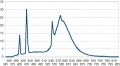
Illuminant Fluo F4 "warm white" 2940K (CRI=54 Sigma=11)

Illuminant Fluo F5 "daylight" 6350K (CRI=74 Sigma=12)


Illuminant Fluo F6 "Lite white" 4150K (CRI=61 Sigma=13)

Illuminant Fluo F7 "D65 simulator" 6500K (CRI=90 Sigma=2)
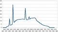
Illuminant Fluo F8 "D50 sylvania F40" 5000K (CRI=94 Sigma=1.4)
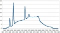
Illuminant Fluo F9 "Cool white delux" 4150K - 4330K (CRI=89 Sigma=2)

Illuminant Fluo F10 "Philips TL85" 5000K (CRI=72 Sigma=11)
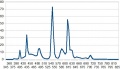
Illuminant Fluo F11 "Philips TL84" 4150K - 4000K (CRI=77 Sigma=9)

Illuminant Fluo F12 "Philips TL853" 3000K (CRI=72 Sigma=8)
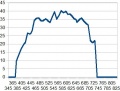
Illuminant Lamp HMI 4800K (CRI=97 Sigma=1)


Illuminant Lamp GTI 5000K (CRI=90 Sigma=2)

Illuminant Lamp Judge III 5000K (CRI=92 Sigma=2)

Illuminant Lamp Solux 3500K (CRI=95 Sigma=2)

Illuminant Lamp Solux 4100K (CRI=92 Sigma=2)
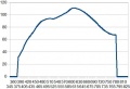
Illuminant Lamp SoluxNG 4700K - 4480K (CRI=97 Sigma=1)

Illuminant Lamp LED LSI Lumelex 2040 - 3000K(CRI=90 Sigma=2)
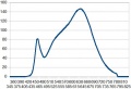
Illuminant Lamp LED CRS SP12 WWMR16 - 3050K(CRI=94 Sigma=3)


Algorithm
I use the basic algorithm "Daylight": a) calculation of the x_D and y_D values that are given as parameters to M1 and M2 (S(lamda) = S0(lamda) + M1*S1(lamda) +M2*S2(lamda) from which we differentiate Xi,Yi,Zi by matrix calculation [XiYiZi]=[observ2°xyz][S(lambda)], then we calculate the channels modifiers modifications by a simple matrix calculation [mulrgb]=[sRGBd65_xyz]*[XiYiZi] (lebarhon: no b)!)
- I used works of John Walker (public domain), and B.Lindbloom - increasing the accuracy and the spectral range - mostly the "Spectrum_to_xyz" function, as known as "CIE_color_match" that converts spectral data (350 – 830nm) of a color or an illuminant into xBar, yBar, zBar values (via the Observer 2° data). We get the output values x and y.
About the blackbody, I use the Planck formula: the seem between the two formulas is very good with a very slight gap of the xD and yD values at 4000K (that we can make out with the histogram between 3995K and 40005K): a) daylight 4000K: xD=0.382 yD=0.383 (for your information for 4500K : xD=0.362 yD=0.370, for 7000K xD=0.30 yD=0.32, for 25000K xD=0.25 yD=0.25); b) blackbody 4000K: xD=0.381 yD=0.377;
For the other illuminants, the works I previously did on the calibration (test pattern 468 colors) led me to search for (and find out) the illuminants spectral data I selected (tungsten, fluorescents, HMI, GTI, Solux, etc.)
rgb ==> RGB conversion - Working space "Working Profile"
This "conversion" converts rgb data (without color space) into the working space chosen by the user.
These working spaces are 11 of them (which sounds more than enough, or even too much...): sRGB, AdobeRGB, Prophoto, Widegamut, BruceRGB, BetaRGB, BestRGB, Rec2020, ACESp0, ACESp1, JDCmax amongst these 11 profiles, 8 have a wide gamut: BetaRGB (origin B.Lindbloom), BestRGB, Rec2020, WideGamut and Prophoto, ACESp1, ACESp0, JDCmax.
Note that other software made other choices:
- Adobe with ACR suggests 4 choices (AdobeRGB, ColorMatch, Prophoto and SRGB)
- Adobe with Lightroom: no choice, but a modified Prophoto space with a sRGB gamma (Melissa)
- DxO: no choice, but a Adobe space
- NX2: choice in the available output spaces
Which one to choose ? Wide ranging debate where small spaces supporters conflict with wide spaces ones... between data lost and false or imaginary data. Indeed, the widest space (Prophoto) houses, by construction, invisible or even imaginary colors. Moreover, in the blues area, it may under some circumstances, generate artefacts.
A good color space would have a shape taking into account the gamut that minimize the waste of space... which means the space should be chosen depending on each image, a too wide space could be generating unsaturated colors in extremes cases (in the working profile, but which will be reproduced during the output conversion ...). Nevertheless, theoretically, the color management must make this choice tranparent.
My answer is pragmatic, choose the space that match the best! but, on what basis ?
- Do you make essentially prints with a printer that use a CMYK driver? In this case it is not really useful to choose a wide gamut profile.

- Do you make prints with a high quality ink-jet printer? In this case, it is better to choose Prophoto (this kind of printers have a gamut, that for some colors, is wider than WidegamutRGB), as working profile, but also as output profile, and of course to choose the right printer profile... on this graphic, we can see the gamut of a) 3 usual color spaces (sRGB in blue, AdobeRGB in pink, WideGamut in yellow), b) the ICC profile ffor my D200 in grey, c) the Epson printer profile and its "3800MOABKOKOPELI_2431_V4" wide gamut paper.
- Do you have a very high quality monitor which has a gamut close to AdobeRGB or WideGamutRGB, in this case take a wide gamut profile.
A pretty simple way to evaluate the minimum profile is to use the statistics given by "vibrance" in debug mode (with verbose=true). In the RawTherapee.exe window you will see a message:
- Gamut : G1negat=x iter - G165535= y iter - G2negat= z iter - G265535= w iter
- if a value (x or y) over 0 appears for one of the two G1, that means the initial image (with the controls made before: contrast, exposure,...) exceed the chosen space gamut in the working profile.
- if a value (z or w) over 0 appears for one of the two G2, that means the saturation set by "vibrance" exceeded the gamut.
- It is up to you to choose if you want to keep these values (see above) or to put them into the gamut (vibrance do it for you, as well as "avoid color cliping" + "enable saturation limiter"), but you 'lose' colors!
- the conversion rgb==>RGB allows when working in "float" to preserve the essential negatives and over 65535 values.
Work in the color space chosen by the user (working space "Working Profile")
RawTherapee made the good choice to work in Lab mode (or its flavours Luv or Lch) or in CIECAM02 mode and with real numbers. This allows to preserve the best colors and gamut.
Functions available in "Exposure" does not modify the hue, except "Saturation" that make it by dysfunction of the Lab mode (see about that the Munsell correction section
Same thing for "Lab adjustments", for the "Saturation" slider, along with the "a" and "b" curves and all the curves that control the chromaticity.
"Channel Mixer" and "HSV equalizer" modify strongly the colorimetry, to be used with all the knowledge of the consequences on the colorimetry. The functions: contrast, brigthness, tone curve,..may quite strongly modify the gamut (see above the control with the statistics given by "Vibrance")
What happens when we are in a "Working Profile" or when we change of "Working Profile" or the settings?
When we are in a narrow profile like sRGB, it may seem obvious that the colors will be limited to this profile limits! So, if an initial color (the sensor one, slightly modified by interpolation) is inside sRGB, what happens when we tweak sliders and curves?:
- in RGB mode (Exposure), if saturation or lightness or contrast is/are modified, we work in rgb mode or its linear derived "hsv". This means that the resulting effects will depend on the working space ((sRGB, AdobeRGB, Prophoto), the results will be different when we move from "sRGB" to "Prophoto", even if we stay inside the gamut limits.
- in Lab mode, if lightness, chromaticity, contrast or curves are modified, we modify directly the L, a, b, (or C,h) values. This means that if we stay inside the gamut limits, the image will be the same (within the limits of the color management)
When exceeding the gamut - that is, the original image - either acting the sliders or the curves, what happens?
- let's take an example, an original color is L=27 a=2 b=-75; this color is in the Prophoto space and is worth R=42 G=52 B=158, and in sRGB R=-85 G=69 B=184 (negative R means out of gamut). If we change the working profile, it is obvious this color can't be restored; the XYZ conversion will give L=32 a=21 b=-67 and R=0 G=69 B=184. The color will have a different aspect because it is completely impossible to reproduce it in a smaller color space.
- second example, a color inside sRGB : L=40 a=42 b=-44, that is in RGB (sRGB) R=133 G=66 B=166, and in RGB(Prophoto) R=102 G=64 B=140: a) if we apply saturation (+30) in exposure, the values become - Prophoto - L=36 a=49 b=-49 and sRGB L=38 a=47 b=-47, because we act on the RGB values; b) if we apply chromaticity in Lab adjustments; Lab values become L=40 a=55 b=-58 as well in sRGB than Prophoto, because we stay inside the sRGB gamut; c) if we choose a color, close enough to the sRGB gamut limits, but inside the gamut: L=40 a=63 b=37 and we apply chromaticity +30, Lab values become - Prophoto L=40 a=81 b=49 - we can notice that the hue is preserved (arctg(b,a)), and in sRGB L=44 a=69 b=50 – the hue isn't preserved.
What does "Avoid color shift"?
If we apply to c) above, "Avoid color shift", the system will try to preserve the hue, by applying a relative colorimetry Lab values become L=40 a=65 b=38 (which leads to the RGB channel G=0).
"Avoid color shift" realises two things:
- try to put in the working profile gamut data out of this gamut, giving priority to a relative colorimetry. RGB negatives values are detected and the chromaticity (and luminance as well) are modified to reach the value 0.
- apply a "Munsell" correction.
The "Munsell" correction
Goal: to give the user possibility to automatically correct the colors that are sometimes false in Lab mode when modifying the saturation, mostly in the blues-crimsons, reds-yellows and the greens (Munsell type correction)
This goal requires the creation of 160 look-up tables with floating-point precision (LUTf):
- These LUTf give to each color (in Munsell sense), each luminance, hue values on a chromaticity basis: 2, 3 or 4 points are set for chromaticities [0..180] from 5, 45, 85, 125 or even 139 when possible. Intermediate values are linearly interpolated. These LUT cause a minimal memory occupation: each one has between 45 and 140 entries, that means about 16000 entries at the total...
- The LUTf are realised for four critical areas, where the drift compared with the Lab mode is important (blue-crimson, red-yellow, green, red-crimson), for the other areas the gaps are low, in any cases very much under the matrix and ICC profiles possibilities.
- These LUTf have the C illuminant as basis (slightly different of D50 or D65), but due to the fact that we work on a gap basis and not on absolute values, the calculation error is very low (less than 1% of the correction, in any cases very much under the matrix and ICC profiles possibilities).
- Theses corrections are quick, nevertheless they are increasing the "vibrance" or "Lab adjustments" processing time of about 10%.
- If "verbose" option is enabled, we can see appear for each correction type, the concerned number of pixels and a rough idea of the correction size (in radians). For correction values in radians, the color gap in deltaE94 is the following:
- correction=0.4 rad deltaE94=12 for blue-crimson
- correction=0.2 rad deltaE94=8 for red-yellow
- correction=0,1 rad deltaE94=3,7 for green
- correction=0.05 rad deltaE94=2 for red-crimson
- the maximum common values of the drift can reach about from 0.05 radian to 0.15 radian for average modifications of saturation, values from 0.2 to 0.25 radian are not exceptionnal.
- for information, a deltaE94 less than 1 is negligible, it is noticeable around 2 or 3 and very important at 8 or 11.
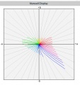
Colors drifts representation for L=20
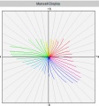
Colors drifts representation for L=40

Colors drifts representation for L=70


Output space "Output Profile"
Space choice
The first thing to examine is: what are the output profiles that are installed on your computer? This depends of: a) the operating system (on the face of it, Linux does not install any profile); b) the other graphical software that are installed (Capture NX2, PhotoShop CS, DxO, etc.), each one install proprietary profiles, for example NX2 installs some NKsRGB.icm NkAdobe.icm, etc. that are copyrighted...; c) profiles that you can have downloaded on the web, for example on the Adobe or B.Lindbloom websites.
On principle I would recommend to check the installation or to install the output profiles matching the working profiles - that are *.icm or *.icc files physically present on your computer and that have nothing to do with the calculation matrix of "iccmatrices.h". If these files are missing, TIFF or JPEG output cannot be done towards these profiles, but will be by default (if the RT_sRGB.icm file is present) done towards the SRGB output space.
These profiles have the following names (we can find others that have the same features or close features), they are generally copyrighted and consequently cannot be shipped with an Open Source software without authorization. They are available on the Web: ProPhoto.icm; SRB Color Space profile.icm ; AdobeRGB1998.icc; BestRGB.icm ; BetaRGB.icc; Bruce.icm; WideGamutRGB.icc. Of course you can install some others like CIE.icc ; Colormatch.icc; etc.
They must be installed in the RawTherapee "Iccprofiles/output" folder or in \windows\system32\spool\drivers\color for Windows and /usr/share/color/icc for the other systems.
When you choose an output profile, e.g. AdobeRGB1998 and the working profile Prophoto, LCMS2 will convert with a Colorimetric intent (chosen by default in the RawTherapee options: relative, perceptual, ...) the RGB data from the working space to the output space.


Gamut for a luminance L=5

Gamut for a luminance L=25

Gamut for a luminance L=75

Gamut for a luminance L=95


Of courses, remarks about the choice of the output color space are similar to the ones about the working space (print, screen,...).
It you want to print with a high quality ink-jet printer (remind: RawTherapee has no print module so far), you have to use a third party software (Photoshop...), in this case I strongly recommend an output profile of Prophoto or WideGamut type.
Take care however, JPG outputs, therefore 8 bits, are almost incompatible - important risk of posterization - with wide gamut spaces (Prophoto, WideGamut...).
Shipped files
Because of the copyrights, I shipped specific files with more detailed LUT that should bring less posterization in the shadows. These files are a by-product of Output Gamma (see below)
- RT_sRGB.icm: similar (primary) to sRGB.icm standard with internal gamma close to sRGB: g=2.40 slope=12.92
- RT_sRGB_gBT709.icm: similar (primary) to sRGB.icm standard with internal gamma BT709: g=2.22 slope=4.5
- RT_sRGB_g10.icm: similar (primary) to sRGB.icm standard with internal gamma linear: g=1.0 slope=0
- RT_Middle_gsRGB.icc: similar (primary) to AdobeRGB1998.icc standard with internal gamma close to sRGB: g=2.40 slope=12.92
- RT_Large_gsRGB.icc: similar (primary) to ProPhoto.icm standard with internal gamma close to sRGB: g=2.40 slope=12.92 (close to "Melissa" used by Lightroom)
- RT_Large_gBT709.icc: similar (primary) to ProPhoto.icm standard with internal gamma BT709: g=2.22 slope=4.5
- RT_Large_g10.icc: similar (primary) to ProPhoto.icm standard with internal gamma linear: g=1.0 slope=0
- Rec2020.icm: new primaries - large gamut - with internal gamma BT709: g=2.22 slope=4.5
RawTherapee gaps
The user can easily note that the output is slightly different from preview. This is not an output default but is due to the curves elaboration that badly take TRC notion into account (ICC profiles embedding to modify from the interior the tone rendering).
It is one of the reasons that led me to give possibility of "adjustable" outputs:
- either by choosing an output profile with another gamma;
- either with an adjustable gamma (gamma and slope);
- either possibly to realise a linear output and adjust it in Photoshop...
- (see further the histograms sketches)
Output Gamma
From my point of view, Output Gamma is one of the key points of a successful TIFF or JPEG output, for several reasons: since the adding of icc/icm profiles above - that are directly derived and elaborate by Output gamma - this option shows a less important interest because the use of these "new" pseudo-profiles Prophoto and SRGB brings similar advantages to Output gamma when selecting the pseudo sRGB and Prophoto ! (see above). This option allows to partially compensate the RawTherapee gap (difference between output/preview)
The ideal would have been to put Output gamma in first process, before the Exposure, Highlights reconstructions, Shadows/highlights, etc. tabs; but, and it is what I thing is a RawTherapee gap, this modification turned out to be impossible without bringing important artefacts: the different RawTherapee pipelines are overlapping and colorimetry in the processing initial part, looks more like do it yourself than professional processing...
I accordingly chose to implant this process in final stage, what is not totally incongruous (even if I think it would be better in initial stage) Output Gamma is going to allow:
- an image evaluation for software without color management
- an image modification if youy print in CMYK (with of course a third party software).
[Lebarhon: this section is indeed not clear, the writer says firstly "Output gamma is a key point for several reasons", and then "this option shows a less important interest" and where are the several reasons ?]
Some thoughts
The gamma acts in a pretty similar way of a combination between "Exposure curves" + "black point" + "tone curves" present in RawTherapee, but modify in a more radically way the contrast, the histogram repartition, mostly between shades and highlights, by modifying at the same time (what previous functions can't do), the TRC curves of the file headers similar to an input ICC profile. A friend of mine, photographer told me recently: "At the beginning, I thought we could simulate gamma with contrasts and tonal curves... but the result is different".
Why indeed has Adobe, with Lightroom, designed "Melissa" that is a Prophoto color space with a sRGB gamma, i.e. a linear part until r=12.92 and then a gamma of 2,4?
Why has D.Coffin embedded in Dcraw for a long time ago, a linear gamma and a varying gamma as well?
Theoretically, if the color management is perfect, whatever the output gamma is (standard, varying...) the image should be identical, because the color management use Lab (or XYZ) data and what we call PCS (Profil Connexion Space in D50); in practice, the image seems identical, but is we watch in the shades, we can see there are gaps, admittedly pretty low but enough for RawTherapee users could have said: the output image is different from "preview".
In the other hand, for software that does not manage colors like many web browsers (Chrome,...) the output image will depend on gamma; it is then important RawTherapee allow to view what the output file will be (softproofing). Today, several factors must be taken into account:
- working space ("working profile") conversion towards output space (Output profile): it may seem obvious that if the image has colors out of the gamut for one or two of the both spaces, if the spaces range is different, then the image rendering will be different;
- color management existing or not: in the case of RawTherapee or of an editor that manage colors, the gaps (with identical output spaces) will be low but nevertheless significant; in the case of software that do not manage colors, gamma impact will be very important.
- possibility to configure in the softproofing, the intent and the black point.
- Later on, it must be quite easy possible to simulate a print by converting the output towards the printer profile; note that in this case, a view of the printable colors should be an important plus.
When RawTherapee will have a function similar to Photoshop CS one "proof format- proof colors", the viewing issue of Output gamma will be solved! this function allows the "soft proofing", e.g. to simulate the look a file is going to have in a website or on a CMYK printer.
Various Output Gamma
In the drop down list you have 7 pre-defined gamma:
- BT709: slope=4.5 gamma=2.2
- sRGB: slope=12.92 gamma=2.4
- linear: gamma=1.0
- standard:slope=0 gamma=1.8
- standard: slope=0 gamma=2.2
- High: slope=3.35 gamma=1.3
- Low: slope=6.9 gamma=2.6
BT709 "is better to process shades (they will be less grey) than sRGB and all the more so, 2.2 or 1.8
"Low" will increase the contrast of the quite poor images, and allow a better post processing for over exposed images
"High" at the opposite will decrease the contrast...
Linear: allows a process in Photoshop of very high dynamic images by adjusting RGB curves in Photoshop (difficult exercice...)
Moreover, you have possibility to use "free gamma" that allows to connect any slope and gamma values to a given output profile, so, you can if desired go out of the new outputs connected to the new added profiles icc/icm:
- sRGB with standard gamma 1.8
- WideGamut with gamma BT709
- sRGB with gamma: 2.2 and slope 6.5
As examples here is with the same NEF file various histograms with various gamma and as a reference the RawTherapee histogram (preview) with the same settings (working spacece Prophoto, profile "neutral", output profile = Prophoto and its varying gamma).


The more the histogram is shifted to the left the more the image appears dark...
Moreover, it is not because the histograms are strictly identical that the images rendering will be identical. Indeed, the "TRC" notion take place as well for the preview as for the output file. This "TRC" acts on the file headers (ICC profile) and modify the tone data. If the "TRC" value of the output file is known for certain, because it is determined by the output file features (Prophoto.icm, RT_srgb.icc,...), I think that it is not the same thing about "preview"... (see further notes about sRGB output).
Some people could be worried, is "RT_SRGB" identical to "sRGB_Color_Space_Profile" and different from the preview. Moreover, what are the effects of another gamma?

Preview en SRGB

Output RT_sRGB

Output sRGB_Color_space_Profile

Output sRGB gamma BT709

Output sRGB gamma=2.3 slope=8


How to use it ?
To satisfy a desire for simplicity, the Output profile will be a derivative of the Working profile, the box Output profile appear in grey. That means Output profile = Working profile.
For instance, you select Working profile = Prophoto and Free gamma = 2.1 and slope =4.0.
Then you validate a TIF output or towards the editor and you generate an output TIF file, with Prophoto profile and gamma 2.1 / 4.0. To open the file in an external editor (e.g. Photoshop CS), it will appear "Prefer the embedded profile: sRGB IEC61966-2.1 (RTH gamma BT709 similar to HP sRGB)" that match to the RT_sRGB_gBT709 profile but with a modification that we will examine further.
Other example, you select Working profile = sRGB and Free gamma=2.3 and slope=10.0, you are going to generate a TIFF with sRGB and gamma 2.3 and slope=10 output. To open the file in an external editor (e.g. Photoshop CS), it will appear "Prefer the embedded profile: sRGB IEC61966-2.1 (RTH gamma BT709 similar to HP sRGB)" that match to the RT_sRGB_gBT709 profile but with a modification that we will examine further.
If you enable the option (Photoshop CS): "Delete the embedded profile", the TIFF file will appear with the new RGB values due to the new gamma and slope values, but the image look will be different (file headers missing).
The algorithm uses the LCMS function "CMSToneCurve":
- the output spaces are computed from their primary (red, green, blue), e.g. for Prophoto : p1=0.7347; p2=0.2653; p3=0.1596; p4=0.8404; p5=0.0366; p6=0.0001;
- the gamma parameters are computed with the "calcgamma" function that will, accordingly with the gamma and the slope, determine 5 parameters to give to the LCMS2 right function.
So, we create a pseudo-profile, kind of RGB "Prophoto" and with a gamma matching the selected one.
But we find here, a LCMS2 gap, which creating this profile, does not write the matching profile in the file header, because it works with RGB values and not with LUT / Lab. Theoretically, it should need as much profiles with an adapted gamma and not only one. In practice, I brought a large modification to Output Gamma and worked around the LCMS2 gap, by applying - after the RGB conversion, a profile *.icc that has the same features that the *.icc or *.icm profiles used by Output Gamma but where the rTRC, gTRC, bTRC tags are computed with "calcgamma".
To improve the understanding of the TIF processing in linear mode, you can read the Dcraw tutorial from Guillermo Luijk http://www.guillermoluijk.com/tutorial/dcraw/index_en.htm
From which the necessity to have in the "Iccdirectory" folder, the "*.icc" and "*.icm" files: BestRGB.icm ; BetaRGB.icc; Bruce.icm; WideGamutRGB.icc, (and thus the icc/icm files added for the pseudo-Prophoto , Adobe, SRGB in "Iccprofile/output").
RawTherapee profiles quality
The user can ask himself with reason what is the RawTherapee profiles validity (RT_sRGB, RT_Large,...)?
These profiles have the same features that the "original" ones (AdobeRGB1998, Prophoto, SrGB Color Space Profile), there is only small differences at the primaries and/or white point level. They do not have any incidence on output quality and level.
In the other hand, TRC have more detailed LUT going from 1024 points to 4096 points. This has for consequence - in the sRGB case that is the more frequent output - a histogram with much less fish bones that may bring posterization in the shades. Here is for comparison with the same image, a 16 bits histogram enlargement in low lights, between sRGB Color Space profile and RT_sRGB
partial 16 bits histogram sRGB_color_space_profile

partial 16 bits histogram RT_sRGB
Advanced Tab
Retinex
Note: This translation of the "Retinex" French page is a working document.
Generalities
While the eyes are able to see correctly the colors through a poor lighting, a colored surrounding or a veil of fog, cameras badly manage in theses conditions. It is by copying the eyes biological mechanisms to adapt itself to these conditions that the MSR algorithm (MultiScale Retinex) has been created. In addition to the digital photography, the Retinex algorithm (Retinex is the contraction for Retina + Cortex) is used in astronomy to show up information laying in the astronomical photographs, in medicine to detect not much visible structures in radiography and tomodensitometry. Numerous theories and algorithms have been working out for more than 20 years. The first experimentation has been proposed by Rahman in 1996. The approach follows the human visual perception and the Edwin Land's retinal function. In a way, this approach is pretty similar to CIECAM. This function and more particularly its general form is similar to a DOG (Difference Of Gaussian). The idea consists of characterizing the luminous information of a point from its intensity and the intensity of its neighbours. This said, this approach has no scientific basis and is only lying on experience and various empirical constants. Over the years many improvements have been added, but from my own point of view, no one is fully satisfactory. I relied on two documents :
- "Automatic Image Haze Removal Based on Luminance Component" (Fan Guo, Zixing Cai, Bin Xie, Jin Tang"[6]
- "Retinex Algorithm on Changing Scales for Haze Removal with Depth Map" (Weixing Wang, Lian Xu)"[7]
- and from some programming tricks inspired from "2003 Fabien Pelisson"
The use of Retinex might be beneficial to images processing:
- that are hazy, misty or having a veil of fog
- with important luminance gaps
- where the user looks for special effects (tone mapping …)
Retinex at the beginning of the processing
It is the algorithm described in this page, with its limitations, advantages and drawbacks.
Retinex in "Wavelets"
I installed 2 possibilities to enable Retinex in the Wavelet process: Wavelet levels/fr. Some of the quoted limitations are no more there !
Quick comparison between the both versions " Retinex in Wavelets" and " Retinex at the beginning of the processing": Wavelet_levels/fr#Avantages_.28.2B.29_et_inconv.C3.A9nients_.28-.29_de_Retinex.2Ffr_par_rapport_.C3.A0_Retinex_in_wavelet
Imposed limitations by RawTherapee
The basic algorithm impose a reference to the whole image, and not to a crop or a reduction like in the RawTherapee processing. This limitation imposed by the gaussian function causes several consequences:
- The processing has been shifted from its dedicated place, that should have been close to "Lab Adjustments" - near the beginning of the RawTherapee processing – that is necessarily (except if somebody has an idea to do differently) a raw process. As a consequence, non raw files (TIFF, JPG, …) can't be processed with this algorithm? This problem should be solved soon (November 2015 ??).
- The second consequence of this position is that the characteristics of the raw data situated just after demosaicing are very different that the ones situated downstream: no gamma, no gamut limitation, no white balance, no RGB conversion… so we must expect artefacts and poor luminance and color rendering.
- The third consequence is the system response time which imposes to re-actualize the whole process after each change in the settings.
- The fourth, sometimes, will need a white point modification, in order to avoid colors distortions (for example: a magenta sky).
- But advantage, this process being situated before "Denoise", the noise reduction will be here fully effective.
Nevertheless, despite these handicaps, as we will see it further, results are more than satisfactory as well about processing time that in contrast and colors rendering, particularly by joining Retinex and Wavelets actions.
Algorithm principle
For more information, see the "pdf" documents given in the "Generalities" section.
To elaborate a "Transmission Map" file obtained by
- making the difference, for luminance only, between each pixel logarithm of the input image and the neighbouring pixels logarithm of the matching gaussian image. The standard deviation (gaussian function) used here is very high - usually in RawTherapee sigma values from 0.5 to 5 are common – here the values range from 10 to 280 (Single Scale Retinex), it is up to the user to choose.
- modifying the input image luminance distribution by
- applying a gamma before the "Transmission Map" file creation
- applying an inverse gamma to restore the input image characteristics
This modification of the distribution allows:
- to change the image tonality
- to modify the "Transmission Map" file to take into account for example the under or over exposed areas.
- applying several time (Scale) – 3 times, not modifiable by the user – this algorithm with an addition using empirical coefficients (Multi Scale Retinex). (Low scale values increase the apparent contrast, but give a perspective look to the image, high scale values make the image more natural but they have a tendency to increase the noise).
- a variation of MSR by the user according to the desired effect (Uniform, Low, High, Highlight)
- Uniform: Strive to process low and high intensities in an equilibrated way.
- Low: Improve low intensities areas
- High: Improve the rendering of the more exposed areas
- Highlight: Improve the rendering of the highlight areas that may become magenta, but can bring strong artefacts.
- choosing the colorspace
- logarithmic L*a*b*
- logarithmic HSL
- linear HSL – this version doesn't comply with Retinex algorithm but in some cases it allows a more suitable image processing.
So, we get a logarithmic distribution "Transmission Map" – except in linear mode! - that we will be able to "subtract" to the input image, either to get an image theoretically free from mist and from veil fog or to get special effects. This distribution owns approximatively a gaussian distribution with a minima (minT) about, according to the images – higher for images with veil – from -10 to -40, an average close to from -1 to +2, a standard deviation often about 2 to 6 and a maxima (maxT) about 10 to 40. The negative values mean low intensity and positive values mean high intensity. Caution, these values are logarithmic coefficients that stand for very high values (log 1000 = 6.9) (exp 10 # 22000)...(exp 20) # 500.000.000. In theory we should use high "Scale" and gaussian values in the areas closest to the lens (where the veil effect is low) and low values in the distance (where the veil effect is important).
To process the mask resulting from the gaussian process
The "Transmission Map" file correspond to a recursive process of:
- The source image – Input image which went through various modifications by the histogram equalizer and the gamma.
- The "mask" files directly resulting from the gaussian process (scale, radius, method low.. high…)
"Mask" display type
"Mask" files processing (the idea came to me by studying the Rusell Cottrell's plugin) will allow to decrease flares and artefacts. I added a combo-box to choose the display type. This is both an educational system and also an aid to find the "right" settings.
- Process:
- Standard: it is the default setting
- Mask: display the mask obtained by the Retinex algorithm resulted from the gaussian process. We will see here the impacts:
- of the various settings upstream: method (low, uniform, high and highlight), radius, gamma, histogram equalizer. In the other hand, the other settings downstream have no effect on this display: contrast, gain, brightness, threshold and the curve "Transmission Map".
- of the various settings of the "Mask equalizer".
- you can export these settings (TIFF/JPG) to use this mask in external software (Gimp, Photoshop).
- Unsharp mask: you can use this option to subtract the mask to the input image. In this case, an action on "strength" will allow to equilibrate between the input image and the mask. So we get the possibility to have images with very high radius values.
- Transmission: display an "image" of the "Transmission Map" file.
- this "image" doesn't match the reality that matches to a logarithmic scale which values are mostly situated between -30 and +30.
- (fixed) in order to make this values "visible", I applied two arbitrary coefficients – I avoided the automatic computing in order to allow comparisons – which shift and increase the basic values.
- (auto) I used here the values displayed in the Preview (TM Min Max Mean Sigma) to elaborate a file with values ranged from 0 to 32700. Of course these data become visible with the maximum range but don't match the reality. This configuration can be, depending on the images, preferable to "fixed".
- the displayed image takes into account each Retinex processing, except: a) "median filter"; b) "Gain"; c) "Brightness" (offset); d) and of course "Strength".
- you can act on the different settings, particularly on the "Mask equalizer" ones, and also the "Transmission Map" curve, and then see directly the actions on the haze, the artefacts annd contrasts.
Action methods on the masks
I set 3 methods:
- a diagonal curve which acts directly on the recursive contrast of the "mask" files – take care, this curve is very sensitive and can lead to important artefacts. In the other hand, it hasn't, or a few, impact on the processing time. You can use this curve alone or combined with the other methods.
- a gaussian process is applied to the masks. You can act on the shadows, the highlights and the radius. The increase of the processing time is moderate.
- a "wavelet" process (Sharp mask) is applied to the masks. You can act on the shadows and the highlights. The increase of the processing time is important or very important according to the selected method (partial or total).
"Transmission Map" file processing

The main basis processing consist of to apply, using the "Transmission Map" average and standard-deviation, a transformation of the type:
- newT = (oldT – mini) / maxi-mini.
- with mini = average – k * standard-deviation
- with maxi = average + k * standard-deviation
The choice of k - contrast (variance): modifiable by the user – is decisive in the image rendering: low values will increase the seeming contrast, hight values will make the image more natural with less artefacts and hazes.
I added three components to this basis processing:
- a threshold - modifiable by the user – that will allow to reduce the maximum (maxT) and minimum (minT) values by integrating the clipped values to the new distribution.
Example: if the chosen threshold is 10, all the values lower than -10 will became -10, all the values over +10 will become +10. This action is going to increase the contrasts, but can lead to artefacts.
- a curve (flatcurve) - modifiable by the user – to directly act on the distribution, by replacing theory by practical… It is by acting on the distribution that the user will be able for example to reduce the negative values and increase the positive ones (or the opposite) to improve the rendering in real time.
- a median 3x3 - modifiable by the user – that acts on the distribution irregularities, in order to reduce the artefacts.
Elaborating the "Image Haze-free" file

This file is obtained by "difference" between the input image and the "Transmission Map" file.
We are going to use here 2 extra parameters, Gain and Brightness (Offset): These two parameters allow to include the "Transmission Map" file to an exploitable image. Indeed, without precautions, the restored image could be totally out of the luminance usual limits that are between 0 and 32768.
- "Gain" will act on the total amplitude by increasing or decreasing it and for example reduce the numbe of totally black pixels.
- "Brightness" (Offset) will allow to reset the luminance after "Gain" acted.
In order to give some help to the user, I added a display for the "haze-free" image minimum values to the GUI. We can act on "Gain" and "Brightness" (Offset), but also on each other parameters, particularly "contrast" (variance) and the "Transmission Map" curve. The ideal is to set Min values the closest possible to 0 and the Max values the closest possible to 32768. For example, an "original" image with min=-44230 and max=76000 could become min=32, max=32500. Of course no other values are forbidden, but in all cases these values will be clipped and brought back to 0 – 32768, the "Transmission Map" file wealth is lost !!
Keys for acronyms and labels used in the GUI to ease the use:
- Restored haze-free Min=-5681 Max=34568 : display image maximum and minimum values "without veil" before clipping.
- TM Min=-3.8 Max=4.1 Mean=0.1 Sigma=3.3 : Tansmission Map -- Min and Max match to the following computing Min=Mean - Sigma * Variance / 100 ; Max=Mean + Sigma * Variance / 100 *TM Tm=-6.5 TM=11.8 : Transmission Map -- Tm minimum value of the distribution; TM maximum value of the distribution.
It is obvious that that a display in the GUI:
- of the "Transmission Map" distribution and also
- the "Haze-free" image data
should make easier both the system understanding and ergonomics… but this is still to be fixed ???
Retinex versus Tone-mapping
There is several ways (according to specialized sources in this field) to adapt the Retinex algotithm to a "Tone-mapping" rendering. The study of the existing code, my understanding of the problem… led me to the following solution:
- Proceed to several "Retinex" specific code iterations. I name specific code the part excluding
- the RGB==>L*a*b* or RGB==>HSL conversions (and vice versa).
- the histogram equalizer.
- the differential gamma (low, middle, high, free).
- in the same way, aren't concerned the choices done with the "Low", "Uniform", "High", "Highlight" method
- These iterations obviously increase the time processing, up to 2.5 times for 5 iterations.
You can choose between several ways to carry on the iterations by acting on 3 factors I called "Gradient":
- "Gaussian gradient" that act on: a) the gaussien blur sigma (Radius or Neighboring pixels); b) the "scale" factor (set by default to 3).
- "Transmission gradient" that act on: a) the contrast (variance); b) the threshold that limits the "Transmission Map" file.
- "Strength gradient" that act on "Strength", that means the combination of the "Haze-free" image with the original one.
If you set these 3 gradients to 0, all the iterations will be identical to the basis processes.
Impact of each gradient:
- "Gaussian gradient" : according to the "it" iteration, the Radius value ("Neighboring pixels") is divided by "grad" and "scale" value become:
- Gg 1 :
- it=1 grad=1; it=2 grad=1.25;it=3 grad=1.5;it=4 grad=1.75;it=5 grad=2
- it=1 scal=4; it=2 scal=3; it=3 scal=3; it=4 scal=3; it=5 scal=2
- Gg 2 :
- it=1 grad=1; it=2 grad=1.50;it=3 grad=2.0;it=4 grad=2.50;it=5 grad=3
- it=1 scal=5; it=2 scal=4; it=3 scal=3; it=4 scal=2; it=5 sca=2
- Gg 3 :
- it=1 grad=1; it=2 grad=1.66;it=3 grad=2.3;it=4 grad=3.00;it=5 grad=3.6
- it=1 scal=5; it=2 scal=4; it=3 scal=3; it=4 scal=2; it=5 scal=2
- Gg 4 :
- it=1 grad=1; it=2 grad=1.80;it=3 grad=2.6;it=4 grad=3.40;it=5 grad=4.2
- it=1 scal=5; it=2 scal=4; it=3 scal=3; it=4 scal=2; it=5 scal=2
- Gg 5 :
- it=1 grad=1; it=2 grad=3.50;it=3 grad=6.0;it=4 grad=8.5;it=5 grad=11.0
- it=1 scal=5; it=2 scal=4; it=3 scal=3; it=4 scal=2; it=5 scal=2
- Gg 6 :
- it=1 grad=1; it=2 grad=6.00;it=3 grad=11.0;it=4 grad=16.0;it=5 grad=21.0
- it=1 scal=5; it=2 scal=4; it=3 scal=3; it=4 scal=2; it=5 scal=2
- Gg-1 :
- it=1 grad=1; it=2 grad=0.875;it=3 grad=0.75;it=4 grad=0.50;it=5 grad=0.37
- it=1 scal=3; it=2 scal=3; it=3 scal=3; it=4 scal=3; it=5 scal=3
For Gg 5 and Gg 6, the selected method is taken into account, if it is "highlight", 'grad' values are boosted according to "Highlight Threshold"
- "Transmission gradient" : according to the "it" iteration, the contrast (variance) and threshold are multiplicated by "var":
- Tg 1: it=1 var=1; it=2 var=0.875; it=3 var=0.75; it=4 var=0.625; it=5 var=0.5
- Tg 2: it=1 var=1; it=2 var=0.800; it=3 var=0.60; it=4 var=0.400; it=5 var=0.2
- Tg-1: it=1 var=1; it=2 var=1.125; it=3 var=1.25; it=4 var=1.375; it=5 var=1.5
- Tg-2: it=1 var=1; it=2 var=1.400; it=3 var=1.80; it=4 var=2.200; it=5 var=2.6
- "Strength gradient" : according to the "it" iteration, "strength" is multiplicated by "s":
- Sg 1 : it=1 s=1.30; it=2 s=1; it=3 s=0.70; it=4 s=0.5; it=5 s=0.5
- Sg 2 : it=1 s=1.60; it=2 s=1; it=3 s=0.40; it=4 s=0.3; it=5 s=0.3
- Sg-1 : it=1 s=0.80; it=2 s=1; it=3 s=1.20; it=4 s=1.2; it=5 s=1.2
- Sg-2 : it=1 s=0.60; it=2 s=1; it=3 s=1.40; it=4 s=1.5; it=5 s=1.5
Note : "Hue equalizer" and "Transmission median filter" are applied only once, whatever the number of iterations is.
The various adjustments
Adjustments always accessible
There are 5 adjustments at your disposal:
- Retinex method : with "Low" "Uniform" "High" "Highlight"
- Low: improve low intensity areas
- Uniform: Strive to process low and high intensities in an equilibrated way.
- High: Improve the rendering of the more exposed areas
- Highlight: Improve the rendering of the highlight areas that may become magenta, but can bring strong artefacts.
These 4 methods act directly on the "Transmission Map" file.
- Space
- L*a*b*
- HSL Log
- HSL Lin
The choice between these 3 spaces depends on the image… The 2 firsts "meet" the Retinex algorithms.
- Strength: Combine "Haze-free" image with the original image. Strength=0 brings no Retinex processing to the image. Strength=100 brings a total processing, "Haze-free" image only is displayed. Values under 50 are recommended.
- Chroma (patch): act on the color component, using the Retinex algorithm, in percentage of the "strength" value relative to the luminance. The slider runs a Retinex process dedicated to the color component by "simplifying" the process, luminance specific components - gamma, luminance, gaussian mask, ...- aren't executed. Caution, processing times are doubled and the extra memory calls important.
- Radius (Neigboring pixels): take into account the neighbouring pixels using the "Difference gaussian" algorithm, higher are the values, more affected is the foreground. Lower are the values, more affected are the distant areas, act directly on the "Transmission Map" file.
- Highlight threshold: only accessible with the " Highlight" method; set the "Highlight" method threshold, a value of 1 will give about the same effects that the "High" method, high values should allow to reduce the magenta colors in the overexposed areas. Be careful, it will probably be needed to:
- change some adjustments, in particular "Radius" (Neigboring pixels)
- increase the "Raw white point" value in case of magenta hues in the overexposed areas
- use "Hue equalizer" in case of magenta hues in the overexposed areas
- act on "Gamma Retinex"
- Contrast (Variance): This coefficient equilibrates "Transmission Map" average and standard-deviation. It is a key factor for the image rendering. It acts on the low and high contrast thresholds of the "Transmission Map" file, the lower are the values the more contrasted is the image, the higher are the values the more natural is the image and the artefacts reduced. This Contrast (Variance) doesn't act on the "Transmission Map" file but allow the Haze-free image computing.
Adjustments accessible with "Setting"
- Gamma Retinex: with 4 choices "Low", "Middle", "High" and "Free", it allows to choose the gamma and the slope for a gamma applied before the Retinex algorithm and for an inverse gamma applied immediately after rebuilding the image. High gamma values associated with low slope values can lead to artefacts. The using depends on images, La*b* or HSL space, used settings… and the wished effects.
- Histogram Equalizer: This curve is a lesser evil… because it aims alone to restore gamma, RGB conversion, icc input profile, white balance … which gap is due to the Retinex position in the processing, that is placed in Raw in order to work on the whole image. Without this curve, "Transmission Map" data are generally bad and bring important artefacts. To be noticed that the interface has 2 different curves for L*a*b* and HSL. This curve is without action by default, but in L*a*b* mode it is quite mandatory to reduce the first quarter action (to be adjusted by the user) and to reduce the high values in order to reduce artefacts and haze. It is experience that will guide the user.
- Hue equalizer: This curve will allow:
- to adjust Retinex action according to the hue, for example to weaken a sky, to boost leaves …
- to reduce the action in the overexposed areas of magenta hue
- it should be noted that when the "highlight" method is selected, this curve also acts on the final image chroma.
These 3 adjustments (Gamma Retinex, Histogram Equalizer,Hue equalizer), don't act directly on the "Transmission Map" file, but modify its original value.
- Gain and Brightness (Offset): used together, they allow to correctly locate the "haze-free" image. You can find help in the information given in the GUI, and place Min close to 0 and Max close to 32768. Gain and offset act on the "haze-free" image and have no action on the "Transmission Map" file.
- Threshold: this coefficient act on the "Transmission Map" maximum and minimum values.
- Transmission Map: this curve is interactive with the "Transmission Map" file, the X axis of the curve represents the "Transmission Map" distribution basis (MinT, mean, MaxT). To drag down the left part will reduce the minimum values (the ones relative to the foreground) and in the same way, to drag down the right part will reduce the maximum values (the ones relative to the background). This curve is a key point for controling the image seeming quality.
- Transmission median filter: reduce the artefacts due to the too strong local variations of "Transmission Map".
I added a "combobox" that allow to select the display type. It is both a pedagogic system and also an help to find the "right" settings.
- Process
- standard: the default setting
- mask: display the mask obtained by the Retinex algorithm, resulting from the gaussian processing. We will se here the results of:
- the different adjustments placed upstream: method (low, uniform, high and highlight), radius, gamma, histogram equalizer. In the other hand, the other adjustments placed downstream have no impact on the display: contrast, gain, brightness, threshold and the "Transmission map" curve.
- the variouos "mask equalizer" adjustments.
- you can export these adjustments (TIFF/JPG) to use this mask in external software (Gimp, Photoshop)
- Unsharp mask: you can use this option in order to subtract the mask to the original image. In this case, the action on "Strength" will alloww to equilibrate the combination between the original image and the mask. Doing so give the possibility to have image with very high radus values.
- Transmission: display an "image" of the "Transmission Map" file
- this "image" doesn't match the reality, that one corresponding to a logarithmic scale which values are generally ranging between -30 to +30.
- (fixed): in order to make these values "visible", I applied 2 arbitrary coefficients – I avoided automatic computing to allow comparisons – that shift and boost the basis values.
- (auto): I use here the values displayed in the Preview (TM Min Max Mean Sigma) to elaborate a file which values are ranging between 0 and 32700. Of course these data become visible with the maximum range but doesn't match the reality. This configuration may, according to the image, be preferable to "(fixed)".
- the displayed image take into account the totality of the Ratinex processings, except a) the "median filter"; b) the "Gain"; c) "Brightness" (offset); d) and of course "Strength".
- you can act on the various adjustments mostly the "Mask Equalizer" ones and also the "Transmission Map" curve and thus directly see actions on the haze, the artefacts and the contrast.
Practical synthesis of the various adjustments
| Adjustments | Main feature | Complementary feature - comments |
|---|---|---|
| Strength | Combine the action of the Retinex image with the original one. | No impact on the Retinex processing |
| Method : Low,Uniforme, High, highlight | Differentiate the action according to the luminance intensity (low = low intensity, highlight = may reduce colored artefacts) | Higher are the values, more impacted is the foreground (high favours the foreground) |
| Radius | High values for the foreground, low values for the background | High values may create artefacts |
| Contrast | Low values increase the global contrast, favour the foreground, create artefacts | High values reduce artefacts |
| Threshold | Low values increase the global contrast, increase transition artefacts | Low values reduce background artefacts |
| Transmission-map curve | Left part acts on foreground, right part acts on background | Moving the median point acts on contrast and artefacts |
| Gain and Brightness | Locate Retinex according to the source image (see Settings - restored haze-free) | May give illusion to act on contrast and lightness |
| Adjustments | Main feature | Complementary feature - comments |
|---|---|---|
| Gaussian-mask and Sharp-mask | Reduce the artefacts resulting from too high local contrasts | High values reduce Retinex action |
| Method L*a*b* - HSL -... | Change the luminance initial repartition, allow to reduce artefacts | L*a*b* seems more adapted for images with high expositions |
| Gamma and Histogram equalizer | Change the luminance initial repartition to reduce artefacts | Gamma is compensated by its inverse at the end of Retinex processing |
Use in combination with wavelets and Lab Adjustments
In case of atmospheric veil, the contrast restoration with Retinex algorithm:
- is sometimes not good enough or leads to artefacts if "Strength" too high,
- leads to a chroma and sharpness insufficiency
Several solutions can be tried, particularly:
- to increase the chroma using L*a*b* adjustments (Chroma slider or C/C curve or * = f(a*) and b* = f(b*) curves;
- to adjust the global contrast using La*b* adjustments (L curve)
- to increase the chroma using the residual image of wavelet,
- it is of course possible to use other RawTherapee controls, particularly in the "Exposure" tab.
But I think that to give priority to the wavelet tool is a good choice, mostly for images with an atmospheric veil. We will be, in addition to the adjustments given above, to:
- increase the residual image contrast,
- use the "contrast" compression method by sliding down "compression strength" and adjusting "gamma",
- lightly increase "Edge sharpness" with "edge detection"
- use "Final touchup", in particular: "Final local contrast", "Final contrast curve" and if necessary ("Tone-Mapping" effect) , "Contrast balance method".
A possible example – Dehaze – some recommendations
In order to better explain the processing using Retinex, I will take the example of a difficult image, very hazy and tainted with an atmospheric veil Madeira
Be careful, this processing is for pedagogic goal only and has no claim to obtain a perfect image! (by the way, what does it mean, it is subjective). The user has total freedom to proceed to changes, modifications, to get the rendering he wishes.
First Retinex adjustments
- At the start [ following not understandable]
- Enable "Retinex" and that's all
To get a synthesis of the different adjustments see # Practical synthesis of the various adjustments
With this kind of image, where the veil is present both in the foreground and in the background and having an uniform histogram, I choose the options:
- Method: Uniform
- L*a*b*: because it is the most efficient of the 3 (Lab, HSL - Log and HSL Lin)
Then I choose, for "Radius", "Contrast" and "Strength", the adjustments by default, that means respectively 80, 200 and 20.
Transmission map adjustment – Iterations with Radius, contrast, scale
The next step consist to study in the tool "settings" the indicator that give partial information about Retinex optimization, the "Transmission-map" file, I quoted "Restore haze-free". You can also, iif you want, view the "Transmission-map" file, (set Process to the "Transmission fixed" option).
We can see the values: Min=-5799 Max=14069., and also other values: TM min =-9.8, Max=7.7 Mean=8.8 Sigma=4.4 Tm=-13.1 TM=20.7
Let's have a look to the both values Min=-5799 and Max=14069. That means that the image corresponding to these values and which will be subtracted to the original image, doesn't correspond at all to the usual luminance values that, as a reminder, are between 0 and 32768 in RawTherapee using L*a*b*. The first thing to do is to use the "Transmission-map" curve to get more relevant values. Be careful, the goal isn't to get Min = 0 and Max = 32768, but more reasonable values. For example, it is possible to lower a little bit the left part of the curve and to lift a little bit the central part. We end up for example to the following adjustments: :Media:madeira-first.pp3
The Haze-free image
Just now I don't modify the values that could have an influence on "Transmission-map" like "radius", "contrast".
Then, in an iterative way between "Gain transmission" + "offset" and "radius", "contrast" and "scale", I will try:
- to act on the "Transmission-map" curve and "offset" in order to get Min and Max values close to 0 and 32768, but -400 and +39000 may be a good choice too.
- and then to act on "radius", "contrast", "scale" to obtain a looking fine image, contrasted enough, but without too much effect of depth… it is a matter of taste.
- work by iterations
I arbitrary took the following values given in the pp3 Media:madeira-second.pp3
To apply a Gaussian mask and a gamma
These two tools allow to modify the distribution of the action between high and low lights.
- choose "Mask Method" = Gaussian mask and increase hihlight = 23 to lighten the sky, you can use the "mask" option to view the changes
- put "Gamma" in "settings" on "Low"
Again, all is matter of taste.
We end up, for example to the following adjustments: Media:madeira-third.pp3
Act on the chroma
Two cases:
- In the version "Retinex at the beginning of the processing" there is no Retinex action on the chroma. You can use the "Lab adjustments" tool and act either on the "Chromacity" slider or on the two curves a*=f(a*) and b*=f(b*), or on the curve C=f© more intuitive.
- In the version "Retinex in Wavelets", act on the Chroma slider in Wavelet.
We end up to the following adjustments: Media:madeira-four.pp3
To boost the contrast and to reduce the atmospheric veil even more – Wavelet
- Slightly increase the contrast with "contrast levels"
- In Residual image" increase contrast and chroma (contrast = 25, chroma = 22), then choose "Compression method" = "Tone mapping" and reduce compression strength = -0.29
- In "Final Touchup", choose "Contrast balance" select "slider" and adjust "Contrast balance d/v-h" to 19
- Enable "chroma balance"
You end up to the following adjustments: Media:madeira-five.pp3
Final adjustment
You can, if necessary :
- Adjust "Strength" in Retinex
- Act on "Final contrast" and/or "after contrast curve" in wavelet
- And also on all the other usual adjustments.
You end up to the following adjustments: Media:madeira-six.pp3
CIECAM02
August 2022
Color Appearance & Lighting (CIECAM02/16) et Color Appearance (Cam16 & JzCzHz) - Tutorial
Introduction
The following information is common to:
- Color Appearance & Lighting (CIECAM02/16) - Advanced tab
- Color Appearance (Cam16 & JzCzHz) - Local tab
Both of these modules use all or part of a CAM or color appearance model. When a topic concerns just one of these two modules, it will be explicitly mentioned. Ciecam02 has many advantages but it has shortcomings when processing high dynamic range images (HDR) and in particular in the highlights where the gamut is reduced. The performance is considerably improved with Ciecam16.
The Color Appearance module (Cam16 & JzCzHz) combines a real CAM (Cam16) and JzCzHz which is not a real CAM, but has some of its characteristics.
HDR to SDR: A First Approach (Log Encoding - CAM16 - JzCzHz - Sigmoid)
Definition of a color appearance model (CAM)
A Color Appearance Model (CAM) is a mathematical model that seeks to describe the perceptual aspects of human color vision i.e. the viewing conditions under which the appearance of a color is different to the corresponding physical measure of the source stimulus (RGB, XYZ are not CAMs, Lab is a CAM with limited possibilities).
CIECAM02/16
This module is based on the CIECAM02/16 color appearance model, which was designed to better simulate how human vision perceives colors under different lighting conditions, for example by taking into account various backgrounds. It takes into account the environment of each color and modifies its appearance to come as close as possible to human perception. It also adapts the output to the intended viewing conditions (monitor, TV, projector, printer, etc.) so that the chromatic appearance and contrasts are preserved throughout the scene and display environments.
Some examples of color phenomena that can be addressed with a CAM:
- A color will be perceived differently on a light or dark background. The darker the background, the more it will be necessary to reinforce the color.
- An object appears brighter and more contrasted in direct light than in shadow.
- As the luminance increases, dark colors appear darker and bright colors appear brighter.
- Colored objects appear lighter than achromatic objects with the same luminance. The most saturated colors appear the brightest.
- Chromatic adaptation, which is the ability of the human visual system to adjust to changes in lighting (illuminating) conditions. In other words, we adapt to the color of the light source to better preserve the color of the objects themselves. For example, under an incandescent light, a white book appears yellow. However, we have the ability to automatically model yellowish light, so we see the paper as white. The world around us would indeed be very complicated if objects changed color each time the light source changed, even slightly. Since the dawn of time, we have had to be able to tell whether a fruit is ripe in the morning, at noon, or in the evening. Chromatic adaptation makes this possible.
Variables - data and vocabulary used by CIECAM
CIECAM02/16 consists of 3 processes:
- Source or Scene conditions: the shooting conditions and corresponding data are normalized to average or "standard" conditions (e.g. D50 white balance) prior to making any subsequent CIECAM corrections.
- Adjustments to the Source data.
- Viewing Conditions: the viewing conditions of the final image (monitor, TV, projector, printer...), as well as the corresponding environment. This process will take the data from process 2 and adapt it to the output medium to take into account the viewing conditions and the viewing environment.
Differences in the way CIECAM is used in the 2 modules (Advanced tab, Local Adjustments tab)
Differences in the way CIECAM is used in the Advanced tab and the Local Adjustments tab
- “Color Appearance & Lighting (CIECAM02/16)” - Advanced tab: this module contains all of the Ciecam02/16 concepts and tools. It was developed in 2012 and is specific to Rawtherapee. The user can select two levels of complexity:
- Standard: gives the user the tools and variables needed to become familiar with the concepts and for everyday use.
- Advanced: contains the complete set of tools and associated variables for advanced use.
- “Color Appearance(Cam16 & JzCzHz)” - Local tab: This module contains a simplified set of Cam16 tools and a first approach to JzCzHz. The user can select three levels of complexity:
- Basic: provides the basic tools and variables used by Cam16.
- Standard: provides additional Cam16 tools to take into account all the perceptual aspects of human color vision. It also includes a mask.
- Advanced: adds additional Cam16 tools and variables and a JzCzHz module.
HDR to SDR: A First Approach (Log Encoding - CAM16 - JzCzHz - Sigmoid)
Some examples of CIECAM02/16
The following five examples will allow us to discover the power of this tool along with some of its limitations:
Example 1 (Advanced Tab)
We are going to use process 1 (Source or Scene conditions) to process a high dynamic range image with heavily underexposed areas. We will use CIECAM to modify the Source lighting.
Preparation
The image we have selected is a difficult one with deep shadows and strong sunlit backlighting. Open the image using the default RawTherapee settings and set the Lockable Color Picker as shown so that you can see the result of the subsequent adjustments.
Raw file (Pixls.us - Creative Common Attribution-share Alike 4.0): [8]

Lighten the image
Go to the Advanced tab and select Color Appearance & Lighting (CIECAM02/16). Under Scene Conditions set the Surround-Scene Lighting combobox to Dark. That's it!

You can refine the adjustment using the Image Adjustments settings.
- Try adjusting Lightness (J) and Contrast (J).
- Try adjusting Chroma (C).
Switch to Advanced mode (Settings – Preset).
- Choose the algorithm: Lightness + Saturation (JS).
- Try adjusting Saturation (s) and compare the result with Chroma (C), looking carefully at the effect on the shadows, midtones and highlights.
.
Example 2 - Chromatic adaptation
a)Advanced tab. Starting with an almost perfect white balance, we will use CIECAM in symmetrical mode (Preset cat02/16 > Automatic Symmetric) to carry out a chromatic adaptation.
CIECAM Advanced tab - preparation
Raw file (Rawtherapee - Creative Common Attribution-share Alike 4.0):[9]
The first step is to set an almost mathematically perfect white balance in the Color tab using White Balance > Auto > "Temperature correlation".

Examine the result:
- Temperature : 7450K
- Tint : 1.050
If you choose the option "Camera" you will get Temperature: 7862K, Tint: 1.134
In both cases the image has a yellowish tinge. The white balance calculation is mathematically correct but the lighting conditions at that latitude and at that time of the year (London at 8.00 am in September) are such that our eyes and brain would have adjusted to preserve the appearance of the colors (chromatic adaptation).
To remedy this, we will use CIECAM02.
Automatically set the chromatic adaptation
- Open the Color Appearance & Lighting (CIECAM02/16) tab.
- Select Automatic Symmetric mode in the "Cat02/16 mode" combobox. That's it!

Look at the image, the sky is blue and the skin tones of the passers-by look natural.
- You can modify the result if you wish by going to Viewing Conditions and changing "CAT02/16 adaptation" by bringing it back to 60 for example.
- Note the temperature – it is the same as the white balance temperature.
Example 3 - Viewing conditions
In this example, we will mainly use process 3, Viewing Conditions (with some process 2 adjustments) to show the impact of the output device and its environment (using a holiday shot that we want to view on the family TV in the afternoon).
Raw file (Creative Common Attribution-share Alike 4.0) [10]
We will use the usual settings for a TV screen (see the documentation of the OLED TV)
- Illuminant = D65
- Mean Luminance (Yb%) = 18 (we assume that the average luminance of the TV screen is correctly adjusted).
Viewing environment:
- Absolute luminance: at the end of the afternoon we can estimate this value to be 10 cd/m2 (ideally we should measure it).
- Surround = Dim: the TV is set against a dark wall.

Important note: The same image viewed on your PC will not look good because the viewing conditions are not the same (illuminant, surround, absolute luminance).
Show your friends: the weather was beautiful, the colors are magnificent
Of course, we are so keen to impress our guests that we have cheated a little by adding some extra contrast and chroma.

Local Adjustments - Color Appearance (Cam16 & JzCzHz Experimental)
Color Appearance - Cam16
As of November 2021, there is a new tool in the development version of Local Adjustments. The module includes:
- The majority of the algorithms in the main Ciecam module (the chromatic adaptation processes have been simplified and the Symmetric mode is no longer automatic).
- A "Sigmoid J & Q" function which allows the user to process the luminance (lightness or brightness) and the contrast using a single algorithm.
- An "experimental" HDR PQ function that applies "gamma HDR" functions (PQ and Inverse PQ -note1) to the XYZ<=>Cam16 conversion matrices.
- A combobox "CAM Model", which allows the user to select either CAM16 or JzCzHz.
- A combobox "Change tool position", which allows the user to either:
- Use the module in stand-alone mode (default).
- Use the algorithms in conjunction with any of the following tools: Tone Mapping, Wavelets, Dynamic Range and Log Encoding.
Note1: PQ = Perceptual Quantizer
Jzazbz - a new experimental CAM? (Cam16 & JzCzHz)
See the possible use in Local Adjustments: An experimental JzCzHz module
General
Jzazbz (and its polar form JzCzHz) is a color space designed for uniform perception in high dynamic range (HDR) and wide color gamut (WCG) applications. It is similar to CIE L*a*b*, but provides theoretical improvements:
- The perceived color difference is predicted by the Euclidean distance (deltaE).
- Uniform perception: MacAdam ellipses are more circular and are similar in size. This means that the chromatic tolerance is lower and the colorimetry is better preserved.
- Hue linearity: a change in saturation or brightness results in less hue shift.
But, Jzazbz is not a real CAM (Note 1). It is not capable of simultaneously processing contrast for example, nor does it allow for chromatic adaptation. Note that in RawTherapee these problems are partially solved for SDR images by using Munsell correction (Uniform Perceptual L*a*b*).
The various comparative studies carried out (in laboratory tests, theses, etc.) show that: CAM16 obtains the best marks for SDR images and Jzazbz is just behind. Jzazbz obtains the best marks for HDR images and CAM16 is clearly behind.
Note 1. The authors of "Jzazbz" are working on ZCAM, which is intended to be the Jz equivalent of CAM16. Several attempts were made to implement ZCAM in Rawtherapee in September and October 2021. However the results were disappointing and the code has been deactivated. Its presence has no impact on performance, memory usage and processing times and can be reactivated at a later stage if necessary.
However, the work on the ZCAM and CAM16 code provided an opportunity to enhance "Jzazbz” with additional CAM characteristics in addition to "La"(Absolute luminance). i.e.
- The mean luminance of the scene "Yb% - Mean luminance";
- Three settings for the scene surround conditions- Average, Dim, Dark;
- The possibility of using "Relative luminance" instead of "Absolute luminance" with the following choices:
- Lightness and Contrast Lightness instead of Brightness and Contrast Brightness.
- Saturation in addition to Chroma.
Issues
Jzazbz uses absolute luminance (La), not relative luminance. Relative luminance refers to the maximum luminance that an input device (such as a scanner or camera) can record, or the maximum luminance that an output device (such as a monitor) can display. Thus, a relative luminance of 100% is the maximum that a camera can record or a monitor can display. Jzazbz is designed to use absolute luminances, which means that 100% in the Jz channel corresponds to a luminance of 10000 cd/m2 (candelas per square meter) for example. As we will see, this poses a number of problems.
These are difficult to address in RawTherapee and a priori in other development attempts, due to the lack of documentation about the Jzazbz concept. Certain questions have been raised with the author of the concept but they remain unanswered at the time of writing. At this stage, it is not known whether these problems are:
- Design flaws, which have not yet been addressed or resolved.
- Issues that have been resolved but not documented.
- Lack of understanding (especially on my part).
What are the problems?
- When we examine the data values obtained using the basic settings of the original conversion algorithm, we find that they are well below the theoretical limits (e.g. 0.08 or less for Jz instead of 1). This also applies to "az" and "bz", for which the theoretical limits are +- 0.5). The immediate consequence is that a simple action on the Jz channel results in a marked saturation deficit. I think this behavior is due to the PQ function (at the end of procees) and its inverse (beginning).
- In the original algorithm, reducing Jz (brightness) produces significantly strong artifacts in the shadows.
- There is no gamut control.
- The major problem however (in RawTherapee at least) comes from the ICC screen profiles, which can be limited by the PCS (Profile Connection Space) in LCMS.
- Depending on the profils the PCS, can be either 8 bit L*a*b*, which limits the transmission to luminance values between 0.1 and 120 cd/m2, or XYZ which does not limit the luminance values for RT4_xxx or RT2_xxx type profiles, whereas an HDR system should be able to cope with luminance values between 0.0001 cd/m2 and 10000 cd/m2.
- The associated TRC (Tone Response Curve) is an sRGB type, which has a linear and a parabolic part. This TRC cannot be replaced by the more efficient Perceptual Quantizer (PQ) originally proposed by Dolby for HDR. Unlike the L*a*b* sRGB gamma value, which is set to 3, the PQ has a gamma which can vary according to the maximum luminance peak supported by HDR screens. In theory this can be up to 10000 cd/m2 for whites, but in practice the value is much lower; OLED screen white values are around 700 to 1000 cd/m2 and blacks are around 0.0001 cd/m2.
- Solving these problems would mean being able to use Jzazbz as a PCS (or failing that XYZ), and to use PQ as a TRC. This implies that LCMS is capable of taking this into account and that it is possible to increase the accuracy of the screen profile calculations!
- I don't have an HDR monitor (HDR monitors have luminance peaks of up to 6000 cd/m2 or more), nor do I have suitable ICC profiles or a modified version of LCMS, so my proposals are only assumptions based on my experience with color management and the problems encountered when implementing Ciecam02 and Ciecam16. All of this was carried out on an SDR system, which still accounts for the vast majority of users.
Objectives and solutions
I have set myself the following goals:
- Use Jzazbz for SDR without producing artifacts and ensuring good colorimetry. Potentially Jzazbz should be able to replace L*a*b* (theoretically better?) and provide a set of tools usable in Jzazbz mode.
- Pave the way for HDR.
What solutions have I chosen?
- Take into account La (absolute luminance) of the source.
- Calculate the "maximum" value of Jz for the image [0..1], often around 0.2. This value changes according to the PQ settings.
- Use an estimated value of Jz = 0.25 for 100cd/m2 (derived from a graph of measured vs perceived luminance and my own interpretation of the results).
- Re-evaluate (remap) the value of Jz, which will be often between 0.5 and 1 (and Jz="maximum" if "La" is higher or equal to 10000 cd/m2) as a function of "La" (absolute luminance) using the 3 values ("La", "maximum", "Jz reference 100"). The calculations are done for sliders and curves with Jz max = 1, to ensure they behave similarly to what users would expect with RGB and L*a*b*. Of course all these values are inverted before performing the inverse function (matrix XYZ<=>JsCzHz, and PQ)
- Change the PQ value, which is uniformly 10000 cd/m2 in the calculations, to match the maximum peak luminance value of the monitor i.e. 100 to 120 cd/m2 for SDR monitors or any value between 120 and 10000 cd/m2 for HDR monitors. This prevents low-light artifacts when reducing Brightness.
The graphical user interface (GUI) incorporated in the Local adjustments Color Appearance module (Cam16 & JzCzHz)
- The solution has been implemented with 3 slides, located in the "Jz remapping" window. If you change "La" (after disabling the checkbox "auto" in 'Scene conditions'), you will see the value of PU-adaptation change with effects on the image and histogram.
- "PU - adaptation" (Perceptual Uniform): automatically takes into account Absolute Luminance.
- "Jz reference 100 cd/m2" : by default set to 0.25.
- "PQ -Peak luminance": to be set according to the characteristics of the output monitor. For SDR it should be 100 or 120 cd/m2. For HDR set it to the required value.
You can see in the console (if verbose = true in 'options'), the calculated values of "Remapping" : "Max_real" compared to the original Jz "maxi" value, as well as the value of the coefficient "To_one" applied to the sliders and curves so that they behave normally.
Understanding the CAM - SDR - HDR settings - General
The development of this experimental tool was fraught with difficulties, due to:
- The lack of in-depth documentation about the JzCzHz concept. The only published information is essentially limited to the description of the XYZ-Jzazbz conversion matrices.
- The fact that current photographic practice uses SDR concepts and tools inherited from technologies used in the 1990s and 2000s for limited-performance CRT monitors.
- The fact that photographic images, unlike video, are mostly viewed on the web (sRGB) or on printed paper, which is even more limited than a CRT in terms of gamut, dynamic range and peak luminance. In view of this, we could question the usefulness of HDR except for specialist applications.
- HDR tools available for photography use are rare, if not non-existent. For example:
- The monitor output in Rawtherapee is programmed in L*a*b* 8 bits (which limits the Dynamic Range to about 7 or 8 Ev, and the peak luminance to 100 or 120 cd/m2).
- Monitor profiles are managed by LCMS which does not have (to my knowledge) HDR access.
- The price of an HDR monitor is currently prohibitive for most people:
- 3000 to 5000€ for a monitor with limited HDR performance (peak luminance around 300 cd/m2).
- 30000 to 60000€ for a monitor able to handle a dynamic range in the order of 21 Ev, a peak luminance higher than 3000 cd/m2, and a gamut close to Rec2020.
- Recent OLED TVs have interesting HDR characteristics (larger gamut than sRGB - close to DCI-P3, infinite contrast, peak luminance from 500 to 800cd/m2 and resolution = 3840x2160), however I have not found any drivers, nor any ICC profiles adapted to these devices. Their use seems possible in partial HDR and WCG (Wide Color Gamut - close to DCI-P3), especially when using recent high-dynamic-range (14 or 15 Ev) cameras connected directly to the TV with an HDMI cable using the 2160p standard. In this case, JPG (or Raw) is used with an XYZ ICC profile in a PCS (Profile Connection Space) and is not limited to 8 bits. It would be possible to use such a TV as a monitor if the graphics card of the PC could cope with the requirements of HDR (3840x2160, the gamut and PQ) and the appropriate ICC profiles.
- Concepts such as CAM, Absolute and Relative luminance, Dynamic Range, PQ and iPQ (instead of TRC) are often abstruse, poorly documented, and their use in programming left to the initiative of the programmer (his skills, his understanding of the concepts, etc.).
As a consequence, using HDR and programming the necessary applications has limited application for widespread daily use and is therefore largely an academic exercise. This did not prevent me from developing this module, which clarifies a number of concepts and tries to share my experiences.
Understanding the CAM - SDR - HDR settings - Introduction
Jzazbz uses absolute luminance (La), not relative luminance (such as L*a*b*). Relative luminance refers to the maximum luminance that an input device (such as a scanner or camera) can record, or the maximum luminance that an output device (such as a monitor) can display. Thus, a relative luminance of 100% is the maximum that a camera can record or a monitor can display. Jzazbz is designed to use absolute luminances. For example, 100% in the Jz channel corresponds to a luminance of 10000 cd/m2 (candelas per square meter), a parameter used by PQ (origin Dolby). This, as we shall see, poses many problems. The same applies to the difference between Q and J in Ciecam02/16, except that Q is not referenced to a luminance value of 10000cd/m2. It is essential to understand this difference between absolute and relative luminance. https://en.wikipedia.org/wiki/Perceptual_quantizer
The two conversion matrices XYZ to Jzazbz and its inverse Jzazbz to XYZ are complex because:
- The color blue is treated differently (contrary to Cam16).
- They introduce the notion of inverse PQ (iPQ) and PQ, which are necessary with HDR devices, instead of the usual gamma and i-gamma functions found in SDR equipment (except for Cam16 conversion matrices), and in Rawtherapee in the form of sRGB gamma (TRC). These PQ functions are incorporated into the direct (iPQ) and inverse (PQ) matrices and take into account the peak luminance, which is directly related to the absolute luminance, La. This will result in a significant reduction of the Jz values when using the Jz data (Jz is between 0 and 0.02 depending on the value of PQ with an average value in the order of 0.003. The maximum range of Jz is [0..1]). Of course this conversion is anything but linear and makes the use of Jz values difficult, if not impossible for curves, sliders and various functions such as wavelets, shadows & highlights etc. If I had left everything as it is, i.e. not changing anything in the two matrices, the overall rendering would have lacked saturation and the 'usual' tools would be have been unusable. Not only that, but the activation of certain sliders would have led to strong artifacts.
Further information can be found in the following links:
- The schematic diagram of the workflow from light capture to image display, figure 1.3 page 29.
- The formulae 1.2 and 1.32 in pages 38 and 39 for the specific handling of the blue color component.
- Formulas 1.5 page 30 for the gamma function (BT709 in this case) and 1.21 page 38 for the iPQ function.
https://tel.archives-ouvertes.fr/tel-02378332/document
Additional information about Dynamic Range and Absolute Luminance:
- Dynamic Range (DR) translates the difference in Ev between the maximum and minimum luminance values (White Ev - Black Ev). Typical values in modern digital cameras are in the order of 13 to 15 Ev or more if we use DNG files combining several raw files.
- Absolute Luminance, La corresponds to the luminance of the scene at the time of shooting, expressed in candelas per m2. This value is estimated using the speed, aperture and ISO in the EXIF data (and may not be accurate especially when using DNG files). Values in the range of 2000 to 7000 cd/m2 (or more) are common in summer sunlight, or in winter snow scenes.
- These values are a long way from the values that can be reproduced by an SDR monitor (7 to 8 Ev, and 120 cd/m2)
- Compromises are therefore necessary if we want to fit high DR values into the range of an SDR monitor.
Implementation
- Jzazbz (in the form JzCzHz) is incorporated into the new Local adjustments “Color appearance (Cam16 & JzCzHz)“ module.
- Because of its complexity, it is only available in Advanced mode.
- It uses “double” precision instead of “float” to increase the precision of the calculations. This has an impact on the processing time.
Several tools are available to judge the relevance of Jzazbz as a replacement for L*a*b*.
- Traditional tools: Brightness (or Lightness), Contrast Brightness (or Contrast Lightness), Chroma, Saturation, Hue rotation as well as the following 6 curves Jz(Jz), Cz(Cz), Cz(Jz), Hz(hz), Cz(hz), Jz(hz).
- Note that for the Hz(hz), Cz(hz), Jz(hz) curves, the inherent design of the XYZ<=>Jzazbz conversion matrices results in a weaker (or in some cases erroneous or zero) response in the blues, especially when the saturation is low.
- Shadows/highlights (similar to the tool in L*a*b*).
- Wavelets :
- Local contrast.
- Clarity & Sharp mask.
- Recovery based on luminance mask.
- Mask and modifications.
- Other L*a*b* tools could also be added in the future if required.
Two tone-mapping tools: Log Encoding Jz and Sigmoid Jz
Log encoding Jz
Jz Log Encoding allows the user to modify the balance of Jz values to reduce contrast, enhance shadows and reduce highlights without overly distorting the image rendering. The effect is similar to its RGB counterpart in the Local Adjustments Log encoding module. However, instead of using RGB luminance we use Jz (Brightness) to completely separate the luminance channel from the other 2 channels i.e. chroma Cz and hue Hz. The logarithmic weighting is applied to the Jz channel. The result is slightly different from the RGB model with better preservation of the colorimetry.
- Four main settings allow you to adjust the results:
- “Mean Luminance (Yb%)” in Scene Conditions: reducing the value of the slider will increase the overall image luminance. This action is carried out before the log conversions.
- Black Ev and White Ev, allow you to readjust the calculated values of the dynamic range and differentiate the modifications made to the shadows and highlights.
- “Viewing Mean luminance (Yb%)” acts in conjunction with Black Ev and White Ev to calculate the final log conversion. Increasing this value will lighten the image.
Sigmoid Jz
This tool dynamically compresses Jz brightness to adjust both contrast and luminance. It is similar in concept Jz Log Encoding and other tone mapping tools.
- For an overview of the sigmoid function see https://en.wikipedia.org/wiki/Sigmoid_function.
- The version used in Rawtherapee is a bit more complex and uses 2 additional parameters. For information, the mathematical formula is: "Sigmoid RT": Result = 1. / (1. + exp(lambda - (lambda/threshold) * Jz)).
- Lambda acts on the slope of the curve, resulting in more or less contrast;
- Threshold moves the curve towards the shadows or the highlights, allowing the action to be distributed more finely according to the image. You could even say that Threshold adjusts the “Gray point".
- A simulation of the sigmoid function using 2 parameters “l”, which corresponds to Contrast and "t", which corresponds to Threshold, can be found in the following link: https://www.desmos.com/calculator/g382ci99gu?lang=fr . Note that the calculation performed in the code is a little different. This simulation is for didactic purposes only.
- The function looks like a tone curve, but without the toe, shoulder or linear part. It is a continuous exponential variation with some interesting features, particularly in the context of HDR images:
- For values close to 0 and 1, the curve progresses very slowly and is almost linear, allowing it to be used in deep shadows with low Jz values around 0.001 cd/m2 (translated into absolute luminance) or in high luminance areas with values of several hundred cd/m2.
- For intermediate values, the exponential part dynamically compresses the data similar to a tone-mapping tool.
- There is an option that allows you to take into account the values of Black Ev and White Ev, which are also calculated for Log Encoding Jz. In this case, Jz is replaced by its equivalent expressed in Ev in the Sigmoid RT formula above i.e. Jz_equivalent_Ev = (log2(Jz) - Black Ev) / Dynamic Range. In the latter case, the tool behaves similarly to Log Encoding Jz. The important difference is in the resolution of the equation:
- In the case of Log Encoding the values of Black Ev, White Ev and "Viewing mean luminance" are used to calculate the log conversion.
- In the case of Sigmoid, the values of Black Ev, White Ev and "Threshold (Gray point)" are modified by the exponential sigmoid curve (via the Contrast slider described below, which acts on the slope of the sigmoid at the inflection point). This allows the user to find the best compromise between the 4 settings – Black Ev, White Ev, Threshold (Gray point) and Contrast, which include the automatic calculation of the the BlackEv and WhiteEv values. The additional contrast slider, which is not present in Log Encoding, allows the user to control the luminance distribution.
- A Blend slider allows the user to adjust the final result (a bit like "Viewing mean luminance" used in Log Encoding).
Adjusting the saturation
Both tools preserve the hue, which is the basis of Jz. Nevertheless the action of these 2 tools can have a significant influence on the contrast thereby increasing or decreasing the resulting Jz luminance. In this case, it may be necessary to adjust the saturation using the following tools, which will preserve the hue:
- Chroma and Saturation sliders.
- Cz(Cz) and Cz(Jz) curves.
Documentation
https://tel.archives-ouvertes.fr/tel-02378332/document
https://www.color.org/groups/hdr/HDRWG-Summer2020.pdf
https://www.osapublishing.org/oe/fulltext.cfm?uri=oe-29-4-6036&id=447640
About CIECAM02
The following sections are legacy translations from the French original, which has been subsequently updated, and need to be reviewed.
Introduction - history
For many years man has been trying to model color and the way it is perceived.
Theories have been advanced since the Middle Ages, but the main advances didn’t occur until the 19th and then the 20th centuries.
The information presented below provides some basic information to help understand the various concepts used in the software. Further information can be found in the links below or on the Web. Please bear in mind that I am not a specialist in the physiology of the human visual system, nor a researcher in the complex field of colorimetry.
Commonly in photography, we use (more than) 50 years old models : RGB and its derivative (HSV, HSL, CMYK,...), XYZ, and Lab and its derivative (Luv, Lch). I won't comeback on the RGB model, known by everyone, it is dependent of the peripheral and doesn't take into account any CAM (color appearance model). The CIE's definition of XYZ (1931) was the first step of the « Commission Internationale de l'Éclairage » (CIE - International Commission on Illumination) towards a human description of the colors faithful to the human vision. To summarize, a color can be characterized by its 3 X, Y and Z values, obtained by a combination of « tristrimulus values », « CIE standard observer » and the base color's « spectral power distribution ». This model has been taken up in RawTherapee, particularly in terms of white balance... This model doesn't take into account any CAM, but it's an extraordinary leap forward, because we now can model a color in cognitive terms.
The Lab model has been designed in 1976 by the CIE by derivating it from the XYZ model, it characterize a color with an intensity parameter corresponding to the luminance and two chrominance parameters that describe the color. It has been specifically studied so that the computed distance between colors correspond to the differences perceived by the human eye. The Lab model is well established in RawTherapee, it is used as a basis for most of the tools : sharpening, denoising, tone mapping, Lab adjustments, etc.. It integrate some characteristics of a CAM, but the benefits are sketchy. The CIECAM02 model, derived from CIECAM97 and using G.Hunt's work, is the first commonly usable model in photography, because it is invertible... and relatively « simple », it can take into account other than purely cognitive aspects and is based on the work of many researchers on the basis of sample of persons who evaluate different parameters, like :
simultaneous contrast
Variation of the colored appearance of an object depending on the colorimetric characteristics of its close environment. For example, the same color will be perceived differently on a white or dark background. The darker the background will be, the more we'll have to boost colors...
(Creative Common Attribution-share Alike 4.0)


the Hunt's effect
Increased seen coloration (colorfulness) with luminance. An object appears more vivid and contrasty in full light than in shade. (Creative Common Attribution-share Alike 4.0)


Stevens's effect
Augmentation of the perceived contrast with the luminance. When the luminance increases, the dark colors looks like even darker and the luminous colors appears even more luminous. (Creative Common Attribution-share Alike 4.0)

Helmholtz-Kohlrausch's effect
Dependence of the brightness in relation to the luminance and chromaticity. Colored objects appear lighter than the achromatic objects with the same luminance. The most saturated colors appear brighter. (Creative Common Attribution-share Alike 4.0)

Chromatic adaptation
Adjustment by the human vision system of some color stimuli. The chromatic adaptation let us interpret a color depending on its spatiotemporal environment. It's an essential effect to be taken care of by a CAM.
The chromatic adaptation is the human visual system's ability to adjust to changing illuminant conditions. In other words, we adapt to the color of the light source to better preserve the color of objects. For example, under incandescent light, a white paper appears yellow. However, we have the ability to automatically model the yellowish light so we see as white paper. The world around us would be very complicated if the objects changed color whenever the light source changes even slightly. Since the dawn of time, we must be able to know whether a fruit is ripe, would it be the morning, afternoon or evening. The chromatic adaptation makes it possible. But it can also be the source of many optical illusions. I think the majority of RT users know, at least by name, the previous model of chromatic adaptation, called “Bradford”. etc.
Note : there will be no question here of "Munsell Correction" because CIECAM02 is, by principle, built around Munsell's tables... so this correction is taken into account, even if the model has shortcomings!
Origine in Rawtherapee
My first thoughts about CIECAM02 dates back to 2007, and the development of a spreadsheet, for best results in the development of ICC “input profiles”. Early 2012, I addressed a request from users: "can we have reference colors - color palette - (skin, sky, ..) which would allow a better white balance through a comparison/iteration process". I also worked on the concept of CRI (Color rendering index) which reflects the difference of illuminants compared to a base illuminant... The lower the CRI is, worse the rendering will be with an identical color temperature see : Color_Management/fr)
Based on CIECAM02, the patch contains the necessary basic elements to work these two points, but it lacks an essential element, not easy to develop : a pipette. I have long considered CIECAM02, not as a gimmick, but as something difficult to implement... and with a quite small bonus compared to Lab. The request of Michael Ezra who surprised me at first, led me to re-open the file; the plug-in for Photoshop was a discovery for me by the example, of CIECAM02. I am now convinced that even if the model is not perfect (for some pictures, its use is almost impossible!), it is today the most undeniable (effective) in terms of color management. The module I am proposing is an "initiation". From the data of CIECAM02, it is possible to develop a series of features similar to those already developed in RT (Lab adjustments with various curves, tone-mapping, etc.). Probably with significant advancements in terms of quality.
The lack of effective documentation adds to the complexity... Some points of view are personal (can be tainted by errors?). If a specialist reads these lines, I'll be happy to change my text and my algorithms!
Evolution
Ciecam
Since 2016, Ciecam16 has been proposed by the researchers. I made the update in 2020, of the module located in the "advanced" tab (with a choice between Ciecam02 and Ciecam16, to preserve compatibility). From now on it is called "Color Appearance & Lighting (CIECAM02/16)".
- Ciecam16 has several advantages compared to Ciecam02: simpler code, no artifacts, better gamut (much wider);
- Cam16 (another name for Ciecam16) is now present in the tab "Local" - "Color appearance (Cam16 & JzCzHz)
Jzazbz - JzCzHz
JzCzHz is the simple transform of Jzazbz - like Lch for Lab.
This "experimental" module, directly derived from the work in progress of researchers, is not a CAM as such. But it behaves very well (once the numerous malfunctions are solved) for both HDR and SDR images. You can find it in "Color appearance (Cam16 & JzCzHz)" with the "advanced" complexity choice
Some definitions
- Brightness [brilliance] (CIECAM02/16 & JzCzHz) :
- The amount of perceived light from a stimulus = indicator that a stimulus appears as more or less bright, light.
- Lightness [luminance] (Lab, CIECAM02/16) :
- The clarity of a stimulus relative to the brightness of a stimulus that appears white under similar viewing conditions.
- Note that in RT, the“brightness” term applies to “Lightness” ! You will need to make a patch to rename “brightness” to “lightness” in the “exposure”, “Lab adjustments”, etc... modules.
- Hue and hue angle (partly in Lab, CIECAM02/16) :
- The degree to which a stimulus can be described as similar to a color described as red, green, blue and yellow.
- Colorfulness (CIECAM02/16) :
- The perceived amount of color relative to gray = indicator that a stimulus appears to be more or less colored.
- Chroma (Lab, CIECAM02/16 & JzCzHz) :
- The “coloration” of a stimulus relative to the brightness of a stimulus that appears white under identical conditions.
- Saturation (CIECAM02/16 & JzCzHz) :
- Coloration of a stimulus relative to its own brightness.
- PQ (Cam16 & JzCzHz) :Perceptual quantizer.
- A sort of variable gamma that is applied to the conversion matrices. It takes into account the characteristics of the image (Source) and the type of output (HDR or SDR monitor) to adjust the observed results. Can be set between 100cd/m2 and 10000cd/m2
To summarize :
- Chroma = (Colorfulness) / (Brightness of White)
- Saturation= (Colorfulness) / (Brightness)
- Lightness= (Brightness) / (Brightness of White)
- Saturation= (Chroma) / (Lightness)
- = [(Colorfulness) / (Brightness of White)] x [(Brightness of White) / (Brightness)]
- = (Colorfulness) / (Brightness)
CIECAM02/16 develops and uses several types of correlated variables that allow the use of these concepts :
J : lightness or clarity, close to L (Lab)
C : Chroma, close to C (Lab)
h : hue angle, close to H (Lab)
H : hue. A color can be described by the composition of 2 base colors between 4 (red, yellow, green, blue), e.g. 30B70G or 40R60Y.
Q : brightness
M : colorfulness
ac, bc : close to a and b (Lab)
Why the saturation in addition to other close variables? Here is a quote from a text by Robert Hunt (2001) :
- “Of the three basic color perceptions, hue, brightness and colorfulness, hue has no relative version, but brightness has lightness, and colorfulness has chroma and saturation. Correlates of chroma are widely used in color difference formulae, but saturation currently plays little part in color science and technology. This is perhaps because in many industries, flat samples are viewed in uniform lighting for the evaluation of color differences, and in this case chroma is the appropriate contributor for samples of small angular subtense. For samples of large angular subtense, however, a correlate of saturation may be more appropriate to use. In the real world, it is common for solid objects to be seen in directional lighting; in these circumstances, saturation is a more useful percept than chroma because saturation remains constant in shadows. In imaging, artists and computer-graphics operators make extensive use of series of colors of constant saturation. In optical imaging, saturation can be an important percept in large dark areas. Recent experimental work has provided a much improved correlate of saturation.“
The 3 processes
Three processes allow the use of CIECAM, their names depends on each designer. I've made a synthesis (reminder: this document is not a course, or a thesis on CIECAM... but an aid to its understanding and use).
Process 1
Names like “origin”, “forward”, “input”, “source” are generally used... I finally chose “source”, which corresponds to shooting conditions and how to bring back the conditions and data to a “normal” area. By “normal”, i mean medium or standard conditions and data, i.e. without taking into account CIECAM corrections, e.g. “surround = average”, D50 white balance !
Process 2
It corresponds to the treatment of correlated variables (J C h H Q M s a b) for various purposes : action on lightness (J), brightness (Q), chroma (C), saturation (s), color level (colorfullness M), the hue angle h, as well as ac et bc. It is quite possible to build an images editing software around those variables...
In the case of this patch for RT, I arbitrarily selected 4 groups of algorithms :
- JC by adding an contrast function ;
- Js, as above
- QM
- All: all parameters including h.
These modules are simple, more for pedagogical purpose than trying to solve the problems of colorimetry, even if the results are in my opinion excellent.
I completed this process by :
- double “curves”, acting on contrasts J (lightness) or Q (brightness), whose principle is similar to the double curves of “exposure” ;
- a choice for color curves between chroma, saturation and color level (colorfulness).
- We could add other algorithms based on the Fourier transform, or replacing equivalent functions of RT...
Process 3
Names like “inverse”, “reverse”, “output” or “viewing conditions” are generally used. I've chose “viewing conditions”, which reflects the media on which the final image will be viewed (monitor, TV, projector, ...), as well as its environment. This process will take the data from the process 2 and “bring them” to the support so that the viewing conditions and environment are taken into account.
Note: we find here the explanation of the rendering difference between a printed photo and a picture viewed on a monitor - even if the printer is a high-end and well calibrated one: the viewing (observation) conditions! A printed photo will often viewed in an album, often on a black background, in low light... and often tungsten lighting. The original will be seen on a monitor with a light background, and a D50 illuminant... There is no question of changing the “print” output, but to adapt the “monitor, TV...” output.
That is to say, but here stops the comparison, that we realize something like soft-proofing, but it's not the case because it's the purpose of CIECAM. We takes into account the settings specified in “Preferences” (white point of the output device [screen TV, projector...] and its average luminance [% gray]. We also takes into account the luminance of the room in which the observation is made, as well as the relative luminance of the visualization device's environment (more or less black).
Simplified synthesis of what RT allows with the current patch :
- general case of the user who uses RT to see his development... that should represent 95% of the cases. In this case, “viewing conditions” corresponds to the RT work environment, e.g.:
- monitor's white point set to 6000K
- calibrated monitor, so Yb=18
- but according to :
- the selected “theme” in “Preferences / General” (almost black or gray), you have to change “surround”
- the monitor's location (on a neutral or dark background), you have to change “surround”
- lighting of the room, that will change with time, you'll have to change “adaptation luminosity viewing La” : e.g. at night without lighting up, “La” will be close to 0 or 1, and on the contrary by day in a bright room, “La” will be close to 1000
- less common case, but possible, because I've already done it, I use RT and the family TV to show pictures as well as RT's possibilities. The “viewing conditions” will be different and to be adapted to each case ; you'll have to review each of the points above with possibly different settings: TV's white point, TV's Yb (empirical?), a different “surround” because we generally look at the TV with a dull background, and with a reduced room's illumination.
- you want to prepare a series of photographs for an exhibition: in this case, in a professional manner, we will "see" viewing conditions on site and ask for data like the projector's white point, calibration (?), the room's brightness on the day of the exposition, etc... In RT, the user will set "viewing conditions" to suit the exposition's conditions, and produce X corresponding jpeg (or TIFF)
- etc.
- that's why I put most of the settings for the process # 3 (Output Device) in "Preference" is not an error, but appears similar setting as the monitor profile that depends on the monitor...
Data
Which data are taken into account and which simplifications I (arbitrarily?) made? How to adjust them? :
- Yb (also in JzCzHz): Yb is the relative luminance of the background ! With that, we're much advanced ! Specifically it is expressed in % of gray. A 18% gray corresponds to a background luminance expressed in CIE L of 50%.
- for process #3, if your monitor is calibrated, you can easily have a value of Yb close to 18 or 20. If your TV or projector, that seems difficult to calibrate, seems dark or light, you can adjust this value empirically. It depends on the visualization support and can be considered as constant for a set of photos and in a condition of observation. If you want to change this value, go to “Preferences / Color Management / Yb luminance output device (%)”
- for process #1, it's much more complex because:
- an image has rarely a constant exposure and small luminance variations
- I placed the CIECAM module at the end of the Lab process, just before the RGB conversion and the sends to the output device, so we can assume that the user has used various tools of RT to make the image have an "average" histogram
- So I arbitrarily made Yb inaccessible by calculating it from the average luminance of the image. Of course, if in the future RT integrates pipettes to separate the image areas (dark, normal, bright...) then it would be possible to enter several Yb values. For example on an image we could see three areas :
- standard, which corresponds to the average luminance of the image with a Yb set to 20%;
- underexposed (approximate contours delineated by the pipette...), where the luminance would be calculated and would e.g. give as a result Yb=5%;
- overexposed, where Yb would be as high as 70%..
- La (also in JzCzHz): La is the adaptation field's absolute luminance ! Again, we're much advanced now !
- In process #1, it corresponds to the luminance when shooting. E.g. if you make a photo in the shade, “La” will be close to 2000cd/m2; if you make interior shots, “La” will vary depending on the lighting from 20 to 300cd/m2... In reproduction, these values may be even lower
- ”Scene luminosity” and the “Auto” checkbox (process #1):
- If Checkbox enabled, La is calculated with Exif data (shutter speed, ISO speed, F number, Camera Exposure comprensation) and also Raw White Point and Exposure compensation slider
- In process #3, it corresponds to the luminance of the place in which is made the observation. When you calibrate your monitor, you are asked for this value... or you are offered the choice of using a probe. Orders of magnitude from 15 to 100 should resolve most cases. But e.g. for a theatrical projection in the dark, it can lead to lower values (1-10)
- These 2 values of “La” are adjustable in RT, in the “CIE Color Appearance Model 2002” tool
- Surround(also in JzCzHz: Scene Conditions)
- Again, I have made simplifications...
- for process #1, this data reflects some shooting conditions, such as photos in a museum with a dark background, or portrait shooting on a black background. Usually RT's user will have corrected the deviations from its perception thanks to its numerous tools. However, I've added a checkbox “Surround (scene) dark”, which can be activated if necessary. Its use will lighten the image (recall: this process bring the data “back to normal”)
- this data reflects the surroundings of the image when viewing. The darker the surrounding will be, the more you'll have to increase the contrast of the image. The “surround” variable is not acting as a D-lighting or tone curve, it also changes the colors in the red-green and blue-yellow axis. If the environment's luminance is greater than 20%, choose “average”, otherwise adapt to your conditions, e.g. RT's settings (Preferences / General / Select theme) will affect the final rendering. This setting is accessible by “Surround (viewing)”. The darker the surrounding will be, the higher will be the image's simultaneous contrast.
- White-points model
- “WB RT + output” : here we trust RT's white balance for the process #1; CIECAM uses D50 as a reference: RT's white balance bring back the conditions to a D50 equivalent, while for process #3, it will be necessary - as needed - to set the white point of the output device. Go to "Preferences / Color Management / Settings white output device (monitor, TV, projector)" and select an illuminant in the list (is it sufficient? I have no idea about the characteristics of projectors, light, temperature...)
- WB RT+CAT02 + output” : for process #3, we are in the same situation than above; for process #1, a mix is made between RT's white balance and CAT02 that is using its settings, which makes a solution where the two effects (RT and CAT02) are combined. You can modulate the action of CAT02 by acting on the “CAT02 adaptation” slider. You'll probably have to change RT's white balance settings to benefit from the “mix” advantages, otherwise the effects does add themselves.
- CAT02 is a chromatic adaptation, it converts the XYZ values of an image whose white points is Xw0, Yw0, Zw0, in new XYZ values whose white point becomes XW1, Yw1, ZW1 ; the algorithm used is similar to the one from Von Kries, therefore different from RT's correction that takes into account the channels multipliers !
- ”CAT02/16 adaptation” and the “Auto” checkbox
- see above for the usage of “WB CAT02/16 + output”
- however, even when “white point model” is set to “equal”, this slider can be useful. Usually, the “auto” checkbox must be checked and CIECAM calculates itself an internal “D” coefficient that is used for other purpose than the chromatic adaptation. The result is a value greater than 0.65 (65%); you can uncheck the box that will alter process #1, the effects can be unexpected...
Normal or symmetrical mode
Algorithm
You can choose between JC, JS, QM (of course there are other possible combinations!), or “All” which lists all the possible settings (I arbitrarily excluded “h” as well as “ac” and “bc” from the 3 algorithms JC, JS, QM). The most common use (if one can use that term for CIECAM) is JC, then act on the sliders to get the desired rendering... which I recall depends on the display device, its environment, its settings and the brightness of the room.
- “JC” algorithm
- J simulates the lightness – close to L (Lab) – and C simulates the chroma, near the c (Lch) chromaticity. But, important difference, J and C take into account the “effects” (simultaneous contrast, Hunt, Stevens, etc...) which is not the case of Lab and even less RGB.
- J varies in the [ 0-100 ] range and corresponds to a relative value of the brightness (likewise L, or Value...) and theoretically C in the [ 0-180 ] range (it can be higher)
- The two cursors using J and C may vary from -100 to +100 with actions similar to the “Brightness” (to be renamed “Lightness”) and “Chromaticity” of “Lab adjustments” sliders.
- with the “JC” algorithm, a skin tones control is possible, the action is similar to the similar cursor from “Lab adjustments”
- The "contrast" cursor modulates the action of "J" with an "S" curve, which takes into account the histogram 's average brightness "J".
- “Js” algorithm
- It is similar to JC, but :
- the chroma is replaced by the saturation (CIECAM). But for which purpose? I'm quoting again an excerpt of the text from G.Hunt For samples of large angular subtense, however, a correlate of saturation may be more appropriate to use. In the real world, it is common for solid objects to be seen in directional lighting; in these circumstances saturation is a more useful percept than chroma because saturation remains constant in shadows. In imaging, artists and computer-graphics operators make extensive use of series of colors of constant saturation. In optical imaging, saturation can be an important percept in large dark areas. Recent experimental work has provided a much improved correlate of saturation.
- Skin tones control is less "fine" than with "JC", globally wider in the reds
- “QM” algorithm
- here we use 2 variables Q (“brightness”) and M (“Colorfulness”) that are not relative data, but absolute. We takes into account the white's brightness. It is easy to realize that the same white "J=100" will appear brighter in the sun than in a dark room...
- the white's brightness takes into account the following parameters (scene) : “adaptation luminosity La”, “CAT02 adaptation” and “Yb” (currently not adjustable)
- in common use, the control is more difficult than with "JC", however it provides opportunities for high contrast images and opens the door for HDR processing
- Skin tones control is less "fine" than with "JC", globally wider in the reds
- The “contrast” obviously acts different, since it takes into account Q differently than J.
- “All” algorithm
- you can control all the CIECAM variables: J, Q, C chroma, saturation s, M color level, J contrast, Q contrast, hue angle h, skin tones protection (acts on C only)
Tone curves and color
Curves
- you have – likewise in the “exposure” module – a set of 2 tone curves, which acts on the “J” lightness and “Q” brightness. You can use one curve only or both, by eventually mixing “lightness” and “brightness”. Beware, “brightness” curves can easily lead to out of bounds results! "Brightness" is an absolute scale, while “Lightness” is a relative scale, the same “J” white will appear whiter directly illuminated by the sun than in the shade, which is taken into account by "brightness" (Q). Thus shadows and highlights will be rendered differently by the “lightness” and “brightness” curves.
- you also have a set of “chroma” curve with 3 choices: chroma (the most common), saturation and colorfulness. These 3 curves are used to adjust the chosen parameter according to itself, e.g. modulate the saturation to avoid that the already saturated colors goes out of gamut. For these 3 curves, the “red and skin tones protection” cursor is operational, it is more suitable for skin tones in the “chroma” mode. I recommend using the “parametric” mode that allow to differentiates according to the colors's saturation level. Note: All “chroma curves” combinations (chroma, saturation, colorfulness) and sliders (chroma, saturation, colorfulness) are not possible without overly complicating the code, that's why in few cases some sliders are grayed out.
Histograms in Tone Curves
The tone curve histograms in the CIE Color Appearance Model 2002 tool can show values before or after CIECAM02 is applied. To view the values after CIECAM02 adjustments, enable the "Show CIECAM02 output histograms in curves" option. If disabled, the histograms show values before CIECAM02.
Histograms in the Color Curve
The histogram in the Color curve shows the distribution of chroma (saturation/colorfulness) according to the intensity of the chroma (saturation/colorfulness) or chromaticity in Lab mode. The more the histogram is shifted to the right, the more saturated colors are close to the limits of the gamut. The more the histogram is shifted to the left, the more the colors are dull.
The abscissa represents the value of the chroma (saturation/colorfulness) or chromaticity (in Lab mode). The abscissa scale is "open".
As usual, the ordinate represents the number of pixels involved.
Gamut control (Lab + CIECAM)
- this checkbox will constrain the data into the workspace. I could perform this action in CIECAM mode (process #3), but it would have considerably slowed down the system
- The used algorithm is the same than in "Lab adjustements", it works in relative colorimetry. I think that differences with what could be produced in CIECAM mode are minimal.
- Some adjustments of the CIECAM code are made when “Gamut control” is enabled..
Code, calculation accuracy and processing time
The code for processes #1 and #3 is strictly the one of CIECAM02 (M.Fairchild, Billy Biggs, ...) that I've adapted and optimized to RT, as well as improvements to the gamut correction by Changjun Li, Esther Perales, M Ronnier Luo and Francisco Martínez-Verdú.
The processes #1 and #3 are symmetrical and stacks many floating point calculations. The use of “double” is mandatory, hence important processing time of about 1 second per Mpix. After extensive testing, we have insights that using float instead of double racing acceleration allowed for processing without sacrificing image quality You can change this setting in "Preferences / Color Management"
In terms of accuracy, I wanted to make some checks by comparing a series of data before and after CIECAM ; the differences are very small, e.g. an XYZ input value of 6432.456 has an output value of 6432.388, which is correct.
Limitations of CIECAM02 & CIECAM16
This model (CIECAM02) is not perfect, and the following limitations are identified. They can lead for certain images to process them correctly :
- we have already seen this for the Yb settings ;
- CIECAM02 is not a workspace as sRGB or Prophoto, or even Lab. So it is difficult to control the gamut. CIECAM is even known for its problems of narrow gamut, that's why unexpected results may occur to the limits if you're pushing up too much the sliders (J, C, s …) ; this may lead in critical situations (highlights, ...) to black or white spots in these areas. Do not hesitate to use RT's tools (highlight recovery, highlight reconstruction, impulse noise reduction, ...), or burned or black areas (raw white and black points, avoid color shift, ...)
- large workspaces (widegamut, Prophoto, ...) can lead, in some cases, to black areas while they won't appear in sRGB (narrowness of CIECAM's gamut).
- The noisy images will influence CIECAM, which will think that the colored dots are realities; that's why I placed CIECAM after “denoise”
- the CIECAM model favors "cones" and takes sparsely into account the "sticks", which means that peripheral vision is sparsely taken into account.
- So, with CIECAM, do not expect to find a cure for "difficult" pictures (overexposure, sensor's saturation, etc...). But for "normal" images (which is the majority), advances that seem more than significant.
- Etc...
Ciecam16 appeared in 2016, updated in Rawtherapee in 2020. It corrects almost all the defects
The 12 principles of CAM by R.Hunt
- The model should be as comprehensive as possible, so that it can be used in a variety of applications; but at this stage, only static states of adaptation should be included, because of the great complexity of dynamic effects.
- The model should cover a wide range of stimulus intensities, from very dark object colors to very bright self-luminous color. This means that the dynamic response function must have a maximum, and cannot be a simple logarithmic or power function.
- The model should cover a wide range of adapting intensities, from very low scotopic levels, such as occur in starlight, to very high photopic levels, such as occur in sunlight. This means that rod vision should be included in the model; but because many applications will be such that rod vision is negligible, the model should be usable in a mode that does not include rod vision.
- The model should cover a wide range of viewing conditions, including backgrounds of different luminance factors, and dark, dim, and average surrounds. It is necessary to cover the different surrounds because of their widespread use in projected and self-luminous displays.
- For ease of use, the spectral sensitivities of the cones should be a linear transformation of the CIE x , y , z or x 10 , y 10 , z 10 functions, and the V’() function should be used for the spectral sensitivity of the rods. Because scotopic photometric data is often unknown, methods of providing approximate scotopic values should be provided.
- The model should be able to provide for any degree of adaptation between complete and none, for cognitive factors, and for the Helson- Judd effect, as options.
- The model should give predictions of hue (both as hue-angle, and as hue-quadrature), brightness, lightness, saturation, chroma, and colorfulness.
- The model should be capable of being operated in a reverse mode.
- The model should be no more complicated than is necessary to meet the above requirements.
- Any simplified version of the model, intended for particular applications, should give the same predictions as the complete model for some specified set of conditions.
- The model should give predictions of color appearance that are not appreciably worse than those given by the model that is best in each application.
- A version of the model should be available for application to unrelated colors (those seen in dark surrounds in isolation from other colors).
Some links
CIECAM02 Wikipedia [11]
Color Appearance Model - Fairchild [12]
Mémoire Laborie ENS Louis Lumière [13]
Wavelets

How is this tool organized?
The Wavelet Levels tool is extensive and its underlying algorithms are complex. It has most of the functions necessary for processing photographs from start to finish with the exception of certain tasks such as interpolation or color management. However, it is most useful when it is used to complete or refine processing operations carried out in other parts of RawTherapee. It allows you to work on different levels of detail to produce subtle contrast and color effects, remove noise or defects in the image without sacrificing overall detail, or work on the color and luminance of the image without introducing artifacts.
It can be used for any sort of image but its unique capabilities make it particularly suitable for portraits, macro photography, astro-photography etc., where selective control over fine detail is important. It can also be used to great effect in landscape photography to remove noise in skies, compress the dynamic range while at the same time preserving the details, reduce the noise, remove color casts in shadows, and create interesting luminosity effects. The capabilities are almost limitless, but you will only be able to use them properly if you have a good understanding of the underlying principles and operation of the various tools, so please read on!
The tool is organized around a general Wavelet Settings module followed by a series of modules which can activated or deactivated to perform specific tasks.
What are Wavelets?
A Wavelet, or more precisely a Wavelet Transform, is a complex mathematical function which is very useful in image processing. It allows you to split images into different levels of detail so that you can work on the level that interests you.
The wavelets term was introduced in the early 1980s by French physicists Jean Morlet and Alex Grossman: they used the French word ondelette, which means small wave. Later, this word was adapted to English changing onde by wave, leading to wavelet.
The Wavelet Transform, which is similar to a Fourier Transform, represents data as combinations of known and predefined waves (the frequencies), so that the result is as close as possible to the original data. Broadly speaking, the main difference for two-dimensional images is that in the Wavelet Transform the data being analyzed is represented as the frequencies present at the pixel level of the image, whereas in the standard Fourier Transform the data represents the frequencies present in the full image. Therefore, using wavelets offers more precision when analyzing the data. [Obviously this is a very simplistic explanation: mathematicians would surely have a lot to say here...]
RawTherapee uses wavelets in various tools, and in this one in particular it uses the Daubechies wavelet, to decompose the elements of the image into the components of the L*a*b* color space (L*, a* and b*).
Image decomposition is carried out using an algorithm to analyze the «internal» contrast of groups of pixels (2x2=4 pixels on the first level, 4x4=16 pixels on the second level, ...) in three directions: vertical, horizontal and diagonal. This analysis converts these contrast values into sets of wavelets with different amplitudes and intensities and stores their characteristics in coefficient matrices, which indicate how the wavelets should be combined to regenerate an image as close as possible to the original.
Each time you make modifications (contrast, tone, noise, ...) this regeneration is done automatically, so that you can immediately see the result of your adjustments.
In fact the moment the image is decomposed, it ceases to exist, leaving only sets of coefficients (one set for each level) which will be used subsequently by the tool. These coefficient sets can be used to characterize the image in the following two ways:
- Several levels of detail: the first level corresponds to details with an area of 2x2 pixels; the tenth level corresponds to «details» with an area of 1024x1024 pixels. The choice of how many you use depends on your needs, however keep in mind that processing time and memory requirements will increase with the number of levels.
- Because only variations (gradients, or differences) in hue or luminance are analyzed at each level, the levels will not contain any information if an image is absolutely uniform in luminance and color. In this case any differences extracted from individual levels will come from digital noise and changes in contrast (or chromaticity) due to edge effects, fog or other scene-related optical phenomena.
- A residual image: the result of removing the details from all of the decomposed levels of the original image. Consequently, any modifications (contrast, chromaticity etc.) that are carried out within a particular level will have no effect on the residual image and vice versa.
Moreover, each level the tool takes into account the set of coefficient values and calculates their arithmetic mean (for each level the mean will be different) and the standard deviation. By adding the maximum and minimum coefficients to this data, a characteristic distribution curve is generated for each level (it should be noted that this curve is not Gaussian). This information is used in different ways in the various algorithms used by the wavelet levels tool.
In practice
After decomposition, the resulting levels can be used for different purposes: image compression, noise reduction, secret watermarking, specific residual image treatment for astronomy, etc.
Depending on your needs, you can work either with an individual level of detail, with several levels of detail (one after another), with the residual image, or with all of them combined.
The size of the details included in each level is:

- 1 (Finest) : 2x2 pixels
- 2 : 4x4 pixels
- 3 : 8x8 pixels
- 4 : 16x16 pixels
- 5 : 32x32 pixels
- 6 : 64x64 pixels
- 7 : 128x128 pixels
- 8 : 256x256 pixels
- 9 (Coarsest) : 512x512 pixels
- Extra : 1024x1024 pixels
If you were to select 5 detail levels, the changes in the various levels would be limited to details with 32 pixels size or smaller. In this case the residual image would have all the details of the image, except those included in levels 1 to 5. And since the details that have been removed are relatively small, the residual image would be similar to the original image.
On the other hand, if you chose level 9 you could change the details with a size of 512 pixels and 1024 pixels (level Extra). In this case the residual image would be quite different from the original image, as the levels from 1 to Extra would contain all the details, leaving little more than a blurred background.
Wavelet decomposition separates the lightness and the chroma channels (a* and b*) in the residual image and in each of the levels. This allows you to apply different adjustments to the brightness and tones of each level and carry out completely different processing operations on the residual image. This means that the levels and the residual image are independent and the tool will only modify those levels where changes have been made. The rest will remain untouched and the residual image will continue to be what is left after the details in each of the levels have been removed (regardless of whether they have been modified).
Note that if you want to use the Wavelet Levels tool at the same time as the CIECAM tool, you may get artifacts due to the fact that the CIECAM color model uses specific values that are close to, but different from the values of the Lab color space. Because of the way the tool is coded these artifacts are unavoidable, but their appearance will depend on which processing operations have been carried out.
The preview
The size of the image on the screen has a direct impact on the perceived sharpness and on one’s ability to see any small changes introduced by the various modules: the effects of this tool are only visible at full size (or larger).
In practice, this means that, for processing speed reasons, you must have the final size of the image in mind. If it is planned to reduce the image size (scale it down, not crop it), then it is advised to first export it with its final size and process it afterwards with wavelets. Keep this in mind because otherwise what you see in the preview will not be the same as the final exported result.
There is also another limitation: RawTherapee uses all the levels it can in the preview and ignores levels that have details larger than the portion of the image you see on the screen. However, if the changes in the ignored levels are not shown on screen, they will be applied when the image is saved to disk.
Examples
- Example 1: the image is 4096x2160 pixels, you have enlarged it (to 100% or more) and in the preview you see a 1500x1200 pixel-area similar in size to the final image. This is the ideal case because on the screen you can see all the modifications in all of the levels (up to the level Extra). In addition, any changes made in any of the levels will be included in the final image.
- Example 2: the image is 4096x2160 pixels, but you have enlarged it and can only see 300x200 pixels in the preview. On the screen you won't be able to see any change in details bigger than level 7 (details of 128 pixels), but when you save it the changes you made in levels 8, 9 and Extra will be included (because the image is bigger than 1024x1024 pixels).
- Example 3: the image is 720x480 pixels and you have enlarged it until you can only see 300x200 pixels in the preview. On the screen you will not be able to see any modification in details bigger than those of the level 7 (details of 128 pixels). When saving, the changes you made in level 8 will be included (details of 256 pixels), but levels 9 and Extra will NOT be included.
To help keep this important information in mind, the tool indicates how many levels are being used for the preview (under the last slider of the Contrast module). In the examples 2 and 3 it would indicate: «Preview maximum possible levels = 7».
Contrast by Detail Levels vs Wavelet Levels
It's worth mentioning that RawTherapee has a tool called Contrast by Detail Levels and although it looks like the Wavelet Levels tool, there are several important differences between them:
- Contrast by Detail Levels has fewer levels (6, instead of up to 10),
- Contrast by Detail Levels only allows you to adjust the luminance of each level, while Wavelet Levels also allows you to adjust the chroma of each level,
- Contrast by Detail Levels adjusts equally all luminance (or chroma) values present in the level, while Wavelet Levels performs a progressive adjustment (this is explained further in the contrast attenuation section),
- Contrast by Detail Levels doesn't have a residual image.
That said, it is possible to use both tools at the same time. It should be noted however that Contrast by Detail Levels is applied earlier in the Processing Pipeline, so depending on the intensity of the adjustments made there, the details presented in levels from 1 to 6 may be affected. In other words, since the contrast will have changed with the Contrast by Levels of Detail settings, the analysis by Wavelet Levels could decompose the image in a different way, so the results would be different. In any case, if you have to use both tools, it is recommended that you adjust first the Contrast by Detail Levels and then adjust the Wavelet Levels.
General tool configuration
When this tool is turned on, any adjustments will affect all the subsequent modules.
Strength
With this slider you can adjust the overall intensity of the tool. It works on a similar principle to the opacity slider used for blending layers in the GIMP: any adjustments made in the Wavelet Levels tool can be blended back into the original image using the Strength slider. This allows you to make fairly aggressive adjustments and then adjust the overall intensity to achieve the desired result.
Wavelet levels
This slider lets you decide how many detail levels the image will be decomposed into. You can choose any level between 4 and 9 (the 10th level, called Extra, appears automatically when you select level 9). The higher the number, the more processing time and memory will be required.
Tiling method
A drop-down list allows you to choose from:
- Full image,
- Tiles.
It is always preferable to use Full image, because it avoids problems in the transition area between tiles.
However, if you do not have enough RAM, or if you are processing very large images (e.g., 50 Megapixels or more), you may have to use the tiles:
| Required memory, in bytes, with 9 detail levels | ||
|---|---|---|
| Pentax K10D | Nikon D810 | |
| Megapixels (Mpx) | 10.2Mpx (3888 x 2608) | 36.3Mpx (7360 × 4912) |
| To open the image (all tools turned off) | 116MiB ([Mebibytes]) | 414MiB |
| Contrast, Chromaticity or Hue Protection turned on | 329MiB | 1172MiB |
| + Avoid color shift | 39MiB | 138MiB |
| Total | 483MiB | 1724MiB |
Edge performance
An image that has been decomposed into its component parts using the Daubechies method may have up to 10 coefficient scales ranging from D2 (which corresponds to the Haar decomposition) to D20. In RawTherapee the coefficients D2 (low), D4 (standard), D6 (standard plus), D10 (medium) and D14 (high) are used. The more coefficients there are, the more detail the wavelet will distinguish albeit with a slight increase in processing time (often negligible).
Although there is no direct relationship between the resulting quality and the number of coefficients (depending on the original image), choosing the right number of coefficients will allow you to refine the quality of the lower levels, or that of the residual image:
- in some cases the best results for edge detection are obtained with D2
- in other cases with D6 or D14
This parameter has a fairly strong impact on Edge detection and also on global decomposition (the relationship between the residual image and each level).
Preview
This group of controls will help you understand how to work with the wavelets tool and assist when fine-tuning the parameters of the various modules (e.g. noise reduction).
You have a total of four drop-down lists, allowing you to tailor what you see in the preview.
The group is divided into two main drop-down lists (and several others that will be activated when you make certain selections in the main lists):
- the first lets you choose the preview background
- the second lets you choose which levels will be displayed in the preview
Background
In the Background list you can choose between 3 possible backgrounds: Black, Gray or Residual Image, which will be used when viewing any of the levels.
The histogram will take into account these options and will allow you, for example, to see the effects of the settings on the residual image. Note however, that if you choose the black or gray background, you will not see the residual image (the real background) and you may find that the image has a strange look. You should be especially aware of this if you make changes to the detail levels, as the actual effect will not be seen until you put the residual image back into the background. In spite of this, it is sometimes interesting to see the changes against a neutral background to better judge what is happening (for example in noise reduction).
The process levels
In the Process list you can select:
- One level
- Finer details levels, with selected level: all levels from the selected level down to level 1,
- Coarser details levels, without selected level: all levels up to the level Extra (plus the residual image), with the exception of the selected level
- All levels, in all directions
In previous versions of the program, the list was shown with different labels, but the behaviour of the sliders remains unchanged:
- One level
- Below or equal the level: now Finer details levels, with selected level
- Above the level: now Coarser details levels, without selected level
- All levels, in all directions
If you select any of the first three options, two drop-down lists will be activated just below Process:.
- in the list on the left you can decide which level the previous options refer to (from level 1 to 9, the level Extra, or the Residual Image).
- in the list on the right you can choose the wavelet decomposition direction (Vertical, Horizontal, Diagonal, All directions).
If you select the option All levels, in all directions, you can edit the levels directly on the residual image (the two lower lists would remain disabled). This option is useful if you already have experience with the tool and you prefer to view the entire image while editing it. It is also the option you should select before exporting. Keep in mind that what you see in the preview will be what is exported in the final image and is shown in the histogram: if you have selected One level, you will see only one level on the screen and the histogram will reflect the RGB values of that particular level. When you export the image only the chosen level will be included in the final image so before exporting, make sure you select All levels, in all directions.
Suggestions for use
- you can select One level with a gray background to see how the selected Daubechies' coefficient (from D2 to D14) has decomposed the details, and then try out different coefficients to see which one offers the most accurate detail separation
- you can select One level to find the level that has the details you want to work on (such as the level that has extracted the blemishes from the skin, but not its texture)
- you can select One level and see the effect of contrast changes on that particular level, or fine tune the noise reduction
- you can select Coarser details levels, without selected level and 8, to see the residual image along with the largest details and better appreciate the action of the various parameters of the module Residual Image
- you can select Finer details levels, with selected level 4 and as a background Residual Image, to see the modifications in the finest details in their context, without the larger details masking what you are doing
Example (the preview)
Below is a sample image with minimal processing that will be used in all the subsequent examples. Next to it, from left to right you will see the level 2 details, the level 4 details and the residual image.
In the two examples showing the details, the decomposition has been done with Edge performance set to D6 - standard plus, the color gray has been selected as Background. In addition, to isolate the detail, One level has been selected in Process.
The Residual Image is the result of removing all of the details after choosing 5 Wavelet Levels.
To enlarge the images click on them and when the new page loads, click on the image a second time.


Contrast module
In this module you can modify the lightness contrast (L* component of decomposition) of the details in each level independently. This allows you to increase the contrast of smaller details to give an impression of greater sharpness, while reducing the contrast of larger details. A practical benefit of this approach is that by reducing the overall contrast (the large details), you do not have to increase the fine details as much to achieve an impression of sharpness. This makes it easier to avoid introducing artifacts.
The attenuation curve
As discussed in an earlier chapter, the wavelets tool calculates the mean and standard deviation for each decomposition level and will use these values in all of the modules.
In the case of the Contrast module, the first step is to set the contrast slider values for each decomposed level depending on the effect required. However, if you only perform this action, the contrast variations would be proportional to the original contrast (homothetical modifications, as in the Contrast by Detail Levels tool) and it would be quite easy to generate artifacts.
To overcome this problem, the contrast values for the details in each of the levels are analyzed and sorted before being modified and progressively attenuated similar to the following curve :

Broadly speaking and for each level, the graph shows that:
- the lowest contrast values are to the left and the highest contrast values to the right
- the contrast value set for each level (contrast in the graph) defines the maximum modification that will be applied to the contrast values present in the level
- the modification will be maximum around the average contrast value of each level (the mean value on the graph)
- the more the contrast values vary from the average contrast value, the less they will be changed
- high or strong contrast values are more attenuated than low ones
This means that for each level, the biggest contrast changes will be made to the mid-contrast values while avoiding the extreme values to avoid excessive effects or artifacts. However, keep in mind two fundamental points:
- the mean contrast value is the arithmetic mean of the contrast values present in the level: if all the contrast values are high (strong contrasts), the mean value will also be high and the extreme contrasts in that particular level will be modified less
- each level has its own average value, which depends on the contrast values present in the details of that particular level
Contrast Levels

The Contrast - and Contrast + buttons make it easier to progressively change the values of each level: stronger in the first levels and more discreet in the last. As you can see in the example, the progression is homogeneous: starting from the Extra level, which has not been modified, each level has been increased by 31 units with respect to the previous level (the actual amount will depend on the number of times you click on the Contrast+ or the Contrast- buttons).
In general these buttons allow you to define a logical progression of microcontrast values: higher for the first levels and lower for the last levels.
Don't forget that if a level has uniform contrast, the slider action for that level will not have any effect (if there are no details, nothing is changed).
Note that the residual image is not included in this group of controls because it is not a level: it is what is left of the original image after removing all the details distributed across all of the levels.
Attenuation and selectivity in contrast changes
There are 3 sliders that allow you to adjust the curve for each level, as explained in Analysis of the contrasts in each level:
- Attenuation Response: by selecting positive values the upper part of the curve becomes wider around the medium contrast area, and is weighted towards the higher contrasts. Conversely, selecting negative values narrows the curve, thus reducing the range of contrasts that undergo any noticeable modification. Graphically:
- Offset: shifts the top of the curve, so that the strongest contrast modifications are no longer made to the medium contrasts. By shifting the curve to the right, the higher contrast values will vary more, whereas with negative slider values, the lower contrast values will be modified more. Graphically:
 Selecting a positive Offset will affect the higher-contrast values (but not the extreme contrasts) for that particular level.
 - Low contrast threshold: this is the minimum contrast value that the details in the decomposition level must have for them to be taken into account. Lower contrast values, which have a value lower than the minimum value, will not be taken into account when calculating the mean of that level, nor will they undergo any variation, whatever the slider settings. In this way we can avoid highlighting noise or finer and more delicate textures.


Apply To
This control block allows you to decide whether changes in contrast in individual levels apply to all the details or only to those details with pixels that are within a given range of luminance. This allows you, for example, to increase the contrast of fine details with high luminance and reduce the contrast of larger details with low luminance.
In the drop-down list, you decide where to apply the contrast changes: over the whole range of luminance values (i.e. to all the details in each level) or only to details that have a certain luminance value.
Luminance ranges
If you have selected the Whole luminance range, the modification will apply to all of the details in each of the levels. However, if you choose Selective luminance range, you can decide which details will be modified in which levels.
In addition, after selecting the Selective luminance range two threshold curves and two sliders will appear allowing you to customize the result. i.e.:
- Finer levels luminance range:
- this is a small area with a black and white gradient and four points that define the range of luminance values that will be affected by the change in contrast
- If you move your mouse over it, you will see where the default limits are: Bottom-Left: 50, Top-Left: 75, Top-Right: 98, Bottom-Right: 100. This range covers the highlights
- these are the luminance values that must be in the image for the contrast change to be applied to the details (see following slider explanation)
- the default values are as follows:
- details with luminance of 50 or less will not be changed
- details with a luminance of 50 to 75 will be subject to an increasing amount of modification
- between 75 and 98, 100% of the modification will be applied
- between 98 and 100, progressively less change will be applied
- to change the values of the points on the curve, we have two options:
- click and move one of the two points on one side (left or right) and slide the two points together
- press the shift key, click on a point and slide it to move only that point
- the default values are set for the highlights but you can modify the points to cover any part of the range from the shadows to the highlights as required.
- Finer levels: only levels from the selected value and below will be affected by the Finer levels luminance range threshold curve.
- Coarser levels luminance range:
- another small area with a black and white gradient and four points that define the range of luminance values that will be affected by the change of contrast
- again, by hovering your mouse over it, you will see where the default boundaries are around the shadows: Bottom-Left: 0, Top-Left: 2, Top-Right: 25, Bottom-Right: 50
- the default levels are:
- details with luminance between 0 and 2 will be subject to an increasing amount of contrast change
- between 2 and 25, 100% contrast modification will be applied
- between 25 and 50, progressively less change will be applied
- from 50 onwards no change will be applied
- the default values are set for the shadows but you can modify the points to cover any part of the range from the shadows to the highlights as required.
- Coarser levels: only those levels from the value set with this slider up to the selected number of wavelet levels will be affected by the Coarser levels luminance range threshold curve.
No modifications will be made to any level that is not included in either a Finer levels or a Coarser levels selection, no matter what values have been set with the Contrast sliders. For these levels the final result will be the same as setting a contrast-slider value of 0.
Case Studies
- you are using 7 levels and only want to change level 7 within the range set by the Coarser levels luminance range threshold curve: adjust the slider for Coarser levels to 7
- you are using 7 levels and only want to selectively modify the finest details: set the Finer levels to the highest level you want to modify, and set the Contrast sliders for the rest of the levels to 0
- you are using 7 levels and you want to selectively adjust levels 1 and 2 in accordance with the luminance values set in the threshold curve for Finer levels luminance range and adjust levels 6 and 7 in accordance with the luminance values set in the threshold curve for the Coarser levels luminance range: set the Finer levels slider to 2 and the Coarser levels slider to 6. This will selectively modify levels 1, 2 and 6, 7 in accordance with the relevant threshold curve settings and the details in levels 3, 4 and 5 will remain unchanged
Example (changing contrast)
The sample image is shown below and next to it, from left to right, are several different possibilities when a contrast increase is applied to all levels (after pressing 15 times on the button Contrast +).
First the effect on the Whole luminance range is shown and to the right the effect if you set the Selective luminance range. Finally, an example of how the changes can be nuanced by the Strength slider.
The sliders not mentioned have been left at their default values (the control points on the curves, ...).


And now both the original image and the final image, side by side to better appreciate the differences: you can see an increase in the sharpness of the texture of the petals, without ruining the overall effect.
Chroma module
This module works in a similar way to the contrast module, except that in this case, the tool analyzes the color contrast (components a* and b*).
In the drop-down list Chrominance method you have the following options:
- Whole chroma range: with this option, any change in any level will affect the full range of chroma, regardless of the values that have been set in the Contrast module levels.
- Saturated/pastel: here you can modify two threshold curves that act simultaneously and limit the pastel and saturated tones, regardless of the values in the Contrast module levels.
- Link contrast levels: the changes in chroma will be directly related to those made at each level of the Contrast module.
When you select Whole chroma range or Saturated/pastel you can use the Neutral button to reset all the level sliders to their default value (0).
In addition, there is a Attenuation Response slider for all 3 options, which will act in the same way as described in the section on the attenuation of the Contrast module.
Whole chroma range
If you choose this option, the entire chroma range in the image is changed, regardless of how saturated each color is already.
The same observation as for contrast applies here: for there to be changes in color, there must be a pre-existing color variation in the level. If a level has a uniform color, the slider will have no effect.
The modifications at each level are limited to the range [-100,+100] : the value -100 is the equivalent of completely desaturating the level, while the value +100 increases the chroma of each detail. This method almost always introduces artifacts because the formula that is applied to the color value for each detail does not take into account whether there are any deviations from the initial value.


The above examples mean that you should only make subtle changes with this option because depending on the level and the strength of the change, it is very easy to introduce highly visible artifacts. However, if the changes are too subtle, they will hardly be noticeable. In all cases the chroma noise will be affected and will increase significantly.
Saturated/pastel
With this option, the color changes in each level are focused on the saturated tones of levels with finer details and on the pastel tones of the other levels (with coarser details).
After selecting this option, a threhold slider and two threshold curves will appear, which operate in the same way as the contrast threshold curves above.
- Saturation/pastel threshold
- with this control you decide from which level to switch from saturated to pastel tones
- the default value is 5, i.e. in the first 5 levels the saturated tones will be changed, and in the higher levels the pastel tones will be changed
- please note that if this value is higher than the number of levels of the wavelet decomposition, only the saturated tones will be changed
- on the other hand, if you choose 1 (the level with only the finest details), it is as if you only modify the pastel tones
- Pastel chroma range:
- the threshold curve is the same as for the contrast. The points define the saturation level for which a change in color will be effective
- it should be noted that the dark area of the gradient corresponds to the pastel tones and the lighter area corresponds to the saturated tones (following this explanation of saturation)
- hovering the mouse over it, you can see the limits: by default the values presented are Bottom-Left: 0, Top-Left: 2, Top-Right: 20, Bottom-Right: 30.
- changes to the curve are made in a similar way to those made to the contrast curves
- Saturated chroma range
- hovering the mouse over it, you will see where the limits are: by default the values shown are Bottom-Left: 30, Top-Left: 45, Top-Right: 100, Bottom-Right: 130
- although the values of both curves do not overlap, you can see an overlap on the graphical interface. And in practice it seems that changes around the threshold level affect both the saturated and pastel tones. To be able to see clearly whether there is an effect or not (depending on whether the tone is pastel or saturated), it is necessary to use very saturated or very desaturated (pastel) values.
Nonetheless, as with the Whole chroma range option, the changes are not noticeable unless you are willing to introduce fairly visible artifacts.

As you can see, despite applying 100% changes in some levels, the differences are subtle and may appear to be negligible if you don't look closely. The most visible changes are the more intensely colored «veins» in the petals.
Link contrast levels
This option is an interesting one because the changes in chroma are directly related to those made to each of the contrast levels.
The ratio between the changes in contrast and color is adjusted with the Chroma-contrast link strength slider: thus 0 will have no effect on chroma, while 100 will provide the maximum effect, and is more intense than for the Whole chroma range option (particularly noticeable in chroma noise).
Keep in mind that if you apply strong changes to the contrast levels, they will also appear in the chroma and will most likely generate undesirable artifacts: your best ally will always be the Chroma-contrast link strength control, to achieve clearly visible effects without producing artifacts that will ruin the photo.
Example (changing chroma)


The modifications to the original image have been exaggerated so that the results are clearly visible. Consequently, the contrast and color modifications made to the last photo have introduced blue edges on the petals, halos around the anthers of the stamens and a noisy background. Despite this, the image is not a complete disaster given how aggressive the modifications are. At this point it is worth noting the intensity of the color in the «veins» of the petals.
Gamut module
This module is linked to the Contrast and Chroma modules, so that adjustments can be targeted as a function of the chroma in the details. In other words, for the details in each of the wavelet levels, you can not only take into account the contrast of the luminance (contrast module) or the contrast of the tones (chroma module), you can also choose the color range that these modifications will be applied to.
Reduce artifacts in blue sky
Digital images often have speckled noise in the blue colors of the sky. Wavelet processing can accentuate this noise or generate small artifacts because it increases local contrast.
This checkbox introduces a median filter to reduce these artifacts, at the expense of loss of detail and generation of artifacts in areas where there are changes in tone or which have high contrast. Although useful for fast and undemanding processing, you will actually achieve better results with a judicious combination of the Noise Reduction tool in the Detail tab and the Denoise and Refine module in this tool.


Skin hue
Although the title refers to skin hues, the adjustment is not restricted to these and you can specify the range of tones you want to modify. The selected range will govern the changes made by the other controls in the module. However, the default range is for the usual skin tones.
For the examples that follow, the following (rather restrictive) range of red tones has been chosen:
Skin targetting/protection
This allows you to modify the contrast and/or color of details that have colors included in the above range:
- with the slider at 0 all the colors of the image are modified equally
- selecting -100 (sliding left) centers the contrast and color changes in the selected color range
- on the contrary, if you select 100 (by sliding right) the colors that do not coincide with the selected range will be modified
In the intermediate positions between 0 and ±100 the changes increase progressively towards either the chosen range, or towards the rest of the colors.
-
 Original image. Courtesy of Photographyblog.com


Curve
Once you've set the desired Skin targetting/protection, you can use this graph to fine tune the contrast/chromaticity variation for each color: moving a control point up will increase the variation for that color, while moving it down will mitigate the changes for that particular color (although it won't eliminate the effect entirely).
However, only those colors within the range selected above will be taken into account regardless of the colors modified with the curve.


Avoid color shift
Processing by Wavelet Levels can introduce significant hue changes, especially near the limits of the color range of the working color space. Activating this option makes a series of corrections to ensure that the resulting hue is related to the initial color.
Toning module
This module can be used for color toning specific detail levels as required.
However, it is not possible to act directly and accurately on the hue in each individual level because the components a* and b* have been decomposed and it is very difficult to create a precise mathematical relationship between the selected hue and the decomposed components.
Still, you can control to some extent which hues will be modified and decide which color dominants they will take.
As with the other modules, there is an Attenuation Response slider, which will act in the same way as described in the chapter on the attenuation in the Contrast module.
Excluded Colors
The Excluded Colors graph is based on the color distribution of the chromatic coordinates used for the L*a*b* color space: the horizontal axis represents the a* component (going from green to red) and the vertical axis represents the b* component (going from blue to yellow).
However, because it is complicated to represent the actual L*a*b* space color distribution in two dimensions, the pastel shades as shown in the interface, while being mathematically accurate, are not visually intuitive, especially when selecting yellow tones. Perceptually they are equivalent to a graph such as the one below:

In the center of the graph there is a white dot which, when dragged, will produce a second black dot. These two dots define the centers of the color ranges that will be protected to a greater or lesser extent by any toning adjustments subsequently carried out in this module. Putting the white dot on a particular color on the graph defines the center of the first color range. Similarly, the position of the black dot defines the center of the second color range. If the black dot is not moved from the initial position at the center, then the second range is ignored.
With the slider Range a and b % a zone of influence is created around the center as defined by the position of the dot on the graph and the slider % determines how large the zone will be.
With the Protection slider, the effect of any adjustments on the selected colors is reduced in the zone of influence (center plus range). The protection slider value corresponds to the % of the protection effect and will decrease as you move away from the center, until at the end of the range (at the periphery of the zone of influence) the reduction is equivalent to half the established value.
For example: Protection=80 means that the protection is 80% and therefore the center of each range will only receive 20% of the toning values set in the equalizer modules (explained below). As we move away from the center and until we reach the limit set by Range a and b %, the toning will become progressively more intense until it reaches a maximum of half of the Protection value. In this case it would be 40 meaning that the colors on the periphery would undergo 60% of the set value.
Toning controls
In this group of controls, two curves are presented:
- the Opacity Red-Green (the a*-curve) which acts on the red-green tones
- the Opacity Blue-Yellow (the b*-curve) which acts on the blue-yellow tones
But don't forget that the final colors of the photo will be a combination of the tones of these two curves. For example: if you modify the a* curve (Red-Green Opacity) to red, all the tones of the level you are modifying will take on a red/reddish tone, but will not necessarily become red (if they also had a strong blue component, they would turn towards magenta/violet).
From a practical point of view: a tone can become more or less saturated up to a certain limit and at the same time undergo a change in hue. To better visualize these effects, take a look at this view from above the L*a*b* color space, with b* as the vertical axis and a* as the horizontal axis. And don't miss this front view of the L*a*b* color space. The bottom of the top view matches the front of the front view.
In the interface you will find two curve types: Linear (![]() ) and Equalizer (
) and Equalizer (![]() ). To choose between one or the other, click on the small triangle on the right.
). To choose between one or the other, click on the small triangle on the right.
The linear curve cancels the effect of the axis to which it refers: if you select it in the Red-Green Opacity, you will not perform any action on those tones. Similarly with the Blue-Yellow Opacity.
In each equalizercurve there is a horizontal axis (or x axis) and a vertical axis (or y axis):
- the x axis represents the 10 possible levels, in ascending order from left to right and evenly distributed
- the y axis represents the intensity of the modification: when the curve rises above or falls below the mid-line the color is modified towards one end or the other of the axis of the component being modified (a* or b*)
- in the Red-Green Opacity (the a*-curve), moving the curve upward introduces a reddish tint, while moving it downward introduces a greenish tint
- in the Blue-Yellow Opacity (the b*-curve), moving the curve upward introduces a yellow tint, while moving it downward introduces a bluish tint
By default, the curve is flat and lies on the mid-line. To get an idea of how you can interact with the curve, see the explanations of the Tone Curves. And remember that if you don't like the changes you have made to the curve, you can always start over by clicking the reset arrow ![]() .
.
As long as there are variations in contrast in the original image color, these curves will allow you to selectively vary the tone of the desired details. The resulting changes depend on where you place the points in the curve and the amplitude of the modification (i.e. the number of levels it affects). Everything has to be done «by eye», as there is no reference to the levels on the x axis, however you can see the effect of the modification by looking at the preview.
If you use less than 10 levels, the points affecting the rightmost levels will simply be ignored: if you are modifying an image with 4 levels, the rightmost 6 (the ones with the largest details) will be ignored.
Example (applying toning)
You will recall that we had some ugly blue halos around parts of the flower, so let's try to eliminate them (or at least hide them) with the toning controls. We take advantage of the fact that most of the image has a red dominant so we can modify the blue component, without it being too noticeable in the overall result. For this example, none of the colors have been excluded:


There are still some traces of blue halos in the final result although they are not as visible, and the overall appearance of the photo seems to be the same.
Denoise and Refine module
This module complements the general Noise Reduction tool (in the Detail tab) and Edge Sharpness (explained in the next section).
Noise management is a complex issue because decisions have to be made as to where should it be done in the processing pipeline (e.g. at the beginning or at the end), what should be done and how.
In RawTherapee the general noise reduction tool is placed at the beginning of the processing pipeline to prevent subsequent tools from enhancing the noise to unacceptable levels. In the Noise Reduction tool in the Detail tab you have the following possibilities:
- process the luminance (also based on wavelets) as a block, i.e. with no distinction between the wavelet levels
- process the color noise using a different method: this generally requires a higher number of wavelet levels (4 to 7) and more complex processing
- add Fourier Transform processing to refine the luminosity
- add a median filter
Although this may be sufficient, use of the Wavelet Levels tool can provide some additional benefits (even though it uses the same algorithm as the general tool):
- it is at the end of the processing pipeline, thus reducing the impact of noise added by other general tools (Exposure, Curves, Dynamic Range, etc.)
- it acts separately and independently on each of the first 4 levels, whereas the standard noise reduction has an effect on the entire image. This is especially useful for low noise images and for images where the general tool has been used sparingly to preserve detail (i.e. to reduce rather than to eliminate the noise)
- it reduces the incidence of noise in the other wavelet processing modules, e.g. allowing you to process skies without exaggerating the noise
- it adjusts both noise processing and the degree of contrast amplification/reduction at each level, which is useful for example for astronomical images
The controls
You can adjust the noise reduction by levels as required with the following set of controls, which not only decide what noise to act on, but also link its effect to the Edge Sharpness module and the chroma denoise.
Link with Edge Sharpness' Strength
This option will modify the behavior of the lower slider of each level (explained below).
- if you choose not to activate it, then the lower slider of each level (the Strength slider) will have a similar effect to the Contrast module when it is used over the Whole luminance range
- if you activate it, you can change the distribution of the sharpness improvement in the first levels with the lower slider (this is explained in more detail in the next module, Edge Sharpness)
Denoise equalizer White-Black
Human vision is able to distinguish noise more easily in light areas than in dark areas, even when there is more noise in the dark areas (the shadows).
With this slider, noise reduction can be increased either in the shadows (with values to the right) or in the highlights (with values to the left).
It is easier to adjust if you choose an area with both light and dark areas, so that you can see the difference between the noise levels in the shadows and in the highlights.
Denoise and Strength
These sliders are used to control noise in the 4 finer-detail levels of the image:
- the upper slider of each level performs the Denoise.
- the lower one, called Strength, modifies the contrast of the details for that particular level. It should be noted that this adjustment isn't as sophisticated as the adjustments made in the Contrast module
Although the Strength slider may seem redundant, it is quite useful for recovering lost contrast in the details when higher values of Denoise have been applied. That way you don't have to jump from one module to another to quickly adjust the image. It also serves to modulate the distribution of the effect on the first 4 levels of the Edge Sharpness.
Denoise chrominance
The chroma denoise is complementary to the Noise Reduction tool in the Detail tab.
Because the wavelet chrominance denoise is at the end of the processing pipeline, it is useful for removing any chrominance noise that wasn't removed when using the noise reduction in the Detail tab, or noise that has been generated by other tools.
In this group of sliders you will find:
- the Denoise Equalizer Blue-Red: chrominance noise usually comes in the form of red or blue dots and with this slider you can increase the reduction of the blue dots (to the left), or the red dots (to the right)
- the Chrominance Fine slider: reduces the chrominance noise in the finest details, i.e. at the lowest levels
- the Chrominance Coarse slider: reduces the chrominance noise in the coarser details, i.e. at the higher levels. This noise can be seen as patches of color that appear to be «dirty» or «do not belong» to the image and that cannot be removed with the Chrominance Fine slider because of their size
Example (applying denoise)
To get a better understanding of the extent to which the noise levels can be improved, it is useful to proceed on a level-by-level basis, taking advantage of the fact that you can view the detail in each individual level on a neutral background (as explained when dealing with the Preview). Turn off Link with Edge Sharpness' Strength and then increase the Strength slider of the level you are working on to the maximum: the noise will become obvious and you will be able to assess how much denoise is needed. Once you have adjusted the Denoise slider, move the Strength slider to the value that suits you best (negative values can also be used) and move to the next level.


As a general rule, it is best not to eliminate the noise completely, but simply reduce it so that it is only just visible and at the same time, increase the contrast of the details in that particular level. By amplifying the presence of the details, the noise will be ignored when the image is viewed and the photo will have a light textured look. The procedure is as follows:
- reduce the luminance noise slightly using the Noise Reduction tool in the detail tab, taking special care not to lose any detail
- select one level, gray background and level 1
- zoom in to 300-400% on an area with poor background detail (there must be enough detail with good contrast, but not so much that it masks the noise)
- move the level 1 strength slider in Denoise to the maximum (or almost), making sure that the details can still be distinguished from the noise
- move the top slider to a point where the noise reduction is medium-low (do not remove noise completely) and then return the lower strength slider back to its original position.
- the noise reduction adjustment will result in a loss of contrast in the details. To remedy this, increase the lower slider to a strength level that allows you to recover the initial contrast of the details
- switch to level 2 and continue with points 4, 5 and 6, this time adjusting the strength of level 2
- continue in the same way with levels 3 and 4
- finish the process by selecting All levels in all directions
If the image is not very noisy, you can go straight to step 2. However, if the image is very noisy, it is important to adjust the luminance noise reduction at step 1: you need to play with the Luminance denoise slider and the Gamma slider (in the Noise Reduction tool), to direct the noise reduction to the shadows or the highlights. The more care you take with this step, the better the final result.
To increase the presence of detail you can use the lower sliders and increase the strength of each level as much as you like, but it is preferable to use the sliders in the Contrast module, as they offer more control and give better results with fewer artifacts. Also, don't forget that in this example only the Denoise and Strength sliders have been used, but the result can be further refined if necessary with the other sliders in this module.
Do not confuse the denoise in this module with the Threshold low (noise) function used for Edge detection in the Edge Sharpness module, which takes noise into account (without reducing it) to avoid highlighting it when analyzing the edges
Edge Sharpness module
This module applies a form of contour detection on the details in each of the wavelet levels.
At first glance it looks like an Unsharp Mask, because decomposition by wavelet levels generates a residual image that looks a bit like a mask, but that's where the similarities end.
If you want results that are similar to the Unsharp Mask or Deconvolution, then you will need to select the Edge detection box and choose a high value of Gradient sensitivity (70 or more; by default it will be 90). It is better not to modify the first contrast levels in Contrast by Detail Levels, because they can impair the way the algorithm works (all of these options are explained in detail below).
Before explaining how to use the module, keep in mind the following to avoid generating excessively strong artifacts or effects: both the configuration of the Edge performance (D2, D4 ... D14) and the strength of each level in Denoise and Refine (when you have Link with Edge Sharpness' Strength activated) have a noticeable effect on Edge detection. Each time you make an adjustment, you need to evaluate the result and readjust everything to obtain good sharpness with the minimum of artifacts.
In the interface you have several control blocks:
- settings: this first block allows you to adjust the way the tool detects the edges
- local contrast: in this block you can decide how contrast changes are applied to the details based on their initial contrast values.
- edge detection: to increase sharpness where it is needed most (i.e. at the edges)
Configuration
For the time being do not enable Edge detection, as the results will be different if this option is activated.
There are 4 sliders:
- Strength: is the amount of contrast enhancement applied to the details. The higher the Strength value, the greater the change in contrast. Its effect is stronger at finer levels and resetting this slider cancels out any changes in the rest of the module.
- Attenuation Response: this operates in the same way as the attenuation control described in the chapter covering the attenuation of the Contrast module. It controls the extent to which the contrast values will be modified.
- Radius: generates a three-dimensional image effect and may give the impression of more volume in the details, or more pronounced texture and has an influence even if the slider is set to zero. It should also be noted that the effect of the Radius is modified by the value of the Detail.
- Detail : changes the way the contrast is distributed between the levels. The effect will be stronger in the first 3 levels if the cursor is moved to the right, whereas if you move it to the left (towards negative values), the contrast changes in the first 3 levels will be practically canceled out.
The following example allows you to see how closely the changes in contrast in each of the levels are related to the values of the Radius and the Detail sliders, and how the effects of the Radius slider are modified according to the value of the Detail slider. To illustrate this we set First level: Unchanged (which will be explained later) and Link with Edge Sharpness' Strength disabled (in the Denoise and Refine module).
- the Radius-Contrast ratio: changing the value of the Radius modifies the contrast of the details. In general, the strongest contrast changes are observed between radii 40 and 75. Below 40, level 1 is enhanced and above 75, level 3 and to a lesser extent the higher levels (the effect becomes increasingly softer the higher the level and at levels 9 and Extra the effect is negligible).
- Radius-Detail relationship: depending on the value of Detail, modifying the Radius increases, more or less, the contrast of details in one level or another.
The following is a summary of the main points. The graphical representation makes it easier to understand:


Just under the Detail control, you have a drop-down list with 3 options for the First (wavelet) level:
- Reinforced: the effect is increased at level 1.
- Unchanged: the distribution of the algorithm is unchanged.
- Reduced: the modification is reduced for level 1.
Being able to see the differences between these three options will depend on the amount of fine detail in the image, how much contrast there is in the details and the choice of coefficients used for the decomposition (D2, D4, ..., D14): in night photos with overexposed points of light (e.g. streetlamps etc.) the Reduced option will soften any high-contrast noise in the first level. Often however, there are hardly any relevant details in level 1 so the option you choose will probably not be important.
In addition, if you use the option Reduced, you may see a somewhat strange or at least «different» behavior for level 1: the contrast decreases progressively from a maximum at Radius: 0 to an almost total blurring of the details at Radius: 19 and then jumps to another maximum at Radius: 20. It then slowly reduces back to Radius:100. Graphically:

The best thing to do is to choose Unchanged, because with the option Link to Edge Sharpness' Strength the changes will be more progressive and controllable.
Link to Edge Sharpness' Strength
All of the above is valid as long as you do NOT activate the option Link to Edge Sharpness' Strength (in Denoise and Refine). Not activating it means that contrast changes will be made depending on the values of Radius and Detail.
However, if you have activated the option Link to Edge Sharpness' Strength, the strength settings for each Denoise level will regulate the strength of the effect in each of the first four levels of Edge Sharpness. This allows you to adjust the sharpness for certain levels only and use significantly higher increases in contrast than can be obtained with the 10 Contrast sliders.
For example, you can:
- leave level 1 contrast unchanged
- increase the maximum strength in level 2
- reduce contrast in level 4 (negative Strength)
Local contrast
For each level of decomposition, the tool calculates the mean and standard deviation of the internal contrast of the details (also called local contrast) and then uses the results for subsequent modifications.
Remember that a «detail» is actually a group of pixels in the original image. The higher the wavelet level, the larger the group (at level 1 a group consists of 2x2=4 pixels, at level 2 4x4=16 pixels, etc). Because each pixel has a different initial luminance from the rest of the pixels in the detail, the tool can derive and analyze the internal contrast between pixels.
Any modification to these internal or local contrast values is based on a pattern (or curve) derived from the mean of the local contrast values in the level and on their standard deviation. It is applied to the local contrast values in the same way in each of the levels. i.e. centered around the mean contrast values.
So, for example, you can:
- for low initial contrast values (usually located in the shadows): reduce local contrast to soften the detail
- for average values: enhance them by increasing the local contrast
- for high values (usually located in very bright areas): reduce or even remove the local contrast, to avoid clipping the highlights
You can choose between two graphical controls for setting the parameters:
- a threshold curve with four movable points that represent (from left to right) the minimum contrast, the mean, the average + standard deviation and the maximum contrast
- a curve, which by default is an asymmetrical Gaussian type curve, with the following characteristics
- the center of the abscissa corresponds to the mean value of the contrast values
- the area from the center covering one-third of the width of the graph on each side are the details with contrast values that are either higher or lower than the average value and lie within the range of values set by the standard deviation
THE CURVE WITH SLIDERS
If you choose the threshold curve, moving a point to the right will increase its contrast, while moving it to the left will decrease it (the whiter the background color, the higher the contrast, whereas a dark background indicates low contrast).
As indicated above, the points correspond, from left to right, to the minimum contrast, the mean, the mean + the standard deviation and the maximum contrast. For example, moving the point that represents the mean of the contrast values to the right will increase the contrast values close to the mean. Similarly for the other points i.e. the tool modifies each group of contrast values (mean, standard deviation, minimum and maximum) in accordance with the position of the adjustable points.
In practice:
- Using the default values, the position of the points on the threshold curve usually gives a more natural look at the expense of exaggerated brightness, and in particular, specular brightness. Details however are enhanced more naturally and with more definition than with the Gaussian curve, without excessively highlighting noise or grain
- in daylight photos, which have a predominance of mid-tones (as in cityscapes), the default settings will highlight details without exaggerating their contrast (however reflections will be more pronounced)
- however, in high contrast photos (night photos with artificial lighting, astronomical photography) the default settings tend to exaggerate the contrast values of bright points of light
- in photos with high contrast (with a lot of contrasting noise): if you have selected first level reduced the effect on level 1 decreases and the noise is quite smooth. However, in photos with moderate contrasts there is practically no difference
THE GAUSSIAN CURVE

In this case the shape of the curve serves as a visual guide when modifying the contrast values of the details. Remember that the standard deviation of the contrast values are one third to the right and one third to the left of the center of the graph.
Compared to the threshold curve, this graph allows you to not only modify the range of local contrast values that will be affected but also the strength of the modification: if you move a point on the curve to the right or left, you will change the range of contrast values that will be affected (as with the slider points), whereas moving it up or down will increase or decrease the strength of the changes in detail.
With the default curve shape (which you can reset with the ![]() button) the effect achieved is similar to a HIRALOAM: it enhances the contrast values by controlling the shadows, while making strong contrasts less prominent. It is like highlighting the volume of each detail, keeping both noise in the shadows and overexposure in the highlights under control (especially with specular highlights). However, the grain and noise of the medium contrast values are excessively enhanced.
button) the effect achieved is similar to a HIRALOAM: it enhances the contrast values by controlling the shadows, while making strong contrasts less prominent. It is like highlighting the volume of each detail, keeping both noise in the shadows and overexposure in the highlights under control (especially with specular highlights). However, the grain and noise of the medium contrast values are excessively enhanced.
The threshold curve and the Gaussian curves will give different results with their respective default values, so the choice depends on what you are trying to achieve. However, when using the Gaussian curve the Strength of the tool should be kept low to avoid overly exaggerated results. With the threshold curve you can use higher strength values and still achieve natural results. However, you can achieve the same effect by adjusting the Gaussian curve, with the added advantage of being able to vary the contrast values to either increase or reduce them, or even flatten them completely by moving the curve below the horizontal line).


Edge detection
Before you start using this part of the module you need to adjust the above parameters carefully, especially the local contrast. You should only make subtle changes, as it is easy to generate exaggerated effects and artifacts in the image.
By activating the edge detection, the result obtained will be different from those of the traditional algorithms (unsharp mask, deconvolution...), as the tool performs a series of operations on the details of each level to highlight the edges without enhancing the noise: it intensifies the details of the decomposition, blurs them to remove the noise and selects those details that are considered to be part of an edge.
The process is based on the Sobel-Canny algorithm, customized to fit the components of the decomposition and reduce the necessary variables to 3 sliders:
- Gradient sensitivity: the more you move the cursor to the right, the more the detection algorithm will focus on sharp edges and the less it will take into account the local contrast values of small areas (such as noise or small details). Conversely, moving the cursor to the left will detect more edges, even the smallest ones, but it will also highlight noise.
- Threshold low (noise): this slider configures a Gaussian filter that does not directly modify the image, but rather the decomposition coefficients. On the left it acts on a 3x3 matrix, while on the right it acts on a larger 5x5 matrix. By blurring the image, noise and finer or lower contrast details are lost or obscured. This is good for mitigating noise, but it also results in less accurate edge detection. The farther to the right the cursor is, the better the noise will be mitigated, but fewer edges will be detected. A value around 3x3 is better for detecting fine edges, but is more prone to interference from noise. A value of 5x5 is better for wider or more prominent edges, at the cost of losing the finer edges and making detection less accurate.
In addition, in a later step of the algorithm, this threshold will remove those edges that, although detected, are unlikely to be true edges. The lower this threshold is, the more it will detect low-contrast edges. However, it will also be more likely to interpret noise as a probable edge.
- Threshold high (detection): once the edges of the image have been detected, this slider allows the tool to analyze the reliability of the edge detection (i.e. whether it is a sharp or blurred edge) and then either attenuate or enhance the local contrast changes depending on how sharp the edge is. Moving the cursor to the right will enhance the contrast of the sharp edges and moving it to the left will attenuate it.
Enhanced algorithm
Activating this part of the module allows you to configure certain aspects of the edge detection algorithm:
- Edge sensitivity: this value allows you to discard details that do not have a higher contrast than the value set by the slider. The more the slider is moved to the right, the higher the contrast in the details must be for them to be considered as a possible edge (lower-contrast edges will be ignored).
- Base amplification: this slider intensifies the initial values before starting the calculations to improve edge detection. The further to the right, the better the distinction between edge and non-edge, but the greater the risk of artifacts.
- Neighboring pixels: here you decide what influence the pixels surrounding the detail will have on edge detection. You have 3 options: None, Low, High.
Example (modifying noise reduction and edge sharpness)

Blur levels module
This module allows you to selectively blur («defocus») the details of selected levels. The result is stronger in the higher levels (from level 7 upwards) and is especially useful in astrophotography.
The Attenuation Response slider acts as described in the chapter on the attenuation of the Contrast module.
The Blur by levels curve modifies the luminance of each level: it is divided into 10 zones, with level 1 on the left and Extra on the right. Raising the curve in the area of a level will increase the blur for that particular level.
The Blur Chroma slider blends the colors with their surroundings, creating a subtle smudge effect. It acts on the same levels defined by the previous curve.
Sharp-mask and Clarity module
The Sharp mask feature is a new way of enhancing sharpness alongside the other methods available in RawTherapee (i.e. Unsharp Mask, Deconvolution and Wavelet Levels Edge Sharpness). It can be used in conjunction with them or on its own.
The Unsharp mask is the method that has been traditionally used to accentuate edges and increase the impression of sharpness in an image: it is based on the creation of a blurred Gaussian type mask generated by taking each pixel and recursively blurring the neighboring pixels. This mask is then subtracted from the original image to emphasise the edges. The radii used with this method are usually small (in the order of less than 1 to a few pixels).
The mask in this module is based on part of the wavelet decomposition and can be used in two ways:
- enhancing the finer levels using the Sharp mask option.
- enhancing the coarser levels using the Clarity option, which increases the impression of local contrast and local saturation in the image.
When you activate the module, the general configuration of the tool will automatically change to:
| Sharp mask | Clarity | |
|---|---|---|
| Background: | Residual Image | Residual Image |
| Levels: | Levels with fine details | Levels with coarse details |
| Level: | 3 | 7 |
In either case you can change the reference level. In the case of the Sharp Mask the change of level is similar to changing the radius in the Unsharp Mask and you can choose any level between 1 and 4. For Clarity a level change results in a greater or lesser three-dimensional volume effect on the image. In this case you can select the levels from 5 to Extra.
When you deactivate the module the merge values are not lost and you will only have to re-select the desired level when you re-activate the module.
The merging in the Sharp Mask consists of enhancing the details below the selected level and merging (blending) the result with the remaining levels: if you have selected level 3, the details of levels 1, 2 and 3 will be enhanced and then merged with levels 4 and above (including the residual image). The merge slider allows you to adjust the mix, giving more or less relevance to the enhanced details with respect to the rest of the image.
Similarly, in the case of Clarity the coarser levels are enhanced and merged with the rest of the photo.
In both cases you have 3 sliders to adjust the changes:
- Merge Luma: by moving it to the right (positive values) the contrast of the details is enhanced, while with negative values the image becomes blurry, like a dream.
- Merge Chroma: by moving it to the right (positive values) saturated tones are enhanced more than the less saturated (pastel) tones. With negative values, the image becomes less vivid and the pastel tones remain virtually unchanged.
- Soft Radius: high merge values can generate halos around the contrasting areas. With this control you can smooth them without affecting the image too much. However, it does have side effects: the dark areas become darker and more and more areas will be considered as not having sufficient contrast to be enhanced, so they remain unchanged.
-
 Original image. Courtesy of Photographyblog.com


Finally, under the Soft Radius you have the option to Show wavelet 'mask', which allows you to see which details will be enhanced:
- in the case of the Sharp Mask, an image will be displayed with a black background and the details will be highlighted in white (if you have ever seen an Unsharp Mask, you will find it similar).
- however, with the Clarity option, the mask is different and is based on Guided Image Filtering and is less intuitive. In general, the white areas (although blurred) are the ones that will be highlighted.
Residual Image module
You will recall that the residual image corresponds to the original image minus the details that were extracted in the levels. Any changes made in the levels will therefore have no effect on the residual image and the more levels you select in the general settings of the tool, the greater the difference between the original and the residual image. Furthermore, when you select more than 6 levels, the residual image will contain almost no noise, so changing the global contrast or chromaticity in the residual image will have almost no effect on the noise.
-
 Original image. Courtesy of Photographyblog.com


It is important to note that to avoid artifacts and out of gamut tones, you will need to closely observe the adjustments you make on each of the levels and on the residual image: if the original image already has tones close to the boundaries of the color space, significantly increasing the contrast or chromaticity of the detail will almost inevitably result in artifacts or tones outside the color range. In this case, increasing or decreasing the residual image contrast and chromaticity will allow you to keep the colors within the range defined by the color space.
As you can see, residual image adjustments are a fundamental aspect of wavelet level processing. They allow you to:
- work with shadows and highlights regardless of the details they contain,
- reduce overall contrast and chromaticity, to better perceive micro-contrast,
- change the chromaticity to reduce artifacts resulting from excessive modifications in the levels (e.g. in the skies)
- etc
Shadows/highlights of the residual image
Moving the sliders for Shadows and Highlights to the right increases the luminance of those areas; to the left (negative values), it reduces it. This can be used to further darken the shadows and increase the brightness of the highlights:


The effect of these changes is influenced by the threshold sliders, which have a luminance scale ranging from 0 to 100: for the shadows, moving the threshold slider to the left will progressively limit the action of the slider to the darker luminance values. Similarly for the highlights, moving the threshold slider to the right will progressively limit the action of the highlights slider to the higher luminance values. To help decide which threshold values to use you can check the luminance values by hovering the mouse over the relevant area in the image and reading off the L* luminance value in the Navigator panel. These values correspond directly to the scale used for the threshold sliders.
If sliders for shadows and highlights have positive values, you can only recover the shadows (lightening them) or highlights (darkening them). The result is similar to the Shadows/Highlights tool in the Exposure tab. However, note that this tool does not have the ability to Reconstruct Highlights.
- negative values have a strong impact on the residual image
- highlights are darkened if negative values are used
- highlights are lightened if positive values are used
- shadows are darkened if negative values are used
- shadows become lighter if positive values are used


The last option in this group is the Radius Shadows/Highlights. Note: this slider will be hidden when the Algorithm using negative values option is activated.
This slider applies Guided Image Filtering that attenuates the transitions in the shadows and the highlights caused by the previous adjustments. It controls the area of influence of adjustments made in the shadows and highlights to improve the way they are integrated into the rest of the image.
You can adjust the shadows and highlights to:
- add impact to shiny objects,
- prevent the highlights from becoming saturated,
- lift the shadows,
- etc
Residual Image Contrast Compression
This is one of the key aspects of wavelet level processing: the Contrast slider allows you to make changes to the contrast of the residual image separately from contrast changes to the details in the levels.
Moderate reductions in the residual image contrast will make the contrast in the details stand out more clearly and give a greater impression of depth and relief. This allows you to limit increases in contrast for the details to avoid generating artifacts and at the same time, produce an effect that is visually equivalent to a greater increase.
However for certain images, drastic changes in the contrast of the residual image will allow you to achieve some interesting effects:


To help you control the effect of this module, there is a set of options that allow you to adjust the dynamic range of the residual image. These options are grouped into Contrast Compression and Tone Mapping Compression.
Compression Method: Contrast
The effects of the contrast slider are immediately visible and vary almost linearly depending on the position of the cursor: to the right the contrast will increase and to the left it will decrease. The action of the slider is limited internally to avoid artifacts.
The Compression strength modifies the dynamic range of the residual image: moving the slider to the right reduces it (shadows are lightened and highlights are reduced) and to the left, increases it (shadows are darkened and highlights are slightly intensified).
The Compression gamma modifies the distribution of light and shadow, effectively moving the histogram to the left or right.
With these controls you can, for example, reduce the effects of fog or compress the dynamic range of high dynamic range images.
Compression Method: Tone Mapping
In this case the compression method used is the same as the Tone Mapping tool and its sliders act in the same way. It acts only in the residual image and will make in-depth modifications to the contrast (in the same way as Tone Mapping). Because of this, you will most likely have to readjust any changes in the levels as well to ensure that the overall image remains balanced.
Although you are applying tone mapping to the residual image, this doesn't prevent you from activating the global Tone Mapping tool as well. In this case, care is needed because using both tools at the same time can generate artifacts.
Blur
This group of two sliders may seem trivial, but it can be an interesting aid to improve the bokeh of the image, by blurring the luminance of the residual image (Blur Luminance) and its color component (Blur Chroma).
The result is closely linked to the values and to the number of Wavelet levels: to obtain a good bokeh you need to be able to adjust the amount of detail in the image depending on whether you want the background to be partially recognizable or completely blurred.
Normally the best results will be obtained with 7 or more wavelet levels and with modest blur values (around 50), as it is easy to generate halos and artifacts with lower levels or extreme values.
Chroma of the residual image
The Chroma slider works on the same principle as described for the contrast slider above, except that in this case it will change the saturation of the residual image tones.
The Intensity control is linked to the values set in the sky hue protection range as explained below.
Sky hue
The title refers to sky hue, but you are not restricted to sky colors and can adjust the color tones without limitation. As mentioned previously, the colours are linked to the Intensity control.
The default range covers the usual shades of blue in the sky.
Sky targetting/protection
With this control you can decide whether you want to modify, the chroma of areas containing colors defined in the previous range:
- with the slider at 0 the changes made to the chroma control will be applied equally to all tones in the image
- selecting -100 (sliding left) centers chroma changes in the selected tonal range
- on the contrary, selecting 100 (sliding right) will modify the tones that don't match the selected range.
In the intermediate positions between 0 and ±100 the changes are made progressively towards the chosen range, or towards the rest of the tones.
This control is very useful to prevent over-saturation of human skin tones, which results in an immediately noticeable «carrot look».
Residual image curve
This is a Flat Curve with colored vertical lines and sliding dots and is independent of the sky hue range and the Chroma Intensity control: you can use it to modify the tones so that they take on a dominant color, independently of the rest of the controls of the module.
It works as follows: if you move a dot upwards, the areas of the image with the color of that particular line will take on the hue of the line immediately to the right. If you move it down, the dominant will be the color of the line immediately to the left. For example: by moving the point of the yellow line up, the yellow areas of the residual image will take on a greenish hue (the line to the right of the yellow), whereas if you move the point down, the dominant will be orange (the line to the left of the yellow).
Toning and Color Balance
Activating this option presents 3 pairs of tone controls for Highlights, Midtones and Shadows, respectively, which can be used to color tone the residual image.
The controls modify the a* and b* components of the Lab color space, so the changes will be:
- for component a* = from green to magenta
- for component b* = from blue to yellow
The results will depend on the intensity of the changes:
- with high values you can create special effects, similar to those achieved with the Chroma Module, but focused on the residual image. You can use it in combination with that module if you wish
- with moderate values you can manually correct the white balance: for example, imagine a scene where the main details are in a shaded area which has a blue color cast and the background is in full daylight and has a different color temperature. In this case you can adjust the white balance for the details (and remove the blue cast) and then readjust the background (the residual image) and customise the white balance for each area (highlights, mid-tones and shadows)
Note that the residual image contrast compression controls, which modify the luminance values of each area, will have a direct influence on the results achieved with this part of the module.
Final Touchup module
In this module you can apply small touch-up adjustments to the image. However because it is located at the end of the Wavelet levels tool, any significant modifications carried out here may mean that you have to readjust the rest of the modules.
Directional Contrast
In general, the initial balance between the 3 directional components of image decomposition is respected throughout the tool: vertical, horizontal and diagonal. However, with this module you can increase the weight of one over the other, to achieve a different result.
Contrast Balance Method
This balance control changes the balance between diagonal decomposition on the one hand and vertical and horizontal decomposition on the other. Its principle is similar to that of the edge-preserving decomposition which is based on the Cholesky factorization and linearly modifies the luminance values of the image.
This module allows you to modify the effects of the following modules: Contrast, Chroma and Residual Image Tone Mapping.
You have two choices:
- Slider: with this option, the Contrast balance d/v-h control appears allowing you to modify the contrast values in the image. Moving it to the right intensifies the overall image contrast, whereas moving it to the left reduces the contrast. Bear in mind though that you are acting on the balance between the different directions of decomposition, so with extreme values you'll introduce important artifacts.
- Curve: In this case the curve Contrast balance d/v-h balance curve appears, which acts on the balance of the luminance values of the image.
In both cases, there is an additional control: Delta balance levels. When it is set to zero (default), all levels of the decomposition are processed in the same way. If it is placed on the left, the lower levels are emphasized (the fine details) and the upper levels are reduced (those that give volume to the image). On the other hand, if it is placed to the right, the lower levels are reduced and the upper levels are increased.
You also have at your disposal an Attenuation Response slider, which will act as described in the chapter on attenuation of the Contrast module.
Finally the option Chrominance balance allows you to modify the d/v-h balance of the chromatic components of the decomposition using the same controls as above (slider or curve).
Final Local Contrast
This curve is located at the end of the processing pipeline, just before recomposition and acts non-linearly on the contrast of the decomposition levels.
Please note that this curve, which acts on the initial local contrast and not on the luminance, does not duplicate the previous one (Contrast balance).
On the graph, the center of the abscissa corresponds to the mean value of the local contrast and a third of the way on each side there is a point corresponding to the mean plus one standard deviation of the local contrast values. By changing the shape of the curve you will reduce or increase the effects of the modulus of Contrast, the Edge sharpness, the Balance method and even the very principle of decomposition - recomposition.
By default the curve is flat (i.e. it has no effect), although you can modify it to your liking to e.g. further reduce the value of low local contrast and thus soften the visibility of the noise, or reduce the values of high local contrasts and avoid artifacts.
In addition, there is also a Attenuation Response slider, which will act in the same way explained in the chapter on the attenuation of the Contrast module.
After Contrast Curve
This curve is not related to the previous curves. It is at the end of the wavelet levels processing pipeline, after the recomposition of the levels plus the residual image, and allows you to modify the global contrast of the image.
It acts on luminance and its use is similar to the other tonal curves found in RawTherapee, although in this case you will not see a background histogram.
Finally, you also have a Soft Radius slider that allows you to apply a blur to selected areas so that they blend in better with the image.
Final comparison


Transform Tab
Crop
Cropping in RawTherapee does not discard the cropped-off area, it just hides it by drawing a crop frame and zooming in to fit the frame to the available screen space. You can still see the cropped-off area in the preview if you zoom out and set the background color of the preview to "theme-based". The cropped-off area will of course not appear in the saved image.
When you set the background color of the preview to anything other than "theme-based" then the cropped-off area will be completely hidden from the preview, but if you set it to "theme-based" then by default the cropped-off area will be covered by a dark but semi-transparent mask. You can define the color and transparency of this mask in "Preferences > General > Crop mask color/transparency".
Activate crop-placing mode by clicking the "Select Crop" button in the tool panel, the ![]() button in the Editor's top toolbar, or the appropriate keyboard shortcut, then create the crop by clicking and dragging over the preview with your mouse. Use the Shift key to move (pan) the crop over the image. Resize a crop by placing the mouse on one of the sides or corners. To clear the crop, activate crop-placing mode again (via the keyboard shortcut or either of the buttons mentioned above), and click anywhere in the preview without dragging. To see only the cropped area, use the "Fit cropped area to screen" keyboard shortcut.
button in the Editor's top toolbar, or the appropriate keyboard shortcut, then create the crop by clicking and dragging over the preview with your mouse. Use the Shift key to move (pan) the crop over the image. Resize a crop by placing the mouse on one of the sides or corners. To clear the crop, activate crop-placing mode again (via the keyboard shortcut or either of the buttons mentioned above), and click anywhere in the preview without dragging. To see only the cropped area, use the "Fit cropped area to screen" keyboard shortcut.
Use Guide Type to select popular guides to help you in composition while cropping, and a horizontal (landscape) or vertical (portrait) orientation. By default, as of version 4.2.214, RawTherapee automatically detects and uses the same crop orientation as the orientation of your image - the "As Image" option.
The PPI value (pixels per inch) does not change any physical property of the image, it only serves to help you see what physical size the current crop would print at using that PPI value.
Aspect Ratios


Custom crop ratio
You can make a custom crop ratio as of RawTherapee 5.1.
- Disable "Lock ratio",
- Make a crop, use "Width" and "Height" values to define the ratio, e.g. to make a crop using a 5:4 ratio set width=5 height=4, or width=1280 height=1024.
- To resize the crop while maintaining the custom ratio, hold the Shift key while dragging the edge or corner of the crop frame with the mouse.
Fixed crop ratio
Use "Lock ratio" to set the crop to a fixed ratio.
- 3:2
- Classic negatives have this ratio, as do APS-C DSLR cameras.
- 4:3
- The Four Thirds System.
- 16:9
- The 1080p and 720p high-definition video format, and due to this the most common computer monitor aspect ratio since 2010.
- 16:10
- The most popular computer monitor aspect ratio between 2005-2009. Still popular in tablets.
- 24:65 XPan
- Hasselblad's medium-format cameras.
- 1.414 DIN EN ISO 216
- 1.414 DIN EN ISO 216 is the standard paper size ratio such as A4, B5, etc.
- 8.5:11
- The US Letter size.
- 11:17 - Tabloid
- A common tabloid newspaper format.
- 45:35 - ePassport
- Guides to help you crop a portrait for a biometric passport. Official measurements do not specify exact ratios, just min/max measurements within which the eyes and chin-crown distance must lie. The guides represent the averages of those distances. The first horizontal guide is for the crown, the second is roughly for the nostrils, the third is for the chin. "On the photo, the face must be between 29mm and 34mm from the bottom of the chin to the crown (the top of the head, not the top of the hair)." [14].
Resize

Resize
Resizing is one of the last things to happen when saving an image - this tool runs after most other tools and transformations. As downscaling an image involves a certain loss of detail, this tool includes a "Post-Resize Sharpening" component which you can use to make the downscaled image crisp.
The effects of the Resize tool will not be shown in the preview. The saved image will of course be resized.
Size limits:
- The downscaling limit is 32x32px.
- The upscaling limit is 16-times the image's size as of RawTherapee version 5.5. In versions prior to and including 5.4, it was 4-times the image's size.
Applies To
You will typically want the width and height to apply to the cropped area, however you can also have it apply to the full image. The crop will be scaled accordingly.

Method
Resizing can be performed using various algorithms, each with its own strengths and weaknesses. We narrowed the choice down to the two most significant:
- Nearest
- The "nearest neighbor" method of interpolation is meant to be used when you want to upscale an image in order to make some detail larger without introducing smooth blending between pixels. It preserves the pixels as they are. It is usually used when upscaling by squares of 2: 2x, 4x, 8x, 16x, etc.. The result will be very sharp, but also very blocky. This method is not meant to be used for everyday photography.
- Lanczos
- Lanczos is the default method. It is meant to be used for everyday photography and in all cases except for the one described above. It results in a smooth yet sharp and high quality image. Use it to resize by any amount.
Specify
You can specify what dimensions to scale to or by:
- Scale
- Uniformly scale the image by a factor. Ranges from 0.01 (100 times smaller) to 16 (16 times bigger).
- Width / Height
- Set the desired absolute width or height in pixels, regardless of the image orientation. The other dimension is updated according to the aspect ratio.
- Bounding Box
- Resize to fit the image within a box of certain width and height in pixels, regardless of the image orientation. The image aspect ratio is kept. E.g. for a bounding box of 1920×1080 px and a landscape image of 3000×2000 px the resulting image will be 1620×1080 px. For the same bounding box and a portrait image of 2000×3000 px the resulting image will be 720×1080 px.
- Long Edge / Short Edge (Since RawTherapee 5.9)
- Set the desired size of either the long or short edge of the image in pixels. The other dimension is updated according to the aspect ratio. E.g. setting the long edge to 1500 px for a landscape image of 3000×2000 px gives a resulting image of 1500×1000 px. Setting the short edge to 1500 px for the same image gives a resulting image of 2250×1500 px. Setting the long edge to 1500 px for a portrait image of 2000×3000 px gives a resulting image of 1000×1500 px.
Allow Upscaling
This setting controls whether the resize tool will also upscale your images, or only downscale. If it is disabled and the combination of image dimensions, crop dimensions and resize dimensions is such that the image would need to be upscaled to meet your target, this setting will prevent it from being upscaled - it will remain at its current size.
This setting was introduced in RawTherapee 5.5. If in RawTherapee 5.5 you use a sidecar file from an older version of RawTherapee, this setting will automatically be disabled.
Post-Resize Sharpening
Resizing an image often leads to a loss of sharpness, so it is common practice to sharpen the image again after having resized it. With the Post-Resize Sharpening tool you can save crystal-clear images straight away with no further hassle. Because this tool works on the image after it is resized, you cannot use the preview to see what it will do, though this is not a problem because the procedure for finding the right values is straightforward.
The default values work great, but if you want to change them, here's how to preview what the image will look like:
- Tweak your image as you usually would and enable the Resize tool, e.g. downscale using the Lanczos method to a 900x900px bounding box.
- Save the image to a lossless format such as TIFF.
- Open that saved TIFF in RawTherapee, apply the Neutral processing profile if that wasn't done automatically, and enable the Sharpening tool in the Detail tab.
- Zoom to 100% (1:1) and tweak the Sharpening tool's parameters until you get a result that satisfies you. These are the values you should use in the Post-Resize Sharpening tool.
- Go back to the raw image, enable the Post-Resize Sharpening tool and set it up with the values from the previous step.
The Post-Resize Sharpening tool is only available when you use the "Lanczos" resizing method.
As the Post-Resize Sharpening tool works identically to the standard Sharpening tool (except that it takes place right at the end of processing), refer to the Sharpening article to learn more about how the sharpening tools work.
Lens/Geometry
To keep the preview fast, RawTherapee uses the preview image of the current zoom level when applying these transformations. Because of this, the preview image can become soft. Lets assume you are editing a Nikon D700 image: 4256×2832px (that's 12.1 megapixels), and the preview image's size is 600x400px. Rotating it 5° will not be the same as rotating the full 12.1Mp image and then scaling it down to 600x400px. The former will be softer than the latter, though rotating the former will take less time than rotating the latter, which is why RawTherapee does that. But don't worry, when saving the image RawTherapee uses the full resolution image, so it will be sharp. If you zoom the preview in, then RawTherapee will use this higher resolution preview image when calculating the transformation, so to see what the saved file will look like, just zoom in to 100% ![]() .
.
Introduction
This tool comprises of several sub-tools which share common adjustment parameters. They allow you to fix errors and distortions which derive from imperfections in your camera gear, such as lens distortion and vignetting, as well as to improve issues deriving from the placement and adjustment of your camera, such as an uneven horizon or perspective distortion.
Lens Hood
Do not confuse vignetting with a blurry lens hood being visible in the corners of your image. Some cameras, typically small ones - compacts, bridge-type and even mirrorless - will capture parts of the lens hood or lens mechanism in the corners of the frame. Typically the same cameras have lenses which suffer from strong distortion. The way these cameras deal with these two problems is by correcting the distortion, as a result of which the corners of the image get "pushed out" beyond the frame, thereby hiding the corners darkened by the lens or lens hood. When you view a JPEG image from these cameras the distortion has already been corrected in-camera, so owners are often unaware that the problem existed in the first place and are surprised to find that the raw image shows these dark corners.
It is not possible to fix the dark corner issue by using vignetting correction - there is no information about the scene in those corners, the scene is occluded by the lens mechanism/lens hood. Do as the camera does: correct the distortion, and the dark corners disappear
Automated Correction
Some of these sub-tools are capable of performing their function in an automated way with a single click by relying on data which describes the imperfections inherent to a given camera and lens. There are two sources for this data: Lensfun and Adobe LCP.
Lensfun
Lensfun is an open-source project which contains a database of lens parameters. You can find more information about it in the Lensfun FAQ.
The tools "Profiled Lens Correction" and "Perspective" rely on data from Lensfun to simplify and automate the work of specifying the right camera/lens information and finding the optimal correction parameters.
In order for RawTherapee to be able to automatically query the Lensfun database, RawTherapee needs to know which camera and lens was used to take a given photo. This information is decoded from the photo's metadata (currently using a home-made solution, and in the future using Exiv2). To check whether the camera and lens names are decoded correctly, open a photo and in the Editor tab hit the "![]() Quick info" button. The info panel should show your camera and lens names. If it does not, then RawTherapee failed to decode this information correctly. For the time being, there is nothing you can do about this but wait for a new version of RawTherapee. This will hopefully change in RawTherapee 6.0 which will use Exiv2.
Quick info" button. The info panel should show your camera and lens names. If it does not, then RawTherapee failed to decode this information correctly. For the time being, there is nothing you can do about this but wait for a new version of RawTherapee. This will hopefully change in RawTherapee 6.0 which will use Exiv2.
If your camera and lens cannot be decoded from the photo's metadata, you may still be able to specify them manually, depending on the tool.
How to check whether your Lensfun database is intact
To find out whether RawTherapee can query the Lensfun database at all, look at the "Camera" and "Lens" drop-downs in the Profiled Lens Correction tool. If you click on either drop-down, it should contain a long list of entries. If it does not, then your RawTherapee installation is buggy - try reinstalling, and if the problem persists then seek help via the forum.
How to check whether your Lensfun database contains information about your camera/lens
To find out whether your Lensfun database contains data for your camera and lens, open a raw file and look at the "Camera" and "Lens" drop-downs in the "Profiled Lens Correction" tool. They should both automatically show the correct camera and lens.
Common causes of failure to auto-detect a profile include:
- RawTherapee could not decode the camera and lens make and model.
- A profile for your camera/lens combination does not exist in your version of the Lensfun database.
- A profile for your camera/lens combination does exist, but it uses names and parameters which differ enough to confuse the matching algorithm, for example "Pentax" vs "Ricoh Pentax", or "F4.0" vs "f/4".
You can try manually looking through each drop-down list to select the right camera and lens.
If you do not find your camera or lens in the drop-downs, then your version of the Lensfun database does not contain this data. Update your Lensfun database. If it still does not contain your camera or lens, then play your part in the open-source world and contribute this information - see the Lensfun documentation to find out how to measure the parameters and contribute them for everyone's benefit.
Updating your Lensfun database in Linux
Run the executable lensfun-update-data to download the latest version of the Lensfun database. Restart RawTherapee.
Alternatively, you could copy and paste the relevant section from the Lensfun database (which could be taken from one of the files in /usr/share/lensfun/) into a new file $HOME/.local/share/lensfun/myLensfun and modify the relevant parameter to match the metadata from your photos. You can find the camera and lens name and parameters contained in your photos by viewing the "![]() Quick info" panel.
Quick info" panel.
Note that while editing the Lensfun database in /usr/share/lensfun/ directly may be possible, this is not recommended because you could lose your changes during an update.
Should you need to use a Lensfun database in a custom location, you can point RawTherapee to it by editing the options file and setting the DBDirectory key's value to the absolute path of the custom Lensfun database file.
Updating your Lensfun database in Windows
- Close RawTherapee while doing this.
- Download the Lensfun database. Either get the appropriate XML file from https://github.com/lensfun/lensfun/tree/master/data/db or download the latest release zip from https://github.com/lensfun/lensfun/releases and find all XML files in the
data\dbfolder. - Move these XML files to the Lensfun database folder on your computer, which could be in
C:\Program Files\darktable\share\lensfun\version_1.
LCP
Adobe provides Lens Correction Profiles (LCP) and the tools needed to create them. These are text files which describe the distortion, vignetting and chromatic aberrations (CA) of a lens, so that simply loading this file in LCP-capable software such as RawTherapee will correct these issues. Select an Adobe LCP file (read the guide on how to get LCP profiles) to automatically correct geometric distortion, vignetting and lateral chromatic aberrations.
The Profiled Lens Correction tool's "geometric distortion" feature can be used together with the manual Distortion Correction tool, and the vignetting correction feature can be used together with the manual Vignetting Correction tool. This lets you apply manual adjustments in addition to the LCP profile's automatic adjustments, either for artistic reasons or if the LCP fails to sufficiently correct a parameter. Be careful that you don't overdo the distortion and vignetting correction by forgetting to turn the manual tools off if you use the LCP equivalents. However, the Profiled Lens Correction tool's vignetting correction is mutually exclusive with the Flat Field tool - that is, when you select a flat-field image, then the LCP's vignetting correction will have no effect.
The following restrictions apply:
- Geometric distortion, vignetting and chromatic aberration correction are all supported in raw files, but only geometric distortion correction is supported in non-raw files.
- Chromatic aberration correction is only supported if the Exif information contains the focus distance (e.g. in DNGs from Nikon files).
- To keep the preview fast and responsive, the preview image is used to show the effects of the LCP. As this preview image is small (exactly the size you see), fixing the distortions will make it appear a little blurry. This has no effect on your saved image, which will be sharp, and so will the zoomed-to-100% preview. Only the zoomed-out preview might look soft.
As with any other tool, you can apply an LCP to multiple images either by including it in the processing profile (see Creating processing profiles for general use), or by selecting multiple images where the same lens was used (you can use the Metadata Filter in the File Browser tab to make this easier) and applying the LCP from the File Browser tab.
Interface
Method
TODO Explain what "logarithmic" and "linear" do.
Auto-Fill


This option will upscale or downscale the photo to the extent that the whole image fits within the image boundaries with no black borders visible.
When correcting images that suffer from barrel distortion, "Auto-fill" will perform downscaling to fit as much of the re-projected image as possible into the image boundaries, so that you don't unnecessarily lose any parts of the image. Conversely if the image suffers from pincushion distortion, "Auto-Fill" will upscale the corrected image to fill the frame without black borders around the periphery.
Auto-Crop


"![]() Auto-Crop" is available when "Auto-fill" is disabled. When activated, it will not cause image interpolation, but instead will crop away the empty space left by the distortion correction or image rotation.
Auto-Crop" is available when "Auto-fill" is disabled. When activated, it will not cause image interpolation, but instead will crop away the empty space left by the distortion correction or image rotation.
Rotate

Rotate the image between -45° and +45°. Use the "![]() Select Straight Line" button to set either a vertical or a horizontal image alignment. Use the mouse to draw this line - click and hold mouse to start, move to draw a new vertical or horizontal axis and release to engage image rotation.
Select Straight Line" button to set either a vertical or a horizontal image alignment. Use the mouse to draw this line - click and hold mouse to start, move to draw a new vertical or horizontal axis and release to engage image rotation.
Perspective
The Perspective tool offers the "simple" manual mode, which is there to provide backward compatibility with RawTherapee versions 5.8 and older, and a powerful "camera-based" guided/automated mode introduced in RawTherapee 5.9. Try the "camera-based" mode first, as when it works it's the easiest and most accurate. Click on the "automatic" buttons for correcting horizontal, vertical or both perspectives. Revert to manual adjustments if these automatic adjustments fail.


Simple
- Horizontal: when your picture was taken while you were slightly off-center of the object, you can correct this (within certain limits) with the horizontal slider.
- Vertical: very useful to correct 'falling lines', e.g. when photographing architecture. Higher values for both sliders produce heavy distortion, so use with care. Or don't care at all and have fun!
Camera-Based
Camera-based correction considers the image's field of view and offset from the optical center to produce a physically correct perspective correction.
Correction
These parameters define your image's attributes and correct perspective distortion.
- Focal length: set this to the lens' physical focal length in millimetres. Automatically set from the image metadata if present.
- Crop factor: set this to the image's crop factor (the camera crop factor and any additional cropping such as digital zoom). It is automatically set from the image metadata if present. This tool really only needs to know the field of view, so the "Focal length" and "Crop factor" sliders are for convenience. You can use any equivalent combination of focal length and crop factor. For example, if you only know the 35mm equivalent focal length, use that for "Focal length" and set "Crop factor" to 1.
- Horizontal/Vertical shift: use these to shift the image until the resulting image's center lines up with the optical center. This is usually not necessary unless you've used the shift function of a tilt-shift lens or are editing an image that has already been post-processed with an off-center crop. Units are in percent of the image width/height.
- Rotation: corrects rotation around the optical axis. This is different from the Rotate tool because it is applied after the shift (they are effectively the same if horizontal/vertical shift are 0). Units are degrees.
- Horizontal/Vertical: corrects perspective distortion due to the camera's yaw and pitch relative to the subject. Units are degrees.
Post-correction adjustment
These are applied after correcting all perspective distortion.
- Horizontal/Vertical Shift: use these to re-center the image to your liking. Units are percent of the image width/height.
- Rotation: totation that is applied after correction. Units are degrees.
Recovery
These add perspective distortion. If no post-correction adjustments are made and only one of horizontal or vertical corrections are made, these can have the same effect as reducing the strength of the horizontal/vertical correction.
An example use-case is making pictures of buildings look more natural. After applying both horizontal and vertical correction, you get unnatural results when reducing the strength of the vertical correction. Instead, use Vertical Recovery.
Automatic
Taken from ART, which in turn was taken from darktable, automatic correction finds likely parallel lines in the image and corrects the perspective automatically. The camera data (focal length, crop factor, and shifts) must be properly set for this to work correctly. There are 3 automatic options:
- Vertical: automatically sets Rotation and Vertical correction.
- Horizontal: automatically sets Rotation and Horizontal Correction. Vertical correction must be properly set because the camera's pitch determines how the camera is rotated to represent yaw.
- Both: automatically sets Rotation, Vertical, and Horizontal correction.
Control lines
Automatic line detection may not always work properly. In this case, you can manually draw the control lines. There are two types of lines: horizontal and vertical.
Drawing lines
Start by clicking either the perspective correction button on the editor's top toolbar, or clicking the Control lines's Edit button.
Add a new line by holding the `ctrl` key and clicking. The line will start and end where you clicked. If instead you don't let go of the mouse button, you can drag one of the endpoints and place it where you want. The type of line is automatically set according to the orientation of the line.
Fine-tune the line by click-and-dragging the endpoints or the line itself. Change the line type by clicking the icon in the middle of the line.
Delete a line by right-clicking on it. Delete all lines by clicking the Delete all button.
Exit the line editing mode by doing any of the following: click the perspective correction button, click the Edit button, click the Apply button, right-click the image, or use another on-image tool (graduated filter, local adjustments, straighten, etc.).
Apply
In editing mode, click the Control lines's Apply button or the perspective correction button on the top toolbar to apply correction using the control lines. There are three correction options which behave the same as the automatic options. The correction option is determined by the number of each type of line you have. For vertical correction, you need at least two vertical lines and at most one horizontal line. Horizontal correction is similar. For vertical and horizontal correction, you need at least two of each type of line.
Profiled Lens Correction
This tool group allows you to use either Lensfun or Adobe LCP to automatically correct:
- Geometric distortion
- Vignetting
- Chromatic aberration
Some of these automatic corrections can work together with manual corrections, while others are mutually exclusive. See the notes in the Lensfun and LCP sections of this page.
Geometric Distortion

Corrects lens distortion. A negative number corrects barrel distortion, a positive value will correct pincushion distortion. You can place a grid over the image by activating Crop (without cropping) and using "Guide Type > Grid". This may serve as a guide to correct lens distortion.
The "Automatic" button only works if your camera corrected the distortion of the JPEG image embedded in the raw file (most cameras embed a JPEG image in every raw file, and some cameras correct the distortion of that image too). What this feature does is it looks at the JPEG image and, if it was corrected, tries to fix distortion in the raw image by making it match the JPEG image. There are two limitations:
- If the JPEG image was not distortion-corrected by your camera, this button will have no effect.
- If the JPEG image is insufficiently corrected or over-corrected, so will the results be, but as the computed correction will be shown on the Amount slider, you can further refine it manually.
Chromatic Aberration Correction


This "Chromatic Aberration Correction" tool in the Transform tab works on the image after demosaicing. The Chromatic Aberration tool in the Raw tab works on the image before demosaicing.
Chromatic aberration can be corrected by using the "Red" and "Blue" sliders. Normally you won't see any chromatic aberration in the fit-to-screen preview, therefore it is highly recommended to open a detail window ![]() or to zoom the main preview in to 100%
or to zoom the main preview in to 100% ![]() or more when you attempt this kind of correction. As in other software tools, this algorithm eliminates moderate chromatic aberration quite well. Do not expect miracles with images having extremely high chromatic aberration - garbage in, garbage out.
or more when you attempt this kind of correction. As in other software tools, this algorithm eliminates moderate chromatic aberration quite well. Do not expect miracles with images having extremely high chromatic aberration - garbage in, garbage out.
Vignetting Correction
Vignetting means light fall-off around the periphery of an image as compared to the center. One of the differences between a cheap lens and an expensive one is that the former is likely to produce stronger vignetting than the latter. The "Vignetting Correction" tool is meant to correct vignetting caused by the lens. This tool is not intended for artistic vignetting; use the Vignetting Filter tool for that.
- Amount
- Setting the "Amount" slider to a positive value brightens the four edges of the images to correct the classical vignetting. Setting it to a negative value darkens them.
- Radius
- Influences how much of the image beginning from the edges will be brightened or darkened. Lower values: area of darkening is bigger; higher values: area of darkening is smaller.
- Strength
- Amplifies the settings of the "Amount" and "Radius" sliders. Set "Amount" to -100, "Radius" to 50 and move "Strength" from 1 to 100 to see how this works.
Raw Tab
Demosaicing
The effects of this tool are only visible at a preview scale of 1:1 or more. Use a detail window (click on the ![]() icon under the main preview panel) to inspect a part of the image, or zoom the main preview to 100% (also called 1:1)
icon under the main preview panel) to inspect a part of the image, or zoom the main preview to 100% (also called 1:1) ![]() .
.


Introduction
Most digital cameras use a sensor which contains millions of homogeneous light-sensitive elements, called sensels or photosites. In order to capture color, a color filter array (CFA) is placed over the sensor, so that specific photosites register specific wavelengths of light. The "Bayer filter" is the most common - it uses a repetitive 2x2 matrix of green, blue, red and green patches. It is used by most camera manufacturers. There is also a filter arrangement called "X-Trans", used by some Fujifilm cameras, with a repetitive 6x6 matrix of patches. As each photosite is responsible for capturing only a specific band of light, there are three main problems that need to be dealt with:
- There is no concept of color yet, as each photosite registers only a single electric charge induced by the photons which pass through the filter and strike it,
- There are twice as many green photosites as either red or blue,
- and thus half (green) or three-fourths (red, blue) of each color channel consist of a lack of data (black, unexposed photosites, since there is for example only one red-filtered photosite out of every four).
Displaying an image from a camera with a Bayer or X-Trans sensor is therefore not straight-forward - the mosaic of discrete data points need to be converted into a cogent color image. This process is called demosaicing.
RawTherapee offers several demosaicing algorithms, each with its own characteristics. The differences between them can be subtle - one might need to zoom in to 100% or more to discern them. However, as the demosaiced image constitutes the foundation upon which all other tools work, the choice of demosaicing algorithm can have a visually significant effect on the end result, particularly when viewed up close. The most visible effects of the choice of demosaicing algorithm include the rendering quality of fine detail and the visibility of artifacts in the form of maze-like patterns.
Concerning Bayer cameras, AMaZE is generally the best method for lower-ISO images, while LMMSE or IGV are better for higher-ISO ones. Concerning X-Trans cameras, 3-pass (Markesteijn) is generally the best method.
On a side note, the Foveon X3 sensor does not use a color filter array and so images coming from camera with such a sensor do not need to be demosaiced. They are, however, unsupported by RawTherapee.
- Comparison of RawTherapee's demosaicing algorithms

AMaZE

IGV

LMMSE

EAHD

HPHD

VNG4

DCB

AHD

Fast

None


Demosaicing Methods
- Common methods:
- Fast
- Very fast but simple and low quality demosaicing method, not recommended.
- Mono
- Only useful for users of monochrome cameras, or cameras with the color filter array removed.
- None
- No demosaicing is performed. This can be useful for diagnostics, but you would not use it for photography.
- Bayer methods:
- AMaZE
- AMaZE (Aliasing Minimization and Zipper Elimination) is the default demosaicing method, as it yields the best results in most cases. In RawTherapee versions 2.4 and older VNG4 used to be the preferred algorithm for Olympus cameras, as AMaZE didn't exist yet and VNG4 eliminated certain maze pattern artifacts that might have been created by the other methods, but with the introduction of the AMaZE method in RawTherapee 3.0, Olympus users might prefer that instead.
- RCD
- RCD (Ratio Corrected Demosaicing) does an excellent job for round edges, for example stars in astrophotography, while preserving almost the same level of detail as AMaZE.
- DCB
- DCB produces similar results to AMaZE. AMaZE can often be slightly superior in recovering details, while DCB can be better at avoiding false colors especially in images from cameras without anti-aliasing filters.
- LMMSE and IGV
- These are recommended when working with very noisy, high ISO images, in conjunction with the Noise Reduction tool. They will prevent false maze patterns from appearing, and prevent the image from looking washed-out due to heavy noise reduction. IGV is also quite effective at mitigating moiré patterns.
- AHD, EAHD and HPHD
- AHD (Adaptive Homogeneity-Directed), EAHD (Horvath's AHD) and HPHD (Heterogeneity-Projection Hard-Decision) are old methods which are generally slow and inferior to the other methods.
- VNG4
- If you use a medium format technical camera with near-symmetrical wide angle lenses such as the Schneider Digitar 28mm or 35mm it's likely that the image captured by your sensor will contain some crosstalk between photosites, especially if the lens is shifted (due to the low angle of incoming light from these lenses some light leaks over to the next pixel on the sensor), and in this case you can get mazing artifacts with AMaZE and DCB because of the green channel separation caused by the crosstalk. If you combine a mirrorless camera using an adapter with a wide angle lens designed for film, you may also get crosstalk. It can then be better to use the VNG4 algorithm (Variable Number of Gradients), which handles this situation well, at the cost of some fine detail. An alternative is to enable green equilibration to even-out the green channel differences.
- Pixel Shift
- Some Pentax and Sony cameras support shooting in Pixel Shift mode, which shoots four frames with the sensor offset one pixel at a time in a circular direction, and then stores all four frames in one large raw file. RawTherapee can combine all frames into one image while automatically masking-out moving objects, thereby reducing the level of noise and increasing the image sharpness.
- Fujifilm X-Trans methods:
- 3-Pass
- For Fujifilm cameras with X-Trans sensors. It runs three passes over the image which leads to sharper results though you can only see this on low ISO photos. It is slower than 1-Pass.
- 1-Pass
- For Fujifilm cameras with X-Trans sensors. It is faster than the 3-pass method but slightly inferior in quality, though this difference is only visible in low ISO shots. If speed is an issue, you can use this method on high ISO shots with no visual difference in quality.
How to Find the Best Demosaicing Method

Zoom in to at least 100% (1:1) and try all the demosaicing algorithms, see which works best for you. Try them on sharp photos with fine detail and tiny patterns, such as the wavy and repetitive fabric of a sweater (watch for maze pattern artifacts), a distant brick wall, a distant round road sign (watch for aliasing along the round edges), and test with both low and high ISO shots. Use photos from your own camera; what's best for Nikon raw images may not be what's best for Olympus ones.
Monochrome Cameras
A monochrome camera has a homogeneous filter in front of the sensor - you get a black-and-white image, and no demosaicing is required. Some of these cameras have no infrared filter and are thus sensitive to infrared light, which can be used for creative black and white photography.
RawTherapee supports monochrome cameras, but the user interface is not specifically adapted for it, so when you load a monochrome file all color tools will still be available.
There are a few additional factors to consider when working with monochrome files: some monochrome cameras report that they have only a single monochrome channel and a neutral color matrix (such as the Leica M Monochrom), while others report RGB channels in a Bayer configuration (such as the Phase One IQ260 Achromatic, or IR-modified cameras). If the camera reports only one channel, RawTherapee recognizes this and won't perform any demosaicing (the demosaicer selection is still enabled but does not do anything), and everything works normally. However, if the camera identifies as an RGB Bayer camera, demosaicing will be performed and a color matrix will be applied. To disable this, you should select the "Mono" demosaicing method, and select "No profile" as input profile in the Color Management panel.
Interface
The demosaicing methods and their associated settings are separated into two main tools, "Sensor with Bayer Matrix" and "Sensor with X-Trans Matrix", each of which is visible when editing a raw file which originates from a camera which uses the given filter matrix. The settings in one tool have no influence over the settings in the other - if you open a raw image from a Bayer-type sensor, only the settings from the "Sensor with Bayer Matrix" tool will be used, the settings from the "Sensor with X-Trans Matrix" tool will be ignored, and vice versa.
Method
The following demosaicing algorithms are available for raw files from Bayer sensors:
- AMaZE
- AMaZE+VNG4
- RCD
- RCD+VNG4
- DCB
- DCB+VNG4
- LMMSE
- IGV
- AHD
- EAHD
- HPHD
- VNG4
- Fast
- Mono
- Pixel Shift
- None
The following demosaicing algorithms are available for raw files from X-Trans sensors:
- 3-pass+fast
- 3-pass (Markesteijn)
- 1-Pass+fast
- 1-Pass (Markesteijn)
- Fast
- Mono
- None
Dual Demosaic
The dual-demosaic methods, such as AMaZE+VNG4, allow you to demosaic areas of high contrast (i.e. detail) using one method and areas of low contrast (i.e. no detail, plain areas such as sky) using the other algorithm. As some algorithms are better at rendering fine detail while others are better at rendering smooth, plain areas, these dual-demosaic options allow you to combine the best of both worlds, this providing a better starting point for the other tools and mitigating the need for sharpening or noise reduction. The downside is that the image needs to be demosaiced twice, thus taking longer than using a single demosaicing method.
The threshold for adjusting the level of detail at which one demosaicing algorithms should be used over the other is controlled using the "contrast threshold" slider. The slider includes a checkbox which computes an optimal level automatically.
Border
Demosaicing may rely on sampling the pixels which surround a given pixel. When demosaicing a pixel which lies at the top edge of the raw image, there are no pixels above it, thus it cannot be demosaiced in the same way and at the same quality as those pixels which are surrounded by a sufficiently large number of pixels. Most raw converters thus crop off a few rows and columns from around the image periphery, as does RawTherapee by default. However, you can override this cropping by manipulating the "border" value. Setting it to "0" means no cropping occurs, and RawTherapee will do what it can to demosaic the border pixels, though artifacts may appear!
You should generally leave this setting at its default value, and change it to 0 only when absolutely needed, for example when processing 1080praw DNG frames where you need to preserve the 1920x1080 pixel count.
Sub-Image
Some raw files contain more than one image. When editing such an image, the sub-image option appears, and allows you to edit a specific sub-image, or to combine the sub-images in one way or another.
Some Fujifilm EXR cameras support "SN mode" at capture time, which stands for "Signal to Noise priority". When editing such an image, the sub-image combobox allows you to select "SN mode", which blends pixels from both sub-images using a mean average, leading to less noise.
False Color Suppression Steps
Sets the number of median filter passes applied to suppress demosaicing artifacts when applying the demosaicing algorithm. False colors (speckles) could be introduced during the demosaicing phase where very fine detail is resolved. False color suppression is similar to color smoothing. The luminance channel is not affected by this suppression.
False colors are generally more apparent in images from cameras without anti-aliasing filters. Note that it is foremost the selected demosaicing algorithm which is the deciding factor in how prominent will be the false color problem with which you will have to deal. In some situations it may be better to change the demosaicing algorithm than to enable false color suppression, as the latter reduces color resolution.
Preprocessing
There are several preprocessing settings and they are split into two parts in the user interface, both in the "Raw" tab: one part appears as the main "Preprocessing" tool, and the other part appears within the "Sensor with Bayer Matrix" tool. The preprocessing settings in the main "Preprocessing" group affect raw files of all types, while the ones in the "Sensor with Bayer Matrix" tool affect only raw files from cameras which use a bayer filter.
PDAF Lines Filter

Cameras with Phase Detection Auto Focus (PDAF) are susceptible to producing line striping artifacts when photographing backlit scenes with visible flare. Some mirrorless interchangeable lens cameras from Sony are known to suffer from this.
Enable the PDAF lines filter to fix these PDAF line striping artifacts.
RawTherapee 5.5 can fix PDAF line artifacts for the following cameras:
- Sony DSC-RX1RM2
- Sony ILCE-6000
- Sony ILCE-6300
- Sony ILCE-6500
- Sony ILCE-7M3
- Sony ILCE-7RM2
- Sony ILCE-7RM3
- Sony ILCE-9
Line Noise Filter
Line noise appears as horizontal or vertical banding most visible in noisy images. It is caused by noise in the sensor electronics which read the value of each photosite row by row or column by column.
You can see examples of what line noise looks like at this MagicLantern forum post: http://www.magiclantern.fm/forum/index.php?topic=10111.msg105001#msg105001
Nikon PDAF Banding

Several mirrorless interchangeable lens cameras from Nikon use Phase Detection Auto Focus (PDAF), and they perform in-camera filtering to mitigate the PDAF striping artifacts. However, the filtering performed seems excessive and leads to "PDAF banding" - darker lines in shadow areas.
Use the line noise filter to fix PDAF banding artifacts with the direction set to "Horizontal only on PDAF rows".
RawTherapee 5.5 can fix Nikon PDAF banding artifacts for the following cameras:
- Nikon Z 6
- Nikon Z 7
The "PDAF lines filter" has no effect on Nikon PDAF banding.
Green Equilibration

Some cameras (for example Olympus, Panasonic, Canon 7D, and some medium format cameras) use slightly different green filters in the two green channels of the color filter array on the camera sensor. This is generally not a designed feature of the sensor, but rather a result of limitations in the manufacturing process when the color filters are applied to the sensor surface. One green filter may get a small pollution from the red filter and the other from the blue for example. Green equilibration suppresses interpolation artifacts that can result from using demosaic algorithms which assume identical response of the two green channels. The threshold sets the percentage difference below which neighboring green values are equilibrated.
Set the value high enough for the mazing to disappear but no higher. The DCB demosaicing algorithm is very sensitive to green split so it is good to use while trying to find the best value.
Green equiliberation can also be used to equalize green split caused by crosstalk. If you, for example via an adapter, use an analog ultra-wide angle lens with your digital camera the incoming light may arrive at such a low angle that some light passes through one color filter and gets registered in a neighboring pixel belonging to a different color channel - this is crosstalk. As one green channel has blue neighbors and the other red, the first will get crosstalk from blue and the other from red, hence they will separate which can cause mazing. Also red and blue channels will in such a situation suffer from crosstalk, but as they only receive from green there's no separation in those channels. Mild crosstalk will not have any visible effect if green is equalized, while heavy crosstalk will show as desaturated dull colors (as the color channels have been mixed). Note that crosstalk generally doesn't occur before heavy color cast, so in this case you will be using flatfield correction too.
Hot/Dead Pixel Filter
This tool suppresses hot and dead pixels by replacing them by a neighborhood average.

"Hot pixels" appear as bright and saturated tiny dots. Each one is the result of a photosite on the sensor outputting a higher current than it should. Whether a single photosite on the sensor corresponds to a single pixel in the processed photo depends on the chosen demosaicing method (and other tools); most methods, such as the default AMaZE, do not have a direct photosite:pixel relationship, and so hot pixels may appear not only as single-pixel dots but also as tiny 3x3 pixel crosses or slightly larger blobs. Hot pixels are a completely normal phenomenon present in all cameras, however in typical daylight photography you will not encounter them. The longer the exposure, the higher the chance of hot pixels appearing and the larger their number, with exposures longer than two seconds generally being regarded as prone to this problem. Heat is also a factor, hot sensors being more prone.
"Dead pixels" on the other hand appear as black dots (or crosses or blobs). They are the result of dead photosites on the sensor, and as such, exposure time does not have any influence on whether they appear or not - if a photosite is dead, every photo will have the dead pixel in the same spot. Because their position is static and always present when using the same camera body, you can fix them not only using the automatic "Dead pixel filter" but also by adding their coordinates to a .badpixels file; see Bad Pixels.

It is impossible to detect hot and dead pixels with absolute certainty by analyzing only one photo (as opposed to analyzing a whole series of photos), and as such one must find the balance between adequate removal and false positives. The threshold slider allows you to set the sensitivity of the automatic detection of hot and dead pixels. Lower values make hot/dead pixel detection more aggressive, but false positives may lead to artifacts. If you notice any artifacts appearing when enabling the Hot/Dead Pixel Filters, gradually increase the threshold value until they disappear.
Chromatic Aberration
This "Chromatic Aberration" tool works on the image before demosaicing, that's why it's located in the Raw tab. The Chromatic Aberration Correction tool in the Transform tab works on the image after demosaicing.
Chromatic aberration correction on the raw level is currently only supported for raw files from cameras with a Bayer filter. If you need to remove chromatic aberration from raw photos from X-Trans sensor cameras (Fuji), then use the Chromatic Aberration Correction tool in the Transform tab.
Chromatic aberration can be corrected by using the "Red" and "Blue" sliders. Normally you won't see any chromatic aberration in the fit-to-screen preview, therefore it is highly recommended to open a detail window ![]() or to zoom the main preview in to 100%
or to zoom the main preview in to 100% ![]() or more when you attempt this kind of correction.
or more when you attempt this kind of correction.
This tools corrects bluish-green and magenta fringes due to lens lateral chromatic aberration that show mainly in the borders of the image. This correction is performed before demosaicing and can sometimes improve the quality of demosaicing.
Auto-Correction
If "Auto-correction" is checked, the "Red"/"Blue" sliders are disabled and an automated detection and correction of chromatic aberration is performed. Where manual correction applies a constant value across the image, auto-correction divides the image into many blocks and tailors the values required to eliminate chromatic aberration to each block. For this reason auto-correction usually performs better than manual correction, and the auto-correction values cannot be displayed in the sliders.
Iterations
This setting is available if "Auto-Correct" is checked. Auto-Correction is conservative, means it often does not correct all Chromatic Abberation. To correct the remaining Chromatic Aberration, from RT 5.5 on you can use up to 5 iterations of automatic Chromatic Aberration correction. Each iteration will reduce the remaing Chromatic Aberration from the last iteration at the cost of additional processing time.
Red/Blue
If the "Red"/"Blue" sliders are non-zero the given values are used to correct chromatic aberration. They cannot be used at the same time as "Auto-correction".
Raw Black Points
It is unlikely you will ever need to use the Raw Black Points tool other than for diagnostic purposes.
These sliders allow you to add offsets to the raw channel values in case the values used in the program are incorrect. You would know that they are incorrect if the colors of your image were severely wrong, for example you would see dark green instead of black, or the whole image would have a very strong magenta color cast. Cameras with a Bayer filter have two green channels, that is why there are two green sliders which are linked by default. Sometimes the two green channels are of different sensitivity, so you can unlink the two green sliders and adjust them individually.
Raw White Points
It is unlikely you will ever need to use the Raw White Points tool other than for diagnostic purposes.
The white-point correction adjuster scales the current white level for all channels. It scales the raw samples linearly after black-level subtraction and can be used to simulate a new white level. This can be necessary if RawTherapee's raw decoder has an incorrect white level, which can happen for new or rare cameras. Flat Field correction may also, in some cases, as a side-effect, scale down raw samples such that blown highlights become discolored (usually magenta/pink); in this case this setting can be used to scale up the raw data so it hits the white level again.
Dark Frame
Dark-frame subtraction is a method of dealing with thermal, dark-current and fixed-pattern noise. It is not effective against high ISO noise because of its different random nature. In long exposure shots (more than 1 sec) the non-homogeneous thermal noise becomes evident, mainly due to unevenness of the sensor and surrounding electronics. A method to mitigate this effect is to subtract one (or more) shots taken in the same conditions, but with the lens cap on. Only raw images for the same camera model can be used as dark-frames, preferably taken around the same time as the photo they are being subtracted from. As taking a dark-frame shot is simply a matter of putting the lens cap on and pressing the shutter without changing any settings, this is not a problem.
In the "Dark-Frame" panel, you can specify a single shot to subtract from the image, or check "Auto-Selection" and let RT choose the best match from the directory specified in "Preferences > Image Processing > Dark-Frame". Under the widget, RT shows how many shots are found and how many groups of shots are found and averaged into a template. From now on, put your dark-frame shots there if not already done. You could also move a shot from the "File Browser" tab into the dark-frames directory by right-clicking on it and selecting "Dark-Frame > Move to dark-frames directory". RT chooses the best match looking for the same camera model with minimal difference in ISO, exposure duration and date. If more than one shot with exactly the same properties is found, then an average of them is used: this produces by far less noise, so it's better to have 4-6 frames taken in the same conditions of the actual photo.
When selecting a dark-frame (or with "Auto-Selection"), RawTherapee extracts from it all the positions of hot pixels and then always corrects them in the final image. This correction is better than applying only the "Hot/dead pixel filter", but works only for hot (=white) pixels not for dead (black) ones.
Auto-Matching Logic
Key for dark frames (dfInfo::key):
- camera manufacturer
- camera model
- ISO
- shutter speed
The search for the best match is two-fold:
- if perfect matches by key are found, then the list is scanned for lesser distance in time,
- otherwise if no match is found, the whole list is searched for lesser difference in ISO and shutter.
Bad Pixels
RawTherapee can correct a list of bad pixels (pixels that are always black or white or stuck at one color) for your particular camera model. To do this, you need to write a text file with the absolute raw coordinates of these pixels: each line specifies a pixel with x<space>y<return> positions.
Important: RawTherapee cuts some pixels from the top and left edges of the raw image's border (because they can't be interpolated correctly). If you look at the pixel coordinates in RawTherapee, beware of the offset introduced by this cutting. To each coordinate you must add 4 for Bayer Sensors and 7 for X-Trans Sensors! Alternatively you can specify the offset (4 for Bayer, 7 for X-Trans) in the first line of the .badpixels file.
The file has to be located in your dark-frames directory. Set it by going to "Preferences ![]() > Image Processing > Dark-Frame".
The file has to be named exactly as your camera's make and model: "make model.badpixels". Get the make and model as RawTherapee expects them by opening a raw image you want corrected in the Image Editor tab and looking at the displayed name and model in the "Quick info
> Image Processing > Dark-Frame".
The file has to be named exactly as your camera's make and model: "make model.badpixels". Get the make and model as RawTherapee expects them by opening a raw image you want corrected in the Image Editor tab and looking at the displayed name and model in the "Quick info ![]() " overlay, shortcut "i", e.g.: "
" overlay, shortcut "i", e.g.: "Pentax K200D.badpixels"
Remember that these .badpixels files must be saved to the dark-frames directory!
If you've done the steps correctly and it still doesn't work, you can verify that your badpixels file is being read by closing RawTherapee, editing the "options" file in a text editor and changing "Verbose=false" to "Verbose=true", then starting RawTherapee from a console, opening the photo you want fixed, and looking at the text output in the console. If you see a message like "Pentax K10D.badpixels not found" then you know what to rename your badpixels file to. Once you get it working, remember to set "Verbose" back to "false".
Pixels in the bad-pixels list will always be corrected in processed photos as long as the camera make and model matches the badpixels filename.
Bad pixel detection software
Programs exist to aid in the detection of bad pixels:
- Dead Pixel Test
- http://www.starzen.com/imaging/deadpixeltest.htm (dead)
- Mirror: https://web.archive.org/web/20140725130003/http://www.starzen.com/imaging/deadpixeltest.htm
- Mirror: http://rawtherapee.com/mirror/deadpixeltest.zip
- This file is free from viruses.
- Pixel Fixer
- http://www.pixelfixer.org/
Remember to fix the 4px or 7px cutting offset if your version of RawTherapee needs that.
Flat Field

Flat-field correction is used to compensate for the non-uniformity characteristics of the camera and lens combination. A well known example of such non-uniformity is vignetting - a peripheral darkening of the image, more pronounced in the corner areas. Another example, more familiar to users of digital medium format cameras, is the lens cast effect - both color and luminance non-uniformity of the image field. Both of these examples of non-uniform image capture can be further complicated by a possible misalignment of the lens mount or by the usage of a tilt-shift lens. Another set of examples of capture non-uniformity is due to light leakage in the camera, thermal non-uniformity of the sensor or defects/irregularities in the sensor readout electronics. An alternate name for this type of function used by some other raw converters is "LCC correction", ie "lens color cast correction" or just "lens cast correction", but flat-field correction is the better name as it can as decribed correct for many sorts of non-uniformity not just lens cast.
Manual correction of these effects in post-production is quite difficult, especially when needed to be reproduced on a series of images captured under various conditions, and would rarely be perfect.
The "Flat-Field" correction tool in RawTherapee allows both automated and user-guided modes. Flat-field correction is performed only on linear raw data in the beginning of the imaging pipeline and does not introduce gamma-induced shifts. Thus in RawTherapee flat-field correction can be applied to raw files only.
Due to performance considerations, thumbnail images do not reflect flat-field corrections. At present only the main preview in the Editor tab and the output image can be flat-field corrected.
Accuracy of the flat-field correction is largely based on use of the appropriate flat-field image which should fulfill the requirements of the sort of correction you desire - either lens/camera non-uniformity, or the same including the removal of dust spots. The creation of flat-field images for both purposes is described in the next section.
To illustrate flat-field correction, a flat-field image has been applied unto itself. There is a noticeable light falloff asymmetry shown in the "before" image at the top, as well as a green color-cast. Flat-field correction removes both color and luminance non-uniformities and results in a perfectly uniform image. The histogram of the bottom "after" image indicates that the corrected image does not have any variation in the tones - exactly what one would expect from a uniform (flat) field. The same level of correction is applied to the "real" image when it is flat-field corrected.
All parameters in the "Flat-Field" panel are saved to the processing profile. These settings can be copied and pasted to other images just as any other setting. This includes the flat-field "Auto-selection" option. Pasting it to different images will result in independent auto-selection of the appropriate flat-field for each of them.
Creating and Using Flat-Field Images for the Correction of Camera/Lens Aberrations
It is sufficient to shoot a single flat field image using the same camera body and lens setup as the images you want to apply it to - you do not need several flat-field images with identical settings, unlike dark-frame shots where in order to get higher quality you do need to take several shots with identical settings and merge them. You do not need to merge flat-field shots since merging serves to increase the signal:noise ratio, and this is unnecessary as the flat-field image gets blurred and should have a low ISO. Shoot it at ISO-100 if possible. The white balance setting is irrelevant. The focus setting of the lens while taking the flat-field shot for camera/lens aberration correction does not need to match that of the image you want to apply it to (this is not true if you take flat-field shots for dust removal, as explained in that section). Keep the lens de-focused while taking the flat-field shot. Your flat-field image should be a de-focused photograph of a uniformly lit, uniformly colored and toned subject.
The most optimal method of shooting such a flat-field image is to use a uniform piece of milky, semi-opaque Poly(methyl methacrylate) (PMMA, also sold under the names Acrylite, Lucite, Perspex and Plexiglas). It should be plain, colorless, smooth, with no symbols or writing etched or embossed into it. You can find sheets at hardware and art stores, or you may have luck finding an empty container made of such material - Nordsjö Vävlim containers work well. Cut out a shape the size of your lens barrel. If you use a lens with an extremely wide angle of view, such as Samyang 8mm fisheye lens, then the size will need to be several times larger than the lens barrel - at least 20x20cm. The thickness of the PMMA sheet should be at least 1mm, preferably 3mm or more, to sufficiently blur and distribute the light shining through it. If it is glossy, use fine sandpaper to make the surface matte. This is now your flat-field filter.
Hold your flat-field filter in front of the lens (at full contact with the lens/filter barrel), click the auto-exposure button, and photograph it against a uniform illumination (e.g. point the camera towards a clear sky). The idea is to provide a uniform entrance illumination into the lens. As a result, all non-uniformities of the lens/camera combination can be recognized in the captured raw image as deviations from the ideal spatially uniform (flat-field) response. Take one shot for every major aperture value (f/1.4, f/2, f/2.8, f/4, f/5.6, f/8, f/11, etc.). Remember to press the auto-exposure button each time to keep the histogram centered without clipping.
If you are using a zoom lens instead of a prime, you may need to check whether you need to take a series of shots at major zoom intervals. For example if you have an 18-55mm lens, you may need to take one series of shots at 18mm, one at 36mm and one at 55mm. Test this for yourself with your own gear, as maybe the 36mm shot will be almost identical to the 55mm one and so you could skip the 55mm series of shots.
If you use an electronic lens then the filename is irrelevant as RawTherapee can automatically find the correct flat-field image, however if you use an old manual lens which does not record the aperture or focal length, then name your files as follows:
ff_<lens>_<YYYYMMDD>_<focallength>_<aperture>.<raw>
for example:
ff_20141009_pentax18-55mm_36mm_f11.dng
This will make finding them manually easy.
Apply the flat-field images to your photos, matching the aperture values of the flat-field images with those of your photos, and keep the "Blur Radius" slider at 32 or above.
If you haven't yet found a PMMA sheet and you need a flat-field image ASAP, you can take a completely de-focused photo of a plain blank wall or a large sheet of matte paper. The difficulty here will be getting the light uniform - remember that the inverse square law is playing against you. The light source should be far away and diffused, as you will not get a good flat-field image using a room light or a diffused strobe. Do not replace the PMMA sheet for a piece of paper, as the paper is far too irregular, and all the variations in thickness and density will show up as lighter/darker regions which will get subtracted from the photo you apply it to. If you want to use paper then get a large blank sheet, place it in an evenly illuminated place such as on a wall opposite a large window or outdoors on the ground under the sky. Zoom into it, de-focused, and take the shots the same way as described above.
Creating and Using Flat-Field Images for Dust Spot Removal
Carefully follow the instructions from above, with the changes and additions described here.
If you intend to use the Flat Field tool for dust spot removal, it is advisable that you take a flat field shot not too long before or after you take the actual photos you want to apply it to, because as time goes by new dust spots on your sensor and lens can appear and old ones can shift or disappear, and if that happens perfect dust spot removal becomes impossible.
The main difference between using a flat-field image for the correction of camera/lens aberrations and for dust removal is that the image will not get blurred inside RawTherapee, and this requires a few changes. Using the flat-field filter described above will make taking these shots significantly easier, faster and more accurate. In addition to shooting one flat-field image at every aperture value, you will also need to take into account the focus setting of the lens. Trying to apply a flat-field image for dust removal taken with the focus setting at 0.5m to a photo taken with the focus at infinity will most likely fail because changing focus zooms the image slightly, even on prime lenses. Luckily, the zoom displacement is very small, so if for every aperture you take one shot at the closes focus (e.g. 0.5m), one at about 2m and one at infinity, this will surely suffice.
The same requirements for zoom lenses apply as described above, as does the file-naming procedure. Additionally, you will want to include the focus setting in your filename:
ff_<lens>_<YYYYMMDD>_<focallength>_<aperture>_<focusdistance>.<raw>
for example:
ff_20141009_pentax18-55mm_36mm_f11_2m.dng
Now you see why having a small PMMA flat-field filter is so useful - instead of shooting whole series of shots at home, you can just take the needed shot without changing any camera settings right after you take your actual photo, standing on the mountain top at sunrise or crouching shooting fungus in the woods.
When taking certain kinds of shots, for example macro photos, I tend to stick to f/11, as for my lens this is the optimal trade-off between depth of field and sharpness. If I make the aperture any smaller, diffraction will have a negative effect on the perceived sharpness. Sticking to f/11 for my macros also means that I only need to take one series of flat-field shots. The series would consist of three shots: one at f/11 with the focus at minimum, one with the focus mid-way, and one at infinity. Having a handy flat-field filter makes that very easy.
When to Take Flat-Field Shots
As described above, make a library containing all the required series of shots for your lens(es). You will want to update this library when you get a new lens or a new camera body. Additionally, if you use flat-field shots for dust spot removal, you will want to take new shots after you clean your camera sensor, and when the dust and spot layout changes, i.e. new dust spots appear or old ones disappear.
Algorithm Specifics & Concise Summary

The user or auto-selected raw flat-field image need not have the same white balance as the image to which it is applied. The flat-field is blurred according to any of several user-selectable blur types and choice of blur radius. The blurred flat-field serves as a template for vignetting, lens cast, etc. and be used to correct the corresponding issues in the image file. "Area" blur uses a box blur of the flat-field file and is the normal use of the correction. Use a large blur radius to smooth the flat-field image in order to mitigate any imperfections such as flat-field image noise, dust spots, etc. Use of a small radius will leave these effects in the flat-field image, and will leave their imprint on the corrected image file. This can be used to advantage; for instance if the flat-field has the same dust spots as the image file, use of a blur radius of 0-1 pixels will subtract the darkening caused by the dust, therefore eliminating dust spots from the image. Use the "vertical", "horizontal" or "vertical+horizontal" blur options if the camera generates repeatable line pattern noise, such as repeatable vertical lines.
Organising Flat-Fields

Non-uniformity of the captured field depends on the following parameters:
- Camera (camera & sensor combination in case when a digital back is used),
- Lens,
- Focal distance,
- Aperture,
- Lens tilt/shift
It is recommended to assemble a library of flat-fields for camera/lens combinations, taken at various aperture settings (ones which you use in your real photography). It is advisable to name flat-fields descriptively, so that files can be recognized easier by the user, preferably incorporating all parameters listed above. During the flat-field correction process these parameters are read from the Exif data only and the filename is irrelevant from this perspective. The flat-fields should be stored in a dedicated directory. RawTherapee allows to point to it via "Preferences > Image Processing > Flat Field > Flat-fields directory". Setting that directory initiates an analysis of its content, and a count of qualifying files and templates is reported in the UI once the scan is complete (this could take a short while depending on the number of flat-field images you have).
Flat-Field File Browser Context Menu Options

You can apply and manage flat-field images from within the File Browser tab, by right-clicking on a thumbnail and selecting the "Flat-field" option. You will be presented with three sub-options:
- "Select flat-field" brings up the file selection dialog to select a flat-field file to be applied to the selected images.
- "Auto flat-field" allows to run the "Auto-select" option on the currently selected images.
- "Move to flat-fields directory" moves the selected image into the directory specified in Preferences.
Auto Selection

Flat-field auto-selection capability can be engaged simply by checking the "Auto-selection" checkbox. RawTherapee will search through the files in the "Flat-fields directory" specified in preferences and select the exact or, if not available, the closest match to the image being corrected based on camera make, model, lens, focal length, aperture and date of the flat-field file. If a match is found, the filename of the selected flat-field image will be displayed along with its aperture setting. If a match is not found, flat-field correction will not be applied and a message will be displayed to the user. If more than one exactly matching flat-fields are found, their data will be averaged and then used for flat-field correction.
Auto-selection does not account for the tilt-shift settings used on the lens, therefore such flat-fields should not be stored in the main flat-fields directory, but rather in a descriptively named sub-directory. Such unusual flat-field files should be applied manually.
Auto matching logic
Key for flat-fields (ffInfo::key):
- camera manufacturer
- camera model
- lens
- focal length
- aperture
The search for the best match is twofold:
- if perfect matches by key are found, then the list is scanned for lesser distance in time,
- otherwise if no match is found, the whole list is searched for lesser distance in lens and aperture.
Blur Type
- Area
- The default and generally most useful setting to apply blur action equally in all directions. Works well for correcting vignetting and lens cast.
- Vertical
- Blurs the flat-field vertically to compensate for vertical non-uniformities. This is useful if the vertical sensor readout has variation between columns.
- Horizontal
- Blurs the flat-field horizontally to compensate for horizontal non-uniformities. This is useful if the horizontal sensor readout has variation between rows.
- Vertical + Horizontal
- Blurs the flat-field sequentially horizontally and then vertically to compensate for both vertical and horizontal non-uniformities.
Note that the concept of vertical and horizontal is related to how the sensor is oriented in the raw file, which is always the same regardless if the camera was held horizontally or vertically when shooting. It varies between camera models if the sensor data is stored in landscape or portrait format so if you want to use Vertical or Horizontal modes you need to test which direction that is right for your model.
Blur Radius
The "Blur Radius" slider controls the degree of blurring of the flat-field data. The default value of 32 is usually sufficient to get rid of localized variations of raw data due to noise. Setting the blur radius to 0 skips the blurring process and allows to correct for dust and other debris on the sensor (as long as their position in the flat-field image is the same as in the photo the flat-field is applied to) at the expense of carrying noise from the flat-field file into the corrected image. If such correction is desired, it is advisable to create flat-field files with minimum amount of noise at the lowest ISO setting and optimal light exposure.
Clip Control
Applying a flat-field image can cause nearly-overexposed areas in the image to become overexposed due to the correction. Activating the Clip Control option will keep the flat-field image from clipping the actual image. Areas in the actual image which were already clipped before the application of the flat-field image may acquire a color cast, therefore as a rule of thumb, if your photo contains overexposed areas it is better to not use Clip Control.
To understand exactly how Clip Control works we need to get a bit technical. The Flat-Field tool works by adjusting the exposure of areas of the actual image whose corresponding areas in the flat-field image are different to the measured exposure of the center of the flat-field image. The factor by which the exposure of an area of the actual image is increased is proportional to how much darker the corresponding area in the flat-field image is relative to the measured exposure of the center of the flat-field image. When Clip Control is disabled or at 0, pixels of the actual image can have their exposure increased beyond the raw white level. Clip Control works by calculating the factor against the raw white level, so that no corrected pixel will exceed the value of the white level.
For instance, if the required exposure increase of a pixel in the actual image would be 1.25 that of the raw white level (1), then the limiting factor would be 1 / 1.25 = 0.8. This factor would then be used in the final calculation to prevent any pixel's value from exceeding the white level.
The formula for the slider is clipControlGui = (1 - limitFactor) * 100
Therefore with a limiting factor of 0.8, the value of the slider would be 20.
Metadata Tab
Exif Tab
The "Metadata" tab lets you control which Exif metadata will be contained in the saved (developed) image file. The Exif metadata is usually created by the camera itself and implemented into the raw image file. Basic Exif information is directly visible. Extended Exif information and so-called makernote data is organized into a tree. Click on the arrow at the very left of the desired sub-tree and you'll see its contents.
You can "Remove", "Keep", or "Add/Edit" Exif metadata. Manipulating metadata does not change the source file in any way! If you want to restore a value you have changed or removed by accident, simply press "Reset". "Reset All" works similarly but is used for trees and works recursively, which means that all values changed/removed in this sub-tree are restored.
You can "Add/Edit" the following Exif information:
- Artist
- Copyright
- ImageDescription
- Exif.UserComment
Only the English names of the Exif fields are displayed for easy reference. They are not translated when you choose a different GUI language.
With the Exif tab focused, you can press ^ Ctrl + f to search for an entry, though only entries with a check-mark can be searched.
Technical Details
Reading Exif.UserComment:
- ASCII values are read without problems.
- For Unicode values, RT detects if the string has an odd length.
- If so, it's assumed to be a UTF-8 string.
- If not, it tries to detect if a UCS-2 byte order mark (BOM) is set.
- If no BOM is provided, and the string is a valid UTF-8 string, it tries to auto-detect the byte order based on the "zeros" count.
- If it is not a UTF-8 string, it is assumed to be a UCS-2 string with the platform's byte order.
- For undefined values, RT tries to convert the string from the local charset to UTF-8.
Saving Exif.UserComment:
- If the string is pure ASCII, it is saved as ASCII.
- Otherwise the string is converted to UTF-16 and saved without a byte order mark, using the metadata's byte order.
IPTC Tab
IPTC values are metadata, as they are stored in the image files but do not affect the actual image. Basically the metadata summarized as IPTC contains additional information about your image. As this information is saved within the image file it cannot get lost. This eases the workflow a lot as you don't have to care about other files when backing up or sorting your images.
IPTC is usually used to describe the image in detail. There are a lot image database software that use the (IPTC) information saved in images to e.g. fill their descriptive fields. For example you can also use IPTC fields when you try to sell your images. Most online image-selling companies support IPTC tags and read them when you upload your images to their databases, thus you have less work. Adding keywords to your images on your home computer once while developing the photo is much more comfortable and efficient than doing so through the web browser every time you share an image. Multiple "Keywords" and "Suppl. Categories" (Supplemental Categories) can be added/removed using the plus ![]() and minus
and minus ![]() signs next to them.
signs next to them.
There are three buttons:
- "
 Reset" resets the IPTC values to those saved in your current processing profile.
 - "
 " copies your current IPTC setting to the clipboard. This is especially useful when you you want to apply the same IPTC values to multiple images.
 - "
 " pastes the formerly copied IPTC settings from the clipboard to your current image.
Technical Details
IPTC strings are handled by libiptcdata. When saving strings, RT sets IPTC_TAG_CHARACTER_SET to UTF-8.