Wavelets/pv
How is this tool organized?
The Wavelet Levels tool is very extensive and its inner workings are truly complex. Except for some tasks such as interpolation or color management, you can fully process a photograph only with this tool, although its best virtue is its ability to complete and refine the effects of other tools.
The general structure consists of a tool configuration block, followed by a series of modules (groups of options) that perform specific tasks. You will be able to turn on and off the modules you want, although if you turn off them all the effect will be the same as deactivating the tool.
What are Wavelets?
A Wavelet, or more precisely a Wavelet Transform, is a complex mathematical function which is very useful in image processing, as it allows you to split images into several levels of detail so you can work on the one that interests you.
The wavelets term was introduced in the early 1980s by French physicists Jean Morlet and Alex Grossman: they used the French word ondelette, which means small wave. Later, this word was adapted to English changing onde by wave, leading to wavelet.
The Wavelet Transform is similar to a Fourier Transform: it is a matter of representing data as combinations of known and predefined waves (the frequencies), so that the result is as close as possible to the original data. Roughly speaking, the main difference for two-dimensional images is that in the Wavelet Transform the data being analyzed are represented as the frequencies present at the points of the image, whereas in the standard Fourier Transform they are only represented as the frequencies present in the full image. Therefore, using wavelets offers more precision when analyzing the data. [Obviously this is a very simplistic and summarized explanation: mathematicians would surely have a lot to say here...]

RawTherapee uses wavelets in various tools, and in this one in particular it uses the Daubechies wavelet, with which it decomposes the elements of the image in the L*a*b* color space elements (L*, a* and b*).
Decomposing the image involves analyzing by means of an algorithm the «internal» contrast of groups of pixels (2x2=4 pixels on the first level, 4x4=16 pixels on the second level, ...) in three directions: vertical, horizontal and diagonal. This analysis converts the values of these contrasts into sets of wavelets with different amplitudes and intensities and stores their characteristics in coefficient matrices, which indicate how the wavelets should be combined to regenerate an image as similar as possible to the original one.
And every time you make modifications (contrast, tone, noise, ...) this regeneration is done automatically and interactively, so that you can immediately see the result of your adjustments.
In this sense, the moment the image is decomposed, it ceases to exist and only remain several sets of coefficients (one set for each level) which will be used by the tool. These sets represent two different results:
- Several levels of detail: the first level corresponds to details with an area of 2x2 pixels; the tenth level corresponds to «details» with an area of 1024x1024 pixels. The choice of how many to use depends on your needs, however keep in mind that the more levels you extract, the more processing time and memory will be needed.
- On the other hand, since only variations (gradients, or differences) in hue or luminance are analyzed at each level, if an image is absolutely uniform in luminance and color, the levels will not contain any information. That is, the differences extracted in each level come from digital noise and changes in contrast (or chromaticity) due to edge effects, fog or other optical phenomena coming from the scene.
- A residual image: it is the result of removing the details present in all the levels analysed from the original image, with the important particularity that the modification of the characteristics of a level (contrast, chromaticity, etc.) has no effect on the residual image. And vice versa.
Moreover, for each level the tool takes into account the set of coefficient values and calculates their arithmetic mean (so that at each level the mean will be different) and the standard deviation. Adding the maximum and minimum coefficients to these data, a distribution curve is generated which represents the characteristics of each level (it should be noted that this curve is not Gaussian). All of this is used in different ways in the tool's algorithms.
In practice
After decomposition, the resulting levels can be used for different purposes: image compression, noise reduction, secret watermarking, specific residual image treatment for astronomy, etc.
Depending on your needs, you will have to work with an individual level of detail, with several levels of detail (one after another), with the residual image, or with all of them combined.
The size of the details included in each level is:

- 1 (Finest) : 2x2 pixels
- 2 : 4x4 pixels
- 3 : 8x8 pixels
- 4 : 16x16 pixels
- 5 : 32x32 pixels
- 6 : 64x64 pixels
- 7 : 128x128 pixels
- 8 : 256x256 pixels
- 9 (Coarsest) : 512x512 pixels
- Extra : 1024x1024 pixels
If you were to select 5 detail levels, the changes in the different levels would be limited to details with 32 pixels size or smaller. In this case the residual image would have all the details of the image, except those included in levels 1 to 5. And since those details removed are relatively small, the residual image would be quite similar to the original image.
On the other hand, if you chose level 9 you could change the details with a size of 512 pixels and 1024 pixels (level Extra). In this case the residual image would be quite different from the original image, as the levels from 1 to Extra would contain all the details, so little more than a blurred background would be left.
In any case, the wavelets decomposition separates in the residual image and in each level the lightness and the chroma channels (a* and b*). Thanks to this you can apply different adjustments to the brightness and tones of each level, without preventing you from performing a completely different processing on the residual image. This means that the levels and the residual image are independent: the tool will only modify those levels where you make changes, the rest will remain untouched and the residual image will continue to be what is left after all details in all levels have been removed (whether they have been modified or not).
Note that if you want to use the Wavelet Levels tool at the same time as the CIECAM tool, you may get artifacts due to the fact that the CIECAM color model uses specific values that are close-to but different from the values of the Lab color space. The way the tool is coded these artifacts are unavoidable, but their appearance will depend on the processing made.
The preview
The size of the image on screen has a direct impact on the perceived sharpness and on the appreciation of the minimal changes made in each module: the effects of this tool are only visible at full size zoom (or larger). In practice, this means that, for processing speed reasons, you must have the final size of the image in mind and if it's going to be necessary to reduce it (scale it down, not crop it), then it's advised to first export it with its final size and process it afterwards with wavelets. Keep this in mind because otherwise what you see in the preview will not be the same as the final exported result.
On the other hand there is another limitation: RawTherapee uses in the preview all the levels it can, ignoring those levels whose details are larger than the portion of the image you see on the screen. But even if the changes in the ignored levels are not shown on screen, they will be applied when processing the image to save it to disk.
Examples
- example 1: the image is 4096x2160' pixels, you have enlarged it (to 100% or more) and in the preview you see a 1500x1200 pixels area at a similar size to which it will have in the final image. This is the ideal case and on the screen you can see all the modifications you make at all levels (up to the level Extra). In addition, the changes you made at every level will be included in the final image.
- example 2: the image is 4096x2160 pixels, but you have enlarged it and in the preview you only see 300x200 pixels, so on screen you won't be able to see any change in details bigger than level 7 (details of 128 pixels), but when you save it the changes you made in levels 8, 9 and Extra will be included (because the image is bigger than 1024x1024 pixels).
- example 3: the image is 720x480 pixels and you have enlarged it until we only see 300x200 pixels in the preview, so on screen you will not be able to see any modification in details bigger than those of the level 7 (details of 128 pixels) and in addition when saving it the changes you made in level 8 will be included (details of 256 pixels), but the levels 9 and Extra will NOT be included.
As all this is very important not to forget, the tool itself informs you how many levels are being used for the preview, under the last slider of the Contrast module. In the examples 2 and 3 above you would see: «Preview maximum possible levels = 7».
Contrast by Detail Levels vs Wavelet Levels
It's worth mentioning that RawTherapee has a tool called Contrast by Detail Levels and although it looks like the Wavelet Levels tool, there are several relevant differences between them:
- Contrast by Detail Levels has fewer levels (6, instead of up to 10),
- Contrast by Detail Levels only allows you to adjust the luminance of each level, while Wavelet Levels also allow you to adjust the chromaticity of each level,
- Contrast by Detail Levels adjusts equally all luminances (or chromaticities) present in the level, while Wavelet Levels perform a progressive adjustment ( this will be better understood in the contrast attenuation section),
- Contrast by Detail Levels doesn't have residual image.
That said, no one is stopping you from using both tools at the same time, although please note that Contrast by Detail Levels is applied earlier in the Pipeline, so depending on the intensity of the adjustments made there, the details presented in levels from 1 to 6 may be affected. In other words, since the contrast will have changed with the Contrast by Levels of Detail settings, the analysis by Wavelet Levels could decompose the image in a different way, so the results would be different. In any case, if you have to use both tools, it is recommended that you adjust first the Contrast by Detail Levels and then adjust the Wavelet Levels.
General tool configuration
Once the tool is turned on, you can make general adjustments to its behavior, which will affect all modules.
Strength
With this slider you can adjust the overall intensity of the tool.
The idea is to envision that two overlapping images are merged: the original image will be underneath, and the modified image is overlaid on top of it, setting the opacity (transparency) of the upper image with the slider, to get a smoother or gradual final image. This way you can make more aggressive adjustments, which will then be integrated into the original image through transparency.
Wavelet levels
This slider lets you decide how many detail levels the image will be decomposed into. You can choose any level between 4 and 9 (the 10th level, called Extra, appears automatically when you select level 9). The higher the number, the more processing time and memory will be required.
Tiling method
A drop-down list allows you to choose from:
- Full image,
- Tiles.
It is always preferable using Full image, because it avoids problems in the transition area between tiles.
However, if you do not have enough RAM, or if you are processing very large images (e.g., 50 Megapixels or more), you may have to use the tiles:
| Required memory, in bytes, with 9 detail levels | ||
|---|---|---|
| Pentax K10D | Nikon D810 | |
| Megapixels (Mpx) | 10.2Mpx (3888 x 2608) | 36.3Mpx (7360 × 4912) |
| To open the image (all tools turned off) | 116MiB ([Mebibytes]) | 414MiB |
| Contrast, Chromaticity or Hue Protecction turned on | 329MiB | 1172MiB |
| + Avoid color shift | 39MiB | 138MiB |
| Total | 483MiB | 1724MiB |
Edge performance
The decomposition of an image into its components by the Daubechies method may have up to 10 coefficient scales, from D2 (which corresponds to the Haar decomposition) to D20. In RawTherapee the coefficients D2 (low), D4 (standard), D6 (standard plus), D10 (medium) and D14 (high) are used. The more coefficients are used, the more detail the wavelet will distinguish and the slightly increased processing time (often negligible) will occur.
Although there is no direct relationship between the resulting quality and the number of coefficients (depending on the original image), choosing the right number of coefficients will allow you to refine the quality of the lower levels, or that of the residual image:
- in some cases the best results for edge detection are obtained with D2
- in other cases with D6 or D14
This parameter has a fairly high impact on the Edge detection and also in global decomposition (the relationship between the residual image and each level).
Preview
This group of controls will help you understand how to work with this wavelets tool and fine-tuning the parameters of the modules (e.g. on noise reduction).
You have a total of four drop-down lists, allowing you to tailor what you see in the preview.
The group is divided into two main drop-down lists (and a couple more that will be activated when you make certain selections in the main lists):
- the first one lets you choose the preview background
- the second one lets you choose which levels will be displayed in the preview
Background
In the Background: list you can choose between 3 possible backgrounds and the one you choose will be the one you will see behind all levels: Black, Grey or Residual Image.
The histogram will take into account these options and will allow you, for example, to see the settings effects on the residual image. However, note that if you choose the black or grey background, you will not see the residual image (the real background) and you may find the image with a strange look. You should be especially aware of this if you make changes to the detail levels, as the actual effect will not be seen until you put the residual image back into the background. In spite of this, it is sometimes interesting to see the changes over a neutral background to better judge what is happening (for example in noise reduction).
The process levels
In the Process: list you can select:
- One level
- Finer details levels, with selected level: all levels from the selected one down to level 1,
- Coarser details levels, without selected level: all levels up to the level Extra (plus the residual image), but not including the selected one
- All levels, in all directions
As a comparison with previous versions of the program, the list was shown with different titles, although the meaning was the same:
- One level
- Below or equal the level: now Finer details levels, with selected level
- Above the level: now 'Coarser details levels, without selected level
- All levels, in all directions
If you select any of the first three options, a couple of drop-down lists will be activated just below Process:.
- in the list on the left you will decide which level the previous options refer to (from level 1 to 9, the level Extra, or the Residual Image).
- in the list on the right you can choose the wavelet decomposition direction (Vertical, Horizontal, Diagonal, All directions).
On the other hand, if you selected the option All levels, in all directions, then you would edit the levels directly on the residual image (the two lower lists would remain disabled). This option is useful if you already have experience with the tool and go straight to the point, that is, if you prefer to be viewing the entire image while editing it. It is also the option you should select before exporting. Keep in mind that what you see in the preview will be what is exported in the final image and what is shown in the histogram: if you have selected One level, you will see on screen only one level, the histogram will reflect the RGB values of that level and when exporting only the chosen level will be included in the final image. So before exporting, make sure you select All levels, in all directions.
Suggestions for use
- you can select One level with a gray background to see how the Daubechies' coefficient chosen (from D2 to D14) has decomposed the details, and try out different coefficients to see which one offers the most accurate separation of details
- you can select One level to find the level that has the details you want to work on (such as the level that has extracted the blemishes from the skin, but not its texture)
- you can select One level and see the effect of contrast changes on that particular level, or tune in noise reduction
- you can select Coarser details levels, without selected level and 8, to see the residual image along with the largest details and better appreciate the action of the various parameters of the module Residual Image
- you can select Finer details levels, with selected level, 4 and as a background Residual Image, to see in context the modifications in the finest details, without the larger details masking what you are doing
Actual example (the preview)
Below is an example image with minimal processing. Next to it, from left to right you will see the level 2 details, the level 4 details and the residual image.
In the two examples of details, the decomposition has been done with an Edge performance in D6 - standard plus, the color gray has been selected as Background:. In addition, to isolate the detail, in Process: it has been chosen One level.
As for the Residual Image, it is the result of removing all details after choosing 5 Wavelet Levels.
To see the images a little bigger, you must click on them and when the new page loads, click on the photo again.


Contrast module
In this module you can modify the lightness contrast (L* component of decomposition) of details in each level independently, so that you can increase the contrast of smaller details to give an impression of greater sharpness, while reducing the contrast of larger details. A practical benefit of this approach is that by reducing the overall contrast (the large details), it is necessary to increase the fine details to a lesser extent in order to notice an increase in the impression of sharpness. This makes it easier to avoid introducing artifacts.
The attenuation curve
As discussed in another chapter, the tool calculates the mean and standard deviation at each level of the decomposition, for use across all modules.
In the Contrast module in particular, the first step is to set the adjustment value for all decomposition levels that need it, but if you only perform this action, the contrast variations would be proportional to the original contrast ([https://en.wikipedia.org/wiki/Homothetic_transformation homothetical modifications, as in the Contrast by Detail Levels tool) and it would be quite easy to generate artifacts.
Thus, the contrasts of details at each level are analyzed and ordered to receive a progressive and attenuated modification, according to a curve similar to:

Broadly speaking and for each level, this graph implies that:
- to the left of the graph are the softest contrasts, while to the right are the strongest contrasts
- the contrast value set for each level (contrast in the graph) will be the maximum modification to be applied to the contrasts present in the level
- the modification will be maximum around the average contrast value of each level (mean, in the graph)
- the more different the contrast values are from the average contrast value, the less change they will undergo
- high or strong contrasts are more attenuated than low ones
Thanks to this behaviour, the greatest contrast changes at each level will be made in the mid-contrast values, leaving out the extreme values to avoid excessive effects or artifacts. However, keep in mind two fundamental points:
- the mean contrast value is the arithmetic mean of the contrast values present at the level: if all the contrasts present are high (strong contrasts), the mean will also be high, but the extreme contrasts at that level will be less modified
- each level has its own average value, depending on the contrasts present in the details of that level
Contrast Levels

The number of levels shown is defined by the Wavelet levels and you can reduce or increase this number in the wavelet configuration.
The Contrast - and Contrast + buttons make it easier to progressively change the values of each level: more intense in the first levels and more discreet in the last. As you can see in the example, the progression is homogeneous: starting from the Extra level, which does not modify its contrast, in each level jump 31 units are added for each level (the specific amount will depend on the number of times you click on the buttons).
In general with these buttons you get a logical progression of microcontrast: higher for the first levels and lower for the last levels.
Don't forget that if a level is uniform in contrast, the slider action of that level will be zero (if there are no details, nothing is changed).
Note that the residual image is not included in this group of controls because it is not a level: it is what is left of the original image after removing all the details that are distributed amongst the levels.
Dampening and selectivity in contrast changes
In order to adjust the curve explained in Analysis of the contrasts in each level to your needs, you have 3 sliders:
- Damper: by selecting positive values the upper part of the curve becomes wider around the medium contrast, although it favours higher contrasts. Conversely, selecting negative values narrows the curve, thus reducing the range of contrasts that receive a noticeable modification. Graphically:
- Offset: shifts the top of the curve, so that the most intensely modified contrasts are no longer the medium contrasts. By shifting the curve to the right, the strongest contrasts will vary more, while with negative values of the slider, the softest contrasts will be the most modified. Graphically:
 When selecting positive Offset values the more contrasted values (but not the extreme contrasts) are more affected by the change of contrast of the slider of that level.
 - Low contrast threshold: this is the minimum contrast value that the details of the decomposition level must have in order for the tool to take them into account. All weaker contrasts, with a value lower than the one set here, will not be taken into account when calculating the mean of that level, nor will they undergo any variation, whatever the settings of the sliders above. In this way we can avoid highlighting noise or finer and more delicate textures.


Apply To
This group of sliders allows you to decide whether changes in contrast for each decomposition level apply to all level details or only to those with pixels within a given luminance range. This allows you, for example, to increase the contrast of fine details with high luminance and reduce the contrast of larger details with low luminance.
In the drop-down list you decide where to apply the contrast changes: either over the entire luminance range (i.e. all level details) or only over details that have a certain luminance value in the image.
Luminance Ranges
If you have selected the Whole luminance range, all level details will be modified. However, when selecting Selective luminance range, the levels affected by these ranges will either modify shadow details, or highlight details, but not both at the same time.
In addition, after selecting the Selective luminance range, several controls will appear to customize the result: a pair of black and white bars with adjustable curves and a pair of sliders. Namely:
- (Graphical) Finer levels luminance range:
- it is a small area with a black and white gradient, where four points are defined that will establish in which luminances the change of contrast will be effective
- if you hover the mouse pointer over it, you can see where the default boundaries are: Bottom-Left: 50, Top-Left: 75, Top-Right: 98, Bottom-Right: 100. It's a range around the highlights
- these values are the luminances that must be present in the image for the contrast change to be applied to its details (more about this when explaining the following slider)
- the default values would read as follows:
- details with a luminance of 50 or less will not be changed
- details with a luminance from 50 to 75 will be subject to an increasing amount of modification
- between 75 and 98, 100% of the modification will be applied
- between 98 and 100, progressively less change will be applied
- to change the values of the control points on the curve, we have two options:
- click and move one of the two points on a side (left or right) and slide the two points on that side, all together
- press the shift key, click on a point and slide it to move only that point
- you can modify the points of the curve at will and adjust the desired range, and you can even select only the lowest luminances (the shadows)
- Finer levels:
- is a slider to set at which levels the contrast of details belonging to areas with the previously required luminances will be changed, always starting at level 1 and ending at the selected level
- for example, if you select 3, only the first three levels will change details that have a luminance within the range defined above. The rest of the details without those luminances of the levels 1, 2 and 3 will not suffer contrast modifications
- the level you select here will be the limit for applying changes to details in the coarser details range (the next two controls), regardless of the level you select in the Coarser levels
- (Graphical) Coarser levels luminance range
- another small area is presented with a black and white gradient, where four points are defined that will establish in which luminances the change of contrast will be effective
- again, hovering the mouse pointer over it, you'll see where the default boundaries are around the shadows: Bottom-Left: 0, Top-Left: 2, Top-Right: 25, Bottom-Right: 50
- the default levels would read like this:
- details with luminance between 0 and 2 will have an increasing amount of contrast change
- between 2 and 25, 100% contrast modification will be applied
- between 25 and 50, progressively less change will be applied
- from 50 on no change will be applied
- to change the values of the curve control points, we will proceed in the same way as in the finer details curve, even going so far as to select a range exclusively for the highest luminances (the highlights)
- Coarser levels:
- is a slider to set at which levels the contrast of details belonging to areas with the set luminances of the image will be changed
- the difference with the finer levels control is that the level you adjust here will be the initial level: for example, if you select a 4, the changes will be made from level 4 to Extra (or to the maximum level at which you have decomposed the image)
- in addition, the lowest level considered by the algorithm can never overlap with the one you have set for finer details: if in Finer levels you have selected 5, the Coarser levels will never apply below level 6
For levels not covered by these controls, changes shall be made over the full range of luminances. Example: Finer levels: 3, Coarser levels: 6, levels 4 and 5 will modify their details contrast whatever the luminance in the image is.
Case studies
- you are using 7 levels and you want only level 7 to apply changes according to the Coarser levels luminance range: set Coarser levels to 7
- you are using 7 levels and only want to be selective with the finer details: set Coarser levels to 8 or higher, so that the larger details will be modified across the entire range of luminances
- you are using 7 levels and want to be selective on levels 1 and 2, as well as on levels 6 and 7 : set Finer levels to 2 and Coarser levels to 6. This way levels 3, 4 and 5 will modify their details whatever the luminance in the image
Real example (changing contrast)
And now the example image is shown again and next to it, from left to right we have several possibilities when applying a contrast increase in all levels, after pressing 15 times on the button Contrast +.
First the effect on the Whole luminance range is shown, to the right the effect if you set the Selective luminance range. Finally, an example of how the changes can be nuanced by the Strength slider.
The sliders not mentioned have been left at their default values (the control points on the curves, ...).


And now both the original image and the final image, side by side to better appreciate the differences: you can see an increase in the sharpness of the texture of the petals, without ruining the overall effect.
Chroma Module
This module works in a similar way to the contrast module, except that in this case, the tool analyzes the color contrast (components a* and b*).
In the drop-down list Chrominance method: you have the following options:
- Whole chroma range: with this option, any change in any level will affect the full range of chroma, regardless of the values in the Contrast module levels.
- Saturated/pastel: here you can modify two ranges that act simultaneously and limit the pastel and saturated tones, regardless of the values in the Contrast module levels.
- Link contrast levels: the changes in chroma will be directly related to those made at each level of the Contrast module.
When you select Whole chroma range or Saturated/pastel you can use the Neutral button to reset all the level sliders to their default value (0).
In addition to this, there is a Damper slider for all 3 options, which will act in the same way as described in the section on the attenuation of the Contrast module.
Whole chroma range
If you choose this option, the entire chroma range in the image is changed, regardless of how saturated each color is already.
The same observation as for contrast applies here: for there to be changes in color, there must be a pre-existing color variation in the level. If a level has a uniform color, the slider will have no effect.
The modifications at each level are limited to the range [-100,+100] : the value -100 is the equivalent of completely desaturating the level, while the value +100 increases the chrominance of each detail. This method almost always introduces artifacts because the formula that is applied to the color value for each detail does not take into account whether there are any deviations from the initial value.


The above examples mean that with this option you should only make subtle changes, because depending on the level and the strength of the change it is very easy to introduce highly visible artifacts. However, if the changes are too subtle, they will hardly be noticeable. In all cases the chroma noise will be affected and will increase significantly.
Saturated/pastel
With this option, the color changes in each level are focused on the saturated tones of levels with smaller details and on the pastel tones of the other levels (with larger details).
After selecting this option, several controls will appear allowing you to fine-tune the effect, i.e. a slider and a pair of black and white bars with adjustable curves, which operate in the same way as the contrast curves above.
- Saturation/pastel threshold
- with this control you decide at what level to switch from saturated to pastel tones
- the default value is 5, i.e. in the first 5 levels the saturated tones will be changed, and in the other levels the pastel tones (in the higher levels)
- please note that if this value is higher than the number of levels of the wavelet decomposition, only the saturated tones will be changed
- on the other hand, if you choose 1 (the level with only the finest details), it is as if you only modify the pastel tones
- Pastel chroma range:
- as was the case with the contrast, this is a small area with a black and white gradient and four points. These define the saturation level for which a change in color will be effective
- it should be noted that the dark area of the gradient corresponds to the pastel tones and the lighter area corresponds to the saturated tones (following this explanation of saturation)
- hovering the mouse over it, you can see the limits: by default the values presented are Bottom-Left: 0, Top-Left: 2, Top-Right: 20, Bottom-Right: 30.
- changes to the curve are made in a similar way to those made to the contrast curves
- Saturated chroma range
- hovering the mouse over it, you will see where the limits are: by default the values shown are Bottom-Left: 30, Top-Left: 45, Top-Right: 100, Bottom-Right: 130
- although the values of both curves do not overlap, you can see an overlap on the graphical interface. And in practice it seems that changes around the threshold level affect both the saturated and pastel tones. To be able to see clearly whether there is an effect or not (depending on whether the tone is pastel or saturated), it is necessary to use very saturated or very desaturated (pastel) values.
Nonetheless, as with the Whole chroma range option, the changes are not noticeable unless you are willing to introduce fairly visible artifacts.

As you can see, despite applying 100% changes in some levels, the differences are subtle and may appear to be negligible if you don't look closely. The most visible changes are the more intensely colored «veins» in the petals.
Link contrast levels
This option is an interesting one because the changes in chroma are directly related to those made at each contrast level.
The ratio between the changes in contrast and color is adjusted with the Chroma-contrast link strength slider: thus 0 will have no effect on chrominance, while 100 will provide the maximum effect, which is more intense than for the Whole chroma range option (particularly noticeable in chroma noise).
Keep in mind that if you apply strong changes to the contrast levels, they will also appear in the chrominance and will most likely generate undesirable artifacts: your best ally will always be the Chroma-contrast link strength control, to achieve clearly visible effects without producing artifacts that will ruin the photo.
Real example (changing chroma)


The modifications to the original image have been exaggerated so that the results are clearly visible. Consequently, the contrast and color modifications made to the last photo have introduced blue edges on the petals, halos around the anthers of the stamens and a noisy background. Despite this, the image is not a complete disaster given how aggressive the modifications are. At this point it is worth noting the intensity of the color in the «veins» of the petals.
Gamut Module
This module is linked to the Contrast and Chroma modules, so that effects can be targeted as a function of detail chroma. In other words, for the details in each wavelet level, you can not only take into account the contrast of the luminance (contrast module) or the contrast of the tones (chroma module), you can also choose the color range that the modifications will be applied to.
Reduce artifacts in blue sky
Digital images often have speckled noise in the blue colors of the sky. Wavelet processing can accentuate this noise or generate small artifacts because it increases local contrast.
This checkbox introduces a median filter to reduce these artifacts, at the expense of loss of detail and generation of artifacts in areas where there are changes in tone or which have high contrast. Although useful for fast and undemanding processing, you will actually achieve better results with a judicious combination of the Noise Reduction tool and the #Denoise and Refine Module'.


Skin hue
Although the title refers to skin hues, the adjustment is not restricted to these and you can specify the range of tones you want to modify. The selected range will govern the changes made by the other controls in the module. However, the default range is for the usual skin tones.
For the examples that follow, the following (rather restrictive) range of red tones has been chosen:
Skin targetting/protection
This allows you to modify the contrast and/or color of details that have colors included in the above range:
- with the slider at 0 all the colors of the image are modified equally
- selecting -100 (sliding left) centers the contrast and color changes in the selected color range
- on the contrary, if you select 100 (by sliding right) the colors that do not coincide with the selected range will be modified
In the intermediate positions between 0 and ±100 the changes increase progressively towards either the chosen range, or towards the rest of the colors.
-
 Original image. Courtesy of Photographyblog.com


As you can see the selected colors do not have such clear boundaries (the «reds») and certain colors will be modified in one position or the other, but even so, the separation is quite clear.
Curve
Once you've set the desired Skin targetting/protection, you can use this graph to fine tune the contrast/chromaticity variation for each color: moving a control point up will increase the variation for that color, while moving it down will mitigate the changes for that particular color (although it won't eliminate the effect entirely).
However, only those colors within the range selected above will be taken into account regardless of the colors modified with the curve.


Avoid color shift
Processing by Wavelet Levels can introduce significant hue changes, especially near the limits of the color range of the working color space used. Activating this option makes a series of corrections to ensure that the resulting hue is related to the initial color.
Toning module
This module can be used for color toning specific detail levels as required.
However, it is not possible to act directly and accurately on the hue at each individual level because the components a* and b* have been decomposed and it is very difficult to create a precise mathematical relationship between the selected hue and the decomposed components.
Still, you can control to some extent which hues will be modified and decide which color dominants they will take.
As with the other modules, there is a Damper slider, which will act in the same way as described in the chapter on the attenuation in the Contrast module.
Excluded Colors
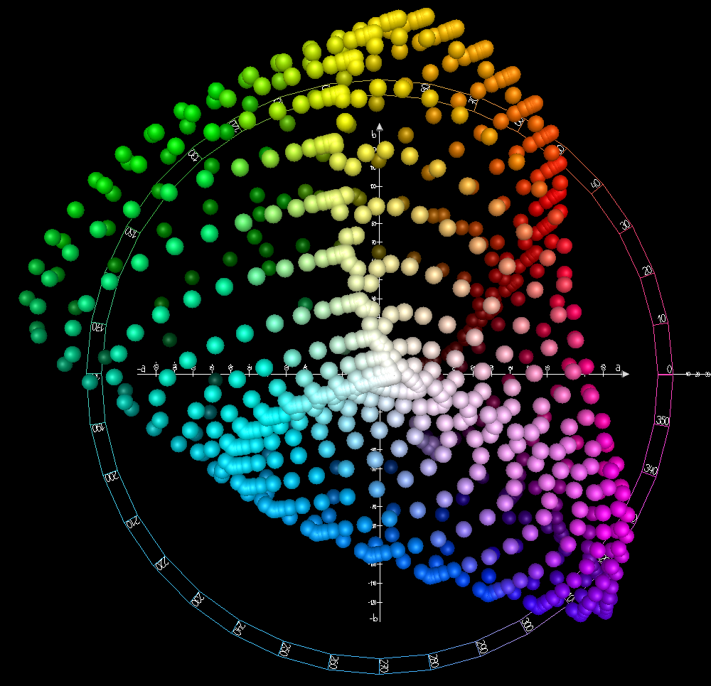
The Excluded Colors graph is based on the color distribution of the chromatic coordinates used for the L*a*b* color space: the horizontal axis represents the a* component (going from green to red) and the vertical axis represents the b* component (going from blue to yellow).
However, because it is complicated to represent the actual L*a*b* space color distribution in two dimensions, the pastel shades as shown in the interface, while being mathematically accurate, are not visually intuitive, especially when selecting yellow tones. Perceptually they are equivalent to a graph such as the one below:

In the center of the graph there is a white dot which, when dragged, will produce a second black dot. These two dots define the centers of the color ranges that will be protected to a greater or lesser extent by the toning adjustments that are subsequently carried out in this module. Putting the white dot on a particular color in the graph defines the center of the first color range. Similarly, the position of the black dot defines the center of the second color range. If the black dot is not moved from the initial position at the center, then the second range is ignored.
With the slider Range a and b % a zone of influence is created around the center as defined by the position of the dot on the graph and the slider % determines how large the zone will be.
With the Protection slider, the effect of module adjustments on the selected colors is reduced in the zone of influence (center plus range). The protection slider value corresponds to the % of the protection effect and will decrease as you move away from the center, until at the end of the range (at the periphery of the zone of influence) the reduction is equivalent to half the established value.
For example: Protection=80 means that the protection is 80% and therefore the centre of each range will therefore only receive 20% of the toning values set in the equalizer modules (explained below). As we move away from the center and until we reach the limit set by Range a and b %, the toning will become more and more intense until it reaches a maximum of half of the Protection value. In this case it would be 40 meaning that the colours on the periphery would undergo 60% of the set value.
Toning controls
In this group of controls, two curves are presented:
- the Opacity Red-Green (the a*-curve) which acts on the red-green tones
- the Opacity Blue-Yellow (the b*-curve) which acts on the blue-yellow tones
But don't forget that the final colors of the photo will be a combination of the tones of these two curves. For example: if you modify the a* curve (Red-Green Opacity) to red, all the tones of the level you are modifying will take on a red/reddish tone, but will not necessarily become red (if they also had a strong blue component, they would turn towards magenta/violet).
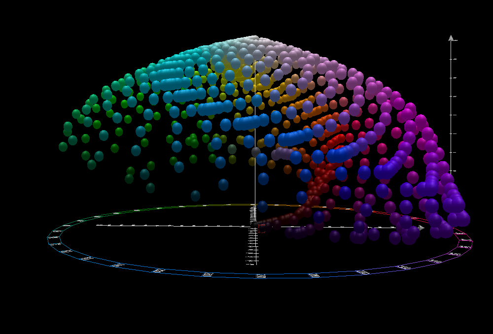
From a practical point of view: a tone can become more or less saturated to a certain extent and at the same time undergo a change in hue. To better visualize these effects, take a look at this view from above the L*a*b* color space, with b* as the vertical axis and a* as the horizontal axis. And don't miss this front view of the L*a*b* color space. The bottom of the top view matches the front of the front view.
In the interface you will find two curve types: Linear (![]() ) and Equalizer (
) and Equalizer (![]() ). To choose between one or the other, you must display the list with the small triangle on the right.
). To choose between one or the other, you must display the list with the small triangle on the right.
The linear curve serves to cancel the effect of the axis to which it refers: if you select it in the Red-Green Opacity, you will not perform any action on those tones. Similarly with the Blue-Yellow Opacity.
In each equalizercurve there is a horizontal axis (or x axis) and a vertical axis (or y axis):
- the x axis represents the 10 possible levels, ordered from left to right and evenly distributed
- the y axis represents the intensity of the modification: when the curve rises above or falls below the midline the color is modified towards one end or the other of the axis of the component being modified (a* or b*)
- in the Red-Green Opacity (the a*-curve), moving the curve upward introduces a reddish tint, while moving it downward introduces a greenish tint
- in the Blue-Yellow Opacity (the b*-curve), moving the curve upward introduces a yellow tint, while moving it downward introduces a bluish tint
By default, the curve is flat and lies on the midline. To get an idea of how you can interact with the curve, review the explanations of the Tone Curves. And remember that if you don't like the changes you have made to the curve, you can always start over by clicking the reset arrow ![]() .
.
As long as there are variations in contrast in the original image color, then these curves allow you to selectively vary the tone of the desired details, depending on where you place the points in the curve and the amplitude of the modification (i.e.the number of levels it affects). Everything has to be done «by eye», as there is no reference to the levels on the x axis, however you can see the effect of the modification by looking at the preview.
If you use less than 10 levels, the points affecting the rightmost levels will simply be ignored: if you are modifying the image with 4 levels, the rightmost 6 (the ones with the largest details) will be ignored.
Real example (applying toning)
You will recall that we had some ugly blue halos around parts of the flower, so let's try to eliminate them (or at least hide them) with the toning controls. We take advantage of the fact that most of the image has a red dominant so we can modify the blue component, without it being too noticeable in the overall result. For this example, none of the colors have been excluded:


There are still some traces of blue halos in the final result although they are not as visible, and the overall appearance of the photo seems to be the same.